Posts written by Thomas Lumley (2645)

avatar

Thomas Lumley (@tslumley) is Professor of Biostatistics at the University of Auckland. His research interests include semiparametric models, survey sampling, statistical computing, foundations of statistics, and whatever methodological problems his medical collaborators come up with. He also blogs at Biased and Inefficient

July 9, 2015

Followup: vitamin D and diabetes

Quite some time ago, I wrote about a story on vitamin D and diabetes:

A: Someone needs to do a randomized trial, where half the participants get vitamin D and half get a dummy pill. If the effect is real, fewer people getting vitamin D will end up with diabetes.

Q: That sounds like a good idea. Is someone doing a trial?

A: Yes, Professor Peter Ebeling, of the the University of Melbourne.

Q: Is there some useful website where I can find more information about the trial?

A: Indeed.

Q: Will it work?

A: No.

Q: Are you sure?

A: No, that’s why we need the trial.[…]

While the clinical trial registry hasn’t been updated, there are now published results from this trial.  The researchers didn’t get to their planned 160 participants; they gave up at 95 because of slow recruitment.  Even so, if the results had been as dramatic as in the observational studies, they would have been able to see the benefit.

They didn’t:

In this 6-month RCT of vitamin D and calcium supplementation in which over 90% of the participants reached the target serum 25(OH)D concentration of 75 nmol/L, there was no effect of supplementation on any measure of insulin sensitivity, insulin secretion or β-cell function in multi-ethnic vitamin D-deficient individuals at risk of type 2 diabetes (with prediabetes or an AUSDRISK score ≥15).

These results are no fun, so they have not received the same media attention as the observational correlations that prompted the trial, even though they are more reliable and more relevant to individual health choices.

Interesting graph of the day

From Matt Levine at Bloomberg

nyse

This is a graph of cumulative US stock trades today. The pink circle is centred at 11:32am, when the New York Stock Exchange had technical problems and shut down. Notice how nothing happens: the computers adapt very quickly to having a slightly smaller range of places to trade. As Levine puts it:

“For the most part the system is muddling along, relatively normally,” says a guy, and presumably if you asked a computer it would be even more chill.

July 8, 2015

Stolen car statistics

Both the Herald and Stuff are covering the AA Insurance list of most-stolen car brands. They have both made it clear what the ranking on the list actually means – -what the denominator is:

“It’s not that there are more Honda Torneos on the road than any other car,” said AA Insurance customer relations manager Amelia Macandrew. “It’s the probability of them being stolen that’s far greater than any other car we insure.” (Stuff)

and

To calculate theft incidence rates, AA Insurance measures the number of claims made for each model of car for which 20 or more claims have been made, as a percentage of the total number of policies it holds for that model. (Herald)


It wasn’t as clear in past years: credit to the reporters and to AA Insurance for the improvement.


July 6, 2015

Briefly

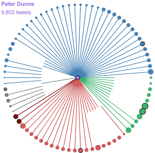
  • Visualizing the Twitter networks of NZ MPs: on the Herald data blog, a post by Chris McDowall, and additional graphics by Jayne Ihaka.  peterdunne
    Now we just need a way to tell which accounts are actually used by MPs and which ones are twitterwallahs.
  • There was a big discrepancy among bookies on the odds for the Greek referendum. Paddy Power estimates an 80% chance of ‘yes’ and has paid out winnings early. Betfair is almost certain of “No”.  The wisdom of crowds has definite limitations, especially in situations where no-one really has a clue.
  • Sense about Science have a new guide to screening tests. I’ll repeat my testing soundbite: “Screening is the opposite of treatment: you go in healthy and come out with a disease”.
  • Measuring happiness: a discussion at the New York Times and an independent (I think) skeptical post by John Quiggin arguing for measures of unhappiness.
June 25, 2015

Poetry about statistics

On Twitter, Evelyn Lamb pointed me to the poem “A contribution to Statistics”, by Wisława Szymborska (who won the 1996 Nobel Prize for Literature). It begins

Out of every hundred people

those who always know better:
— fifty-two,

doubting every step
   — nearly all the rest,

glad to lend a hand
if it doesn’t take too long:
— as high as forty-nine,

Read all of it here

The same blog, “Poetry with Mathematics”, has some other statistically themed poems:

The last was written in honour of Florence Nightingale, who was the first female member of the Royal Statistical Society, and also an honorary member of the American Statistical Association.

June 23, 2015

Refugee numbers

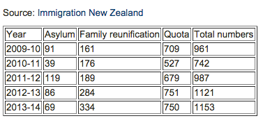
Brent Edwards on Radio NZ’s Checkpoint has done a good job of fact-checking claims about refugee numbers in New Zealand.  Amnesty NZ tweeted this summary table

CIJSRW9UMAABRkB

If you want the original sources for the numbers, the Immigration Department Refugee Statistics page is here (and Google finds it easily).

The ‘Asylum’ numbers are in the Refugee and Protection Status Statistics Pack, the “Approved” column of the first table. The ‘Family reunification’ numbers are in the Refugee Family Support Category Statistics Pack in the ‘Residence Visas Granted’ section of the first table. The ‘Quota’ numbers are in the Refugee Quota Settlement Statistics Pack, in the right-hand margin of the first table.

Update: @DoingOurBitNZ pointed me to the appeals process, which admits about 50 more refugees per year: 53 in 2013/4; 57 in 2012/3; 63 in 2011/2; 27 in 2010/11.


June 21, 2015

Sunbathing and babies

The Herald (from the Daily Mail)

A sunshine break is the perfect way to unwind, catch up on your reading and top up that tan.

But it seems a week soaking up the rays could also offer a surprising benefit – helping a woman have a baby.

Increased exposure to sunshine could raise the odds of becoming a mother by more than a third, a study suggests.


If you read StatsChat regularly, you probably won’t be surprised to hear the study had nothing to do with either holidays or sunbathing, or fertility in the usual sense.

As the story goes on to say, it was about the weather and IVF success rates. The researchers looked for correlations between a variety of weather measurements and a variety of ways of measuring IVF success. They didn’t find evidence of correlations with the weather at the time of conception. As they said (conference abstract, since this isn’t published)

When looking for a linear correlation between IVF results and the mean monthly values for the weather, the results were inconsistent.

So, following the ‘try, try again’ strategy they looked at weather a month earlier

However, when the same analysis was repeated with the weather results of 1 month earlier, there was a clear trend towards better IVF outcome with higher temperature, less rain and more sunshine hours. 

It helps, here, to know that “a clear trend” is jargon for “unimpresssive statistical evidence, but at least in the direction we wanted”.  That’s not the only problem, though. Since these are honest researchers, you find the other big problem in the section of the abstract labelled “limitations”

Because of the retrospective design of the study, further adjusting for possible confounding factors such as age of the woman, type of infertility and indication for IVF is mandatory. 

That is, their analysis lumped together women of different ages,  types of infertility, and reasons for using IVF, even those these have a much bigger impact on success than is being claimed for the weather.

I don’t have any problem with these analyses being performed and presented to other consenting scientists who are trying to work out ways to improve IVF.  On the other hand,  I’m pretty sure the Daily Mail didn’t get these results by reading the abstract book or sitting through the conference. Someone made a deliberate decision to get publicity for this research, at this stage, in a form where all the cautionary notes would be lost. 


Briefly

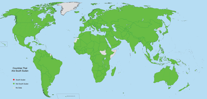
  • From Vox, for map nerds: “Countries that are South Sudan” in red, “Countries that are not South Sudan” in green, “No data” in grey
    countries_that_are_south_sudan.0
  • Medical marijuana laws didn’t lead to an increase in teenage marijuana use in the US (MinnPost, Lancet Psychiatry). This is less unsurprising than it sounds, because in some of the states, (eg, California) the medical-use requirement is not all that stringent.
  • Survey research finds that people who (claim to) have more sex are (or claim to be) happier. As XKCD has pointed out, this is something you can’t easily do a double-blind randomised trial of.  But you could do a trial of encouraging people to have more sex. It didn’t make them happier. This is an issue more generally with lifestyle changes: just because a lifestyle difference would be good, it doesn’t necessarily mean that a doctor telling you to make the change will be good. (via Tim Harford)
  • Google Research was looking for ways of visualising what actually happens in different layers of a computational neural network. They used feedback of images and amplification of layers to get things like
    ibis
  • Nice story in the Herald about second languages in Auckland. (though also note the Herald search page finds 514 stories with the phrase “melting pot”)
June 18, 2015

Bogus poll story again

For a while, the Herald largely gave up basing stories on bogus clicky poll headlines. Today, though, there was a story about Gurpreet Singh,  who was barred from the Manurewa Cosmopolitan Club for refusing to remove his turban.

The headline is “Sikh club ban: How readers reacted”, and the first sentence says:

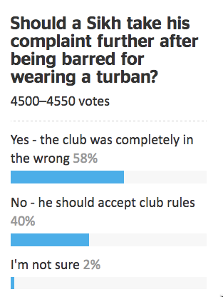
Two thirds of respondents to an online NZ Herald poll have backed the controversial Cosmopolitan Club that is preventing turbaned Sikhs from entering due to a ban on hats and headgear.

In some ways this is better than the old-style bogus poll stories that described the results as a proportion of Kiwis or readers or Aucklanders. It doesn’t make the number mean anything much, but presumably the sentence was at least true at the time it was written.

A few minutes ago I looked at the original story and the clicky poll next to it

turban

There are two things to note here. First, the question is pretty clearly biased: to register disagreement with the club you have to say that they were completely in the wrong and that Mr Singh should take his complaint further. Second, the “two thirds of respondents” backing the club has fallen to 40%. Bogus polls really are even more useless than you think they are, no matter how useless you think they are.

But it’s worse than that. Because of anchoring bias, the “two thirds” figure has an impact even on people who know it is completely valueless: it makes you less informed than you were before. As an illustration, how did you feel about the 40% figure in the new results? Reassured that it wasn’t as bad as the Herald had claimed, or outraged at the level of ignorance and/or bigotry represented by 40% support for the club?


June 17, 2015

Chocolate: the new health food?

A UK cohort study published a paper yesterday with the title “Habitual chocolate consumption and risk of cardiovascular disease among healthy men and women.”  In contrast to the last chocolate study to make headlines, this is actual research, involving 20,000 people followed up for twelve years, and was published in a respectable medical journal.

The study found that people who ate more chocolate back in the mid-1990s had less cardiovascular disease over the period to 2008. Of course, this makes for a great press release and headlines

  • StuffEating chocolate every day linked to lower heart disease and stroke
  • NZ Herald (from the Telegraph): Two choc bars a day keeps doctor away
  • One News: Is chocolate good for you? New study suggests 100g a day may be beneficial

Are the findings of the paper true? Well, that depends on what you mean by ‘true’, which is important to remember when you see claims that 90% of scientific results are false.

On the one hand, it’s true that the EPIC study recruited all these people and asked them questions about their diet in the 1990s, and it’s presumably true that the proportion getting cardiovascular disease was lower among those who ate more chocolate and that the study included people who ate up to 100g/day.  These are historical facts, not health claims.

The conclusion of the research paper was

Cumulative evidence suggests that higher chocolate intake is associated with a lower risk of future cardiovascular events, although residual confounding cannot be excluded. There does not appear to be any evidence to say that chocolate should be avoided in those who are concerned about cardiovascular risk.

This is also probably true: there is a correlation; it could be due to confounding; there doesn’t seem to be any big extra risk from eating chocolate (instead of something else with similar calorie content).

At the other extreme, though, the Herald and One News headlines are misleading: they imply that adding 100g/day of chocolate to your existing diet would be beneficial. First, while the maximum consumption was 100g/day, 95% of the study participants consumed less than 40g/day, and 90% less than 25g/day. Second, and more important, the study looked at people’s normal diet, not at changes in diet.

If you add 100g/day of chocolate to your diet, you either need to cut more than 500 Calories of other foods, or exercise a lot more, to avoid gaining weight. The study participants basically did this: the high-chocolate and low-chocolate groups had similar BMI and waist:hip ratio, and the high-chocolate group exercised more.

Third, there is confounding. The people who ate more chocolate might have been healthier for other reasons. For example, those who ate no chocolate were more likely to have diabetes, which is probably why some of them ate no chocolate. The difference in cardiovascular disease rates was far too small for confounding to be ruled out as an explanation, no matter how carefully the analysis was done (and it was done pretty well).

Fourth, and in some ways most important, is the role of chance. This was a big study, but it still came up with only moderately strong evidence that the correlation was real, and that’s considering the study on its own. We don’t know whether there was any publication bias leading positive results about chocolate to be easier to publish in the scientific journals, but we can be sure there was publication bias in the media coverage. Always, if you see a diet and health study on TV, it must have had unusually interesting results. Even when it’s valuable as a component in the cumulative scientific literature, the biased selection for interesting results usually means you can’t believe it in application to your own life.

I got up at 5:15 today in order to be on breakfast TV to talk about this study. That would never have happened if the results had been different.