Posts written by Thomas Lumley (2645)

avatar

Thomas Lumley (@tslumley) is Professor of Biostatistics at the University of Auckland. His research interests include semiparametric models, survey sampling, statistical computing, foundations of statistics, and whatever methodological problems his medical collaborators come up with. He also blogs at Biased and Inefficient

April 13, 2015

Puppy prostate perception

The Herald tells us “Dogs have a 98 per cent reliability rate in sniffing out prostate cancer, according to newly-published research.” Usually, what’s misleading about this sort of conclusion is the base-rate problem: if a disease is rare, 98% accuracy isn’t good enough. Prostate cancer is different.

Blood tests for prostate cancer are controversial because prostate tumours are common in older men, but only some tumours progress to cause actual illness.  By “controversial” I don’t mean the journalistic euphemism for “there are a few extremists who aren’t convinced”, but actually controversial.  Groups of genuine experts, trying to do the best for patients, can come to very different conclusions on when testing is beneficial.

The real challenge in prostate cancer screening is to distinguish the tumours you don’t want to detect from the ones you really, really do want to detect. The real question for the canine sniffer test is how well it does on this classification.

Since the story doesn’t give the researchers’s names finding the actual research takes more effort than usual. When you track the paper down it turns out that the dogs managed almost perfect discrimination between men with prostate tumours and everyone else. They detected tumours that were advanced and being treated, low-risk tumours that had been picked up by blood tests, and even minor tumours found incidentally in treatment for prostate enlargement. Detection didn’t depend on tumour size, on stage of disease, on PSA levels, or basically anything. As the researchers observed “The independence of tumor volume and aggressiveness, and the dog detection rate is surprising.”

Surprising, but also disappointing. Assuming the detection rate is real — and they do seem to have taken precautions against the obvious biases — the performance of the dogs is extremely impressive. However, the 98% accuracy in distinguishing people with and without prostate tumours unavoidably translates into a much lower accuracy in distinguishing tumours you want to detect from those you don’t want to detect.
April 12, 2015

Reductionism and the Petone-Grenada link

If you have to make a decision with several options, each with different types of positive and negative effects, it’s going to be hard. Techniques for breaking down complex decisions into sets of simpler questions are very valuable, but it’s important that the way you break down the problem and recombine the answers fits with how you answer the simpler questions.

I’ve been pointed to what looks like an unfortunate example from the NZTA, in assessing options for the Petone–Grenada link road to be constructed near Wellington. The road comes in two sections: from Petone to the eastern section of Lincolnshire Farm, and from there to Grenada. According to the scoping report (PDF), these can be decided independently of each other, so there’s an ideal opportunity to simplify the decision making.  NZTA describes four options P1 to P4 for the first section, and four options A to D for the second section.

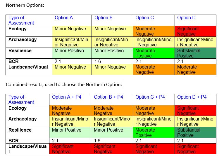
I would have expected them to just make independent recommendations for the two sections, but what they actually did was more complicated. First, they looked at the P options and decided based on four criteria that P4 was best.  They then looked at A+P4, B+P4, C+P4, and D+P4 for the same four criteria, and said in a footnote (p172) “Upon combining one of Option P1, P2, P3 or P4 with one Option A, B, C or D the effect more towards the negative takes precedence.

This can only make sense if the harms or benefits weren’t independent.  Sometimes that’s possible. In particular, one of the criteria was “resilience”, and you might argue that it doesn’t matter how robust the second part of the road is when the first part is under several meters of rock and mud, or filled with bumper-to-bumper traffic jams. It could make sense to take the worst value of the two sections when assessing resilience: but people who know more about Wellington-area transport than I do still seem dubious.

The same argument certainly doesn’t apply for the other criteria: archaeological,  ecological,  landscape/visual impact, and transport benefit/cost. If one section of the road is an environmental nightmare, that doesn’t make the environmental impact of the other section unimportant. If one section of the road is unavoidably ugly, that doesn’t excuse making the other section ugly. If one section destroys an important heritage site, it doesn’t mean the other section doesn’t have to care about preservation of the past. If one section is ridiculously expensive it doesn’t mean the costs are unimportant for the other section.

The impact of decomposing and recombining the evaluation as they did, is that any criterion where P4 was bad becomes much less important in choosing among options A to D. P4 was very bad on the landscape/visual criterion, and moderately bad on ecology.

By now you should be expecting the punch line: evaluated independently, options A and B look good because they score well on ecology and landscape/visual criteria. Evaluated in combination with P4, they look terrible, because the ecology and landscape benefits are masked by the “more negative” combining rule. That’s a problem with the combining rule, not with the road. Here’s a colour-coded version of the information in Table 23-19, p182 (from T. Duran)

Separate%20and%20Combined

Not only is the combining rule obviously missing some information, it’s not even internally consistent. If the evaluation had been done in the opposite order they might well have chosen A first, and then looked at A+P1 to A+P4. Even D was what they’d chosen first, P3+D would then look slightly better than P4+D.

It’s very tempting to look for ways of combining preferences that don’t rely on numbers, just on orderings, but in most cases they aren’t available, and attempts to do it leave you worse off than before.

This evaluation wasn’t set up to focus only on resilience — even assuming that the resilience assessment is valid, which I hear is also being questioned — it was set up to value the four criteria equally. It really looks as though a minor detail of the approach to simplifying the evaluation has had a large, accidental effect on the result.

April 10, 2015

Briefly

  • A properly-conducted opinion poll in Cuba, done in secret. Impressive.
  • As the Herald reports, New Zealand moved from 1st to 5th on the index reported by Social Progress Imperative. The story also points out, helpfully, that a lot of this is changes in how things are measured.  It turns out this goes further:  a 2014 version of the index is available using the new measurements. When the same definitions are used for the two years, NZ stays at the same ranking (5th) and improves on the actual values (from 86.93 to 87.08).
  • JPMorgan is using workplace data to predict which employees are likely to ‘go rogue’. Matt Levine doesn’t really worry. The Bloomberg News story worries a bit, but only “Policing intentions can be a slippery slope. Do people get a scarlet letter for something they have yet to do?” They don’t seem to consider false positives: people who weren’t going to do anything wrong (or more wrong than is necessary if you work for an investment bank).
  • The NZ Association of Scientists is having a conference titled “Speaking Out: Going public on difficult issues”. There will probably be more stuff on line soon, but currently you can read an expanded version of Peter Gluckman’s talk, and listen to (NZAS President) Nicola Gaston on Radio NZ; the Twitter hashtag is 

Odds and probabilities

When quoting results of medical research there’s often confusion between odds and probabilities, but there are stories in the Herald and Stuff at the moment that illustrate the difference.

As you know (unless you’ve been on Mars with your eyes shut and your fingers in your ears), Jeremy Clarkson will no longer be presenting Top Gear, and the world is waiting with bated breath to hear about his successor.  Coral, a British firm of bookmakers, say that Sue Perkins is the current favourite.

The Herald quotes the Daily Mail, and so gives the odds as odds:

It has made her evens for the role, ahead of former X-factor presenter Dermot O’Leary who is 2-1 and British model Jodie Kidd who is third at 5-2.

Stuff translates these into NZ gambling terms, quoting the dividend, which is the reciprocal of the probability at which these would be regarded as fair bets

Bookmaker Coral have Perkins as the equivalent of a $2 favourite after a flurry of bets, while British-Irish presenter Dermot O’Leary was at $3 and television personality and fashion model Jodie Kidd at $3.50.

An odds of 5-2 means that betting £2 and winning gives you a profit of £5.  The NZ approach is to quote the total money you get back: a bet of $2 gets you $2 back plus $5 profit, for a total of $7, so a bet of $1 would get you $3.50.

The fair probability of winning for an odds of 5-2 is 2/(5+2); the fair probability for a dividend of $3.50 is 1/3.50, the same number.

Of course, if these were fair bets the bookies would go out of business: the actual implied probability for Jodie Kidd is lower than 1/3.5 and the actual implied probability for Sue Perkins is lower than 0.5.  On top of that, there is no guarantee the betting public is well calibrated on this issue.


April 9, 2015

Graph of the week

license

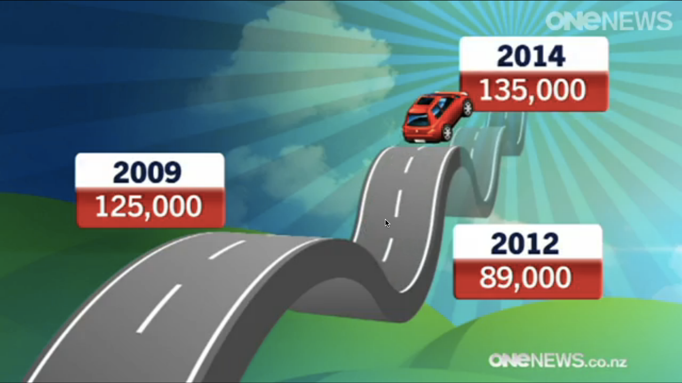
Number of learner license tests taken in New Zealand, according to One News.

We’ll follow up to see if the future prediction part of the graph turns out to be correct.

Height and heart attack: genetic determinism is still wrong

From the Herald (originally from the Independent)

Short people are at a greater risk of heart attack – and there’s little they can do about it because the link is genetic.

This one is partly the fault of the researchers and partly the fault of the journalists.  The press release says

“We have shown that the association between shorter height and higher risk of coronary heart disease is a primary relationship and is not due to confounding factors such as nutrition or poor socioeconomic conditions.”

That’s partly true, and new and interesting, but (a) it’s being oversold (“the” association?) and (b) even if it were completely true, it wouldn’t imply the “there’s little they can do about it” added by the journalists.

Taking the second point first: knowing that something has a genetic component tells you absolutely nothing about how easy or hard it is to change. At a biological level hair colour and eye colour have similar degrees of genetic influence, but one of them is very easy to change and the other is more difficult and inconvenient.

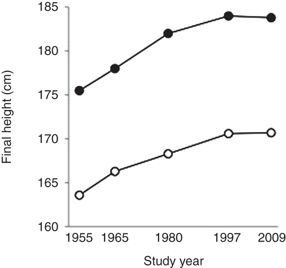
Also, it’s certainly not true that height is entirely genetically determined. There is a genetic component: tall people have tall children. There is also an environmental component: most people are taller than their grandparents.  Here’s a graph (source) showing how the heights of Dutch people changed over sixty years: the Dutch went from some of the shortest people in Europe to some of the tallest, and this was an environmental change, not a genetic change.

pr2012189f2

The research paper doesn’t even claim that among modern Westerners the association between height and heart attack risk is all genetic, though if you only have the press release you have to read carefully to avoid getting that impression. Even within the (fairly homogeneous) groups of people being studied, the genetic variants they used explain only about 10% of the variation in height.

What’s new in this research is that some of the relationship between height and heart attack risk is genetic. Until now, it was possible that all the association was explained by environmental factors in childhood or before birth that made people shorter and also, separately, increased their heart attack risk.

For the part of the relationship explained by genetic variation there are basically three possible sorts of explanation:

  • Being short has some direct biological effect on risk,  for example, smaller people have smaller blood vessels, which might get blocked by smaller blood clots.
  • Being short subjects you to different environmental risks: for example, if shorter people had lower incomes (on average) they might have higher risk for various social and lifestyle reasons
  • The genetic variants that make you shorter also have some separate effect on heart attack risk: for example, the same variant might affect growth in infancy and also affect diabetes risk in later life.

These are all interesting, and there’s a reasonable hope of being able to separate them out with more data and experiments.

The last sentence of the research paper is a good counterpoint to the media coverage

More generally, our findings underscore the complexity underlying the inherited component of CAD.


[Disclosure: I work with one of the cohorts that is part of one of the consortia that is part of the whole Cardiogram group and I know some of the researchers — but that would be true of anyone in the field]

April 7, 2015

Briefly

  • NPR’s Science Friday covers BAHfest, a competition to produce what look like scientific arguments for nutty conclusions. Hilarious, but also important: serious and scammy pseudoscience uses the same tricks.
  • Emma Pierson, a scientist who studies dating analyses a year of emails with her boyfriend
    Him
    : You’re going to find some weird pattern and break up with me.

    Me: Either that will be warranted by the data, in which case it’s a good thing, or it won’t, in which case I’m a bad statistician. Are you saying I’m a bad statistician?

  • And a post by Emma Pierson at 538.com: “people just want to date themselves”
  • Another story about changes in cancer risk that just uses number of diagnoses, without even gesturing in the direction of screening bias.

Evils of Axis

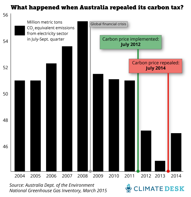
First, from Mother Jones magazine, via Twitter

oz-carbon-emissions4

The impact of the carbon tax looks impressive, but this is a bar chart — it starts at zero and they’ve only shown the top fifth of it.

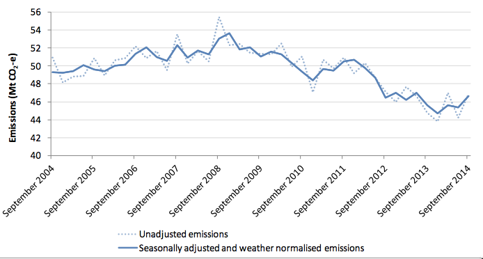
They do link to the data, the quarterly Greenhouse Gas Inventory update.  In that report, Figure 8 is

ozcarbon-line

The dotted line is the same data as the bar chart, except that the dotted line has data for every quarter and the bar chart has data only for the July-September quarter each year. And  the line chart has a wider range on the vertical axis — it doesn’t go down to zero, but it isn’t a bar chart, so it doesn’t have to. The other point about the line chart is that there’s a solid line there as well. The solid line is adjusted for seasonal variation and weather. If you wanted to know about real changes in how Australians are using energy, that’s the line you’d use.


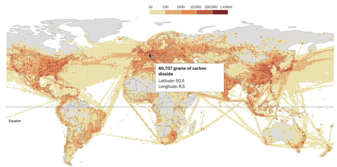
Second, a beautiful map of CO2 emissions from fossil fuel combustion, from the Washington Post via Flowing Data

co2map

The ‘vertical’ scale here is a colour scale; what’s misleading is that it’s a logarithmic scale. The map makes it look as if a large fraction of CO2 emission comes from transporting stuff through empty areas, but the pale beige indicates emissions thousands of times lower than in the urban/suburban areas. Red ink isn’t anywhere close to being proportional to CO2.

What’s wrong with this picture?

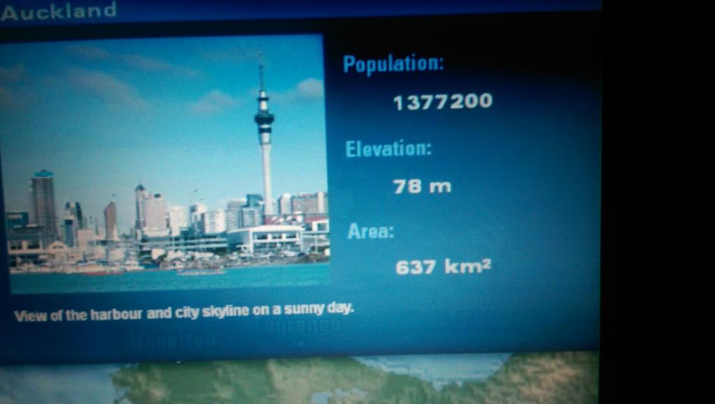
So, I was on a plane from Sydney yesterday that was old enough they told us to switch off our books half an hour before landing. As a result, I actually looked at the Auckland information on the flight map channel (photo taken after we were allowed technology, naturally):

CB6H2HkUoAAnW3i

It’s interesting to see where these numbers come from, given all the different ways these things can be defined. Two of these numbers are inconsistent with each other and somewhat obsolete, and the third isn’t even wrong.

According to the Google, the population number 1,377,200 is the June 2011 estimate of the urban population of the Auckland metropolitan area.  Ok, that’s a bit old but so was the plane. Slightly more strange is that StatsNZ thinks the urban Auckland population at 30 June 2011 was 1,351,200, but that’s probably a matter of projections being made in advance and then adjusted as more information comes in. The current (June 2014) estimate is 1,413,500.

So if the population is urban Auckland, what’s the area? With a bit of searching, you can find it’s the area of the old Auckland City, the central Auckland isthmus plus various islands. Auckland City had a population of 450,000 when it was absorbed into the Supercity in 2010. The population and area numbers are for very different entities, and the population number, although old, dates from after the area number became completely obsolete.

The area that goes with the 1,377,200 number is 1,102.9km2, the size of the Statistical Urban Area. You could reasonably want the urbanised area (483km2) or the Metropolitan Urban Limits (560km2) as better summaries of the size of Auckland, but they don’t match the quoted population.

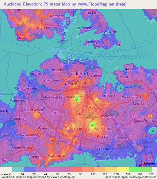
That leaves elevation. The picture next to the statistics shows that 78m is not a completely satisfactory characterisation of the elevation of Auckland. The blue stuff with boats floating on it is at sea level (up to tidal variation). Here’s a map (from FloodMap.net) of Auckland elevation; the change from pink to red is at 75m.

www.floodmap

Overall, population and area, which could have multiple satisfactory definitions, are defined incompatibly with each other.  Elevation doesn’t really have a satisfactory definition, but isn’t 78m.


March 31, 2015

Beautiful and trustworthy

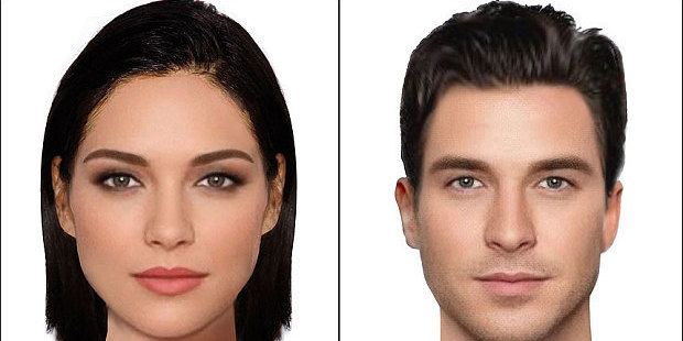
The Herald has pictures of the most beautiful faces in the world

BEAUTIFUL-FACES_3249636b_620x310

and NPR reports on a computer algorithm that can tell if you sound trustworthy or calming or engaging.

The Herald story at least admits these faces are only world-famous in New Zealand (or, rather, the UK)

“It’s important to note that these are the idealised faces according to those living in the UK, so a study in Asia or Africa for example would no doubt have different results.”

The NPR story instead doubles down by saying

But algorithms have stamina, and they do not factor in things like age, race, gender or sexual orientation.

There’s a sense in which this is true, but it’s not a very useful sense. If we can guess age, race, or gender from the sound of someone’s voice, and these perceptions affect whether we think the voice is engaging,calming or trustworthy, our prejudices will show up in the training data and any competent black-box algorithm will learn them.