Posts written by Thomas Lumley (2645)

avatar

Thomas Lumley (@tslumley) is Professor of Biostatistics at the University of Auckland. His research interests include semiparametric models, survey sampling, statistical computing, foundations of statistics, and whatever methodological problems his medical collaborators come up with. He also blogs at Biased and Inefficient

March 31, 2015

Polling in the West Island: cheap or good?

New South Wales has just voted, and the new electorate created where I lived in Sydney 20 years ago is being won by the Greens, who got 46.4% of the primary vote and currently 59.7% on preferences. The ABC News background about the electorate says

In 2-party preferred terms this is a safe Labor seat with a margin of 13.7%, but in a two-candidate contest would be a marginal Green seat versus Labor. The estimated first preference votes based on the 2011 election are Green 35.5%, Labor 30.4%, Liberal 21.0%, Independent 9.1, the estimated Green margin after preferences being 4.4% versus Labor.

There was definitely a change since 2011 in this area, so how did the polls do? Political polling is a bit harder with preferential voting when there are only two relevant parties, but much harder when there are more than two.

Well, the reason for mentioning this is a piece in the Australian saying that the swing to the Greens caught Labor by surprise because they’d used cheap polls for electorate-specific prediction

“We just can’t poll these places accurately at low cost,” a Labor strategist said. “It’s too hard. The figures skew towards older voters on landlines and miss younger voters who travel around and use mobile phones.”

The company blamed in the story is ReachTEL. They report that they had the most accurate overall results, but their published poll from 19 March for Newtown is definitely off a bit, giving the Greens 33.3% support.

(via Peter Green on Twitter)


March 30, 2015

Aspect ratios and not starting at zero

The vertical axis on a bar chart must start at zero. The very rare exceptions are ones that prove the rule: where ‘zero’ isn’t zero. Otherwise, the axis starts at zero or it isn’t a bar chart. The whole point of bar charts is that the length of the bar is proportional to the data value.

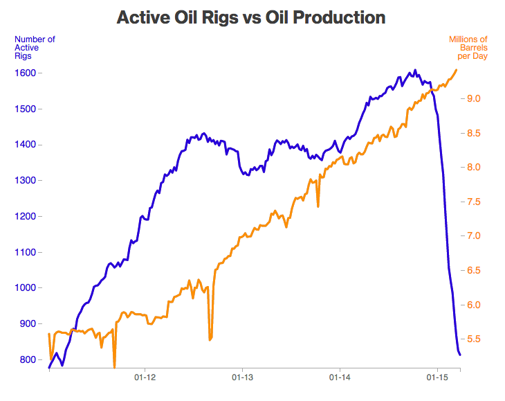
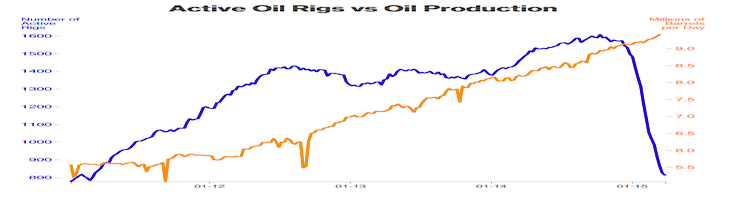
Line charts and scatterplots are different.  They don’t need to be tied down to zero, and the axis scales can be chosen to make the information as clear as possible. With great power comes great responsibility, as we can see from the following pair of line graphs of oil drilling in the US.

littlerigs

bigrigs

It’s pretty obvious that these come from people with different communications agendas. Or, it would be, except they are from the same story at Bloomberg.

Neither graph has an ideal aspect ratio. The flat one is too flat: you can’t see the wobbles over time in number of rigs. The tall one is too tall: the number of rigs has halved, but it looks as though it has crashed much more than that.

Bill Cleveland has a useful default rule for scaling line graphs: the median slope of the line segments should be about 45 degrees. The orange line on the tall graph isn’t far off that, but the blue line is steeper.  The 45-degree rule would give a graph like this:

flatrigs

In fact, there is plenty of room to start the blue axis at zero, but that’s not always the right choice.

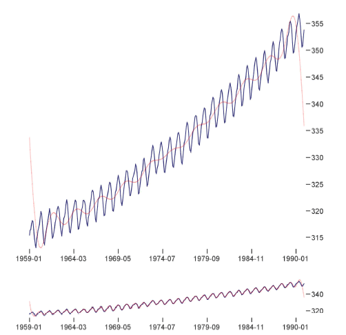
Here, in a sadly-appropriate pairing, is the Keeling Curve, the graph of atmospheric CO2 concentrations at Mauna Loa observatory, in a visualisation paper from Berkeley.

co2

There’s no sense at all in having the vertical axis start at zero. Zero is just not a relevant value of atmospheric CO2. What’s more interesting, though, is how the two scalings show different information. The upper graph is scaled so the year-to-year changes have slope centred at 45 degrees. This makes it easier to see that the CO2 increase is accelerating. The lower graph is scaled so the month to month changes have slope centred at 45 degrees, making it easier to see the shape of the seasonal pattern.

Different vertical scaling can be used just to mislead the reader, but it can also be used to make data more readable and to communicate more effectively.

Briefly

  • Two data-related notes about the Northland by-election: the polls were amazingly accurate given how hard by-elections are to predict, and the Electoral Commission did a wonderful job in getting the vote counted and reported fast.
  • The Medical Council of New Zealand has released a Discussion Paper on the value of performance and outcome data.
March 26, 2015

Understanding Ebola

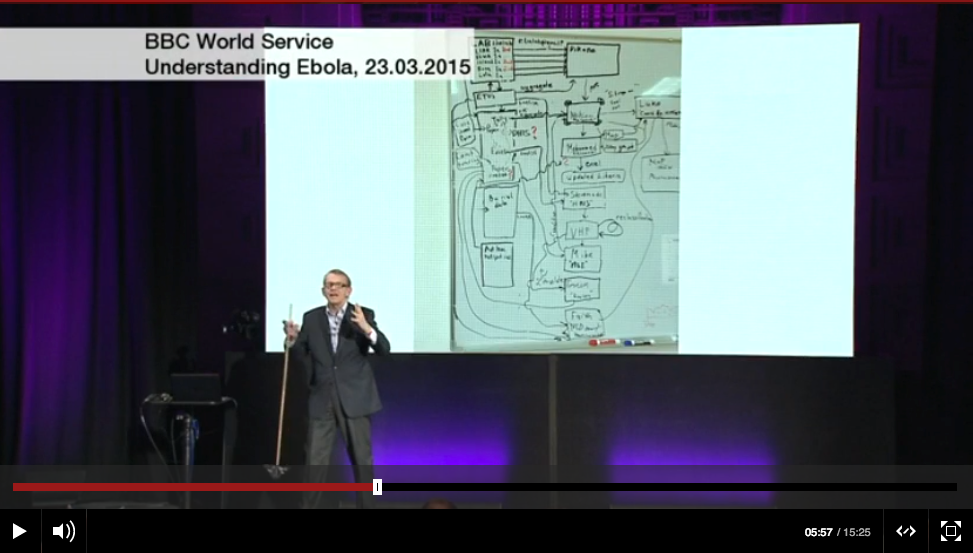
From the BBC, Hans Rosling on the Ebola epidemic

rosling-ebola

(That’s a diagram of the data collection system behind him)

(via Harkanwal Singh)

March 25, 2015

Translating from Scientist to English

Stories were coming out recently about new cancer research led by Bryony Telford in Parry Guilford’s lab at Otago, and I’d thought I’d use it for an example of translation from Scientist to English. It’s a good example for news because it really is pretty impressive, because it involved a New Zealand family with familial cancer, and because the abstract of the research paper is well written — it’s just not written in ordinary English. Combining the abstract with the press release and a bit of Google makes a translation possible.

This will be long. (more…)

Gimme that old time nutrition

Q: Did you see that eating a bowl of quinoa every day helps you live longer?

A: No.

Q: There’s story on Stuff (well, from the West Island branches). Is it true?

A: Hard to say.

Q: Well, does the research claim it’s true?

A: Hard to say.

Q: Why? Didn’t they link?

A: No, they linked, and the paper is even open-access. It just doesn’t say anything about the effects of quinoa.

Q: But the story said “A new study by Harvard Public School of Health has found that eating a daily bowl of the protein-packed, gluten-free grain significantly reduces the risk of premature death from cancer, heart disease, respiratory disease and diabetes.”

A: Sadly, yes.

Q: This is your correlation and causation thing again, isn’t it?

A: No, the paper just doesn’t mention quinoa. It talks about grains and cereals.

Q: Ok. So they just didn’t break out the data for quinoa separately. It’s still a grain and a cereal, isn’t it?

A: Yes, as long as you aren’t even more pedantic than me. But it’s not just data analysis. They didn’t even ask their study participants about eating quinoa.

Q: So? Some of the grain they ate must have been quinoa, and there’s no reason to expect it’s different from other grains, is there? Won’t it all get averaged in somehow?

A: I suppose so. But there can’t have been that much of it getting “averaged in”

Q: Why not? You old folks may not have caught on, but quinoa’s getting popular now.

A: The study was in people over 50. That’s older than both of us. Even assuming we weren’t the same person.

Q: Even so. Things are changing. People have more adventurous diets. It’s not the twentieth century any more.

A: It is in the study.

Q: Huh?

A: The dietary data were collected in 1995 and 1997, from people with average age 61 years.

Q: Oh.

Foreign drivers, yet again

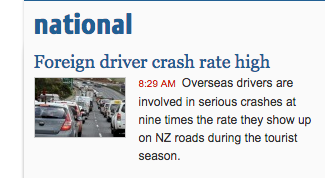
From the Stuff front page
ninetimes

Now, no-one (maybe even literally no-one) is denying that foreign drivers are at higher risk on average. It’s just that some of us feel exaggerating the problem is unhelpful. The quoted sentence is true only if “the tourist season” is defined, a bit unconventionally, to mean “February”, and probably not even then.

When you click through to the story (from the ChCh Press), the first thing you see is this:
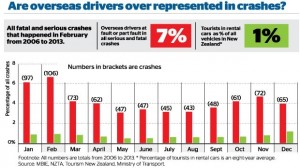
1427225389525

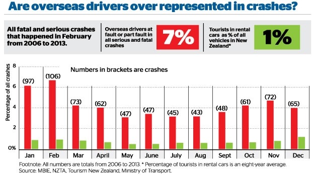
Notice how the graph appears to contradicts itself: the proportion of serious crashes contributed to by a foreign driver ranges from just over 3% in some months to just under 7% at the peak.  Obviously, 7% is an overstatement of the actual problem, and if you read sufficiently carefully, the graphs says so.  The average is actually 4.3%

The other number headlined here is 1%: cars rented by tourists as a fraction of all vehicles.  This is probably an underestimate, as the story itself admits (well, it doesn’t admit the direction of the bias). But the overall bias isn’t what’s most relevant here, if you look at how the calculation is done.

Visitor surveys show that about 1 million people visited Canterbury in 2013.

About 12.6 per cent of all tourists in 2013 drove rental cars, according to government visitor surveys. That means about 126,000 of those 1 million Canterbury visitors drove rental cars. About 10 per cent of international visitors come to New Zealand in January, which means there were about 12,600 tourists in rental cars on Canterbury roads in January.

This was then compared to the 500,000 vehicles on the Canterbury roads in 2013 – figures provided by the Ministry of Transport.

The rental cars aren’t actually counted, they are treated as a constant fraction of visitors. If visitors in summer are more likely to drive long distances, which seems plausible, the denominator will be relatively underestimated in summer and overestimated in winter, giving an exaggerated seasonal variation in risk.

That is, the explanation for more crashes involving foreign drivers in summer could be because summer tourists stay longer or drive more, rather than because summer tourists are intrinsically worse drivers than winter tourists.

All in all, “nine times higher” is a clear overstatement, even if you think crashes in February are somehow more worth preventing than crashes in other months.

Banning all foreign drivers from the roads every February would have prevented 106 fatal or serious injury crashes over the period 2006-2013, just over half a percent of the total.  Reducing foreign driver risk by 14%  over the whole year would have prevented 109 crashes. Reducing everyone’s risk by 0.6%  would have prevented about 107 crashes. Restricting attention to February, like restricting attention to foreign drivers, only makes sense to the extent that it’s easier or less expensive to reduce some people’s risk enormously than to reduce everyone’s risk a tiny amount.


Actually doing something about the problem requires numbers that say what the problem actually is, and strategies, with costs and benefits attached. How many tens of millions of dollars worth of tourists would go elsewhere if they weren’t allowed to drive in New Zealand? Is there a simple, quick test would separate safe from dangerous foreign drivers, that rental companies could administer? How could we show it works? Does the fact that rental companies are willing to discriminate against young drivers but not foreign drivers mean there’s something wrong with anti-discrimination law, or do they just have a better grip on the risks? Could things like rumble strips and median barriers help more for the same cost? How about more police presence?

From 2006 to 2013 NZ averaged about 6 crashes per day causing serious or fatal injury. On average, about one every four days involved a foreign driver. Both these numbers are too high.


March 23, 2015

Cricket visualisations

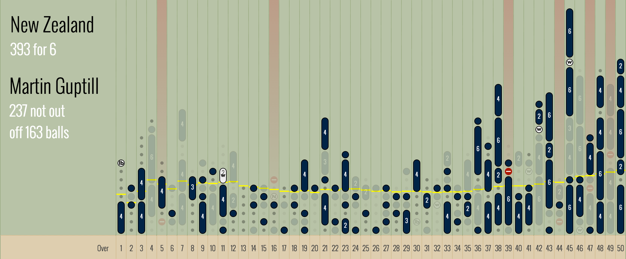
Lascarides-Guptill

Population genetic history mapped

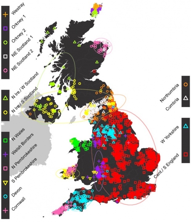
Most stories about population genetic ancestry tend to be based on pure male-line or pure female-line ancestry, which can be unrepresentative.  That’s especially true when you’re looking at invasions — invaders probably leave more Y-chromosomes behind than the rest of the genome.  There’s a new UK study that used data on the whole genome from a few thousand British people, chosen because all four of their grandparents lived close together.  The idea is that this will measure population structure at the start of the twentieth century, before people started moving around so much.

Here’s the map of ancestry clusters. As the story in the Guardian explains, one thing it shows that the Romans and Normans weren’t big contributors to population ancestry, despite their impact on culture.

0b02a9ee-3110-4323-8654-ee559ee03cc0-875x1020

Briefly

The “It’s not paranoia if..” issue

  • A new initiative, Data Justice, concerned with widespread commercial data collection and analysis as a threat to privacy and equality.
  • Trying to get “open” data in New Jersey: “initially refused to answer The Jersey Journal’s OPRA request because it didn’t make it on the agency’s standardized OPRA form, which wasn’t available on the NBHA website. Even after a reporter noted that in 2009 the state Supreme Court ruled standardized forms aren’t necessary, Earl wouldn’t accept a request on anything but the agency’s form.”