Posts written by Thomas Lumley (2645)

avatar

Thomas Lumley (@tslumley) is Professor of Biostatistics at the University of Auckland. His research interests include semiparametric models, survey sampling, statistical computing, foundations of statistics, and whatever methodological problems his medical collaborators come up with. He also blogs at Biased and Inefficient

March 20, 2015

Ideas that didn’t pan out

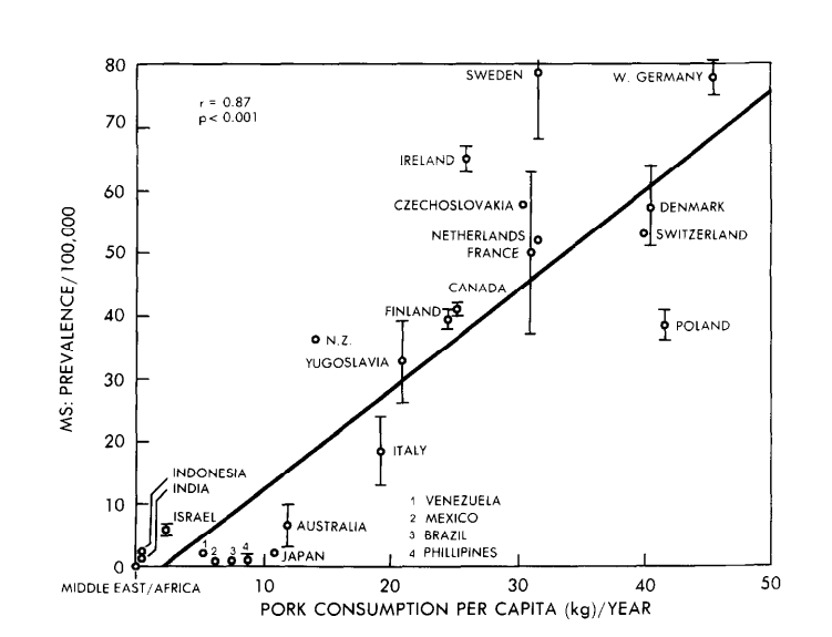
One way medical statisticians are trained into skepticism over their careers is seeing all the exciting ideas from excited scientists and clinicians that don’t turn out to work. Looking at old hypotheses is a good way to start. This graph is from a 1986 paper in the journal Medical Hypotheses, and the authors are suggesting pork consumption is important in multiple sclerosis, because there’s a strong correlation between rates of multiple sclerosis and pork consumption across countries:
pork

This wasn’t a completely silly idea, but it was never anything but suggestive, for two main reasons. First, it’s just a correlation. Second, it’s not even a correlation at the level of individual people — the graph is just as strong support for the idea that having neighbours who eat pork causes multiple sclerosis. Still, dietary correlations across countries have been useful in research.

If you wanted to push this idea today, as a Twitter account claiming to be from a US medical practice did, you’d want to look carefully at the graph rather than just repeating the correlation. There are some countries missing, and other countries that might have changed over the past three decades.

In particular, the graph does not have data for Korea, Taiwan, or China. These have high per-capita pork consumption, and very low rates of multiple sclerosis — and that’s even more true of Hong Kong, and specifically of Chinese people in Hong Kong.  In the other direction, the hypothesis would imply very low levels of multiple sclerosis among US and European Jews. I don’t have data there, but in people born in Israel the rate of multiple sclerosis is moderate among those of Ashkenazi heritage and low in others, which would also mess up the correlations.

You might also notice that the journal is (or was) a little non-standard, or as it said  “intended as a forum for unconventional ideas without the traditional filter of scientific peer review”.

Most of this information doesn’t even need a university’s access to scientific journals — it’s just out on the web.  It’s a nice example of how an interesting and apparently strong correlation can break down completely with a bit more data.

March 19, 2015

More on petrol prices

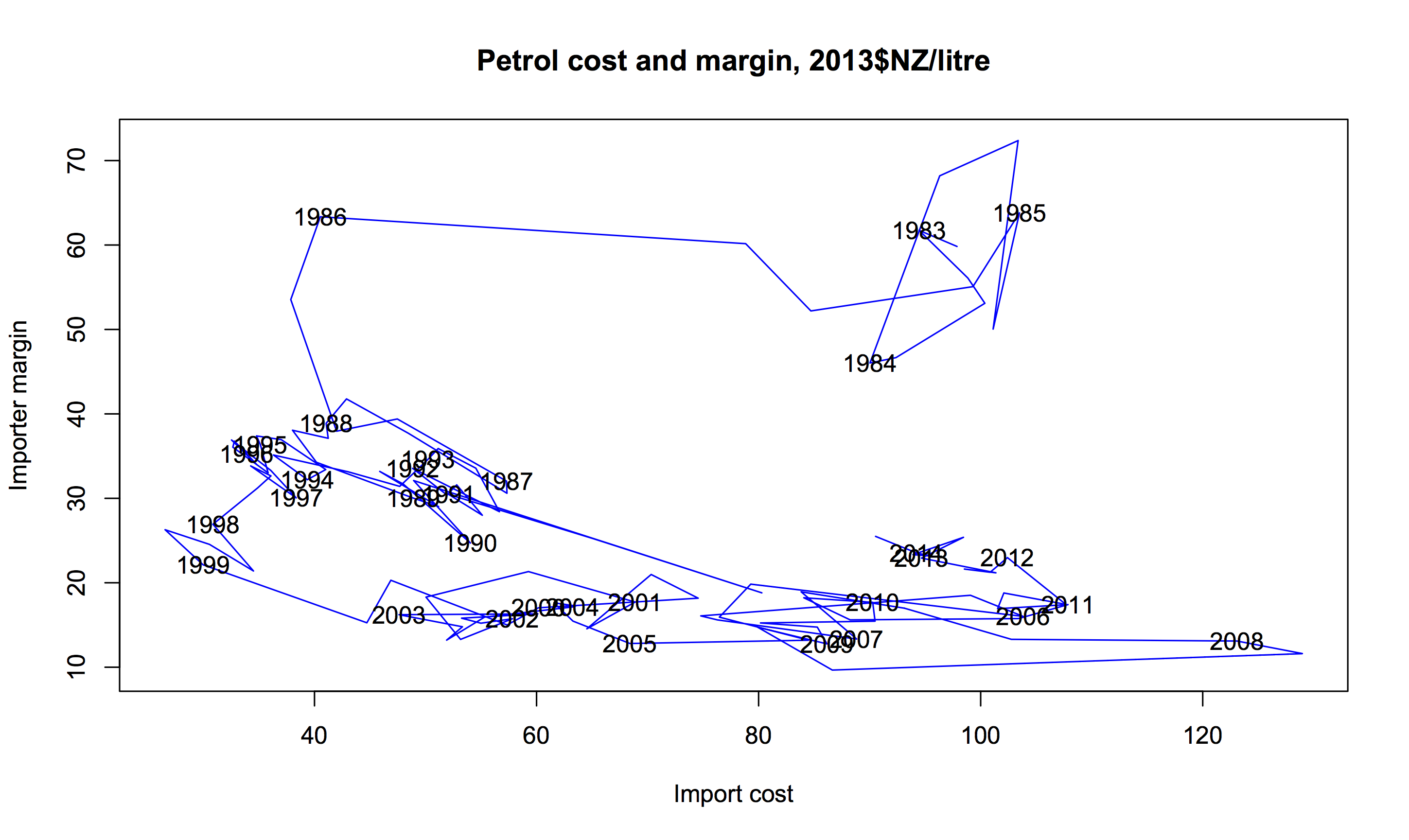
I posted a version of this graph with ten years of weekly data, and Mark Stockdale pointed out there are quarterly data back to 1983 (isn’t official data wonderful?). You’ll need to click the graph to embiggen for easy viewing.

petrol-long


The horizontal axis is the import cost plus freight and insurance (with CPI adjustments to 2013 NZ dollars), and the vertical axis is the importer margin, which covers transport and sale costs within New Zealand, and profit. The idea is that local costs are typically slowly varying, so that short-term variation in margin tracks short-term variation in profit. The label for each year is on the data point for June.

The import cost plummeted in the early 1980s, soon followed by a drop in the importer margin. That’s presumably Rogernomics and its consequences. The cost stayed fairly stable and low in the 1990s and the margin drifted down.  Then the cost increased after 1999, with the margin staying stable. We’ve recently entered a new pattern, with margin drifting upwards.

A final note: the import cost is about the same as in 1983, and so is the retail price (in real terms). The reduction in importer margin since 1983 has been almost exactly matched by an increase in taxes, though the taxes would probably be higher under a realistic world carbon price.

Model organisms

The flame retardant chemicals in your phone made zebra fish “chubby”, says the caption on this photo at news.com.au. Zebra fish, as it explains, are a common model organism for medical research, so this could be relevant to people

591917-2a8735a0-cced-11e4-a716-dcac481e1bbe

On the other hand, as @LewSOS points out on Twitter, it doesn’t seem to be having the same effect on the model organisms in the photo.

What’s notable about the story is how much better it is than the press release, which starts out

Could your electronics be making you fat? According to University of Houston researchers, a common flame retardant used to keep electronics from overheating may be to blame.

The news.com.au story carefully avoids repeating this unsupported claim.  Also, the press release doesn’t link to the research paper, or even say where it was published (or even that it was published). That’s irritating in the media but unforgivable in a university press release.   When you read the paper it turns out the main research finding was that looking at fat accumulation in embryonic zebrafish (which is easy because they are transparent, one of their other advantages over mice) was a good indication of weight gain later in life, and might be a useful first step in deciding which chemicals were worth testing in mice.

So, given all that, does your phone or computer actually expose you to any meaningful amount of this stuff?

The compounds in question, Tetrabromobisphoneol A (TBBPA) and tetrachlorobisphenol A (TCBPA) can leach out of the devices and often end up settling on dust particles in the air we breathe, the study found.

That’s one of the few mistakes in the story: this isn’t what the study found, it’s part of the background information. In any case, the question is how much leaches out. Is it enough to matter?

The European Union doesn’t think so

The highest inhalation exposures to TBBP-A were found in the production (loading and mixing) of plastics, with 8-hour time-weighted-averages (TWAs) up to 12,216 μg/m3 . At the other end of the range, offices containing computers showed TBBP-A air concentrations of less than 0.001 μg/m3 . TBBP-A exposures at sites where computers were shredded, or where laminates were manufactured ranged from 0.1 to 75 μg/m3 .

You might worry about the exposures from plastics production, and about long-term environmental accumulations, but it looks like TBBP-A from being around a phone isn’t going to be a big contributor to obesity. That’s also what the international comparisons would suggest — South Korea and Singapore have quite a lot more smartphone ownership than Australia, and Norway and Sweden are comparable, all with much less obesity.

March 18, 2015

Men sell not such in any town

Q: Did you see diet soda isn’t healthier than the stuff with sugar?

A: What now?

Q: In Stuff: “If you thought diet soft drink was a healthy alternative to the regular, sugar-laden stuff, it might be time to reconsider.”

A: They didn’t compare diet soft drink to ‘the regular, sugar-laden stuff’.

Q: Oh. What did they do?

A: They compared people who drank a lot of diet soft drink to people who drank little or none, and found the people who drank a lot of it gained more weight.

Q: What did the other people drink?

A: The story doesn’t say. Nor does the research paper, except that it wasn’t ‘regular, sugar-laden’ soft drink, because that wasn’t consumed much in their study.

Q: So this is just looking at correlations. Could there have been other differences, on average, between the diet soft drink drinkers and the others?

A: Sure. For a start, there was a gender difference and an ethnicity difference. And BMI differences at the start of the study.

Q: Isn’t that a problem?

A: Up to a point. They tried to adjust these specific differences away, which will work at least to some extent. It’s other potential differences, eg in diet, that might be a problem.

Q: So the headline “What diet drinks do to your waistline” is a bit over the top?

A: Yes. Especially as this is a study only in people over 65, and there weren’t big differences in waistline at the start of the study, so it really doesn’t provide much information for younger people.

Q: Still, there’s some evidence diet soft drink is less healthy than, perhaps, water?

A: Some.

Q: Has anyone even claimed diet soft drink is healthier than water?

A: Yes — what’s more, based on a randomised trial. I think it’s fair to say there’s a degree of skepticism.

Q: Are there any randomised trials of diet vs sugary soft drinks, since that’s what the story claimed to be about?

A: Not quite. There was one trial in teenagers who drank a lot of sugar-based soft drinks. The treatment group got free diet drinks and intensive nagging for a year; the control group were left in peace.

Q: Did it work?

A: A bit. After one year the treatment group  had lower weight gain, by nearly 2kg on average, but the effect wore off after the free drinks + nagging ended. After two years, the two groups were basically the same.

Q: Aren’t dietary randomised trials depressing?

A: Sure are.


Briefly

  • Large-scale data cleaning: the US Social Security Administration has social security records but no death records for 6.5 million people over 112, ie, about 6.5 million more than the number of people over 112 in the world. Nearly 4000 of these people are trying to get jobs “During Calendar Years 2008 through 2011, employers made 4,024 E-Verify inquiries using 3,873 SSNs belonging to numberholders born before June 16, 1901.”
  • First FDA approval of a ‘biosimilar’ drug — the analogue of ‘generic’ for biologicals. Copying a biologic treatment  such as a protein hormone or an antibody is much harder than copying a small molecule (where the patent gives the necessary details), so the makers can charge more for it: in this case, only a 30% discount relative to the brand-name version. Biosimilars will be an important issue for Pharmac in the future: its second and third biggest medication expenses are for two biologicals.
  • Census at School (or, in this context, Tatauranga Ki Te Kura) was on Māori TV’s news programme Te Kāea yesterday, with StatsChat contributor Julie Middleton explaining.

censusatschool


Awful graphs about interesting data


Today in “awful graphs about interesting data” we have this effort that I saw on Twitter, from a paper in one of the Nature Reviews journals.

nrd4570-f2

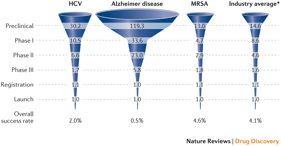
As with some other recent social media examples, the first problem is that the caption isn’t part of the image and so doesn’t get tweeted. The numbers are the average number of drug candidates at each stage of research to end up with one actual drug at the end. The percentage at the bottom is the reciprocal of the number at the top, multiplied by 60%.

A lot of news coverage of research is at the ‘preclinical’ stage, or is even earlier, at the stage of identifying a promising place to look.  Most of these never get anywhere. Sometimes you see coverage of a successful new cancer drug candidate in Phase I — first human studies. Most of these never get anywhere.  There’s also a lot of variation in how successful the ‘successes’ are: the new drugs for Hepatitis C (the first column) are a cure for many people; the new Alzheimer’s drugs just give a modest improvement in symptoms.  It looks as those drugs from MRSA (antibiotic-resistant Staph. aureus) are easier, but that’s because there aren’t many really novel preclinical candidates.

It’s an interesting table of numbers, but as a graph it’s pretty dreadful. The 3-d effect is purely decorative — it has nothing to do with the represntation of the numbers. Effectively, it’s a bar chart, except that the bars are aligned at the centre and have differently-shaped weird decorative bits at the ends, so they are harder to read.

At the top of the chart,  the width of the pale blue region where it crosses the dashed line is the actual data value. Towards the bottom of the chart even that fails, because the visual metaphor of a deformed funnel requires the ‘Launch’ bar to be noticeably narrower than the ‘Registration’ bar. If they’d gone with the more usual metaphor of a pipeline, the graph could have been less inaccurate.

In the end, it’s yet another illustration of two graphical principles. The first: no 3-d graphics. The second: if you have to write all the numbers on the graph, it’s a sign the graph isn’t doing its job.

March 17, 2015

Bonus problems

If you hadn’t seen this graph yet, you probably would have soon.

bonuses CAQYEF4UYAA5PqA

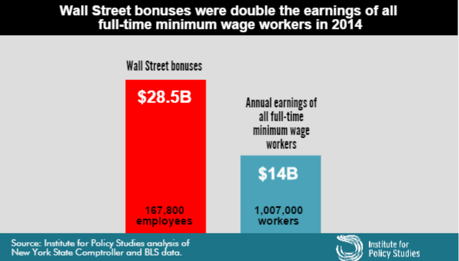
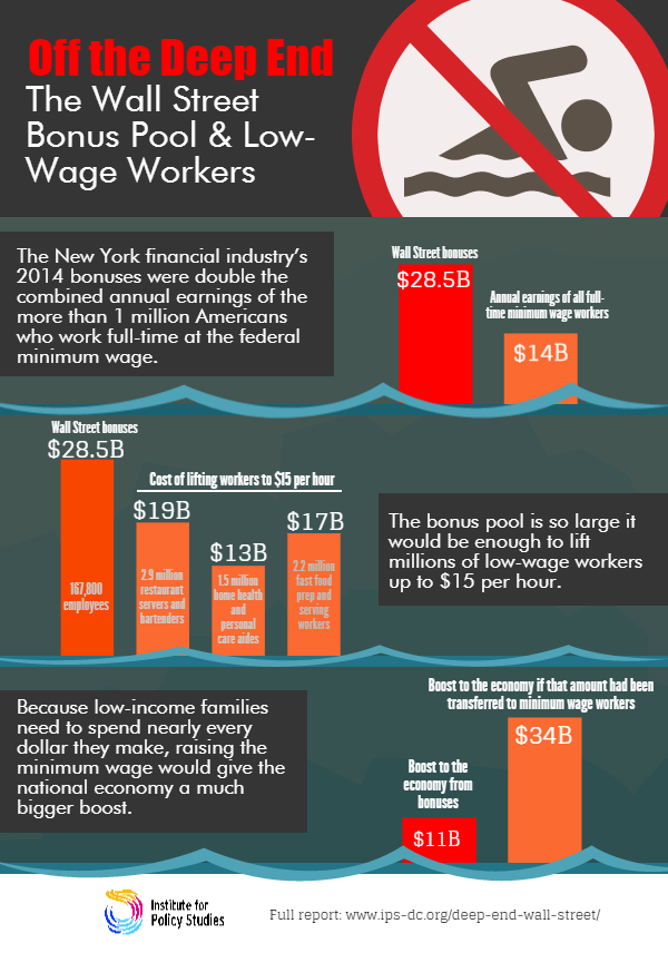
The claim “Wall Street bonus were double the earnings of all full-time minimum wage workers in 2014” was made by the Institute for Policy Studies (which is where I got the graph) and fact-checked by the Upshot blog at the New York Times, so you’d expect it to be true, or at least true-ish. It probably isn’t, because the claim being checked was missing an important word and is using an unfortunate definition of another word. One of the first hints of a problem is the number of minimum wage workers: about a million, or about 2/3 of one percent of the labour force.  Given the usual narrative about the US and minimum-wage jobs, you’d expect this fraction to be higher.

The missing word is “federal”. The Bureau of Labor Statistics reports data on people paid at or below the federal minimum wage of $7.25/hour, but 29 states have higher minimum wages so their minimum-wage workers aren’t counted in this analysis. In most of these states the minimum is still under $8/hr. As a result, the proportion of hourly workers earning no more than federal minimum wage ranges from 1.2% in Oregon to 7.2% in Tennessee (PDF).  The full report — and even the report infographic — say “federal minimum wage”, but the graph above doesn’t, and neither does the graph from Mother Jones magazine (it even omits the numbers of people)

On top of those getting state minimum wage we’re still short quite a lot of people, because “full-time” is defined by 35 or more hours per week at your principal job.  If you have multiple part-time jobs, even if you work 60 or 80 hours a week, you are counted as part-time and not included in the graph.

Matt Levine writes:

There are about 167,800 people getting the bonuses, and about 1.03 million getting full-time minimum wage, which means that ballpark Wall Street bonuses are 12 times minimum wage. If the average bonus is half of total comp, a ratio I just made up, then that means that “Wall Street” pays, on average, 24 times minimum wage, or like $174 an hour, pre-tax. This is obviously not very scientific but that number seems plausible.

That’s slightly less scientific than the graph, but as he says, is plausible. In fact, it’s not as bad as I would have guessed.

What’s particularly upsetting is that you don’t need to exaggerate or use sloppy figures on this topic. It’s not even that controversial. Lots of people, even technocratic pro-growth economists, will tell you the US minimum wage is too low.  Lots of people will argue that Wall St extracts more money from the economy than it provides in actual value, with much better arguments than this.

By now you might think to check carefully that the original bar chart is at least drawn correctly.  It’s not. The blue bar is more than half the height of the red bar, not less than half.

March 16, 2015

Maps, colours, and locations

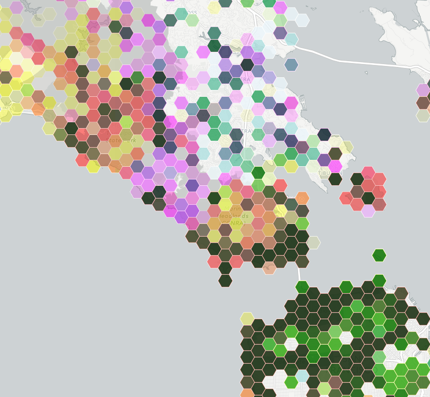
This is part of a social media map, of photographs taken in public places in the San Francisco Bay Area

bayarea

The colours are trying to indicate three social media sites: Instagram is yellow, Flickr is magenta, Twitter is cyan.

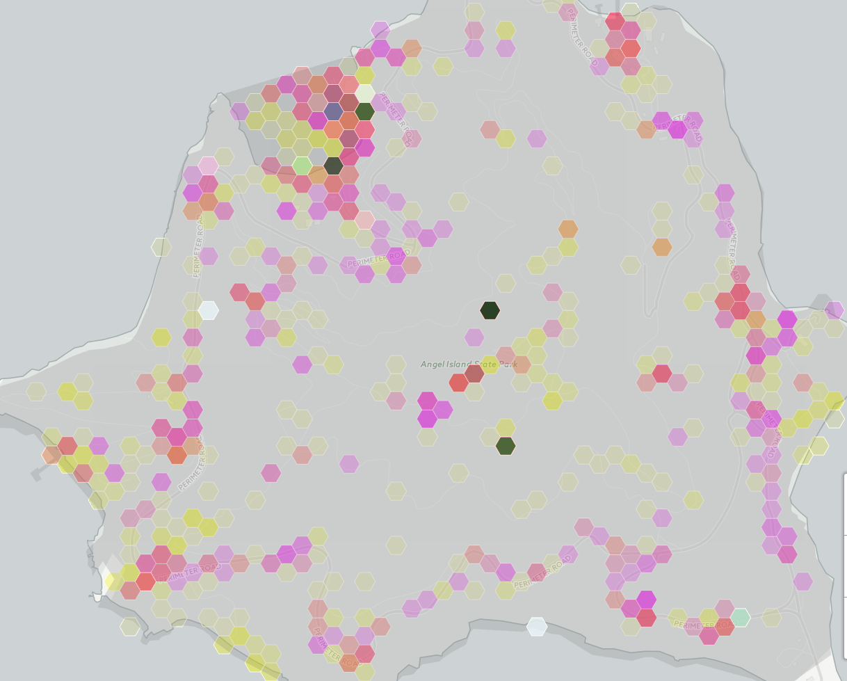
Encoding three variables with colour this way doesn’t allow you to easily read off differences, but you can see clusters and then think about how to decode them into data. The dark green areas are saturated with photos.  Light green urban areas have Instagram and Twitter, but not much Flickr.  Pink and orange areas lack Twitter — mostly these track cellphone coverage and population density, but not entirely.  The pink area in the center of the map is spectacular landscape without many people; the orange blob on the right is the popular Angel Island park.

Zooming in on Angel Island shows something interesting: there are a few blobs with high density across all three social media systems. The two at the top are easily explained: the visitor centre and the only place on the island that sells food. The very dense blob in the middle of the island, and the slightly less dense one below it are a bit strange. They don’t seem to correspond to any plausible features.

angelisland

My guess is that these are a phenomenon we’ve seen before, of locations being mapped to the center of some region if they can’t be specified precisely.

Automated data tends to be messy, and making serious use of it means finding out the ways it lies to you. Wayne Dobson doesn’t have your cellphone, and there isn’t a uniquely Twitter-worthy bush in the middle of Angel Island.


March 14, 2015

Ok, but it matters in theory

Some discussion on Twitter about political polling and whether political journalists understood the numbers led to the question:

If you poll 500 people, and candidate 1 is on 35% and candidate 2 is on 30%, what is the chance candidate 2 is really ahead?

That’s the wrong question. Well, no, actually it’s the right question, but it is underdetermined.

The difficulty is related to the ‘base-rate‘ problem in testing for rare diseases: it’s easy to work out the probability of the data given the way the world is, but you want the probability the world is a certain way given the data. These aren’t the same.

If you want to know how much variability there is in a poll, the usual ‘maximum margin of error’ is helpful.  In theory, over a fairly wide range of true support, one poll in 20 will be off by more than this, half being too high and half being too low. In theory it’s 3% for 1000 people, 4.5% for 500. For minor parties, I’ve got a table here. In practice, the variability in NZ polls is larger than in theoretically perfect polls, but we’ll ignore that here.

If you want to know about change between two polls, the margin of error is about 1.4 times higher. If you want to know about difference between two candidates, the computations are trickier. When you can ignore other candidates and undecided voters, the margin of error is about twice the standard value, because a vote added to one side must be taken away from the other side, and so counts twice.

When you can’t ignore other candidates, the question isn’t exactly answerable without more information, but Jonathan Marshall has a nice app with results for one set of assumptions. Approximately, instead of the margin of error for the difference being (2*square root (1/N)) as in the simple case, you replace the 1 by the sum of the two candidate estimates, so  (2*square root (0.35+0.30)/N).  The margin of error is about 7%.  If the support for the two candidates were equal, there would be about a 9% chance of seeing candidate 1 ahead of candidate 2 by at least 5%.

All this, though, doesn’t get you an answer to the question as originally posed.

If you poll 500 people, and candidate 1 is on 35% and candidate 2 is on 30%, what is the chance candidate 2 is really ahead?

This depends on what you knew in advance. If you had been reasonably confident that candidate 1 was behind candidate 2 in support you would be justified in believing that candidate 1 had been lucky, and assigning a relatively high probability that candidate 2 is really ahead. If you’d thought it was basically impossible for candidate 2 to even be close to candidate 1, you probably need to sit down quietly and re-evaluate your beliefs and the evidence they were based on.

The question is obviously looking for an answer in the setting where you don’t know anything else. In the general case this turns out to be, depending on your philosophy, either difficult to agree on or intrinsically meaningless.  In special cases, we may be able to agree.

If

  1. for values within the margin of error, you had no strong belief that any value was more likely than any other
  2. there aren’t values outside the margin of error that you thought were much more likely than those inside

we can roughly approximate your prior beliefs by a flat distribution, and your posterior beliefs by a Normal distribution with mean at the observed data value and with standard error equal to the margin of error.

In that case, the probability of candidate 2 being ahead is 9%, the same answer as the reverse question.  You could make a case that this was a reasonable way to report the result, at least if there weren’t any other polls and if the model was explicitly or implicitly agreed. When there are other polls, though, this becomes a less convincing argument.

TL;DR: The probability Winston is behind given that he polls 5% higher isn’t conceptually the same as the probability that he polls 5% higher given that he is behind.  But, if we pretend to be in exactly the right state of quasi-ignorance, they come out to be the same number, and it’s roughly 1 in 10.

March 13, 2015

Clinical trial reporting still not happening

According to a paper in the New England Journal of Medicine, about 20% of industry-funded clinical trials registered in the United States failed to report their summary results with no legally acceptable reason for delay. That’s obviously not good enough, and this sort of thing is why people don’t like drug companies.

As the paper says

On the basis of this review, we estimated that during the 5-year period, approximately 79 to 80% of industry-funded trials reported summary results or had a legally acceptable reason for delay. In contrast, only 49 to 50% of NIH-funded trials and 42 to 45% of those funded by other government or academic institutions reported results or had legally acceptable reasons for delay.

Um. Yes. <coughs nervously> <shuffles feet>

via Derek Lowe