Posts written by Thomas Lumley (2645)

avatar

Thomas Lumley (@tslumley) is Professor of Biostatistics at the University of Auckland. His research interests include semiparametric models, survey sampling, statistical computing, foundations of statistics, and whatever methodological problems his medical collaborators come up with. He also blogs at Biased and Inefficient

March 13, 2015

Feel-good gene?

From Stuff

Suffering anxiety, is not a mark of character, but at least in part to do with the genetic lottery, he says.

“About 20 per cent of adult Americans have this mutation,” Professor Friedman says of those who produce more anandamide, whose name is taken from the Sanskrit word for bliss.

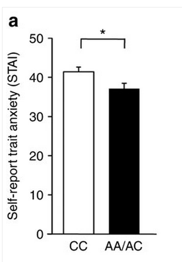
There’s good biological research behind this story, on how the gene works in both mice and people, but the impact is being oversold. The human data on anxiety in the paper look like
feelgood

Combining this small difference with the claim that 20% of people  in the US carry the variant, it would explain about 1% of the population variation in the anxiety questionnaire score. Probably less of the variation in having/not having clinically diagnosable anxiety.

The story continues

“Those who do [have this mutation] may also be less likely to become addicted to marijuana and, possibly, other drugs – presumably because they don’t need the calming effects that marijuana provides.”

The New York Times version mentioned a study of marijuana dependence, which found people with the low-anxiety mutation were less likely to be dependent. However, for other drugs the opposite has been found:

Here, we report a naturally occurring single nucleotide polymorphism in the human FAAH gene, 385A, that is strongly associated with street drug use and problem drug/alcohol use.

People with the mutant, A, version of the gene, the low-anxiety variant, were more likely to have drug problems.  In fact, even the study that found (weak) evidence for lower rates of marijuana dependence found much stronger evidence of higher rates of sedative dependence.

Simple, binary, genetic explanations for complex human conditions are always tempting, but usually wrong.
March 12, 2015

Briefly

  • There will be SCIENCE at the Auckland Festival on Saturday: Dr Michelle ‘Nanogirl’ Dickinson blowing things up, Dr Siouxsie Wiles (and artists, and you) lighting things up, and panel discussions.
  • ‘In the 17th century, another genre of paintings emerged, showing public administrators holding their books open for all to see. More than 100 of these paintings were produced between 1600 and 1800. Transparency became a cultural ideal worthy of art.’ Jacob Soll writing in the Boston Globe about the financial data revolution of the 16th century.
  • “The next big milestone for the project is to get a judge to rule in favor of a tenant based on Heat Seek data. That would set a precedent that the courts see these devices as reliable and unbiased evidence.” New York, like many US cities, has temperature standards for apartments where the landlord controls the heating system. Heat Seek wants to provide independent data using internet-connected thermometers.
  • Does the popularity of party leaders affect voting? In the UK it seems the answer is “sometimes, a bit”.  (via Alex Harrowell)

Election donation maps

There are probably some StatChat readers who don’t read the NZ Herald, so I’ll point out that I have a post on the data blog about election donations.

Variation and mean

A lot of statistical reporting focuses on means, or other summaries of where a distribution lies. Often, though, variation is important.  Vox.com has a story about variation in costs of lab tests at California hospitals, based on a paper in BMJ OpenVox says

The charge for a lipid panel ranged from $10 to $10,169. Hospital prices for a basic metabolic panel (which doctors use to measure the body’s metabolism) were $35 at one facility — and $7,303 at another

These are basically standard lab tests, so there’s no sane reason for this sort of huge variation. You’d expect some variation with volume of tests and with location, but nothing like what is seen.

What’s not clear is how much this is really just variation in how costs are attributed. A hospital needs a blood lab, which has a lot of fixed costs. Somehow these costs have to be spread over individual tests, but there’s no unique way to do this.  It would be interesting to know if the labs with high charges for one test tend to have high charges for others, but the research paper doesn’t look at relationships between costs.

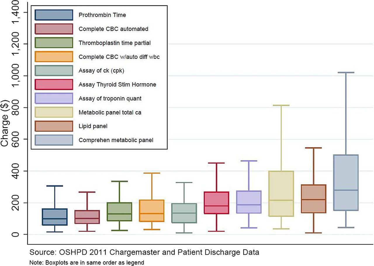
The Vox story also illustrates a point about reporting, with this graph

 F1.large-1

If you look carefully, there’s something strange about the graph. The brown box second from the right is ‘lipid panel’, and it goes up to a bit short of $600, not to $10169. Similarly, the ‘metabolic panel’, the right-most box, goes up to $1000 on the graph and $7303 in the story.

The graph is taken from the research paper. In the research paper it had a caption explaining that the ‘whiskers’ in the box plot go to the 5th and 95th percentiles (a non-standard but reasonable choice). This caption fell off on the way to Vox.com, and no-one seems to have noticed.

March 9, 2015

Not all there

One of the most common problems with data is that it’s not there. Families don’t answer their phones, over-worked nurses miss some forms, and even tireless electronic recorders have power failures.

There’s a large field of statistical research devoted to ways of fixing the missing-data problem. None of them work — that’s not my cynical opinion, that’s a mathematical theorem — but many of them are more likely to make things better than worse.  The best ways to handle data you don’t have depends on what sort of data and why you don’t have it, but even the best ways can confuse people who aren’t paying attention.

Just ignoring the missing data problem and treating the data you have as all the data is effectively assuming the missing data look just like the observed data. This is often very implausible. For example, in a weight-loss study it is much more likely that people who aren’t losing weight will drop out. If you just analyse data from people who stay in the study and follow all your instructions, unless this is nearly everyone, they will probably have lost weight (on average) even if your treatment is just staring at a container of felt-tip pens.

That’s why it is often sensible to treat missing observations as if they were bad. The Ministry of Health drinking water standards do this.  For example, they say that only 96.7% of New Zealand received water complying with the bacteriological standards. That sounds serious. Of the 3.3% failures, however, more than half (2.0%) were just failures to monitor thoroughly enough, and only 0.1% had E. coli transgression that were not followed up by immediate corrective action.

From a regulatory point of view, lumping these together makes sense. The Ministry doesn’t want to create incentives for data to ‘accidentally’ go missing whenever there’s a problem. From a public health point of view, though, you can get badly confused if you just look at the headline compliance figure and don’t read down to page 18.

The Ministry takes a similarly conservative approach to the other standards, and the detailed explanations are more reassuring than the headline compliance figures. There are a small number of water supplies with worrying levels of arsenic — enough to increase lifetime cancer risk by a tenth of a percentage point or so — but in general the biggest problem is inadequate fluoride concentrations in drinking water for nearly half of Kiwi kids.


March 5, 2015

Showing us the money

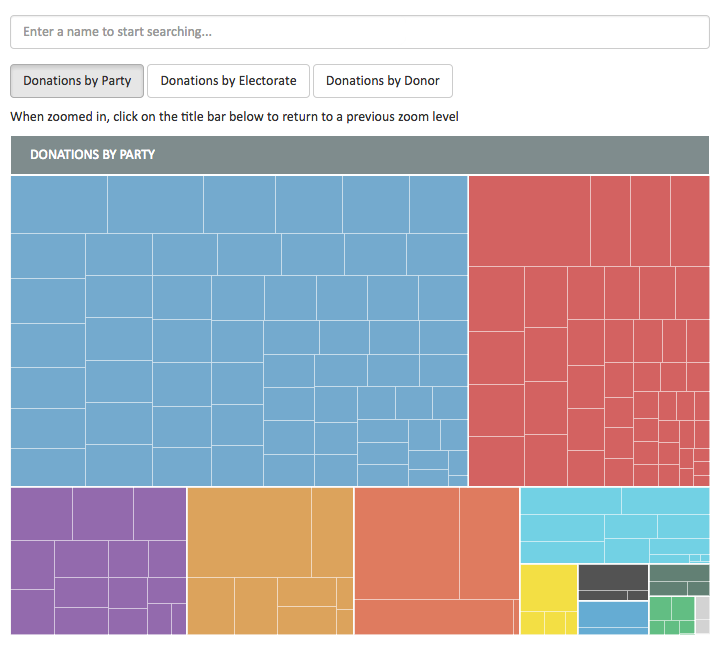
The Herald is running a project to crowdsource data entry and annotation for NZ political donations and expenses: it’s something that’s hard to automate and where local knowledge is useful. Today, they have an interactive graph for 2014 election donations and have made the data available

money

Briefly

March 2, 2015

A nice cuppa

Q:  What do you think about this new research on tea preventing diabetes?

A: That’s not what it says

Q: Sure it is. Big black letters, right at the top: “Three cups of tea a day can cut your risk of diabetes… even if you add milk”

A: I mean that’s not what the research says

Q: The bit about milk?

A: Well, they didn’t study milk at all, but that’s not the main problem

Q: They didn’t study cups?

A: No. Or diabetes. Or, in one of the studies, tea.

Q: Hmm. Ok, so this “glucose-lowering effect” they write about, is that a lab study?

A: Yes.

Q: Mice?

A:  One of the studies used rats, the other didn’t

Q: Cells, then?

A: No, just enzymes in a test tube, and a highly processed chemical extract of tea.

Q: Ok, forget about that one. But the rat study, that measured actual glucose lowering and actual tea?

A:  Almost. They gave the rats a high-sugar drink, and if they were given the tea first, their blood glucose didn’t go up as much.

Q: Which of the two studies was this one?

A: The one where the story just says the results were similar and doesn’t give the researchers’ names, only their institution.

Q: Wouldn’t you think the story would say more about this one, since it actually involves blood glucose and, like, living things?

A: In a perfect world, yes.

Q: The story says they don’t think milk would make a difference. What about sugar?

A: No mention of it.

Q: That’s strange. Quite a lot of British people have sugar in their tea. Wouldn’t it be helpful to say something?

A: You’d think.

Q: How much tea did the rats get?

A: The lowest effective dose they report is 62.5 mg/kg of freeze-dried tea powder

Q: What’s that in cups?

A: The research paper says “corresponds to nine cups of black tea”.

Q: Per day?

A: No, all at once.

Q: So we need to get bigger cups?

A: Or fewer reprinted British ‘health’ stories.

February 27, 2015

Quake prediction: how good does it need to be?

From a detailed story in the ChCh Press, (via Eric Crampton) about various earthquake-prediction approaches

About 40 minutes before the quake began, the TEC in the ionosphere rose by about 8 per cent above expected levels. Somewhat perplexed, he looked back at the trend for other recent giant quakes, including the February 2010 magnitude 8.8 event in Chile and the December 2004 magnitude 9.1 quake in Sumatra. He found the same increase about the same time before the quakes occurred.

Heki says there has been considerable academic debate both supporting and opposing his research.

To have 40 minutes warning of a massive quake would be very useful indeed and could help save many lives. “So, why 40 minutes?” he says. “I just don’t know.”

He says if the link were to be proved more firmly in the future it could be a useful warning tool. However, there are drawbacks in that the correlation only appears to exist for the largest earthquakes, whereas big quakes of less than magnitude 8.0 are far more frequent and still cause death and devastation. Geomagnetic storms can also render the system impotent, with fluctuations in the total electron count masking any pre-quake signal.

Let’s suppose that with more research everything works out, and there is a rise in this TEC before all very large quakes. How much would this help in New Zealand? The obvious place is Wellington. A quake over 8.0 magnitude has been observed in the area in 1855, when it triggered a tsunami. A repeat would also shatter many of the earthquake-prone buildings. A 40-minute warning could save many lives. It appears that TEC shouldn’t be that expensive to measure: it’s based on observing the time delays in GPS satellite transmissions as they pass through the ionosphere, so it mostly needs a very accurate clock (in fact, NASA publishes TEC maps every five minutes). Also, it looks like it would be very hard to hack the ionosphere to force the alarm to go off. The real problem is accuracy.

The system will have false positives and false negatives. False negatives (missing a quake) aren’t too bad, since that’s where you are without the system. False positives are more of a problem. They come in two forms: when the alarm goes off completely in the absence of a quake, and when there is a quake but no tsunami or catastrophic damage.

Complete false predictions would need to be very rare. If you tell everyone to run for the hills and it turns out to be sunspots or the wrong kind of snow, they will not be happy: the cost in lost work (and theft?) would be substantial, and there would probably be injuries.  Partial false predictions, where there was a large quake but it was too far away or in the wrong direction to cause a tsunami, would be just as expensive but probably wouldn’t cause as much ill-feeling or skepticism about future warnings.

Now for the disappointment. The story says “there has been considerable academic debate”. There has. For example, in a (paywalled) paper from 2013 looking at the Japanese quake that prompted Heki’s idea

A detailed analysis of the ionospheric variability in the 3 days before the earthquake is then undertaken, where a simultaneous increase in foF2 and the Es layer peak plasma frequency, foEs, relative to the 30-day median was observed within 1 h before the earthquake. A statistical search for similar simultaneous foF2 and foEs increases in 6 years of data revealed that this feature has been observed on many other occasions without related seismic activity. Therefore, it is concluded that one cannot confidently use this type of ionospheric perturbation to predict an impending earthquake.

In translation: you need to look just right to see this anomaly, and there are often anomalies like this one without quakes. Over four years they saw 24 anomalies, only one shortly before a quake.  Six complete false positives per year is obviously too many.  Suppose future research could refine what the signal looks like and reduce the false positives by a factor of ten: that’s still evacuation alarms with no quake more than once every two years. I’m pretty sure that’s still too many.


Siberian hamsters or Asian gerbils

Every year or so there is a news story along the lines of”Everything you know about the Black Death is Wrong”. I’ve just been reading a couple of excellent posts  by Alison Atkin on this year’s one.

The Herald’s version of the story (which they got from the Independent) is typical (but she has captured a large set of headlines)

The Black Death has always been bad publicity for rats, with the rodent widely blamed for killing millions of people across Europe by spreading the bubonic plague.

But it seems that the creature, in this case at least, has been unfairly maligned, as new research points the finger of blame at gerbils.

and

The scientists switched the blame from rat to gerbil after comparing tree-ring records from Europe with 7711 historical plague outbreaks.

That isn’t what the research paper (in PNAS) says. And it would be surprising if it did: could it really be true that Asian gerbils were spreading across Europe for centuries without anyone noticing?

The abstract of the paper says

The second plague pandemic in medieval Europe started with the Black Death epidemic of 1347–1353 and killed millions of people over a time span of four centuries. It is commonly thought that after its initial introduction from Asia, the disease persisted in Europe in rodent reservoirs until it eventually disappeared. Here, we show that climate-driven outbreaks of Yersinia pestis in Asian rodent plague reservoirs are significantly associated with new waves of plague arriving into Europe through its maritime trade network with Asia. This association strongly suggests that the bacterium was continuously reimported into Europe during the second plague pandemic, and offers an alternative explanation to putative European rodent reservoirs for how the disease could have persisted in Europe for so long.

If the researchers had found repeated, prevously unsuspected, invasions of Europe by hordes of gerbils, they would have said so in the abstract. They don’t. Not a gerbil to be seen.

The hypothesis is that plague was repeatedly re-imported from Asia (where affected a lots of species, including, yes, gerbils) to European rats, rather than persisting at low levels in European rats between the epidemics. Either way, once the epidemic got to Europe, it’s all about the rats [update: and other non-novel forms of transmission]

In this example, for a change, it doesn’t seem that the press release is responsible. Instead, it looks like progressive mutations in the story as it’s transmitted, with the great gerbil gradually going from an illustrative example of a plague host in Asia to the rodent version of Attila the Hun.

Two final remarks. First, the erroneous story is now in the Wikipedia entry for the great gerbil (with a citation to the PNAS paper, so it looks as if it’s real). Second, when the story is allegedly about the confusion between two species of rodent, it’s a pity the Herald stock photo isn’t the right species.


[Update: Wikipedia has been fixed.]