Posts written by Thomas Lumley (2645)

avatar

Thomas Lumley (@tslumley) is Professor of Biostatistics at the University of Auckland. His research interests include semiparametric models, survey sampling, statistical computing, foundations of statistics, and whatever methodological problems his medical collaborators come up with. He also blogs at Biased and Inefficient

June 24, 2014

Beyond clinical trials?

From The Atlantic

And with reliable simulations for what’s happening at the cellular level, this approach could be used to treat patients and also to test new drugs and devices. Dassault Systèmes is focusing on that level of granularity now, trying to simulate propagation of cholesterol in human cells and building oncological cell models. “It’s data science and modeling,” Charlès told me. “Coupling the two creates a new environment in medicine.”

Charlès and his colleagues believe that a shift to virtual clinical trials—that is, testing new medicines and devices using computer models before or instead of trials in human patients—could make new treatments available more quickly and cheaply. 

From pharmaceutical chemist Derek Lowe, in response

Speed the day. The cost of clinical trials, coupled with their low success rate, is eating us alive in this business (and it’s getting worse every year). This is just the sort of thing that could rescue us from the walls that are closing in more tightly all the time. But this talk of shifts and revolutions makes it sound as if this sort of thing is happening right now, which it isn’t. No such simulated clinical trial, one that could serve as the basis for a drug approval, is anywhere near even being proposed. How long before one is, then? If things go really swimmingly, I’d say 20 to 25 years from now, personally, but I’d be glad to hear other estimates.

We do, potentially, have the tools to use current treatments more effectively, and data science can help.  Even there,  the biggest opportunities are nothing to do with subtle individual differences — for example, both here and in the US, only about half of people with hypertension are being treated.

June 23, 2014

Possibly underreported

From Stuff, the headline “Cheating on the rise at Massey.” The basis for the story is that there were 56 incidents from 56 separate students reported in 2012, and 72 incidents from 51 separate students reported last year.

We aren’t told if that’s out of the 35000 total students, the 18000 on-campus students, or the 9000 at the Manawatu campus. Even with the smallest denominator, the cheating rate is only about half a percent. Taking this at face value requires a touching faith in the honest of Massey students, since the rate is a couple of orders of magnitude lower than self-report surveys often find for ever having plagiarised in college, and five times lower than a careful experiment found for a single assignment in US colleges (PDF)

Since reported incidents of cheating are a small minority of actual incidents, it’s hard to say anything sensible about trends from two years at a single university, especially as the story says Massey is taking new steps to combat cheating. There’s no way to disentangle changes in reporting from changes in cheating.

Briefly

  • From The Functional Art, ethics in infographics
  • From Scott Aaronson, is it possible to define morality or trust the way Google defines reliability
  • “Ethics in Graphic Design” is a forum for the exploration of ethical issues in graphic design. It is intended to be used as a resource and to create an open dialogue among graphic designers about these critical issues. 

Undecided?

My attention was drawn on Twitter to this post at The Political Scientist arguing that the election poll reporting is misleading because they don’t report the results for the relatively popular “Undecided” party.  The post is making a good point, but there are two things I want to comment on. Actually, three things. The zeroth thing is that the post contains the numbers, but only as screenshots, not as anything useful.

The first point is that the post uses correlation coefficients to do everything, and these really aren’t fit for purpose. The value of correlation coefficients is that they summarise the (linear part of the) relationship between two variables in a way that doesn’t involve the units of measurement or the direction of effect (if any). Those are bugs, not features, in this analysis. The question is how the other party preferences have changed with changes in the ‘Undecided’ preference — how many extra respondents picked Labour, say, for each extra respondent who gave a preference. That sort of question is answered  (to a straight-line approximation) by regression coefficients, not correlation coefficients.

When I do a set of linear regressions, I estimate that changes in the Undecided vote over the past couple of years have split approximately  70:20:3.5:6.5 between Labour:National:Greens:NZFirst.  That confirms the general conclusion in the post: most of the change in Undecided seems to have come from  Labour. You can do the regressions the other way around and ask where (net) voters leaving Labour have gone, and find that they overwhelmingly seem to have gone to Undecided.

What can we conclude from this? The conclusion is pretty limited because of the small number of polls (9) and the fact that we don’t actually have data on switching for any individuals. You could fit the data just as well by saying that Labour voters have switched to National and National voters have switched to Undecided by the same amount — this produces the same counts, but has different political implications. Since the trends have basically been a straight line over this period it’s fairly easy to get alternative explanations — if there had been more polls and more up-and-down variation the alternative explanations would be more strained.

The other limitation in conclusions is illustrated by the conclusion of the post

There’s a very clear story in these two correlations: Put simply, as the decided vote goes up so does the reported percentage vote for the Labour Party.

Conversely, as the decided vote goes up, the reported percentage vote for the National party tends to go down.

The closer the election draws the more likely it is that people will make a decision.

But then there’s one more step – getting people to put that decision into action and actually vote.

We simply don’t have data on what happens when the decided vote goes up — it has been going down over this period — so that can’t be the story. Even if we did have data on the decided vote going up, and even if we stipulated that people are more likely to come to a decision near the election, we still wouldn’t have a clear story. If it’s true that people tend to come to a decision near the election, this means the reason for changes in the undecided vote will be different near an election than far from an election. If the reasons for the changes are different, we can’t have much faith that the relationships between the changes will stay the same.

The data provide weak evidence that Labour has lost support to ‘Undecided’ rather than to National over the past couple of years, which should be encouraging to them. In the current form, the data don’t really provide any evidence for extrapolation to the election.


[here’s the re-typed count of preferences data, rounded to the nearest integer]

June 18, 2014

Counts and proportions

Phil Price writes (at Andrew Gelman’s blog) on the impact of bike-share programs:

So the number of head injuries declined by 14 percent, and the Washington Post reporter — Lenny Bernstein, for those of you keeping score at home — says they went up 7.8%.  That’s a pretty big mistake! How did it happen?  Well, the number of head injuries went down, but the number of injuries that were not head injuries went down even more, so the proportion of injuries that were head injuries went up.


To be precise, the research paper found 638 hospitalised head injuries in 24 months before the bike share program, and 273 in the 12 months afterwards. In a set of control cities that didn’t start a bike-share program there were 712 head injuries in the 24 months before the matching date and 342 in the 12 months afterwards. That is, a 14.4% decrease in the cities that added bike-share programs and a 4% decrease in those that didn’t.


The screening problem

Nicely summarised by two paragraphs from a story in the Herald

In a separate breast cancer study published online by the British Medical Journal(BMJ), researchers from Norway and the United States found that mammograms carried out once every two years may reduce death risk by about 28 per cent.

About 27 deaths from breast cancer can be avoided for every 10,000 women who did mammography screening – or about one in 368, said the team after analysing data from all women in Norway aged 50 to 79 between 1986 and 2009.

The two prevention numbers — 28% of breast cancer deaths, or one breast cancer death for every 368 women screened — are the same, but they give a very different impression. [Note that this is the age range where mammography works best]

June 17, 2014

Margins of error

From the Herald

The results for the Mana Party, Internet Party and Internet-Mana Party totalled 1.4 per cent in the survey – a modest start for the newly launched party which was the centre of attention in the lead-up to the polling period.

That’s probably 9 respondents. A 95% interval around the support for Internet–Mana goes from 0.6% to 2.4%, so we can’t really tell much about the expected number of seats.

Also notable

Although the deal was criticised by many commentators and rival political parties, 39 per cent of those polled said the Internet-Mana arrangement was a legitimate use of MMP while 43 per cent said it was an unprincipled rort.

I wonder what other options respondents were given besides “unprincipled rort” and “legitimate use of MMP”.

June 15, 2014

A thousand words

Compare these two stories:

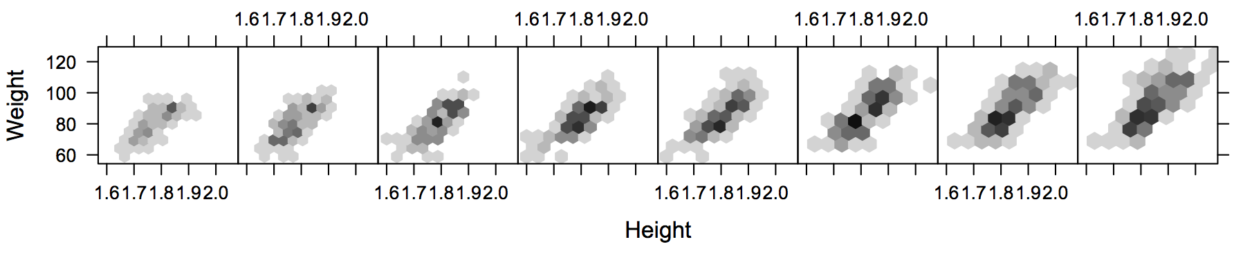
The second story actually gives more context and explanation, but the first one is (to me) more effective.  It also shows something surprising: the size distribution splits into separate modes in recent years, perhaps reflecting specialisation in playing positions.

The second story actually argues that there isn’t a similar divergence in builds of rugby players, so I went to look at the data (which involved scraping it off the NZ Rugby Museum website).  The pattern over time I get is (click to embiggen)

rugby


which suggests that rugby players aren’t just getting bigger, they are showing a little of the same separation into big and very big seen in the NFL players


June 14, 2014

Science communication links

The need for science communication:

 Stephen Curry, writing at The Guardian

Even so, I think we need to work on our relationship. Approval ratings may be high and over two-thirds of you may also be happy to leave it to the ‘experts’ to advise the government on science, but a similar proportion still believe that scientists don’t try hard enough to listen to what ordinary people think or to inform them about their work.


Robert Finn, writing at Scientific American

The journalist reached out to Dr. A and also to two other researchers (Drs. X and Y), who work in related fields, to get independent comment. Boy oh boy did Dr. X and Dr. Y comment, and those comments surely were independent, which is what any journalist wants. But in the same emails in which they eviscerated the study they also insisted that their comments remain off the record.

Because our sources said that their comments were off the record, we couldn’t use them in any way, and I can’t quote them here, not even anonymously. At this writing, the journalist has been unsuccessful in finding sources willing to offer on-the-record comments or criticisms of the study.


And, for some promising news, there is a new science column in the ChCh Press, that gives brief summaries of science stories over the week. It’s written by Sarah-Jane O’Connor, who is both a scientist with a PhD in Ecology and a journalist.

Why is this week unlike every other week?

Keith Humphreys, writing in New York Magazine

clever new study in the journal Addiction provides clues about who is worst at owning up to the full extent of their drinking.

The researchers surveyed over 40,000 people with standard alcohol survey questions about their quantity and frequency of alcohol consumption — “How many drinks have you had in the past month?” and so on. But in a smart twist, they then asked a more immediate question: “How many drinks did you have yesterday?”

I’ve written about this technique before; it can be very powerful, though it won’t help much if people are intentionally misleading you.