Posts written by Thomas Lumley (2645)

avatar

Thomas Lumley (@tslumley) is Professor of Biostatistics at the University of Auckland. His research interests include semiparametric models, survey sampling, statistical computing, foundations of statistics, and whatever methodological problems his medical collaborators come up with. He also blogs at Biased and Inefficient

June 11, 2014

But did he ever return?

An excellent visualisation of very detailed data from the Boston subway system:

Boston’s Massachusetts Bay Transit Authority (MBTA) operates the 4th busiest subway system in the U.S. after New York, Washington, and Chicago. If you live in or around the city you have probably ridden on it. The MBTA recently began publishing substantial amount of subway data through its public APIs. They provide the full schedule in General Transit Feed Specification (GTFS) format which powers Google’s transit directions. They also publish realtime train locations for the Red, Orange, and Blue lines (but not Green or Silver lines). The following visualizations use data captured from these feeds for the entire month of February, 2014. Also, working with the MBTA, we were able to acquire per-minute entry and exit counts at each station measured at the turnstiles used for payment.

[No, he never returned]

June 10, 2014

Eat your greens

Stuff has a story about ‘Powerhouse Fruits and Vegetables”.  They get points for linking to the source, and for pointing out that although

“The rankings provide clarity on the nutrient quality of the different foods

the rankings are quite different from other rankings that are supposed to do the same thing.

They don’t point out that it’s silly to list scores to four digit accuracy when nutrient content varies enough to make the first digit somewhat unreliable.They also don’t point out that these are nutrient scores not per serving, but per 100 Calories of the food. Google thinks watercress has about 11 Calories/100g, so that’s 900g of watercress. The data are for raw watercress — the research paper doesn’t say how much the score goes down if you stir-fry it, Chinese-style.

If you much through a couple of pounds of watercress, it’s not surprising you’d pick up a few nutrients along the way. The applicability of this fact to NZ daily life must be a bit limited, though.

June 9, 2014

Sticking it to ACC

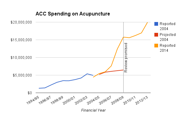
From Mark Hanna on Twitter, ACC expenditures on acupuncture (the sources are in the Twitter conversation)

acupuncture


The graph shows three things. Firstly, there was a review promised. Second, the expenditure on acupuncture is vastly different from the projections. Third, it’s getting to be a moderately large sum of money.

Comparing to the 2012 Pharmac report (PDF, p5), there were only seven prescription items where Pharmac spends more per year than the $17 million ACC spent on acupuncture that year (and one about the same). Things like diabetes test strips and the breast-cancer drug Herceptin.

I’m not as opposed as Mark to spending taxpayer money on the placebo effect, but at some point you have to wonder whether there might be more cost-effective ways to get it.

Chasing factoids

The Herald says

Almost four in 10 young UK adults describe themselves as digital addicts, according to research published by Foresters, the financial services company.

The story does quote an independent expert who is relatively unimpressed with the definition of ‘digital addict’, but it doesn’t answer the question ‘what sort of research?”

Via Google, I found a press release of a digital addiction survey promoted by Foresters. It’s not clear if the current story is based on a new press release from this survey or a new version of the survey, but the methodology is presumably similar.

So, what is the methodology?

Over 1,100 people across the UK responded to an online survey in November 2013 , conducted by Wriglesworth Research

There’s also a related press release from Wriglesworth, but without any more methodological detail. If I Google for “wriglesworth survey”, this is what comes up

wriglesworth

That is, the company is at least in the habit of conducting self-selected online polls, advertised on web forums and Twitter.

I tried, but I couldn’t find any evidence that the numbers in this online survey were worth the paper they aren’t written on.

June 8, 2014

Foreign drivers

From the ChCh Press

Foreign drivers cause more fatal and injury crashes in the South Island than the national average – and the West Coast is the worst spot.

They don’t actually mean “more,” they mean “a higher proportion of”.

New Zealand Transport Agency (NZTA) safety directions chief adviser Lisa Rossiter said its crash statistics for the past 10 years showed foreign drivers were involved in about 6 per cent of all fatal or injury crashes in New Zealand, and were at fault in about 2 per cent.

On average, short-term visitors make up roughly 2.5% of people in New Zealand (2.78 million visitors in the year to April 2014, median visit of 9 days, so I’m guessing mean visit about two weeks). About another 2% of people in New Zealand are international students, who are at least sometimes counted as foreign drivers.

So, the risk seems to be a bit higher for foreign drivers, but probably not twice as high. Some of the excess can probably be explained by age: international students, backpackers, and drunk Australians in Queenstown are younger than the population average.

It’s different in parts of the South Island

The tourist hot spots of Otago and the West Coast fared worst.

A foreign driver was identified as a factor in 13 per cent of fatal crashes on the coast, and 5 per cent of fatal crashes in Otago from 2004 to 2013.

A lot of this must be because tourists are over-represented in tourist hot spots: that’s what ‘tourist hot-spot’ means. The proportion of short-term visitors is about 2.5% nationwide, but it’s probably rather lower that than in Gisborne and rather higher on the West Coast.

It’s also worth noting that “identified as a factor” is fairly weak. If you go to the Ministry of Transport reports and add up the percentage of times different factors were involved in a crash, you get a lot more than 100% (for the 2010 report I get 225% for fatal crashes and 185% for injury crashes)

For crashes involving a tourist driver and more than one car, the foreign driver was fully or partly responsible two out of three times.

This at least gets rid of the denominator problem, but the “partly” responsible is still a problem. We aren’t told what proportion of the time the local driver was fully or partly responsible — based on the information given, that could also be two out of three times.

It’s quite likely that foreign drivers are at higher risk, especially those from countries that drive on the right, but the problem is not a big fraction of the NZ road toll. It’s worth considering things that can sensibly be done to reduce it — which doesn’t include withdrawing from the U.N. Convention on Road Traffic — but if you’re trying to stop road deaths it may be more effective to concentrate on interventions that don’t just affect foreign drivers.  Clearer signage, guard rails and median barriers, separated bike lanes, improved public transport… there are many things that might knock a percentage point off road deaths more easily than targetting foreign drivers.

Briefly

June 5, 2014

NZ interactive graphic examples


  • From The Wireless, a story with maps of voter turnout and registration rates for younger people (RadioNZ might not be where you expect interactive graphics, but there it is). If I were being picky, I would say the popup labels are too big relative to the size of the map window.

Gender, coding, and measurement error

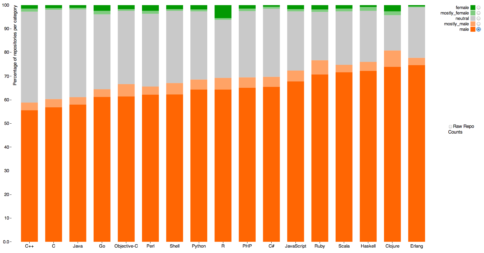
Alyssa Frazee, a PhD student in biostatistics at Johns Hopkins, has an interesting post looking at gender of programmers using the Github code repository. Github users have a profile, which includes a first name, and there programs that attempt to classify first names by gender.

This graph (click to embiggen, as usual) shows the guessed gender distribution for software with at least five ‘stars’ (likes, sort of) across programming languages. Orange is male, green is female, grey is “don’t know”

coder-gender

The main message is obvious. Women either aren’t putting code on Github or are using non-gender-revealing or male-associated names.

The other point is that the language with the most female coders seems to be R, the statistical programming language originally developed in Auckland, which has 5.5%.  Sadly, 3.9% of that is code by the very prolific Hadley Wickham (also originally developed in Auckland), who isn’t female. Measurement error, as I’ve written before, has a much bigger impact on rare categories than common ones.

June 4, 2014

How much disagreement should there be?

The Herald

Thousands of school students are being awarded the wrong NCEA grades, a review of last year’s results has revealed.

Nearly one in four grades given by teachers for internally marked work were deemed incorrect after checking by New Zealand Qualifications Authority moderators.

That’s not actually true, because moderators don’t deem grades to be incorrect. That’s not what moderators are for.  What the report says (pp105-107 in case you want to scroll through it) is that in 24% of cases the moderator and the internal assessor disagreed on grade, and in 12% they disagreed on whether the standard had been achieved.

What we don’t know is how much disagreement is appropriate. The only way the moderator’s assessment could be considered error-free is if you define the ‘right answer’ to be ‘whatever the moderator says’, which is obviously not appropriate. There always will be some variation between moderators, and some variation between schools, and what we want to know is whether there is too much.

The report is a bit disappointing from that point of view.  At the very least, there should have been some duplicate moderation. That is, some pieces of work should have been sent to two different moderators, so we could have an idea of the between-moderator agreement rate. Then, if we were willing to assume that moderators collectively were infallible (though not individually), we could estimate how much less reliable the internal assessments were.

Even better would be to get some information on how much variation there is between schools in the disagreement: if there is very little variation, the schools may be doing about as well as is possible, but if there is a lot of variation between schools it would suggest some schools aren’t assessing very reliably.


June 3, 2014

Are girl hurricanes less scary?

There’s a new paper out in the journal PNAS claiming that hurricanes with female names cause three times as many deaths as those with male names (because people don’t give girl hurricanes the proper respect). Ed Yong does a good job of explaining why this is probably bogus, but no-one seems to have drawn any graphs, which I think make the situation a lot clearer. (more…)