Posts written by Thomas Lumley (2645)

avatar

Thomas Lumley (@tslumley) is Professor of Biostatistics at the University of Auckland. His research interests include semiparametric models, survey sampling, statistical computing, foundations of statistics, and whatever methodological problems his medical collaborators come up with. He also blogs at Biased and Inefficient

May 30, 2014

Trusting your data or your model

Even with large amounts of data, automated predictions must usually incorporate explicit or implicit prior understanding of the structure of the problem. “Look for anything” is not good enough: “anything” is too big.

Here, for your weekend light entertainment, are some examples where the prior structure was too strong or too weak:

The example that prompted this post, from the blog of Melville House Press, is about automated scanning of books to create digital editions

 in many old texts the scanner is reading the word ‘arms’ as ‘anus’ and replacing it as such in the digital edition. As you can imagine, you don’t want to be getting those two things mixed up.

A similar phenomenon was pointed out at Language Log a decade ago

Fear not your toes, though they are strong,
The conquest doth to you belong;

Daniel Dennett recounts two anecdotes of speech recognition, one human and one computer, which err in the opposite direction to the text recognition example. The computer one:

An AI speech-understanding system whose development was funded by DARPA (Defense Advanced Research Projects Agency), was being given its debut before the Pentagon brass at Carnegie Mellon University some years ago. To show off the capabilities of the system, it had been attached as the “front end” or “user interface” on a chess-playing program. The general was to play white, and it was explained to him that he should simply tell the computer what move he wanted to make. The general stepped up to the mike and cleared his throat–which the computer immediately interpreted as “Pawn to King-4.” 

And, the example that is frustratingly familiar to so many of us: mobile phone autocorrupt, which you can search for yourself.
Levels of evidence

If you find that changing your diet in some way makes you feel happier and healthier, that’s a good thing.  It doesn’t matter whether the same change would be useful for most people, or only useful for you. It doesn’t matter whether the change is a placebo effect. It doesn’t even matter if it’s an illusion, a combination of regression to the mean and confirmation bias. You might check with a doctor or dietician as to whether the change is dangerous, but otherwise, go for it.

If you want to campaign for the entire community to make a change in their diet, you need to have evidence that it’s better on average for the entire community. A few people’s subjective experience isn’t good enough.  Good quality observational data might be all you can manage if the benefits are subtle or take years to appear, but if you’re claiming dramatic short-term benefits you should be able to demonstrate them in a randomised controlled trial.

The reason for mentioning this is that PETA has been making friends again. They’re trying to link milk consumption to autism. They don’t even pretend to have any evidence that milk causes autism, and the evidence that milk-free diet has a beneficial effect in people with autism is very weak.  That is, there are a few studies that suggest a benefit, but the benefit is smaller in studies with more reliable designs, and absent in the best-designed studies.  The most recent review of the evidence concluded that dairy-free or gluten-free diets should only be tried for people who have some separate evidence of food intolerance.  After reading the review, I would agree.

There are respectable arguments against dairy farming, both ethical and environmental. Scaremongering about autism isn’t one of them.

May 29, 2014

Lede program at Columbia

Columbia University in New York is running an amazing-looking data journalism certificate called The Lede Program. The program director is Cathy O’Neill of mathbabe.org and Occupy Finance,  and the program advisor is Mark Hansen, statistician, computational scientist, and artist.

Anyway, their syllabus (and quite a bit of other content) is available on Github.

I’d like to quote a course outline by Cathy O’Neill

This course begins with the idea that computing tools are the products of human ingenuity and effort. They are never neutral and carry with them the biases of their designers and their design process. “Platform studies” is a new term used to describe investigations into these relationships between computing technologies and the creative or research products that they help to generate. How you understand how data, code, and algorithms affect creative practices can be an effective first step toward critical thinking about technology. 


We like to say ‘second lowest’

From the Herald

New Zealand has the highest rate of obesity in Australasia, according to a new global analysis.

The “Australasia” group has two countries in it. The proportion overweight or obese differs between those two countries by 3.3 percentage points.

There’s a good interactive visualisation from the IHME group who put the data together.

Margins of error and our new party

Attention conservation notice:  if you’re not from NZ or Germany you probably don’t understand the electoral system, and if you’re not from NZ you don’t care.

Assessing the chances of the new Internet Mana party from polls will be even harder than usual. The Internet half of the chimera will get a List seat if the party gets exactly one electorate and enough votes for two seats (about 1.7 1.2%), or if they get two electorates (eg Hone Harawira and Annette Sykes)  and enough votes for three seats (about 2.5 2%), or if they get no electorates and at least 5% of the vote. [Update: a correspondent points out that it’s more complicated. The orange man provides a nice calculator. Numbers in the rest of the post are updated]

With a poll of 1000 people, 1.2% is 12 people and 2% is 20 people.  Even if there were no other complications, the sampling uncertainty is pretty large: if the true support proportion is 0.02, a 95% prediction interval for the poll result goes from 0.9% to 2.9%, and if the true support proportion is 0.012, the interval goes from 0.6% to 1.8%.

Any single poll is almost entirely useless — for example, if the party polls 1.5% it could have enough votes for one, two, or three total seats, and national polling data won’t tell us anything useful about the relevant electorates. Aggregating polls will help reduce the sampling uncertainty, but there’s not much to aggregate for the Internet Party and it’s not clear how the amalgamation will affect Mana’s vote, so we are limited to polls starting now.

Worse, we don’t have any data on how the polls are biased (compared to the election) for this party. The Internet half will presumably have larger support among people without landline phones,  even after age, ethnicity, and location are taken into account. Historically, the cell-phone problem doesn’t seem to have caused a lot of bias in NZ opinion polls (in contrast to the US), but this may well be an extreme case. The party may also have more support from younger and less well off people, who are less likely to vote on average, making it harder to translate poll responses into election predictions.

May 28, 2014

Monty Hall problem and data

Tonight’s Mythbusters episode on Prime looked at the Monty Hall/Pick-a-Door problem, using experimental data as well as theory.

For those of you who haven’t been exposed to it, the idea is as follows:

There are three doors. Behind one is a prize. The contestant picks a door. The host then always opens one of the other doors, which he knows does not contain the prize. The contestant is given an opportunity to change their choice to the other unopened door. Should they take this choice?

The stipulation that the host always makes the offer and always opens an empty door is critical to the analysis. It was present in the original game-show problem and was explicit in Mythbusters.

A probabilistic analysis is straightforward. The chance that the prize is behind the originally-chosen door is 1/3.  It has to be somewhere. So the chance of it being behind the remaining door is 2/3.  You can do this more carefully by enumerating all possibilities, and you get the same answer.

The conclusion is surprising. Almost everyone, famously including both Marilyn vos Savant, and Paul Erdős, gets it wrong. Less impressively, so did I as an undergraduate, until I was convinced by writing a computer simulation (I didn’t need to run it; writing it was enough).  The compelling error is probably an example of the endowment effect.

All of the Mythbusters live subjects chose to keep their original choice,ruining the comparison.  The Mythbusters then ran a moderately large series of random choices where one person always switched and the other did not.  They got 38 wins out of 49 for switching and 11 for not switching. That’s a bit more extreme than you’d expect, but not unreasonably so. It gives a 95% confidence interval (analogous to the polling margin of error)  from 12% to 37%.

The Mythbusters are sometimes criticised for insufficient replication, but in this case 49 is plenty to distinguish the ‘obvious’ 50% success rate from the true 33%. It was a very nicely designed experiment.

‘Balanced’ Lotto reporting

From ChCh Press

Are you feeling lucky?

The number drawn most often in Saturday night’s Lotto is one.

The second is seven, the third is lucky 13, followed by 21, 38 and 12.

And if you are selecting a Powerball for Saturday’s draw, the record suggests two is a much better pick than seven.

The numbers are from Lotto Draw Frequency data provided by Lotto NZ for the 1406 Lottery family draws held to last Wednesday.

The Big Wednesday data shows the luckiest numbers are 30, 12, 20, 31, 28 and 16. And heads is drawn more often (232) than tails (216), based on 448 draws to last week.

In theory, selecting the numbers drawn most often would result in more prizes and avoiding the numbers drawn least would result in fewer losses. The record speaks for itself.

Of course this is utter bollocks. The record is entirely consistent with the draw being completely unpredictable, as you would also expect it to be if you’ve ever watched a Lotto draw on television and seen how they work.

This story is better than the ones we used to see, because it does go on and quote people who know what they are talking about, who point out that predicting this way isn’t going to work, and then goes on to say that many people must understand this because they do just take random picks.  On the other hand, that’s the sort of journalistic balance that gets caricatured as “Opinions differ on shape of Earth.”

In world historical terms it doesn’t really matter how these lottery stories are written, but they are missing a relatively a simple opportunity to demonstrate that a paper understands the difference between fact and fancy and thinks it matters.

$5 million followup

It’s gettable, but it’s hard – that’s why it’s five million dollars.”

“The chances of picking every game correctly were astronomical”

  • NBR (paywalled)

“crystal ball gazing of such magnitude that University of Auckland statistics expert associate professor David Scott doesn’t think either will have to pay out.”

“quite hard to win  “

“someone like you [non-expert] has as much chance  because [an expert] wouldn’t pick an upset”

“An expert is less likely to win it than someone who just has a shot at it.”

“It’s only 64 games and, as I say, there’s only 20 tricky ones I reckon”


Yeah, nah.


May 27, 2014

What’s a shot at $5million worth?

In March, the US billionaire Warren Buffett offered a billion dollar prize to anyone who could predict all 63 ‘March Madness’ college basketball games. Unsurprisingly, many tried but no-one succeeded.

The New Zealand TAB are offering NZ$5 million to anyone who can predict all 64 games in the 2014 World Cup (soccer, in Rio de Janeiro (probably)). It’s free to enter. What’s it worth to an entrant, and what is the expected cost to the TAB?

If the pool games had equal probability of win/loss/draw and the finals series games were 50:50, which is the worst case for punters (well, almost), the chance of winning would be 1 in 5,227,573,613,485,916,806,405,226,496. That’s presumably also your chance of winning if you use random picks, which the TAB helpfully provides. At those odds, the value of an entry is approximately 1 ten-thousand-million-billionth of a cent (10-19 cents), which is probably less than the cost to you of

By entering this Competition, an Entrant agrees to receive marketing and promotional material from the Promoter (including electronic material).

Of course, you could do better by picking carefully. Suppose that a dozen of the pool round games were completely predictable walkovers, the remaining 34 you could get  70% right, and you could get 50% for final games. That would be doing pretty well.  In that case the value of entering is hugely better — it’s almost a twentieth of a cent.   If you can get 70% accuracy for the final games as well, the value of entering would be nearly ten cents.

But if you can predict a dozen of the games with perfect accuracy and get 70% right for the rest, you’d be much better off just betting.  I looked at an online betting site, and the smallest payoffs I could find in the pool games were 2/9 for Brazil to beat Cameroon and 2/11 for Argentina to beat Iran.  If you have a dozen pool matches where you’re 100% certain, you can make rather more than ten cents even on a minimum bet.

So, what’s this all costing the TAB? It’s almost certainly less than the cost of sending a text message to every entrant, which is part of the process. There are maybe three million people eligible to enter, and a maximum of one entry per person. Given that duplicate winners will split the prize, I can’t really believe in an expected prize cost to TAB of more than 0.01 cents per entrant, which works out at about $1200 if every adult Kiwi enters. They should be able to insure against a win and pay not much more than this. The cost of advertising campaign will dwarf the prize costs.

The real incentive to enter is that there will be five $1000 consolation prizes for the best entries when no-one wins the big prize. What matters in figuring the odds for this  is not the total number of total entries (which might be a million), but the number of seriously competitive entries. That could be as low as a few tens of thousands, giving an expected value of entry as high as twenty cents if you’re prepared to put some effort into research.


[Update: It’s actually slightly worse than this, though not importantly so. You may need to predict numbers of goals scored in order to break ties when setting up the knockout rounds.]

May 26, 2014

What’s wrong with this question?

ruitaniwha

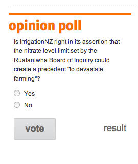
I usually don’t bother with bogus polls on news stories, but this one (via @danyl) is especially egregious. It’s not just the way the question is framed, or the glaring lack of a “How the fsck would I know?” option. There are some questions that are just not a matter of opinion. After a bit of informed public debate, and collected in a meaningful way, the national opinion on “This is the impact on farming: is it worth it?” would be relevant. But not this.

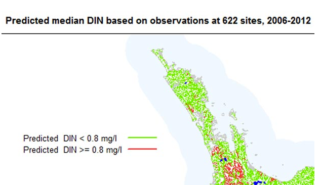
While we’re on this story, the map illustrating it is also notable. The map shows ‘Predicted median DIN’. Nowhere in the story is there any mention of DIN, let alone a definition. I suppose they figured it was a well-known abbreviation, and it’s true that if you ask Google, it immediately tells you. DIN is short for Deutsches Institut für Normung.

din


PS: yes, I know, Dissolved Inorganic Nitrogen