May 20, 2014
International Clinical Trials Day
May 20 is International Clinical Trials Day, commemorating James Lind’s trial of treatments for scurvy in 1747.

Thomas Lumley (@tslumley) is Professor of Biostatistics at the University of Auckland. His research interests include semiparametric models, survey sampling, statistical computing, foundations of statistics, and whatever methodological problems his medical collaborators come up with. He also blogs at Biased and Inefficient
May 20 is International Clinical Trials Day, commemorating James Lind’s trial of treatments for scurvy in 1747.
We’ve seen animated pictures of mass transit routes before, but mta.me has the wonderful touch of lines that behave like plucked guitar strings when they cross. Not all that useful, but pretty and soothing. And a reminder that New York has a whole lot of trains, just like we don’t. By Alexander Chen

(via @_inundata)
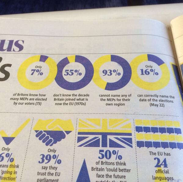
Yes, it’s a simple swap of two numbers, but if anyone actually read the thing…
(via @WINDY_BUTT)
A new study pooled data from previous studies of vaccination and autism, and as Emily Willingham writes, it gives what you’d expect.
Five cohort studies involving 1,256,407 children and five case-control studies involving 9920 children were included in this analysis.
- There was no relationship between vaccination and autism (OR: 0.99; 95% CI: 0.92 to 1.06).
- There was no relationship between vaccination and [autism spectrum disorder] (OR: 0.91; 95% CI: 0.68 to 1.20).
- There was no relationship between [autism spectrum disorder] and MMR (OR: 0.84; 95% CI: 0.70 to 1.01).
- There was no relationship between [autism spectrum disorder] and thimerosal (OR: 1.00; 95% CI: 0.77 to 1.31).
- There was no relationship between [autism spectrum disorder] and mercury (Hg) (OR: 1.00; 95% CI: 0.93 to 1.07).
Findings of this meta-analysis suggest that vaccinations are not associated with the development of autism or autism spectrum disorder.
These results basically rule out any substantial effect due to vaccination. To the extent that they suggest any effect, it is protective, but that’s probably just chance.
This sort of result is pretty boring, so it’s unlikely to get anywhere near the same media coverage as the claims that there is an effect.
Our only Prime Minister, on Radio NZ
“I utterly reject those propositions. Twelve percent of households pay 76 percent of all net tax in New Zealand,” he said.
I’ve written about “net tax” before, both on StatsChat and elsewhere. It has to be defined and analysed carefully and non-intuitively in order to get these sorts of results.
Suppose we had an imaginary population divided into three groups. The ‘Low’ group, of 10 people, each pay $1000 in income tax, $1000 in GST, and receive $1500 in cash benefits. The “Middle” group, of 5 3 people, each pays $4000 in income tax, $3000 in GST, and receives no cash in benefits. The one person in the “High” group pays $17000 in income tax, $8000 in GST, and receives no cash in benefits.
According to Mr Key’s definition, the high-income group pays 71% of the “net tax”. The middle-income group pays 50% of the “net tax”, and the low-income group pays -21% of the “net tax”. That’s even though every person in this imaginary population pays more in tax than they receive in cash benefits.
There are three strange things going on here. The first is that GST is ignored. That’s obviously just wrong — GST is just as real as income tax. The second is that cash benefits are treated differently from all other categories of government expenditure, even other categories such as subsidised medications that provide a direct, quantifiable individual benefit. The third is that percentages behave strangely when you have a mixture of negative and positive numbers. It’s quite possible, by choosing the subsets of the NZ population correctly, to find a group that pays well over 100% of the “net tax”.
Percentages become a lot less useful when they aren’t bounded by 100, and people who want to communicate accurately should avoid them in that situation. And if you want to distinguish income tax revenue from GST revenue, you should clearly explain what you’re doing and why.
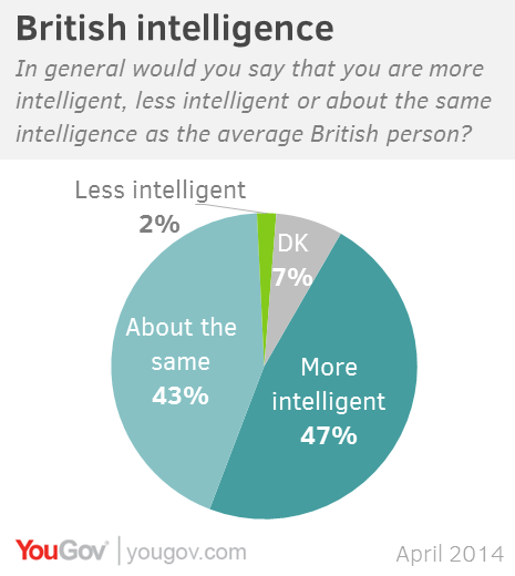
Online polling company YouGov asked people in the US and Britain about how their intelligence compared to other people.
For the US, the results were
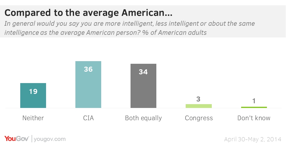
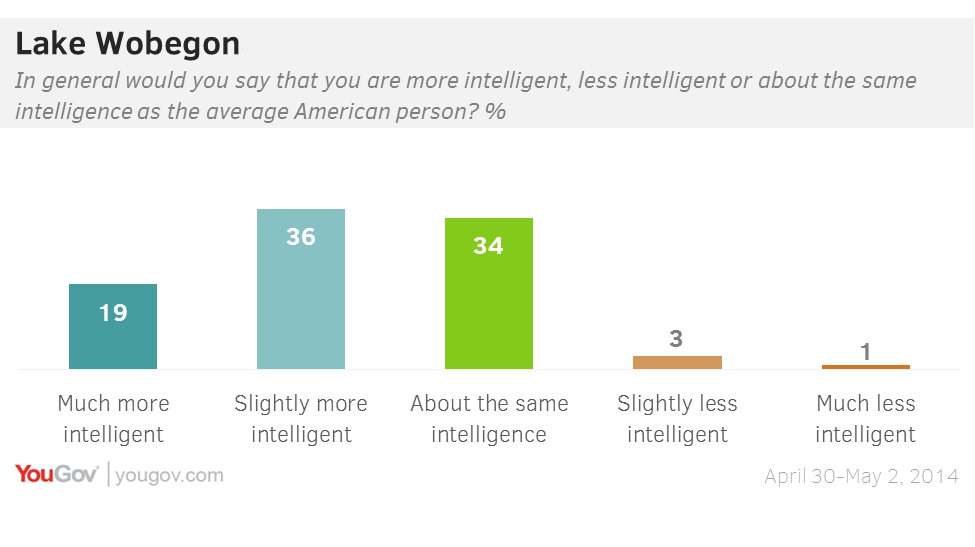
They pulled that graph only seconds after I found it, and replaced it with the more plausible
The British appear to be slightly more reluctant that the Americans to say they’re smarter than average, though it would be unwise to assume they are less likely to believe it.
Keith Ng has his annual interactive graphic of budget changes up at Public Address, and will soon have a graphic showing how overall forecasts have changed over time.
[update] And Harkanwal Singh has his version up at the Herald
There’s a Stat-of-the-Week nomination for a Dominion Post article that I haven’t seen, because Stuff has had the good sense not to put it online. The press release is on Scoop, and from what our correspondent says, if you’ve read that, you’ve read the story. It’s about sex at the office, based on a ridiculously small sample selected from members of a dating website. Since the dating website in question makes a lot of how different its members are from typical people, representativeness is not likely. Also, their infographic disagrees with the text of the release in at least one place.
That’s all standard. What’s interesting is the comparison of proportion of men and women who have had sex in various situations. Now, for the heterosexual majority, we have a basic accounting constraint in play. The office-sex survey says 20% of men and 3% of women have got it on in a conference room and 15% of men and 2% of women have done so in a storage room. If these numbers were true there would be only three explanations: there are a lot more gay men around than other data suggest, and they really like the office; the few women who have sex at the office do so with many different men; or we have a Clintonesque definitional problem where the vast majority of the women involved don’t think what they did was sex. More likely, it’s just evidence that the numbers are meaningless.
We’ve seen this problem before, but at least this is one problem the Herald’s story about holiday romance based on an Expedia press release avoided.
[Update: 538 now has an intro to the story explaining the mistakes and apologising. Good for them.]
So, at fivethirtyeight.com there’s this story on mapping kidnappings in Nigeria using data from GDELT, the sort of thing data journalism is supposed to be good at. GDELT automatically extracts information from news stories to build a huge global database.
On Twitter, Erin Simpson, whose about.me page says she is “a leading specialist in the intersection of intelligence, data analysis, irregular warfare, and illicit systems – with an emphasis on novel research designs,” — and who has worked on the GDELT parser — is Not Happy.
Thanks to Storify, here are three summaries of what she says, but a lot of it can be boiled down to one point:
In conclusion: VALIDATE YOUR FREAKING DATA. It’s not true just because it’s on a goddamn map.
(via @LewSOS)
From the Herald
Housing Minister Nick Smith has revealed that Government held data on the proportion of New Zealand homes owned by offshore buyers, which he says is very low compared to other countries.
It turns out that the Government actually has data on the proportion of rental landlords who are overseas. Not the proportion of all homes, and not even the proportion of all rental homes. And even then, the proportion is based on whether the landlords are currently offshore, not whether they were offshore at the time of purchase, which is the topic of controversy (as the Herald does note).
It’s hard to do anything about the landlords vs rentals difference, but if the proportion of rentals owned offshore was also 11%, that would translate to about 4% of New Zealand homes, based on the home ownership figures from the Census.
Recent comments on Thomas Lumley’s posts