May 13, 2014
Seeing the data
Two new(ish) interactive visualisations
- From Harkanwal Singh, in the Herald, a map of the new edition of the NZ deprivation index
- From Stats New Zealand, the national progress indicators

Thomas Lumley (@tslumley) is Professor of Biostatistics at the University of Auckland. His research interests include semiparametric models, survey sampling, statistical computing, foundations of statistics, and whatever methodological problems his medical collaborators come up with. He also blogs at Biased and Inefficient
Two new(ish) interactive visualisations
Q: Did you see “Cocaine now on tap in British homes” in the Herald
A: Yes.
Q: Is it true?
A: Not so as you’d notice.
Q: Didn’t they find traces of cocaine in drinking water?
A: Up to a point.
Q: You mean no?
A: I mean they found traces of the chemical that cocaine gets broken down into
Q: And is that a drug?
A: Not really. It was one component of an unsuccessful treatment for back pain. It is restricted, because it can be turned into cocaine.
Q: How much of this stuff did they find?
A: Almost none. A few nanograms per litre
Q: What’s that in real numbers? If it was really cocaine, how long would it take you to get one dose if you drank eight glasses of water a day like the doctors recommend?
A: That isn’t actually what the doctors recommend.
Q: Well, then, “like the doctors don’t recommend?”
A: Several centuries.
Q: How can they detect such tiny amounts?
A: They use liquid chromatography to separate out each chemical, and then mass spectroscopy to basically count the molecules.
Q: Ok, impressed now. The story also mentions “significant amounts of caffeine”. What does that mean?
A: It means “insignificant amounts”, about a million times lower concentration than in a cup of decaffeinated coffee.
Q: At least this is new, though?
A: The same agency reported finding the cocaine metabolite in drinking water in 2011, based on measurements in 2009-10. (PDF, Table 6)
Q: Why is there a video of a drug bust in Spain embedded in the story?
A: Because technology.
Attention conservation notice: I have to write this post because I’ve spent too much time on it otherwise. You don’t have to read it.
There was an episode of “Yes, Prime Minister” where the term “Human Resource Rich Countries” was being posed as a replacement for “Less Developed Countries”, meaning “poor”. “Resources” is a word that can mean lots of different things, which is why I spent more time than was strictly sensible investigating the following graph
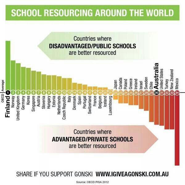
The graph appeared in my Twitter feed last Monday. It’s originally from a campaign to give Australia a school funding model a bit more like NZ’s decile system, as recommended by a national review panel, so it is disturbing to see New Zealand almost at the bottom of the world.
Tens of thousands of well-off pensioners are claiming up to half a billion dollars in superannuation every year.
With government debt at more than $60 billion, critics say the wealthy are asking their children and grandchildren to fund their so-called retirement.
Ministry of Social Development figures revealed more than 26,000 people with total income of more than $70,000 a year claimed superannuation last year. At current rates, this could add up to $570m a year before tax..
From last year in the Herald via me
Imagine the public outrage if it were discovered that more than 80,000 New Zealanders were receiving wages, salaries and investment incomes of more than $6 billion a year, but were also receiving a benefit from the Government.
…
Income figures this week from Statistics NZ show more than 80,000 New Zealanders over the age of 65 receive wages, salaries and investment returns of more than $6.5 billion a year while claiming NZ Super.
The benefits to those 80,000-plus seniors are costing poorer taxpayers at least $1.3 billion a year. Many of these beneficiaries will be retired judges, politicians, chief executives, doctors, diplomats and lawyers who are well able to look after themselves.
It seems the problem is only half as bad now, without any policy changes. Either that, or people really don’t know where they would like to draw the line.
When you hear a car alarm go off, do you even think that someone might be stealing a car? Frequent false positives undermine credibility.
— Stat Fact (@StatFact) May 6, 2014
From One News and a Colmar Brunton poll about Judith Collins and the Oravida affair
Which of these statements best describes how the issues will influence your vote in the upcoming election?
23% These issues will be a factor in your decision about who to vote for
75% These issues will not have much influence on your vote
1% Don’t know/won’t vote
Graeme Edgeler pointed out on Twitter that it matters what starting position people are being influenced from. That information wasn’t in the Colmar Brunton summary, because reporting it would also involve reporting the split of party affiliations in the sample, and the poll wasn’t designed for that split to be a reliable estimate.
I’m not going to report the split, either, but you can get it from the detailed poll report. I do think it’s reasonable to note that among people who identified as Labour/Green voters, about 1/3 said it would influence their vote, and among those who identified as National voters, less than 10% said it would influence their vote. The difference is more than twice the margin of error estimated from those proportions and numbers. Looked at the other way, three-quarters of respondents said the issue would not make much difference to their vote, and three-quarters of the rest were Labour or Green voters.
It’s not impossible for Labour or Green supporters to have their votes influenced by the Oravida affair. You could imagine someone with a long-term philosophical or emotional attachment to Labour, who had been thinking of voting National at this election, but who decided against it because of the scandal. But if there are enough people like that to show up in a poll, the left-wing parties are in real trouble. It’s more likely that most respondents said whatever they thought would make their side look good.
From Stuff
The road toll has moved into triple figures for 2014 following the deadliest April in four years.
Police are alarmed by the rising number of deaths, that are a setback after the progress in 2013 when 254 people died in crashes in the whole year – the lowest annual total since 1950.
So far this year 102 people have died on the roads, 15 more than at the same point in 2013, Assistant Commissioner Road Policing Dave Cliff said today.
The problem with this sort of story is how it omits the role of random variation — bad luck. The Police are well aware that driving mistakes usually do not lead to crashes, and that the ones which do are substantially a matter of luck, because that’s key to their distracted driver campaign. As I wrote recently, their figures on the risks from distracted driving are taken from a large US study which grouped together a small number of actual crashes with a lot of incidents of risky driving that had no real consequence.
The importance of bad luck in turning bad driving into disaster means that the road toll will vary a lot. The margin of error around a count of 102 is about +/- 20, so it’s not clear we’re seeing more than misfortune in the change. This is especially true because last year was the best on record, ever. We almost certainly had good luck last year, so the fact that it’s wearing off a bit doesn’t mean there has been a real change in driver behaviour.
It was a terrible, horrible, no good, very bad month on the roads, but some months are like that. Even in New Zealand.
Today, Wiki New Zealand came to our department to talk about their work. I mentioned them in late 2012 when they first went live, but they’ve developed a lot since then.
The aim of Wiki New Zealand is to have ALL THE DATAS about New Zealand in graphical form, so that people who aren’t necessarily happy with spreadsheets and SQL queries can browse the information. Their front page at the moment has data on cannabis use, greenhouse gas emissions, wine grape and olive plantings, autism, and smoking.
From Stuff: “New Zealand’s worst air is not where you think“. That’s not actually true. New Zealand’s worst air, according to the story, is pretty much where I thought it would be, in coastal Canterbury and Otago. However, if you search the Stuff website for the term “air pollution”, you get:
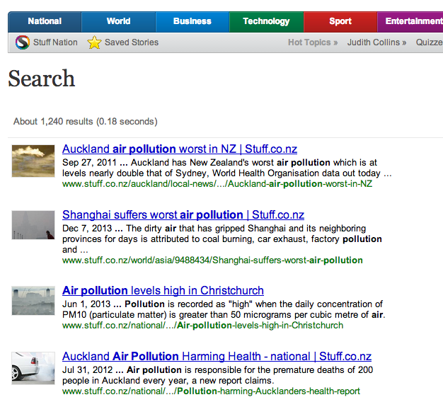
So if you expected Auckland to be the worst, you know who to blame.
Recent comments on Thomas Lumley’s posts