Posts written by Thomas Lumley (2645)

avatar

Thomas Lumley (@tslumley) is Professor of Biostatistics at the University of Auckland. His research interests include semiparametric models, survey sampling, statistical computing, foundations of statistics, and whatever methodological problems his medical collaborators come up with. He also blogs at Biased and Inefficient

March 1, 2014

Briefly

  • From Tim Harford, Toronto effectively had a randomised trial for countdown walk signals — what do they do for accidents?
  • From Mathbabe It would be idiotic for someone with the intention of being discriminatory to do so outright. It’s much easier to embed such a thing in an opaque model where it will seem unintentional and will probably never be discovered at all.

    But how is an investigative journalist going to even approach that?

  • From Matthew Ericson of the New York Times: “When maps shouldn’t be maps”
  • From Max Fisher at the Washington Post, a look at the problems of interpreting changes in rankings

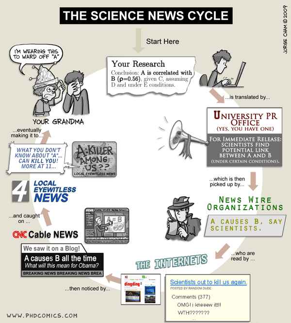
Science news cycle

From Piled Higher and Deeper.  Substitute as necessary if your grandma is a scientist.

sciencegap


The only thing wrong with this is it gives too much credit to university PR departments.

February 27, 2014

As if you didn’t have enough to read

A new blog of science-themed links and (NZ) event listings, Science Club.

Their most recent  post is for this story from the Guardian, which reports that one in every thirteen tweets contains swearing.

What do you think is the most commonly used swearword on Twitter? Well of course it is

There is, of course, substantial variation between users. Most of the people I follow are dragging the average down.

They couldn’t hit an elephant at this dist…

James Russell sent me a link to this story from a Canadian paper (originally from the Daily Telegraph).  The Herald has it too, with a very slightly less naff picture.  The research (open access) is good; the story is reasonably informative, but seriously credulous

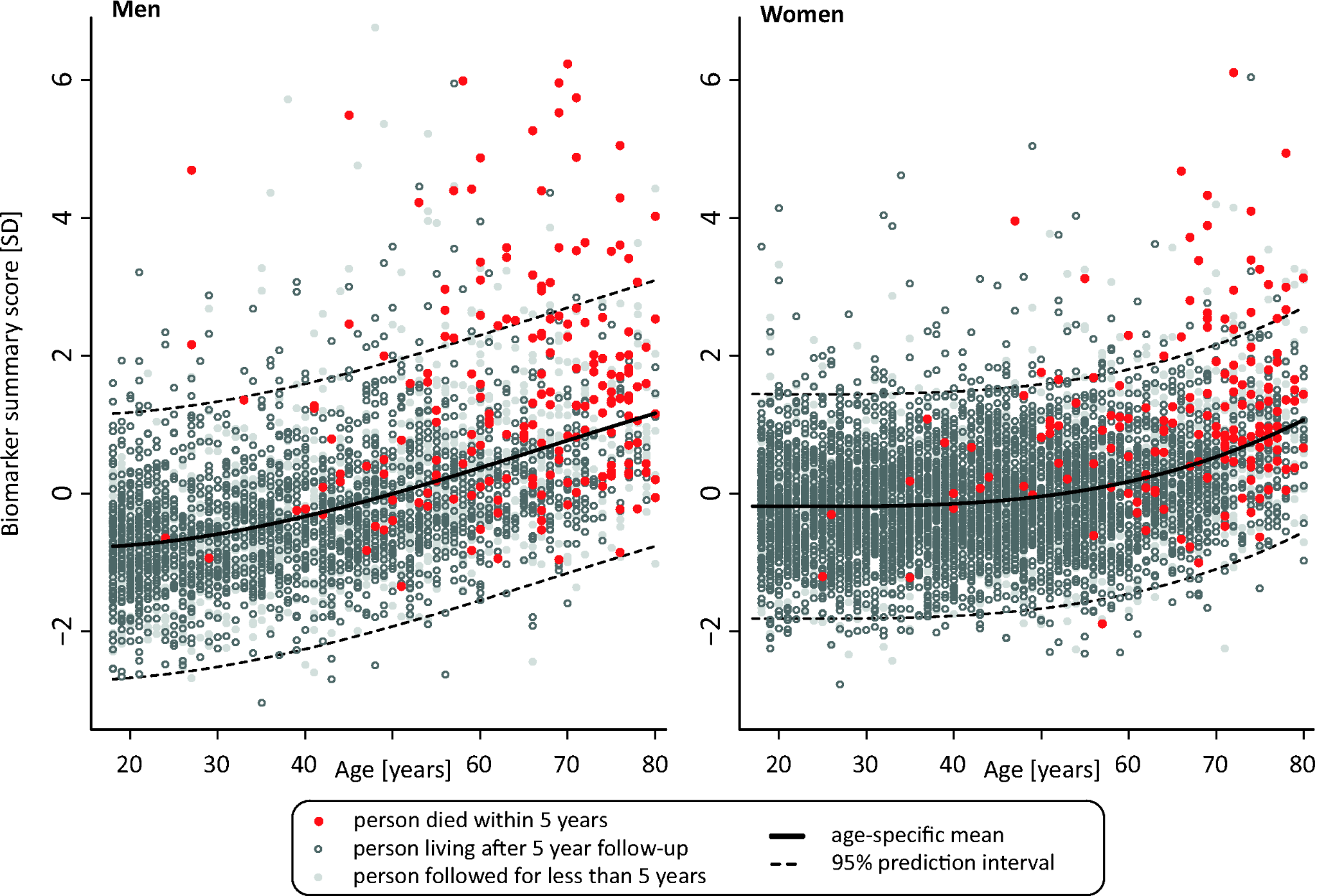
Blood samples from over 17,000 generally healthy people were screened for 100 biomarkers, and those people monitored over five years.

In that time, 684 died from illnesses including cancer and cardiovascular disease. They all had similar levels of four biomarkers: albumin; alpha-1-acid glycoprotein; citrate, and a similar size of very-low-density lipoprotein particles.

Compare the last sentence to this graph from the research paper. The vertical axis is a combined score on the four biomarkers. The red dots are the people who died. As you can see, they didn’t all have similar values.
journal.pmed.1001606.g004


The research is impressive not because the prediction is very accurate, but because its less appalling inaccurate than usual.  Using standard risk factors (age, sex, cholesterol, smoking, diabetes, cancer) if you picked a random person who died and one who didn’t die from their cohort there’s an 80% chance the one with the worse risk factors was the one who died.  Adding the ‘death test’ measurements increases the probability to 83%.  Asking an experienced nurse to guess would probably be more accurate (and cheaper), but is hard to automate.

Despite the impression from the headline and lead, if you’re asked to predict whether someone will live another year, based on this sort of information, the safe bet is “yes”. Even among the 1% of people with the very worst values of the ‘death test’ biomarkers, 80% lived for more than a year and half were still alive at the end of the five year study.

Interestingly, the two republished versions lack the last paragraphs of the original Telegraph story, which talk about whether the test is useful

“If the findings are replicated then this test is surely something we will see becoming widespread,” added Prof Perola.

“But at moment there is ethical question. Would someone want to know their risk of dying if there is nothing we can do about it?”

Dr Kettunen added: “Next we aim to study whether some kind of connecting factor between these biomarkers can be identified.

February 26, 2014

Caricatures in music space

There’s a map going around Twitter, being described as the most popular band in each US state


It’s a bit surprising that every state has a different favourite band, so I looked at the site listed on the map as the source.  In fact, the listed bands are not the most popular ones in any of the states. They are something more interesting.

Paul Lamere used Spotify (and perhaps other social music-streaming services) to get music listening preferences for 200000 people. He then looked at which artist in the top 100 for a state had the worst ranking over the US as a whole. He forced the result to be different for every state by bumping the less-populous state to its next choice when there was a tie. So, as the title on the map actually says, these are the most distinctive bands for a state, not the most popular.  They are caricatures, not photographs.

Since he had data based on postal code (ZIP code), it’s a pity he grouped these all the way up to the state level.  It would have been interesting to see urban vs suburban vs rural differences, and the major geographical trends across states such as Texas.

Graphics choices depend on audience

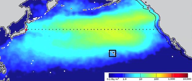
From BBC News,in what’s actually a very good story, a picture of radiation from Fukushima spreading across the Pacific.

_73203536_73203535

It’s actually a picture of a model prediction — the story is about using measurements of radiation from Fukushima to decide between two models that give predictions disagreeing by a factor of more than ten. That’s important not for the current plume, but in case there’s serious radiation release into the ocean from some reactor at some time in the future.

My point, though, is about colour scales. The yellow-green colour looks to be about halfway between reassuring non-irradiated dark blue and OMG WE’RE ALL GOING TO DIE!1!11!! dark red.  It isn’t.  The colour is on a logarithmic scale, so the maximum predicted concentration is about 30 becquerels per cubic metre, and the dark red is 10,000 becquerels per cubic metre.  That sounds like a lot, but becquerels are very small — enough radioactive material to have one atom decaying per second. A banana contains about 15 becquerels of potassium-40.

In fact, the story says that 10,000 Bq/m3 , the dark red end of the scale, is the Canadian safety threshold for radiation in drinking water (ie, about 1.5 litres of water per banana of radiation), so the yellow colour on the map is about one third of one percent of the official safety threshold for drinking water.

There’s a good reason the graphic uses a log scale and a very low limit — on a scale that corresponded to risk the predicted Fukushima plume would be completely invisible. For scientific presentation, the graphic and its scaling are completely appropriate. For the top of a story on a mass-media website, perhaps not so much.

(via @zentree)

Alcohol arithmetic not needed

From Stuff the Herald

Rising economic confidence and “aggressive” marketing techniques are the driving factors behind an 8.9 million litre rise in alcohol availability last year, says one concerned health organisation.

That sounds like a lot, but the population is also increasing. So how does the alcohol per capita change? That might take some slight effort to work out, except that Statistics New Zealand puts it in the list of Key Facts for this data release and in the media release

The volume of pure alcohol available per person aged 15 years and over was unchanged, at 9.2 litres. This equates to an average of 2.0 standard drinks per person per day.

So, probably not due entirely to rising economic confidence and aggressive marketing techniques.

February 25, 2014

Minimum wage trends

I’m not going to get into the question of whether the NZ minimum wage should be higher; inequality and poverty are problems in NZ, but whether a minimum wage increase would help more than, say,  tax and benefit changes is not my area of expertise.  However, the question of how much the minimum wage has gone up is a statistical issue, and also appears to be controversial.

From April 2008 to April 2013, the minimum wage increased 14.6%. Inflation (2008Q1 to 2013Q1) was 11%. So, the minimum wage increased faster than inflation, and the proposed change will keep it increasing faster than inflation.

From whole-year 2008 to whole-year 2013, per-capita GDP increased 9.7%.  Mean weekly income increased 21%. Median weekly income increased 18.8%. Average household consumption expenditure increased 7.8%.

Increasing the 2008 minimum wage by 18.8%, following median incomes, would give $14.26, so the proposed minimum wage is at least close to keeping up with median income, as well as keeping ahead of economic growth. An increase to $14.50 would have basically kept up with mean income as well.

An important concern in using CPI is that housing might be a larger component of expenditure for people on minimum wage. However, since 2008 the CPI component for housing has increased more slowly than total CPI, so at least on a national basis and for this specific time frame that doesn’t change the conclusion.

[Sources: GDP at StatsNZ for GDP, household consumption expenditure. NZ Income Survey at StatsNZ for mean and median income. RBNZ for inflation]

As a final footnote: the story also mentions the Prime Minister’s salary. There really isn’t an objective way to compare changes in this to changes in the minimum wage. The PM’s salary has increased by a smaller percentage than the minimum wage since 2008, but the absolute increase is more than ten times that of a full-time minimum wage job.

February 24, 2014

Shot in the foot

The UK is trying to set up a national research database of medical records from the National Health Service. That’s a good idea. New Zealand has one, and many of the larger fragments of the US medical system have their own.  As well as helping improve the performance of the National Health Service, the UK database could be used for research that would help people around the world; for example, detecting adverse effects of drugs.

A UK drug safety system would be more informative than the NZ one, because it involves so many more people. It might even be more informative than the US systems because the NHS it is comprehensive, not selective. That’s only true if everyone’s data is in the system, and that will only be possible if most people trust the system to protect their privacy.  Since it’s not really possible for the average person to tell if the system is trustworthy, it needs to be designed and implemented well enough that there aren’t any reasonable people with serious criticisms for inevitable opponents of the scheme to point to.

Sadly, the promoters of the database have at best been a bit careless about some of their claims, as Ben Goldacre describes. Some descriptions of the system have implied that making the data anonymous — removing obvious identifiers — is a strong safeguard. It isn’t: re-identification is often possible. It isn’t clear whether this was an omission in describing the safeguards or in designing them, but it’s unfortunate either way.

Worse still, the Telegraph has a story claiming that 13 years of complete British hospital records were sold to insurers, who used them to improve risk estimates and increase premiums. This is a problem because one of the key guarantees of the system was going to be that data wouldn’t get to insurers. The data release was under the old rules, not from the new proposed database, but it still is Not Helpful if you’re trying to persuade people not to worry.


February 22, 2014

Internal and external

There’s an interesting story in the Herald with interactive graphics comparing internal and external NCEA assessments for different subjects, levels, and decile of schools, over time.  The main thing I might change about the graphic is to display over deciles rather than over years, since that’s where the action is.

The general picture is fairly consistent: in low-decile schools, the students get substantially better grades on internal assessment than external. The difference is progressively smaller as you move up the decile scale, in some cases vanishing.  Interpreting the results is more difficult.

The lead says that students do better away from the pressure of exams, which is one explanation. Another, given by Professor Carnegie from VUW, is that the internal assessment is not very reliable. There are many alternatives views given in the story, and even some who says the differences over decile are reasonable and appropriate.