Posts written by Thomas Lumley (2645)

avatar

Thomas Lumley (@tslumley) is Professor of Biostatistics at the University of Auckland. His research interests include semiparametric models, survey sampling, statistical computing, foundations of statistics, and whatever methodological problems his medical collaborators come up with. He also blogs at Biased and Inefficient

February 21, 2014

Most generous in the world

From Stuff

But Tertiary Education Minister Steven Joyce has made it clear they are not going to get any more in this year’s Budget, and says students already have “one of the most generous support systems in the world”.

This is sufficiently vague that you can probably find a sense in which it’s true, and so could Mr Joyce’s counterparts in most other countries. For example, the Hong Kong system provides slightly larger loans and similar tuition subsidy, but charges (low) interest on the loans from day 1.  The US system allows much larger student loans and significant means-tested non-loan support, but provides much less public subsidy for tuition.  The UK system is more generous for students in low-income households but less generous for students in high-income households. It must be hard to find criteria where the NZ system is more generous than Germany or some other Western European countries, though.

What’s a bit more surprising is that the story treats inflation as basically a matter of opinion

From January 1999 to December 2008, they could borrow up to $150 a week. The limit has risen slowly since, and now stands at $173.56, which Mr Joyce says is in line with the rise in inflation.

vs

But Victoria University third-year student Annabelle Nichols said she and many of her friends were left in the red at the end of each week, and disagreed with Mr Joyce that living costs had kept pace with inflation.

If you look at the RBNZ online inflation calculator, you find that $150 in the first quarter of 1999 translates to $212.06 in the first quarter of 2014 using overall CPI, $217.38 using the food category, $346.62 using the housing category, $221.11 in the transport category, and $155.72 in the clothing category. Unless students are expected to spend the majority of their money on clothing, this seems inconsistent with Mr Joyce’s claim.

It’s possible that the Treasury has done specific living-cost modelling for students and that they do face lower effective inflation rates than the rest of the population, but given the location of many universities in places with expensive housing, that’s a bit surprising and would have been worth mentioning explicitly.

[Update: Mr Joyce was talking about just the period since 2008 ,when the loan limit stopped declining in real terms. That doesn’t affect my main point, which is that reporters shouldn’t treat inflation adjustment as a matter of opinion — they should check. Also, while 2008 is a relevant starting point for Mr Joyce, it’s not clear that it is for anyone else]
February 20, 2014

Three maps

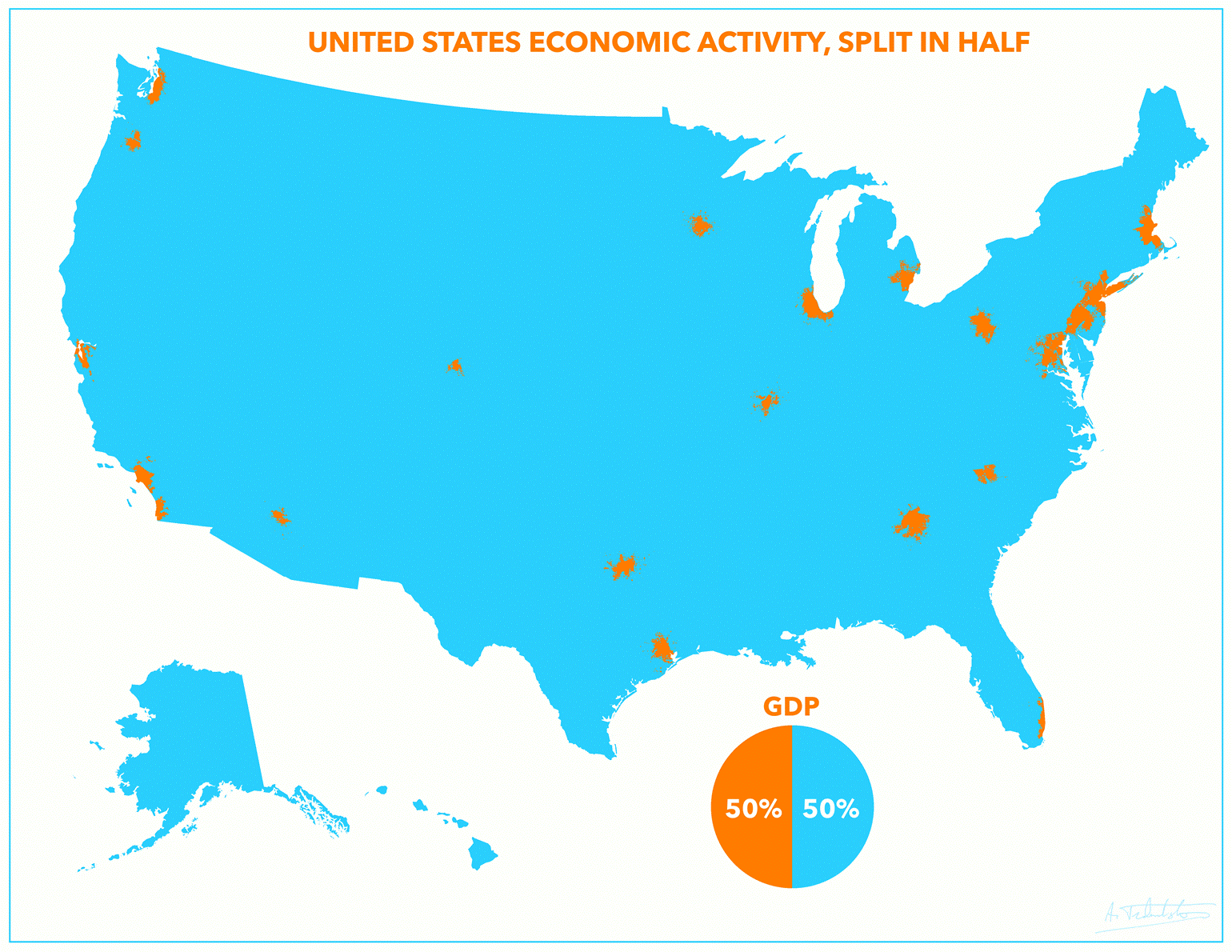
US GDP, measured by locations of businesses, from Reddit user atrubetskoy

usgdp


Now, GDP isn’t really well-defined at that sort of spatial scale — employees and businesses and customers need not all live in the same small census area — and the data are old, but it still looks striking.

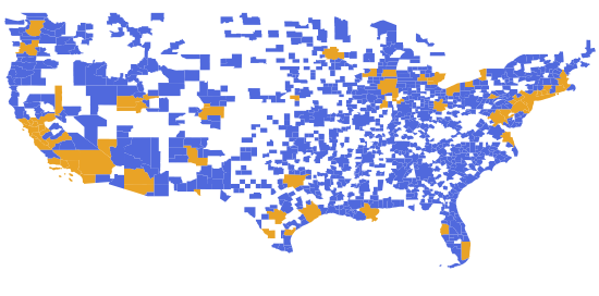
However, in this map, the orange areas have 50% of the US population

uspop


and since I used whole cities/counties as units, the orange areas could be made a lot smaller with a bit of effort, giving a better approximation to the GDP map.

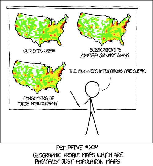
From XKCD 

heatmap

Astronomy vs astrology: it’s complicated

As he comments this StatsChat post, Jim Lindgren did a similar test of the astrology/astronomy confusion hypothesis, with different results.

I replicated Landers study using the two NSF questions actually used, rather than questions that Landers made up. I then asked two followup questions designed to probe what the respondents meant by astrology.

If you ask the actual questions used in the NSF study and probe further than Landers did, you get completely different results from Landers’. In my sample, only 1 of 108 respondents seemed confused in the way that Landers hypothesized.

You can read about my replication in my blog post at the Washington Post:

http://www.washingtonpost.com/news/volokh-conspiracy/wp/2014/02/18/did-people-confuse-astronomy-with-astrology-in-the-nsf-study/


February 17, 2014

Two charts about animal use in research

Prompted by Siouxsie Wiles’s report of talking to an anti-vivisectionist demonstrator, here are two charts from the annual report of the National Animal Ethics Advisory Committee. These are the people who monitor the use of animals in research, testing, and teaching in New Zealand.

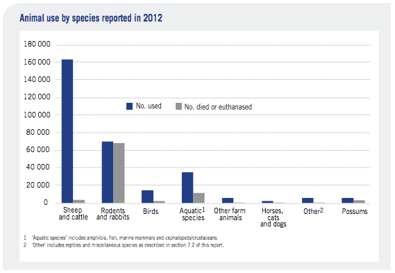
The first chart shows what types of animals are used and what happens to them afterwards

animal-bar

More than half are sheep and cattle, mostly cattle, and mostly subjected to things like breeding or eating different types of feed.  There are quite a lot of mice used in biological research, though the numbers are decreasing (down 24% last year) partly because they are being replaced by zebrafish. None are monkeys.

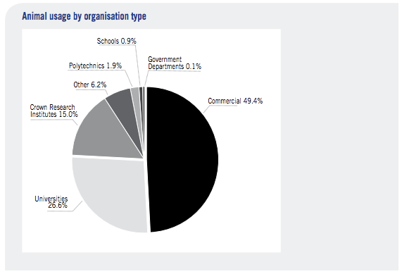
About half of the research is commercial, with about a quarter at universities

animal-pie

Some people will still be opposed to livestock research because they’re opposed to livestock farming. Some people still  disapprove of the use of mice in biomedical research. But anyone who wants to campaign on those issues should be clear that those are the issues.

Briefly

  • From Stuff: Having a nasty bout of shingles is becoming more common in New Zealand [no data or anecdote given to support this], with the numbers of those at high-risk of infection on the rise. [when that’s defined just as older people]

Press releases and science in the media

From Tracker, the blog of the MIT journalism school, in a long post on the habit of reprinting lightly-edited press releases and calling it science journalism

Let’s be clear: The aim of Stanford press releases is to promote Stanford; not to enrich the readers of The Washington Post. The same is true of the University of Zurich’s releases. And of all the other releases that have been reprinted in the Post.

And the aim of the Post is–or should be–something quite different. And the paper says so in a lengthy credo on its website. “Through lively, sometimes humorous, but always rigorously researched stories, we try to separate the truths from the half-truths to help people make smarter HEALTH & SCIENCE care choices for themselves and their families.” It goes on: “We insist on getting information from the most reliable sources—the respected authorities in a particular field and the most solid studies in peer-reviewed medical journals. We’re fiercely independent of any commercial interest or advocacy group.” And that would include doctors and universities?


February 16, 2014

Most young Americans think astronomy is science

And they’re right.

The problem is they don’t know the difference between the words “astronomy” and “astrology”. So we get survey results like this,

A study released by the National Science Foundation finds nearly half of all Americans feel astrology—the belief that there is a tie between astrological events and human experiences—is “very” or “sort of” scientific. Young adults are even more prone to believe, with 58% of 18- to 24-year-olds saying it is a science.

Richard N. Landers, a psychologist in Virginia, thought the name confusion might be responsible, and ran a survey using Amazon’s Mechanical Turk, where you pay people to do simple tasks.  He asked people to define astrology and then to say whether they thought it was scientific.

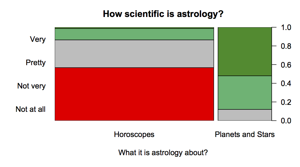
What he found, is shown in this graph based on his data

astro


People who think astrology is about horoscopes and predicting the future overwhelming don’t think it’s scientific — about 80% are in the ‘no’, and ‘hell, no’ categories. People who think astrology is about the solar system and stars  think it is pretty scientific or very scientific.

The data isn’t perfect — it’s from a much less representative sample than the NSF used — but there’s a very strong indication that confusion between “astronomy” and”astrology” could explain the otherwise depressing results of the NSF survey.


(via @juhasaarinen)

Yoghurt health nostalgia

Some of you may be enough older than me to remember yoghurt as the miracle food of the 1970s. It seems to be back. From the Independent, this time, a Herald headline “Low fat yoghurt could combat type 2 diabetes”.

The research paper is open-access, at least for now, so I looked at it.  The first thing to note is that the research did not anywhere distinguish low-fat yoghurt from full-fat. All yoghurt was grouped together in all the analyses.

While the study could not prove a conclusive causal link between eating dairy and lower diabetes risk, the association was strong.

Not all that strong. Comparing high to low yoghurt consumption they only saw a 28% lower risk; the difference in risk was less when they included other “low-fat” fermented dairy products, and the evidence wasn’t all that overwhelming even before you take into account that they looked at 9 different subsets of dairy foods.

The researchers also note that when they compared people who had similar diets except that one group had one more snack (crisps, etc) and the other had one more yoghurt, the risk was 47% lower for the less-crisps group. As they say “suggesting that some of the association may be attributed to not consuming unhealthy alternatives,” and I’d say “some of” could easily mean “all of.”

February 15, 2014

I only drink it for the pictures

Stuff has a story about differences in coffee preference between regions of NZ.

A customer survey published yesterday confirms the capital has the country’s biggest coffee snobs – almost three in four will choose an expensive brew over a less tasty one every time.

They don’t give enough information to work out how big the differences are, or how they compare to the uncertainty in the survey.

There’s slightly more information in the press release — still no uncertainty, but we are told that the figure is 72% for Wellington and 67% for the country as a whole. Not a terribly impressive difference, and almost certainly the survey isn’t large enough to be able to tell which region is really highest. Fortunately, it’s not a question where the true answer matters.

You have to go to the Canstar Blue site to find that the survey population isn’t Kiwis in general, or even coffee-drinkers, but people who have been to a chain coffee store at least once in the past six months.

Interestingly, although 17% to 33% of people (varying between regions) consider coffee alone to qualify as breakfast, only 10% to 14% say they drink coffee for the caffeine.

Yeah, right.

Crushing hopes

Now Valentine’s Day is safely past in NZ, I can link to a post on It’s a Stat Life, a blog not entirely unlike StatsChat. Robin Evans writes:

A friend pointed me to this story about the average number of men (or rather frogs) a woman has to date before finding their ‘Prince Charming’ (apparently it’s 15).  Let’s leave aside for now how they came up with the number: I’ve no doubt the methodology conforms to the most rigorous standards that we’ve all come to expect from the internet.  I thought that this paragraph might give some people hope:

If you’ve made out with 11 men, great news! A new survey suggests you’re only 4 away from Prince Charming. On average, anyway.

It’s now my duty to crush that hope.