Posts written by Thomas Lumley (2645)

avatar

Thomas Lumley (@tslumley) is Professor of Biostatistics at the University of Auckland. His research interests include semiparametric models, survey sampling, statistical computing, foundations of statistics, and whatever methodological problems his medical collaborators come up with. He also blogs at Biased and Inefficient

February 14, 2014

Briefly

  • Genetic determinism, from Nathaniel Comfort: Studying genetics and popularization over the last century or so has led me to the surprising conclusion that genetic oversell is independent of genetic knowledge. We see the same sorts of articles in 2014 as we saw in 1914.
  • Kudos to the Herald for explicitly saying that research on grapeseed extract in colon cancer was lab-based, not on people. This sort of science is interesting if it isn’t hyped up as a cure.
  • Rather less impressive is the ‘sextacy’ story on the evils of Viagra. This combines general warnings on psychological problems; the specific, well-characterised dangerous interaction between Viagra and nitrates; and relatively anecdotal warnings about serotonin syndrome. And rubbish about arginine, where the fact that it gets sold in early February is taken as convincing evidence it has genuine sexual effects. Guess where the Herald got the story.

Interpreted with caution

There’s a new paper in The Lancet, summarising population-based surveys across the world that asked about non-partner sexual violence. The paper’s conclusion, from the abstract

Sexual violence against women is common worldwide, with endemic levels seen in some areas, although large variations between settings need to be interpreted with caution because of differences in data availability and levels of disclosure.

The story in Stuff has the headline Sexual assaults more than double world average, and starts

The rate of sexual assault in Australia and New Zealand is more than double the world average, according to a new report.

After several highly publicised rapes and murders of young women in India and South Africa, researchers from several countries  decided to review and estimate prevalence of sexual violence against women in 56 countries.

The results, published in the UK medical journal The Lancet, found that 7.2 per cent of women aged 15 years or older  reported being sexually assaulted by someone other than an intimate  partner at least once in their lives.

The study found that Australia and New Zealand has the third-highest rate, more than double the world average, with 16.4  per cent.

If you look at the raw numbers reported in the paper, they showed Australia/NZ at about ten times the rate of the Caribbean or southern Latin America or Eastern Europe, which is really not plausible. Statistical adjustment for differing types of survey reduced that margin, but as the researchers explicitly and carefully point out, a lot of the variation between regions could easily be due to variations in disclosure, and it suggests that rape is being underestimated in some areas.

As usual with extreme international comparisons, the headline is both probably wrong and missing the real point. The real point is that roughly one in six women in Australia & NZ report having experienced sexual violence.

Manipulating official statistics

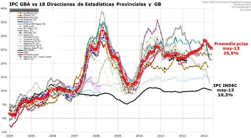
This is what it looks like when a country does manipulate its official statistics (from Ezequiel Tortorolli, via Tom Pepinsky and Xavier Marquez).

inflation


The black line is Argentina’s official federal inflation rate. The red line is the average of the rates for the 18 provinces, which are the fainter wiggly lines.


[Update: Argentina has just announced a new inflation index that’s supposed to be non-bogus. It will take a while to convince people.]

Statistical improvements in advertorials

The Herald has a headline “Why internet adultery numbers are soaring“, but doesn’t actually say why, or even provide any real evidence that they are increasing.

The news is that the number of people signed up to the website AshleyMadison is increasing as they expand internationally, but we’re not given any indication that the number of active members in a given area is increasing, let alone any data on how much actual goings-on is going on. So, the only internet data in the story would be relevant in the business section of the paper, but the Herald has the story filed under “Relationships & Pets.”

There is a gesture towards data later in the story

According to figures in the Journal of Marital and Family Therapy, some 22 per cent of men and 14 per cent of women will cheat on their spouses at least once during their marriage.

but this is basically useless for the headline claim about numbers soaring, since these are one-time percentages, and we aren’t even told when or where they are from. It looks as though they are probably from this 2005 paper, which summarises data back to the 1980s.

On the positive side, though, this is enormously better than the one from two years ago which had astonishingly bad use of data, completely ignoring denominators

If your partner supports National, has a PC, drinks Coke, eats meat, has a tattoo, smokes and is a Christian, be warned – they could be a cheater.

Progress, of sorts.

February 13, 2014

Commuting costs are housing costs

There’s an interesting story in the Herald about research on the combined cost of commuting and housing in Auckland.

“If you just look at housing costs alone, outlying areas appear really affordable and it initially seems to make sense to say, hey, let’s open up greenfield sites on the urban periphery and develop here,” Mr Mattingly said. “But when you include these broader costs, they are not as affordable as they seem.”

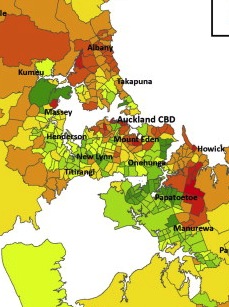
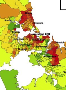
This is the sort of conclusion I like to see, as a non-driver, so I looked at the research paper (there wasn’t a link, but the Herald did give the researchers’ names and journal name). I was disappointed that the impact of commuting costs wasn’t higher, at least until you got out to Pukekohe or Warkworth.

Since the journal is published by a company known for its dedication to preventing knowledge being disseminated for free, I won’t show any whole maps, but here are the central chunks of the cost maps with and without commuting costs. Or perhaps the other way around.


How stats fool juries

Prof Peter Donnelly’s TED talk. You might want to skip over the first few minutes of vaguely joke-like objects

Consider the two (coin-tossing) patterns HTH and HTT. Which of the following is true:

  1. The average number of tosses until HTH is larger than the average number of tosses until HTT
  2. The average number of tosses until HTH is the same as  the average number of tosses until HTT
  3. The average number of tosses until HTH is smaller than the average number of tosses until HTT?

Before you answer, you should know that most people, even mathematicians, get this wrong.

Also, as Prof Donnelly doesn’t point out, if you have a programming language handy, you can find out the answer very easily.

February 12, 2014

Evils of Axis

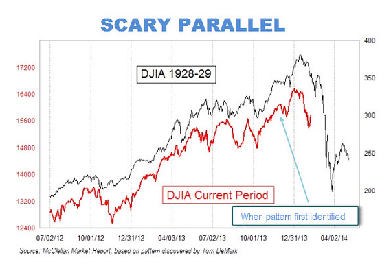
A scary chart showing how the stock market looks just like it did before the big crash that started the Great Depression:

MW-BU310_scary__20140210132547_MG


Or perhaps not


That is, if you scale the charts so that the vertical scale corresponds to the same proportional rise and fall for both of them, and extend them up to the day of publication rather than stopping in mid-January, the similarity vanishes.

How do we know which scaling is right?  It depends on whether you think the detailed day-to-day shape of stock market fluctuations is much more important than the size of the fluctuations. And on whether you think it’s still January.

Briefly

  • An interview with Sir David Cox, probably the most famous living statistician “I know the term ‘the profession of statistics’ is widely used but I am not that keen on it. I would like to think of myself as a scientist, who happens largely to specialise in the use of statistics. “
  • A page with interactive graphics to demonstrate Simpson’s Paradox. I’m not sure the interactivity helps, but more important, they show dividing people into groups can change the direction of association, but don’t talk about how you decide which of the two is correct.
  • “Disinformation Visualization”
  • A long-term personalised-medicine study. “We hope to develop a whole series of stories about how actionable opportunities have changed the wellness of individuals, or have made them aware of how they can avoid disease,” We can be confident they will find stories. It’s less clear they will be true.
February 8, 2014

Evils of axis

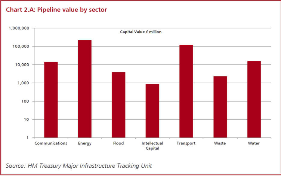
The UK Statistics Authority, among its other responsibilities, has the job of writing polite but firm letters to government bodies that misuse statistics. Yesterday’s installment is about the UK National Infrastructure Plan, which contains a chart showing how planned and ongoing infrastructure projects (ie, the infrastructure pipeline) are in all sorts of useful areas.

logbar


At least, that’s what it shows if you don’t look closely enough to see the y-axis is in powers of ten. The Statistics Authority thinks

 the chart could leave readers with a false impression of the relative size of investment between sectors. 

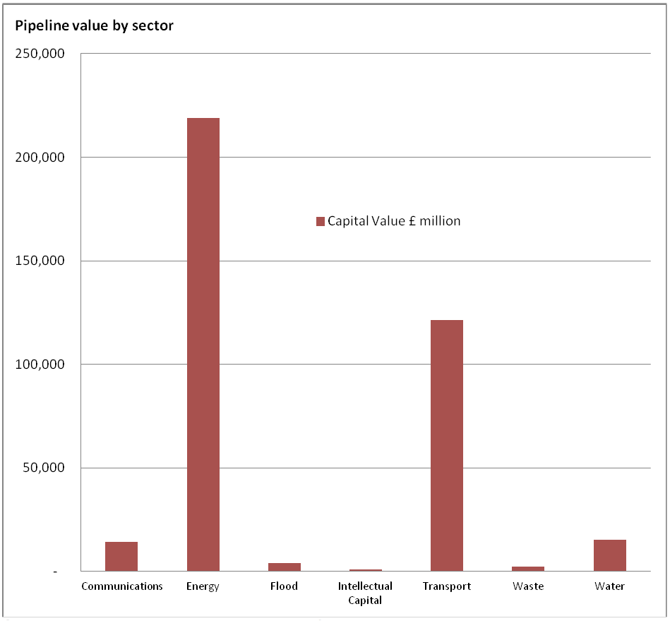
and suggests this revision

unlogbar


As a general principle, barcharts are only useful when zero is a relevant value, and since you can’t take the logarithm of zero, log-scale barcharts should never exist.

Context needed in reporting

Two headlines a month apart on the BBC news website, one of the world’s most respected sources for serious news

speaksforitself


The older one, “Schizophrenia: talking therapy offers ‘little benefit’” is based on a summary of 50 randomised trials.

The newer one, “Schizophrenia: Talking therapies `effective as drugs‘”, is based on a report from a pilot study of 74 people that compared cognitive behavioural therapy to no treatment, not to drugs.  It doesn’t mention the earlier story.

Ezra Klein, who’s one of the United States’ top political and economic journalists, has just left the Washington Post to start a new web-based publication.  He writes

New information is not always — and perhaps not even usually — the most important information for understanding a topic. The overriding focus on the new made sense when the dominant technology was newsprint: limited space forces hard choices. You can’t print a newspaper telling readers everything they need to know about the world, day after day. But you can print a newspaper telling them what they need to know about what happened on Monday. The constraint of newness was crucial.

The web has no such limits. There’s space to tell people both what happened today and what happened that led to today.

For health and science stories there should be room for less newness and more context even on paper, since only a tiny minority of the most interesting stories are covered. But even if you can’t explain why today’s headline is different, you can at least notice that it’s the opposite of what you said a month ago.


[update: I lost the credit to Dean Rutland and Ben Goldacre for the picture in editing. My apologies to them.]