Posts written by Thomas Lumley (2645)

avatar

Thomas Lumley (@tslumley) is Professor of Biostatistics at the University of Auckland. His research interests include semiparametric models, survey sampling, statistical computing, foundations of statistics, and whatever methodological problems his medical collaborators come up with. He also blogs at Biased and Inefficient

January 29, 2014

Mouthwash hogwash?

The Herald (from the Daily Mail again, sigh) has a story about deadly mouthwash

Using mouthwash is a ‘disaster’ for health, increasing the risk of heart attacks and strokes, scientists are warning

In a small experimental study, 19 people who spent two weeks using a type of mouthwash not recommended for long-term use ended up with slightly higher blood pressure, by 2-3.5mmHg (or ‘mmgh’ as the story says). This was an uncontrolled study and everyone had the with-mouthwash and without-mouthwash experimental periods in the same order, so it could just have been a problem of experimental design, but it’s quite plausible that it’s true, and similar results have been found in the past.

What’s a bit surprising is that the story regards this as entirely a bad thing. The hypothesised reasons for the blood pressure difference is that the mouthwash kills bacteria in the mouth that make nitrite. You probably have heard of nitrite in previous Herald or Daily Mail stories.  It’s usually  described as a preservative for cured meats and is anathematised for its presumed potential to cause cancer. Even the introduction in the mouthwash research paper mentions that nitrite has traditionally been regarded as harmful and doesn’t give any of the recent evidence to the contrary.

There is also a widespread belief, though based on relatively weak evidence, that gum and mouth infections increase the risk of heart disease. Since the type of mouthwash being studied is recommended only for treatment, not for long-term use, it might easily decrease rather than increase the risk of heart disease if used as recommended.

It’s not obvious whether the benefits of mouthwash for chronic disease would outweigh the disadvantages, even if the research had studied the sorts of mouthwash (such as Listerine) intended for daily use. It is clear that the context, even context present in the abstract of the open-access research paper, is being ignored.
January 25, 2014

When do we care about international comparisons?

I’ve done a bunch of posts recently about international comparisons. A good way to get a headline is to say NZ is the worst (second-worst, third-worst) in the world.  These tend not to be true — what’s usually true is that NZ is the worst among a smaller group of countries with high-quality official statistics.

But when do we even care? I’ll look at three recent examples

  • NZ is the worst (only not) in bowel cancer rates, so we need subsidised screening
  • NZ is the third worst (only probably not) in child road deaths, so we need to require child car seats up to age 11.
  • NZ is the second worst (only not) in imprisonment rates, so we need to change the justice system

When deciding whether to subsidise bowel cancer tests there are just two things that matter: whether it works, and how much it costs. If the screening isn’t effective, we shouldn’t do it. If it is effective, but costs a lot more than other ways of preventing the same amount suffering and loss of life, we should do those instead. It doesn’t matter whether the rates are higher in Austria or Australia. No-one should be taking that into account.

When deciding whether to require child car seats, there are three things that matter: do they prevent injuries, how much do they cost to buy, and how much does the law cost in enforcement and in the (subjective but real) costs of forcing people to do things. If the seats don’t prevent injuries, we shouldn’t use them. If they don’t prevent more injuries than other things we could do at a similar price, we should consider those things first. And to make them compulsory, the benefit has to be large enough to be worth the monetary and non-monetary costs of enforcement, but not large enough that parents will do it voluntarily. If we can satisfy these criteria, we should pass the law, regardless of what is happening in other countries. If we can’t satisfy these criteria, we shouldn’t.

Imprisonment rates are a bit different. It’s not obvious what the ‘right’ imprisonment rate is, so international comparisons are actually helpful in deciding whether the NZ rate is high or low. Comparisons to the whole world are still pointless, but it makes sense to compare to other countries with basically similar legal systems and a fairly high level of trust in government.

Even when we shouldn’t care about what is being done in other countries, it’s often useful to know why they do what they do. That’s why I link to things like the US Preventive Services Taskforce recommendations. It’s not that New Zealand should necessarily do what the US does, but the PTF has more resources for making decision, and they show their working. We can look at their collected evidence and read their rationales, and that’s helpful in deciding what to do in New Zealand.

Briefly

  • Warren Buffett is offering a prize of a billion dollars for correctly predicting all 63 US college Division 1 basketball games. Corey Chivers analyses the odds, and summarises as “You’re not going to win, but you’re still going to play.”  (via Jie Fu Yu)
  • According to the Herald, nearly one in three people (28%) admitted to the emergency room on Saturday nights had been drinking. According to the NZ Alcohol and Drug Use Survey 26% of people in New Zealand drink more than twice a week, and it would be deeply unsurprising if Saturday was one of those nights. The real statistic is that 80% of those had been drinking heavily: that’s just over 20%, almost twice the proportion of people who report drinking heavily at least once a week. There is an increased risk, but less than the story implies.
  • Some researchers at Princeton have modelled Facebook as an epidemic (PDF preprint), and predict that 80% of people will recover by 2017. I’m not convinced — they aren’t modelling the heterogeneity in Facebook users, and I think the older users will hang on longer. [Update: Mike Devlin uses web and social media data to show that Princeton will also disappear]


January 24, 2014

Citation needed

From Stuff, in a story about the new child-seat law not being broad enough

New Zealand has the third-highest child road death toll in the OECD, [a group of paediatric specialists] say in this month’s New Zealand Medical Journal.

This group are arguing for child restraints up to age 11, rather than age 7. As you know, I’m skeptical about claims like ‘third-highest’, so I looked at the NZ Medical Journal article. Its claim isn’t as strong

New Zealand compares unfavourably to other OECD countries for child traffic crash-related trauma[2]

And reference 2 is

  1. New Zealand Transport Agency. Child Restraints Fact Sheet 07. Wellington: New Zealand Transport Agency, 2012

which, as you can see for yourself, doesn’t say anything at all about OECD comparisons. Presumably that’s just an editing error in the NZMJ paper, but as far as I can tell, none of the other references were OECD documents either.

The closest thing to OECD statistics I can find on the internets is this 2004 report, based on data from 1996-2000. It does show NZ third out of the set of countries with good enough data to be in the table, so I suspect it’s the source of the statistic. It’s a bit out of date, is nowhere near all of the current OECD, and is for all children 0-14, when the story is about needing child restraints for children 7-11.

The NZ data in the NZMJ article are more up-to-date (2000-2009), but are only for infants 0-4, who have been required to been in proper child seats for the last twenty years, so those data are irrelevant to the point being made.

So in this case the ‘3rd worse’ statistic is true(ish), but you can’t find it where Stuff attributes it, and you can’t find it where the NZMJ paper attributes it. And it’s based on data from a time when the overall NZ road toll (per capita) was twice what it is now, and the number of deaths in children under 14 was three times what it is now.

It’s a good thing the statistic isn’t really relevant to the campaign.


[update: in comments, Glen Koorey has found up-to-date information. New Zealand is currently 10th out of 29 countries in 0-14 road deaths]

January 23, 2014

Really the worst?

Stuff has a story saying NZ is the worst in the world for bowel cancer, according to new World Health Organisation statistics. We’ve looked recently at claims that NZ was 2nd worst and 3rd worst in the world on various measures. They weren’t true. This one isn’t true either, though as with the previous stories, the truth is that NZ is still pretty bad.

The Herald story is more accurate, saying that Australia and New Zealand are the highest; that’s still a bit misleading because it just means the highest among regions, not countries, and because the region is dominated by the Australian data.

Since the stories are calling for more screening, it doesn’t really make sense to look at rates of diagnosis (‘incidence’). Incidence rates can only go up with increased screening, not down — the whole point of screening is to increase diagnosis. It makes more sense to looks at rates of death from bowel cancer (though the claims aren’t actually true for incidence, either).

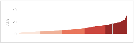
If we use the new World Health Organisation statistics that both stories mention, and compare deaths from bowel cancer (as a fraction of the whole population, standardised for age) to all the countries for which the World Health Organisation has data, we find that NZ is second-worst in women (the gray line) and the rate of death is almost twice that for Australia.

female-mortality

In men, New Zealand is 25th-worst, and about 50% higher than Australia

male-mortality

Going for the ‘worst in the world’ title has led to missing a real public-health fact from the new statistics: NZ fatal bowel cancer rates compare much less favorably in women than in men, whether the comparison is to the whole world or to Australia.

But probably not.

From the Herald: “Herbs, berries and red wine could create diabetes barrier

High intakes of the flavonoids are linked to lower insulin resistance and better control of blood sugar, a study has shown.

Both effects help stave off the onset of Type 2 diabetes

That’s better than the Daily Mail lead

It sounds like the ingredient list for an indulgent dessert. But red wine, chocolate and strawberries are more than a guilty pleasure. They could all help guard against diabetes.

But it’s still misleading.  The study (newspapers,would it kill you to link?) didn’t measure diabetes in anyone, just an estimate of insulin resistance.

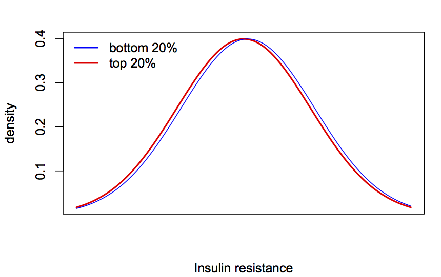
More importantly, the difference is tiny. No, smaller than that. The difference in the insulin resistance estimate between the 20% of participants with the highest and lowest flavanoids in the diet was 0.1. The standard deviation of insulin resistance was 1.6. For people who aren’t as used to visualising this sort of difference, this is what it would look like if they were Normal distributions

bluered


As usual, the StatsChat advice is that there are good reasons to consume red wine and chocolate, but preventing diabetes is not one of them.

Onward and upward

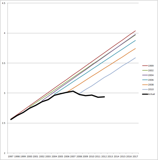
This graph (from Clark Williams-Derry via Andrew Gelman) shows US national traffic forecasts over time (the straight lines) and the reality (the black line)

VMT-C-P-chart-big1-541x550


Initially, the straight-line extrapolation would have made sense, but for the past five years or so it’s been increasingly obvious that it’s bogus.   Some of the fall off from expectations is due to the US recession, but people in the US seem to just be driving less than forecast.

It would be interesting to see this sort of graph for NZ data.

January 20, 2014

What’s wrong with this picture?

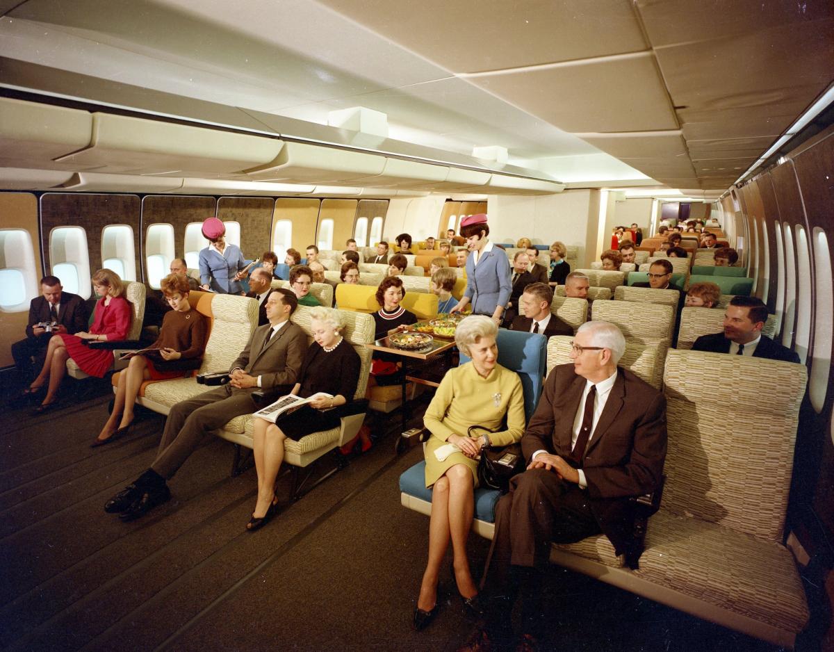
There’s a popular image on Twitter at the moment, labelled as “Economy Class on Pan Am 747 in the late 60’s”

BeXEgN-IYAAeS_d

Air travel, especially in the United States, was much more luxurious then, but there are some problems with this picture.

The easy ones: the picture as posted by @HistoryInPics has no attribution. It’s also mislabelled, and has been converted to black and white to make it look more period. The original (via @hypatiadotca) is a Boeing promotional photo of a mock-up of the 747 cabin.

SetWidth1200-K14142

Presumably the mock-up was done with Pan Am and their customers in mind, since Pan Am were the big customer, but that’s not the same thing at all. And the 747 wasn’t used in the 1960s — that’s what I noticed, since I know the first test-flight of the 747 was the year I was born.

Now we’ve got that out of the way, the StatsChat-relevant aspect of the picture is the dramatic fall in the price of flying over the years. In the 1960s Pan Am used to charge about US$500 for a round-trip from New York to London.  Adjusted for inflation, that’s nearly US$4000 now, which would get you a much nicer business-class ticket. In terms of median income the fall in price is even greater, and much greater in terms of the income of the sort of people who used to fly in the 1960s.

My parents moved from the UK to Australia in the mid-1960s. It was ten years before they next saw their families.  That’s what has really changed about flying.


[Update: 2014-5-30  @HistoryinPics has excelled themselves (screenshot)]

January 19, 2014

How to beat Lotto

That is, how to gamble in a way that over a course of a year, gives you a higher chance at a larger payout than playing NZ Lotto each week and hoping for Division 1. We all know you can’t “beat Lotto” in the usual sense of improving your odds of winning.

In the ordinary Saturday Lotto, you pick 6 numbers out of 40, and if all 6 are correct (which they aren’t) you win $1 million. The chance of winning is 1 in 3838380 per ‘line’. Suppose you play the minimum of 4 lines, for $6, each week for a year. The chance of winning in a year is one in 18453.75. That is, on average you’d expect to win once in every 18453 years and 9 months.

Alternatively, suppose you save up the $6 per week, and then at the end of the year go to a casino and play roulette.  Put it all on a single number.  If you win, put it all on a single number again, and then if you win,  put it all on a ‘double street’ of six numbers.  Your chance of winning (in double-zero roulette) is 1 in 9145.33, and if you win you will make $2426112.

So, you get twice the chance of winning as you would have for Lotto division 1, and more than twice the payout. The expected return is 85%, much better than the 56% that NZ Lotteries returns (averaged over all its games, annual report).  Does that mean it’s a good idea? No. Not even slightly.  You have a 37 in 38 chance of turning up with $300 and losing it in a few minutes. If you don’t, you have a 37 in 38 chance of losing $7500 in the next few minutes, and if you don’t, you have about an 85% chance of losing more than quarter of a million dollars.   This strategy makes your losses obvious, which makes gambling no fun. And you still only win once every 91 centuries.

Enjoyable gambling, including Lotto, is based on making your losses less obvious by masking them with small wins and stretching them out over time. Of course, that’s also what makes gambling, including Lotto, potentially addictive.

January 18, 2014

Briefly