Posts written by Thomas Lumley (2645)

avatar

Thomas Lumley (@tslumley) is Professor of Biostatistics at the University of Auckland. His research interests include semiparametric models, survey sampling, statistical computing, foundations of statistics, and whatever methodological problems his medical collaborators come up with. He also blogs at Biased and Inefficient

January 18, 2014

Prostate cancer controversy

The Ministry of Health has put out two brochures about prostate cancer screening, and there has been a heated reaction from some doctors. Prostate cancer screening in men without any symptoms is controversial, because it makes a lot of sense that it would have benefits, but the estimates from clinical trials are surprisingly small, and it definitely causes harm.  There are plausible reasons to hope the benefits are larger than estimated in the trials, but not clear evidence.

The US Preventive Services Taskforce says that basically no-one should be screened, because there’s moderately good evidence that screening does not prolong life, and gives only small reductions in prostate cancer death. A statement from a group of prostate cancer researchers (somewhat misleadingly called a ‘consensus statement’, given the clear lack of consensus) says basically everyone should be screened because there’s good evidence that it reduces death specifically from prostate cancer. This isn’t just a situation where some people would decide one way and some would decide the other way because of different preferences and values; this is genuine disagreement.

You’re obviously not going to get a resolution of this question from me. But according to the ChCh Press

The Prostate Cancer Foundation says the pamphlets are perfectly balanced and branded the critics as “pathetic”.

Here I do have to disagree.  One of the pamphlets says literally not one word about risk or harm or any possible disadvantage of screening. I don’t see how that can possibly be `perfectly balanced’.

The other one is substantially better; it says

A prostate check aims to reduce your chances of being harmed or dying from prostate cancer. While the PSA blood test and the DRE may be uncomfortable, there is no risk from having them. They do not harm you in any way.

Depending on your PSA and DRE results, you may need to make decisions about more tests and possibly treatments. The tests and treatments have benefits and risks (can cause harm). You need to understand what the benefits and risks are so you can make the right decisions for you and your family and whānau.

The second paragraph there is the important one. Personally, I don’t think it’s sufficiently clear how much the second paragraph takes back the claims of the first, but it is there, as is a description of the treatment options. The pamphlet also does emphasize that screening should be an individual choice, but there isn’t  any suggestion that there is any uncertainty or controversy over the best approach.

In any case, if you’re male, older than, say, Russell Coutts, and the sort of person who reads StatsChat, it’s probably worth reading both the US PTF anti-screening recommendations and the Melbourne Consensus pro-screening recommendations. They are both produced by intelligent, knowledgeable people using the same set of facts and trying their best to help.

It’s a real pity the NZ Guidelines Group is no more. They wouldn’t be able to solve the problem, either, but they might at least be able to referee the argument and perhaps reduce the name-calling.
Desolation of Smog

From the air pollution monitor at the US Embassy in Beijing

01-16-2014 04:00; PM2.5; 671.0; 613; 
  Beyond Index (at 24-hour exposure at this level)

“Beyond Index” means “when we made up the categories, we didn’t bother to go this high because it obviously wouldn’t be needed.”  671 μg/m3 of PM2.5 is roughly the same as the peak particulate air pollution in the Great London Smog of 1952 — only a rough comparison is possible because air pollution was measured differently back then.  The pollution isn’t quite as bad as the London Smog because the Beijing air improves around midday and again in the evening. The 24 hour average was ‘only’ 448μg/m3, and the following day’s average was down to 154, a bit more than four times the US standard for the 98th percentile of days.

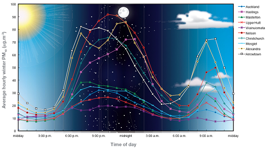
For comparison, here’s a New Zealand graph from GNS. The y-axis is PM10, which includes larger particles that aren’t measured in the Beijing figure; PM2.5 would be very roughly half as high.

air-quality-graph

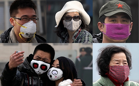
Last month there was a story at Quartz about China’s air pollution, mentioning how sharing face-mask pictures had become a thing. Here are some examples, from the South China Morning Post

masks

They make good photos. They don’t protect you from PM2.5, which goes straight through ordinary paper or cloth masks.

Vaccine-preventable disease outbreaks

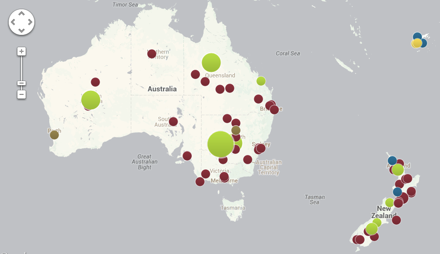
The Council on Foreign Relations has built an interactive map showing outbreaks of the major vaccine-preventable diseases since mid-2008, based on news stories. Here’s the local map

vaccine-oznz


The red circles are measles; the green are pertussis; blue are rubella.

There are two big limitations to the use of news stories as the source. The first is obvious from the map. That outbreak of 3500 pertussis cases in Western Australia wasn’t actually among the Ngaanyatjarra people of the Western Desert, where the circle is. It was mostly in Perth, but the story didn’t say that, just “Western Australia”.

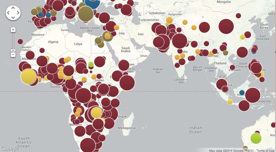
The second limitation is that not everything gets reported. Here’s a map of more of the world

vaccine-world


The small orange circles are  polio, and probably include every polio case diagnosed in the world. The larger, yellow circles include cholera and typhoid, and are just big outbreaks. The brown circles are mumps, which only seems to make the news in Europe and the Middle East. And there’s basically no pertussis reported in Africa or South Asia, because it’s underdiagnosed and not really news.

January 17, 2014

Hard-to-survey populations

As we saw a few weeks ago with the unexpectedly high frequency of virgin births, it can be hard to measure rare things accurately in surveys, because rare errors will crowd out the true reports. It’s worse with teenagers, as a new paper from the Add Health study has reported. The paper is not open-access, but there’s a story in MedicalXpress.

So imagine the surprise and confusion when subsequent revisits to the same research subjects found more than 70 percent of the self-reported adolescent nonheterosexuals had somehow gone “straight” as older teens and young adults.

“We should have known something was amiss,” says Savin-Williams. “One clue was that most of the kids who first claimed to have artificial limbs (in the physical-health assessment) miraculously regrew arms and legs when researchers came back to interview them.”

This wasn’t just data-entry error, and it probably wasn’t a real change; after some careful analysis they conclude it was a mixture of genuine misunderstanding of the question (“romantic” vs “sexual” attraction), and, well, teenagers. Since not many teens are gay (a few percent), it doesn’t take many incorrect answers to swamp the real data.

It doesn’t matter so much that the number of gay and bisexual teenagers was overestimated. The real impact is on the analysis of health and social development in this population.  In Add Health and at least one other youth survey, according to the researchers, this sort of error has probably led to overestimating the mental and physical health problems of non-heterosexual teenagers.

January 16, 2014

Private-sector surveillance

A maths-free article on data mining and surveillance, from the New York Review of Books

Using techniques ranging from supermarket loyalty cards to targeted advertising on Facebook, private companies systematically collect very personal information, from who you are, to what you do, to what you buy. Data about your online and offline behavior are combined, analyzed, and sold to marketers, corporations, governments, and even criminals. The scope of this collection, aggregation, and brokering of information is similar to, if not larger than, that of theNSA, yet it is almost entirely unregulated and many of the activities of data-mining and digital marketing firms are not publicly known at all.

January 15, 2014

He’s a forestry export statistic and he’s ok

From the Herald

Log exports to China are driving an increase in the value of New Zealand’s forestry products – which has more than doubled in the past 20 years, according to figures from Statistics New Zealand.

and from Stats NZ, this infographic (click to embiggen, as usual)

forestry-exports-infographic-jpg


In both the infographic and the Herald story there’s interesting information about changes in the makeup of NZ forestry exports (more logs, more to China), but in both cases the headline number is a bit misleading.

The change is from $1.9 billion in 1992 dollars to $4.5 billion in 2012 dollars. It’s not explicit that the dollar values are nominal, but they are — if I were a newspaper I’d say “evidence obtained by StatsChat under the Official Information Act”, which is to say I asked the always-helpful @StatisticsNZ twitter account.

My general view is that comparing nominal dollars twenty years apart is Not Even Wrong, but I have to admit it’s not obvious what the ideal adjustment would be. Consumer Price Index? Producer Price Index? Something that involves exchange rates? For that reason, here’s a selection of adjustments

  • CPI: $1.9 billion in 1992 is $2.97 billion now, using the Reserve Bank’s calculator, which all journalists should have bookmarked
  • PPI (outputs, all industries) $1.9b in 1992 is $3 billion now
  • PPI (inputs, all industries) $1.9b in 1992 is $3.1 billion now
  • As a proportion of GDP, forestry has fallen from 2.5% to 2.1%
  • As a proportion of all exports, forestry has fallen from 10.4% to 9.4%

So, there’s a reasonable degree of agreement between measures that forestry has increased in value about 50% and has fallen slightly as a fraction of the economy. “More than doubled” doesn’t seem defensible.

(via @kiwieric)

Briefly

‘Approaches to measurement’ edition

Fancy packaging of plain packaging impact

The Sydney Morning Herald has a story on the impact of plain packaging for cigarettes in Australia.  Cancer researchers in Sydney found a big spike in calls to Quitline after the packaging change, and interpreted this as evidence it was working

The researchers said although the volume of calls to Quitline was an ”indirect” measure of people’s quitting intentions and behaviour, it was more objective than community surveys where people can answer questions in a socially desirable and biased way.

On the other side, tobacco companies say there hasn’t been any actual fall in smoking.

”In November 2013, a study by London Economics found that since the introduction of plain packaging in Australia there has been no change in smoking prevalence … What matters is whether fewer people are smoking as a result of these policies – and the data is clear that overall tobacco consumption and smoking prevalence has not gone down,” he said.

In this setting you might reasonably be concerned that either side is putting their results in fancy packaging. So what should you believe?

In fact, the claims are consistent with each other and don’t say much either way about the success of the program.  If you look at the research paper, they found an increase peaking at about 300 calls per week and then falling off by about 14% per week. That works out to be a total of roughly 2000 extra calls attributed to the packaging change, ie, just over half a percent of all smokers in Australia, or perhaps a 10% increase in the annual Quitline volume. If the number of people actively trying to quit by methods other than Quitline also goes up by 10%, you still wouldn’t expect to see much impact on total tobacco sales after one year.

The main selling point for the plain packaging (eg) was that it would prevent young people from starting to smoke. That’s what really needs to be evaluated, and it’s probably too early to tell.


[Update: Of course, other countries that were independently considering changing their policies shouldn’t wait for years just because Australia started first. That would be silly.]

[Update: the Quitline data are just for NSW; so perhaps 1.5% of smokers]

January 14, 2014

Causation, counterfactuals, and Lotto

A story in the Herald illustrates a subtle technical and philosophical point about causation. One of Saturday’s Lotto winners says

“I realised I was starving, so stopped to grab a bacon and egg sandwich.

“When I saw they had a Lotto kiosk, I decided to buy our Lotto tickets while I was there.

“We usually buy our tickets at the supermarket, so I’m glad I followed my gut on this one,” said one of the couple, who wish to remain anonymous.

Assuming it was a random pick, it’s almost certainly true that if they had not bought the ticket at that Lotto kiosk at that time, they would not have won.  On the other hand, if Lotto is honest, buying at that kiosk wasn’t a good strategy — it had no impact on the chance of winning.

There is a sense in which buying the bacon-and-egg sandwich was a cause of the win, but it’s not a very useful sense of the word ’cause’ for most statistical purposes.

The dangers of better measurement

An NPR News story on back pain and its treatment

One reason invasive treatments for back pain have been rising in recent years, Deyo says, is the ready availability of MRI scans. These detailed, color-coded pictures that can show a cross-section of the spine are a technological tour de force. But they can be dangerously misleading.

This MRI shows a mildly herniated disc. That's the sort of thing that looks abnormal on a scan but may not be causing pain and isn't helped by surgery.

This MRI shows a mildly herniated disc. That’s the sort of thing that looks abnormal on a scan but may not be causing pain and isn’t helped by surgery.

“Seeing is believing,” Deyo says. “And gosh! We can actually see degenerated discs, we can see bulging discs. We can see all kinds of things that are alarming.”

That is, they look alarming. But they’re most likely not the cause of the pain.