November 20, 2013
Statistician statistics: gender, race, ethnicity
New data from the American Community Survey on race, ethnicity, and gender balance in science/technology employment. (more…)

Thomas Lumley (@tslumley) is Professor of Biostatistics at the University of Auckland. His research interests include semiparametric models, survey sampling, statistical computing, foundations of statistics, and whatever methodological problems his medical collaborators come up with. He also blogs at Biased and Inefficient
New data from the American Community Survey on race, ethnicity, and gender balance in science/technology employment. (more…)
The annual posting of our second-semester MSc and Honours project topics, which were handed in this week.
From online site Games and Learning
A massive study of some 11,000 youngsters in Britain has found that playing video games, even as early as five years old, does not lead to later behavior problems.
This is real research, looking at changes over time in a large number of children and it does find that the associations between ‘screen time’ and later behaviour problems are weak. On the other hand, the research paper concludes
Watching TV for 3 h or more at 5 years predicted a 0.13 point increase (95% CI 0.03 to 0.24) in conduct problems by 7 years, compared with watching for under an hour, but playing electronic games was not associated with conduct problems.
When you see “was not associated”, you need to look carefully: are they claiming evidence of absence or just weakness of evidence. Here are the estimates in a graphical form, comparing changes in a 10-point questionnaire about conduct.
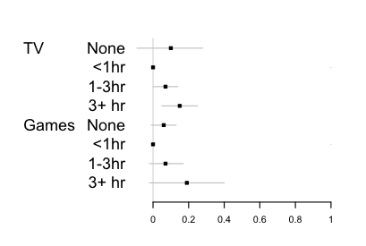
The data largely rule out average differences as big as half a point, so this study does provide evidence there isn’t a big impact (in the UK). However, it’s pretty clear from the graph that the data don’t provide any real support for a difference between TV and videogames. The estimates for TV are more precise, and for that reason the TV estimate is ‘statistically significant’ and the videogames one isn’t, but that’s not evidence of difference.
It’s also interesting that there’s mild support in the data for ‘None’ being worse than a small amount. Here the precision is higher for the videogame estimate, because there are very few children who watch no TV (<2%).
Via Business Insider, a live map of which currencies are being spent on Bitcoins
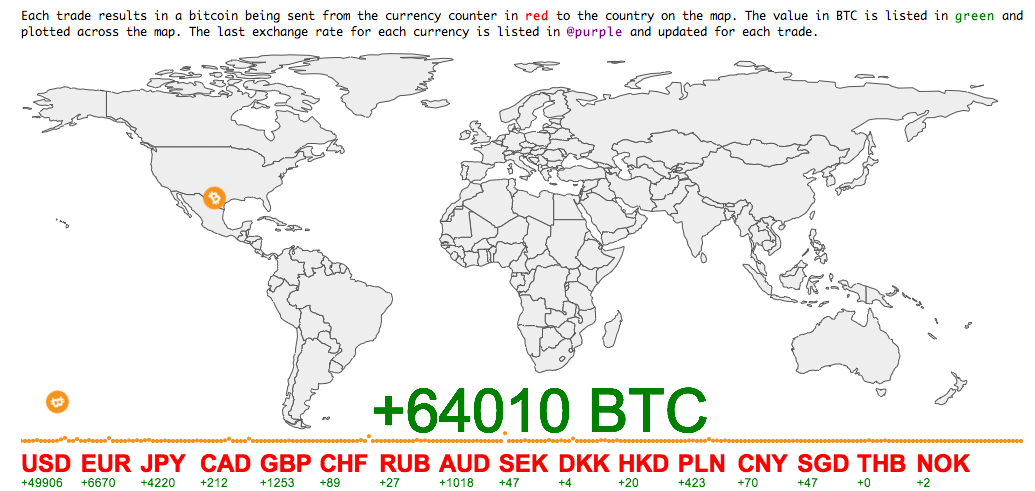
The Business Insider post says
[I]n the time we’ve watched it, it becomes clear that China really is big into Bitcoin relative to the rest of the world.
Below is a brief snapshot of what we saw in which the transactions were dominated by Chinese trading (at other times it’s more even, with more US action).
A big reason for the variation would be time of day, but my map above ran for about 17 hours, and it shows much more US than Chinese bitcoin activity — and even more Australian than Chinese. Longer sampling times are clearly needed to say anything definite.
The map website says “watch the world’s currencies flow into BTC in realtime”, which is the sort of exaggeration that’s unfortunately common with bitcoin enthusiasts. These are exchanges of bitcoin for other currencies: one person gets USD and gives up BTC, the other person gets BTC and gives up USD. The only net flow into (or out of) bitcoin comes from the seller’s profit (or loss) as bitcoin changes in price — and that can be much more easily and accurately estimated from the exchange rates, without needing to track individual transactions.
The Institute for Health Metrics, at my previous university in Seattle, has a new tool for visualising the causes of death and disability across the world with interactive graphics.
This pair of maps is for cancer in women.
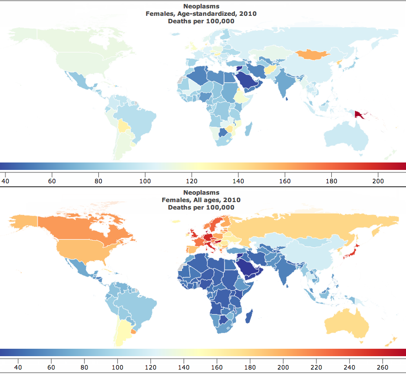
The lower map is just cancer deaths per 100,000 women. That’s the easiest sort of number to obtain, but the problem with it is obvious: the orange and red countries are mostly just the places where the female population is older than average.
The upper map is age-standardised deaths per 100,000 women. That is, you take the rate in your country for women of a particular age, say 72 years old , and multiply by the proportion of 72-year olds in the UN’s standard reference population. When you do this for each year of age and add up the results, you get an estimate of what the cancer rate differences really are like, averaged over ages.
The map looks completely different after standardising by age. In particular, there’s a lot less variation between countries. The lowest rate is in Saudi Arabia, which is wealthy enough to afford good medical care but still has low rates of many cancer risk factors in women. The highest rate is Papua New Guinea, which has very high rates of cervical cancer (affecting younger women than many cancers).
This week there was a quarterly report estimating smartphone market share for different operating systems, which turned out to be packed with trapdoors for the unwary reporter. The NZ media largely avoided the problems (mostly by sensibly ignoring the report) but many international tech sites leaped in with both feet.
The basic information is in this table:
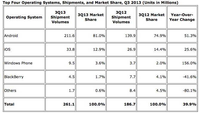
There are some important nerdy details in interpreting the numbers, such as the difference between “shipments” and “sales,” but we can ignore those for now. The main problem came in picking which numbers to report. The popular ones were the 81.0% market share for Android, the 1.5% fall in market share for Apple’s iOS, and the 156% increase in shipments for the Windows Phone.
The big rise in Windows phones is due (as the report points out) to the fact that there were basically no Windows phones being sold last year, and that’s now increased to some Windows phones being sold — not only is Windows still well behind iOS and Android, but its increase in actual phones shipped was smaller than the increase for either iOS or Android. That’s all clear just from the numbers in the report.
Android has obviously been really successful, but 80% market share doesn’t mean quite as much as it sounds: this is just one quarter of phone shipments, and nowhere near 80% of the smartphones already out there are Android — the installed base is still much larger for iOS. If you’re writing the next Candy Crush or Angry Birds, what you care about most is the number of potential customers on each operating system. On the other hand, if you’re interested in current cash flow, so that one quarter’s shipments are relevant, you care about revenue or profit, which are lower per phone for Android (which is why I now have an Android phone).
And, finally, if you’re a tech writer, as Kit Eaton points out, you should know enough about the industry to realise that Apple made a much-anticipated announcement of two new iPhone models at the end of September. Given a choice, many people (and not just psychotic Apple fanboys) would want to wait until the new phones appeared, either to buy one or to get discounted obsolete model. You’d expect iOS sales to be lower in the preceding quarter. This isn’t just hypothetical: the chart from the April IDC press release (we’re not digging very deep here) shows the contraction and expansion in Apple market share around the release of the previous model, the iPhone 5, last September.
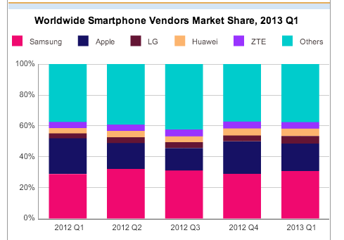
On the other hand, at least the fact that last year also had a new iPhone release means that ignoring the context sort of cancels itself out.
(via @juhasaarinen)
Actually existing open data in Australia (via @juhasaarinen):
The number of datasets available on the Government’s open data website has slimmed by more than half after the agency discovered one third of the datasets were junk….
“We unfortunately found that a third of the “datasets” were just links to webpages or files that either didn’t exist anymore, or redirected somewhere not useful to genuine seekers of data,” Sheridan said.
Do-it-yourself open data in NZ : Graeme Edgeler on the Official Information Act
Some time last year [note: 2010], I realised that you could find stuff out by asking the Government. It used to be I’d have had a discussion with someone, or read a news story or made a blog comment and thought to myself “I wonder if they …” or “how many …” and I wouldn’t try to find out. And then once – for some reason – likely the personal satisfaction of knowing I was right about something – I flicked off an email to a government department asking them for some small piece of information.
From phys.org
With Harvard students Azalea A. Vo and Shashank Sunkavalli, as well as MIT graduate students Zoya Bylinskii and Phillip Isola, the team designed a large-scale study—in the form of an online game—to rigorously measure the memorability of a wide variety of visualizations. They collected more than 5,000 charts and graphics from scientific papers, design blogs, newspapers, and government reports and manually categorized them by a wide range of attributes. Serving them up in brief glimpses—just one second each—to participants via Amazon Mechanical Turk, the researchers tested the influence of features like color, density, and content themes on users’ ability to recognize which ones they had seen before
The researchers talk about what features were present in the more-memorable graphs, which tended to be visually dense and not to be of standard forms.
It’s good to see empirical evaluation of theories about graphics. However, as they admit, ‘memorable’ may not be the right criterion. Even if it isn’t ‘memorable’ in the eyeball-bleach sense, memorability may not be a good proxy for informativeness.
From Stuff, this morning
This year, and for the first time in New Zealand, Fairfax Media is partnering with the Global Drug Survey to help create the largest and most up-to-date snapshot of our drug and alcohol use, and to see how we compare to the rest of the world.
That all sounds good. The next line (with a link) is
Take the survey here.
That doesn’t sound so good.
This research group has been running a survey in partnership with UK clubbing magazine Mixmag for years, and last year branched out to ‘Global’ status with the help of the Guardian. Not all that global, though: more than half the respondents were from the UK, with half of the rest from the US. As you might expect, the respondents were more likely to be from demographic groups with high drug use: overrepresented attributes included young, male, student, and gay or bi. The research team and their expert advisory committee includes experts in a wide range of areas needed to design and interpret a study of this sort, with one exception: they don’t seem to have a statistician.
What are the results going to be useful for? Clearly, any estimates of prevalence of drug use will be pretty much useless if the survey oversamples drug users as it has in the past. Comparisons with past surveys done by different methods will be completely useless. International comparisons within the survey will be a bit dodgy, since the newspapers taking part will reach different segments of each country– readers of the Fairfax media are quite a different subpopulation than Guardian readers.
Useful information is more likely to be obtained on drug prices, on subjective experience of drug taking, on harm people experience from different drugs, and on comparison between drugs: eg, among people who’ve tried both MDMA and cocaine, which do they keep using and why? In countries where there is no high-quality survey information, the semi-quantitative information about drug use might be helpful, but that’s probably not true for NZ or the USA. Certainly for alcohol use, the NZ Health Survey would be more reliable, and the estimates of street price of drugs from Massey’s IDMS should be pretty good.
For New Zealand, the most useful outcome would be if the survey provokes a repeat of the NZ Alcohol and Drug Use Survey, which was run in 2007-2008.
[Update: the NZ Health Survey was planned to have a drug use module in 2012. I can’t find any confirmation that it actually happened, or any planned release date for the data. See the comments. The module was administered and data will appear next year. So, it’s definitely not true that there hasn’t been an NZ survey since 2007/8, contrary to the story]
Recent comments on Thomas Lumley’s posts