November 12, 2013
Screaming above our weight
Via @BenAtkinsonPhD: a map of heavy metal bands per capita
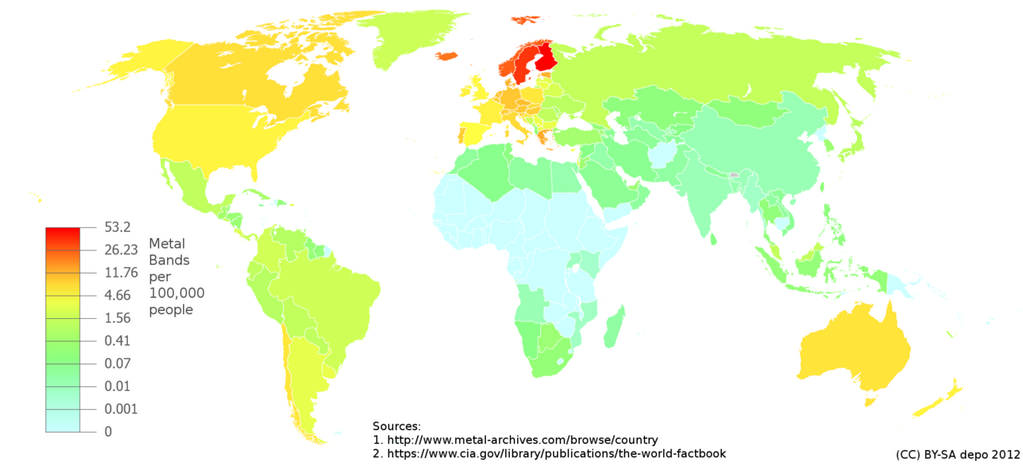
We’re ahead of the US, though behind the Scandinavian countries, as usual.
(for foreigners: NZ political cliche)

Thomas Lumley (@tslumley) is Professor of Biostatistics at the University of Auckland. His research interests include semiparametric models, survey sampling, statistical computing, foundations of statistics, and whatever methodological problems his medical collaborators come up with. He also blogs at Biased and Inefficient
Via @BenAtkinsonPhD: a map of heavy metal bands per capita
We’re ahead of the US, though behind the Scandinavian countries, as usual.
(for foreigners: NZ political cliche)
Data journalism can range from ordinary journalism carried out with enough numeracy to use published data, to informative and insightful displays of information, to analysis, searching and linkage that wouldn’t be possible without computers.
The Herald and Keith Ng have an example of the last type: an analysis of New Zealand’s property records to find property owned by MPs but not declared in the Register of Pecuniary Interests. Property ownership records let you find out who owns a particular piece of land. They aren’t set up to let you go the other way and ask what property is owned by a particular individual, but computers can easily solve that sort of problem by brute force. There are other complications, since land might well be owned by a trust, not by the MP personally; these increase the effort, but don’t make it impossible. It doesn’t seem that the omissions in reporting violate the law — if the MPs were really trying to hide their holdings, they’d do a much better job — but it exposes a loophole.
This sort of search requires doing things to large, probably messy databases, but it also requires manual verification of all the findings, and the involvement of someone who can ask public figures for explanations — if the Herald asks questions and they don’t get answers, that’s news.
From Fresh Spectrum,
The natural constraints of a paper journal didn’t give me an opportunity to dive into the practical side of the subject, but that’s why it’s nice to have a blog. This post is the first in a series I have planned on data visualization. Call it an introduction to interactivity, hope you like it.
The basic reason for interactivity: not everyone wants the same numbers

There are reports that as many as 10,000 people may have died on the Philippine island of Leyte on Friday, drowned in the storm surge or killed by collapsing buildings.
Leyte is roughly comparable in size and population to the Auckland Region (about 40% larger). Fewer than 8000 people died in Auckland in all of 2012.
A disaster
There’s a couple of posts being promoted on the internet about an important and relatively subtle form of selection bias. Epidemiologists know it as Berkson’s Paradox, in modern causal inference terminology it’s ‘conditioning on colliders’, and for an economist it’s a consequence of production-possibility frontier.
The basic issue is very simple. As Gabriel Rossman puts it at The Atlantic
There is no ontological reason why we can’t have shoes that are both hideous and uncomfortable but rather there is a practical reason in that nobody wears shoes that are terrible in every way and so such shoes don’t make it unto the market.
In the same way, there’s no necessary reason why cricketers who are good at bowling have to be bad at batting. Being able to deliver the ball so it misleads or outpaces the batsman doesn’t make it any harder to spot bowling trickery or to react fast. And in fact, if you look at 12-year-olds, often the same kids are good at batting and bowling. In international-level cricket, though, all-rounders are pretty rare, and someone who can take 5 wickets in an Test innings is very unlikely to be able to score a Test century. The slight positive correlation you see in kids turns into a strong negative correlation in adults. The reason is that getting into an international cricket team requires you to be very, very good at batting or very, very good at bowling. Since it’s more likely that you’re very, very good at one thing than two, most international cricketers are either batsmen or bowlers, but not both. Among those who are selected, there’s a negative correlation.
There are examples in the social sciences: opposition to marijuana legalisation is positively correlated with opposition to government wealth redistribution in the US as a whole, but uncorrelated among Republican voters.
There are examples in medicine: the genetic variant Factor V Leiden is strongly associated with deep-vein thrombosis in the population in general, but not at all predictive of recurrence in people who have already had one.
And there are examples in dining: for a given price, a successful restaurant has to do well enough on some combination of food quality, pleasant ambience, trendiness, etc. So these will end up negatively correlated, and if you want good inexpensive food in downtown Auckland, try one of the Asian food courts.
(via @gnat, who points to one of the posts and notes: Anyone who thinks it’s possible to draw truthful conclusions from data analysis without really learning statistics needs to read this.)
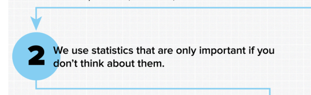
From Saturday Morning Breakfast Cereal: The top six reasons your infographic is just wrong enough to sound convincing
. 
While some traditional herbal medicines (foxglove, opium, willow, qinghaosu) turn out to actually work when studied carefully, others don’t. The most likely explanation for the reported benefits in some ineffective herbal products is some sort of placebo effect. That’s become more likely following recent research that tested 44 herbal products on sale in the USA and found that a third of them were completely missing the active ingredient, with some of the others containing inactive fillers such as oats or potentially active (or allergenic) plants other than those on the label.
The researchers used DNA barcodes: measurements of short DNA regions that are variable enough to distinguish most plant species, they didn’t measure the putatively active compounds in the herbs. The DNA approach is much more efficient, but it can give an unrealistically favorable view of the situation: it’s possible that even where the right plant was present, it didn’t have a meaningful concentration of the right compounds.
There was a bit of publicity over this when it came out a few weeks ago (I wrote about it on my blog), but now the New York Times has picked the story up and has a lot more detail.
The website datadrivenjournalism.net says
The website is part of an European Journalism Centre initiative dedicated to accelerating the diffusion and improving the quality of data journalism around the world. We also run the online course Doing Journalism with Data as well as the School of Data Journalism, and are behind the acclaimed Data Journalism Handbook.
A couple of interesting links in particular
Recent comments on Thomas Lumley’s posts