Posts written by Thomas Lumley (2645)

avatar

Thomas Lumley (@tslumley) is Professor of Biostatistics at the University of Auckland. His research interests include semiparametric models, survey sampling, statistical computing, foundations of statistics, and whatever methodological problems his medical collaborators come up with. He also blogs at Biased and Inefficient

November 5, 2013

Can we bring out the real numbers now?

So, the decision has been made and the blood alcohol limit will be lowered.  Perhaps now we can start using realistic numbers for the impact.  The story in the Herald today shows the problem, although it’s actually much better than anything I’ve seen in the mainstream media previously:

The changes come after a two-year review of the impact of lowering the legal blood alcohol limit by 30mg suggested 3.4 lives would be saved a year and 64 injury-causing crashes avoided.

It would also save $200 million in social costs over 10 years.

“Alcohol impairment is a major cause of road accidents in New Zealand, with an average of 61 fatalities, 244 serious injuries, and 761 minor injuries every year caused by at-fault drivers who have been drinking,” said Transport Minister Gerry Brownlee.

“The social cost of these injuries and fatalities is $446 million – a huge sum in a country of our size.”

In the first paragraph the estimated benefit based on actual research is quoted. That’s a big step forward. The second paragraph is just wrong: the social costs aren’t in addition to the lives saved and injuries prevented; that’s where the social cost numbers come from. And it’s multiplied by ten years.

In the third and fourth paragraphs Mr Brownlee is quoted as justifying the change by quoting total costs of drink driving. The social cost number in the fourth paragraph is 22 times larger than the actual estimated benefit. You’d think that sort of discrepancy would draw some journalistic comment.

And later in the story we are told about a victim of a drunk driver. A driver whose blood alcohol concentration was 190mg/100ml, more than twice the existing legal limit, and who was duly convicted and sent to prison under the old laws. Not the sort of person whose behaviour is likely to be affected by this change.
November 4, 2013

Majorities in public and in politics

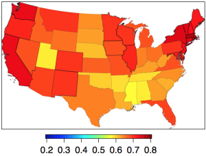
From Andrew Gelman, who is passing along research by some Columbia political scientists, the estimated support, by state, for the Employment Nondiscrimination Act, a gay rights bill that the US Senate will be voting on this Monday.

nondiscr


US Senators are elected by, and theoretically represent, their  state as a whole. The bill has majority support in every state, well over 60% in most states. It’s not clear whether it will pass.

Part of the problem is multilevel democracy: to be a Senator, you have to be selected as a candidate as well as winning the election. And the people who vote at the preselection stage (primary elections, in the US) average more extreme than those who vote in the election.  The more levels of selection you need, the worse the problem gets: Tim Gowers (prompted by the US government shutdown) does the mathematician thing and derives the extreme case. And the problem is exacerbated by the fact that politicians aren’t as knowledgeable about the views of their electorates as they think are.

November 3, 2013

Visualising 7 million

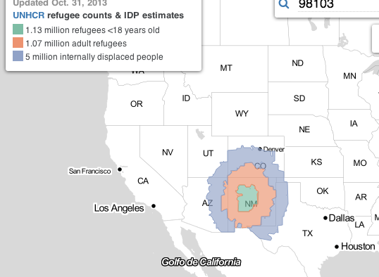
Syria has a million child refugees, a million adult refugees, and about 5 million ‘internally displaced persons’. What does that look like?

Al Jazeera News has an interactive map of the USA to demonstrate: click on a location and see an area around that point whose population is equal to the number of refugees. For example, Albuquerque, New Mexico, location of Breaking Bad, gives

refugee


In New Zealand, the 1 million child refugees corresponds to most of the population of urban Auckland. Adding the million adult refugees would expand to cover Northland and Waikato, and the total of seven million people corresponds to all of New Zealand, plus Samoa, Tonga, Fiji, the Solomon Islands, and more.

November 1, 2013

Global wine shortage?

The Herald has a story about a global wine shortage and its potential benefits for NZ producers. The story links to the Morgan Stanley report that it’s based on, and presents it well.

However (and you knew something like this was coming), Felix Salmon at Reuters has also written about the report, using more than just this one report as a source. Find out how the Organisation Internationale de la Vigne et du Vin numbers that show a modest and increasing surplus

turn into the Morgan Stanley numbers that show an increasing wine deficit

He also cites wine industry experts pointing out that the shortage story just doesn’t add up, and concludes

But never mind all that: the Morgan Stanley report has numbers and charts, and journalists are very bad at being skeptical when faced with such things. Even Finz’s Chronicle article, which sensibly poured cold water on the report, ends with a “Wine by the numbers” box which simply reproduces all of Morgan Stanley’s flawed figures. And besides, the debunkings are never going to go viral in the way that the original “wine shortage!” articles did.


Science journalism training

A new Australian website with information for journalists about good science journalism

The bulk of journalists entering undergraduate and postgraduate courses in journalism come from an arts and humanities background and can find reporting complex science stories a challenge.

To address this challenge, an expert working group—comprised of some of Australia’s top science journalists and science communicators—published a report in 2011 with recommendations to support journalists who report science. 

One of the recommendations in the report—Science and the media: From ideas to action—was to “Develop a unit on reporting research that can be incorporated into undergraduate journalism courses“.

The group felt that the accuracy of reporting on key science issues could be improved if journalists are given some basic training in reporting on research findings during their undergraduate degree. This could include training on how to assess the credibility of experts, understanding the peer review process and making sense of scientific reports and basic statistics. This training is applicable across a wide spectrum of news stories and would be beneficial for all journalists not just those wanting to work on a science round.

They currently have six modules:


(via the NZ Science Media Centre)

Why we need self-driving cars

From Stuff

The [product being advertised] survey, which involved 2034 participants, found that 11 per cent of drivers admitted to having sex while driving. Men were three times more likely to admit to participating in sexual activity than women .

Firstly, a little skepticism would be appropriate here.  Isn’t it just possible there’s something wrong with the survey? If you go and search for the press release, you find

This online survey is not based on a probability sample and therefore no estimate of theoretical sampling error can be calculated.

which is not encouraging. Also, the breakdown by age in the press release says the proportion who have ‘participated in sexual activity’ while driving is even higher, 17%, among 18-44 year olds. And flirting with a driver in a different car is apparently less common than having it off with a passenger in the same car.

I suppose I could just have led a very sheltered life. But if these figures are accurate you’d expect the AA to have noticed and to have a slightly different list of the top ten driving distractions. And surely it would be hard to have missed the salacious headlines whenever one of these couples caused an accident, which 5% of them report having done.

I’m not sure if it’s encouraging or discouraging that this is a  Fairfax story, not something from the Daily Mail.

Inflow and outflow

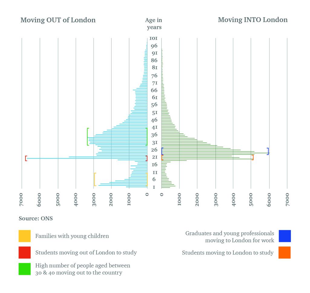
From a UK real estate ‘insight’ paper, via Twitter, the age distribution of London immigration and emigration

londonage


As a technical quibble, this is the sort of graph that shouldn’t be in JPEG format. It should be in PNG or GIF — you can easily the see artifacts produced by JPEG compression.

What matters about numbers in the news

From Felix Salmon at Reuters

Let’s say that you saw various news reports about an event, and that different words were used to describe the weather: some said it was “cold”, others “brisk”, others “frosty”, others “wintry”, and so on. You wouldn’t raise an eyebrow: you’d see that they were all describing the same thing, in slightly different language, and you wouldn’t demand an explanation for the “discrepancy”. Well, numbers in news articles behave like words: they’re trying to describe the state of the world. That’s why the NYT has banned the use of “record” or “largest” unless inflation is taken into account. What matters is not the mathematical relationship between abstract numbers, but rather the state of the world that is being described.

Go and read the whole thing.

October 31, 2013

A statistic for the Day of the Dead

Remember the shootings at Sandy Hook elementary school in Newtown, Connecticut last December?

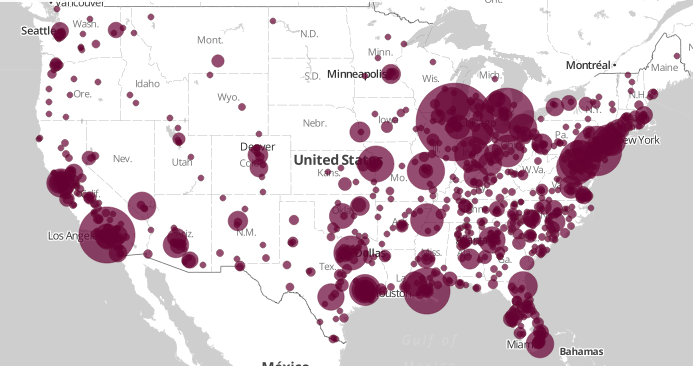
Since then, Slate magazine has been collecting news reports of gun deaths in the US. Here’s a map.

gundeaths


Actually, that’s a map of just the 1000 locations with the most deaths.

As of today, they have 10,001 deaths with the place and the name of victim known. That’s going to be an underestimate, since some don’t make the news. And since the number doesn’t include suicides, who make up about 60% of gun deaths in the US according to the CDC.  These mostly aren’t mass shootings, so they don’t attract international attention, but there are about as many gun deaths as car deaths in the US.

It’s not simply a matter of number of guns: the US has about 3.5 times the number of guns per capita as New Zealand, but about seven times the gun death rate per capita (nearly ten times the rate if you don’t include suicides).  It may be more that for a lot of people in the US, an important reason to own a gun is so that you would be able shoot another person with it if the circumstances arose. In a recent survey by Pew Research, 48% of gun owners gave self-protection as their main reason for owning a gun, and 79% said owning a gun made them feel safer. I can’t find figures for NZ, but I’d expect hunting and target shooting to be more common reasons here.

Scary lack of context

A number that should be in all stories about accidents on special days of the year: 4500.  That’s roughly how many new claims ACC gets per day: divide the 1.7 million per year by 365.

The Herald passes on the ACC’s figures of 31 Halloween-related injuries and 840 attributed to Guy Fawkes. First you have to divide by five, since these are aggregate totals over five years. Then divide by the average number of claims per day to find that Guy Fawkes Day is responsible for about 4% of a typical day’s injuries, and Halloween racks up about 0.1% of a day.

It wouldn’t be surprising if Halloween actually prevented more injuries than it causes — participating children will be doing something safe under adult supervision, rather than teasing innocent pets, fighting with siblings, getting underfoot in the kitchen, or participating in team sports.