Posts written by Thomas Lumley (2645)

avatar

Thomas Lumley (@tslumley) is Professor of Biostatistics at the University of Auckland. His research interests include semiparametric models, survey sampling, statistical computing, foundations of statistics, and whatever methodological problems his medical collaborators come up with. He also blogs at Biased and Inefficient

October 16, 2013

Briefly

October 15, 2013

Why we care

From the Medical Journal of Australia

Accurate health journalism helps Australian consumers make informed choices by exposing fraudulent or exaggerated claims about health products and services, by informing them about effective products and services, and by countering disease mongering. A well informed public is also vital to the proper functioning of a modern democracy; and in democratic countries like Australia where the state is a major funder of health services, it is particularly important that the public have accurate information…

While some health reporting in the mainstream media undeniably fails the test of accuracy, it has also been shown that reports about health interventions in the less sensationalist newspapers are more accurate and complete than reports in other media, including online news outlets.

Substitute as necessary for NZ.

(via @vincristine)

Briefly

  • Eric Crampton discusses a Gallup poll in the US which thinks >20% of the population is gay
  • At NBR, Horizon polling claims to have predicted the Auckland election most accurately. At least, after they changed which one of their numbers was supposed to be the prediction.  Basically, everyone got the winner right, and getting accurate results has to be pretty much luck given this is only the second election ever for mayor of the supercity.
  • From The Civilian, a nice send-up of bogus polls: “Stewart Island to be renamed Harry Styles as a result of online poll”
  • Census population counts for areas are now out.  Auckland is bigger. ChCh is only very slightly smaller, and Canterbury is bigger.

Nobel Prize for Statistics

Q: There isn’t a Nobel Prize for Mathematics, is there?

A: No

Q: I’ve heard that was because Nobel’s wife was having an affair with a prominent mathematician. Is that true?

A: Almost certainly not

Q: How can you be sure?

A: Various reasons. For a start, Nobel wasn’t married.

Q: Oh. Is there a Nobel Prize for Statistics?

A: No.

Q: Why not?

A: Various reasons. For a start, statistics hadn’t really been invented in 1895, when Nobel died.

Q: Do statisticians ever win Nobel Prizes?

A: Yes and no.

Q: How is that not a simple “yes” or “no”?

A: The Sverige Riksbank Prize in Economic Sciences in Memory of Alfred Nobel has often been given for statistical research. Opinions vary on whether this is a ‘real’ Nobel Prize.

Q: Can you explain how to pronounce that?

A: No.

Q: When was the most recent time it was given for statistics research?

A: Yesterday, to Lars Peter Hansen (together with two other people for non-statistical research)

Q: Can you explain in simple terms what he did?

A: I could try, but Jeff Leek at Simply Statistics has already done a reasonable job

October 14, 2013

Briefly

October 13, 2013

Think of a number and multiply by 80000

Bernard Hickey in the Herald

Imagine the public outrage if it were discovered that more than 80,000 New Zealanders were receiving wages, salaries and investment incomes of more than $6 billion a year, but were also receiving a benefit from the Government.

and

Income figures this week from Statistics NZ show more than 80,000 New Zealanders over the age of 65 receive wages, salaries and investment returns of more than $6.5 billion a year while claiming NZ Super.

It certainly helps to summon the outrage if you uses totals rather than averages. I  think there could be a reasonable case for means-testing NZ Super, but these numbers are not a contribution to informed public debate.

I’m not even sure where he got the data: he says “income figures this week from Statistics NZ”, and the only plausible source on the Stats NZ release calendar seems to be the NZ Income Survey, released on October 4. But in the NZ Income Survey data, table 8 says there are only 53,900 people aged 65+ with income above $1150/wk, which works out to just under $60000/year (including their NZ Super, of course).  His figures could still be right — perhaps the very wealthy people at the top drag the total up —  but they can only be right in the same sense as Bill English‘s “people earning under $110000 collectively pay no net income tax”.

Imagine the public outrage if it were discovered that nearly 54000 retired New Zealanders were earning over $45000/yr  from investments and salaries and still collecting NZ Super as well. Go on, imagine it.

October 10, 2013

Innovation and indexes

The 2013 Global Innovation Index is out, with writeups in Scientific American and the NZ internets, but not this year in the NZ press. Stuff, instead, tells us “Low worker engagement holds NZ back”, quoting Gallup’s ’employee engagement’ figure of 23% for NZ, without much attempt to compare to other countries.

The two international rankings are very different: of the 16 countries above us in the Global Innovation Index, 13 have significantly lower employee engagement ratings, one (Denmark) is about the same, and one (USA) is higher (one, Hong Kong, is missing because Gallup lumps it in with the rest of the PRC).  It’s also important to consider what is behind these ratings. If you search on  “Gallup employee engagement”, you get results mostly focused on Gallup’s consulting services — getting you to worry about employee engagement is one of the ways they make money.  The Global Innovation Index, on the other hand, came from a business school and was initially sponsored by the Confederation of Indian Industry  and has now expanded with wider sponsorship and academic involvement: it’s not biased in any way that’s obviously relevant to New Zealand.

With any complicated scoring system, different countries will do well on different components of the score.  If you believe, with the authors of Why Nations Fail,  that quality of institutions is the most important factor, you might focus on the “Institutions” component of the innovation index, where New Zealand is in third place. If you’re AMP econonomist Bevan Graham you might think the ‘business sophistication’ component is more important and note that NZ falls to 28th.

If you want NZ innovation to improve, the reverse approach might be more helpful: look at where NZ ranks poorly, and see if these are things we want to change (innovation isn’t everything) and how we might change them.


October 9, 2013

Bell curves, bunnies, and dragons

Keith Ng points me to something that’s a bit more technical than we usually cover here on StatsChat, but it was in the New York Times, and it does have  redeeming levels of cutesiness: an animation of the central limit theorem using bunnies and dragons

The point made by the video is that the Normal distribution, or ‘bell curve’, is a good approximation to the distribution of averages even when it is a very poor approximation to the distribution of individual measurements.  Averaging knocks all the corners off a distribution, until what is left can be described just by its mean and spread.  (more…)

Evils of axis

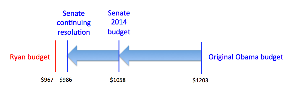
From the US shutdown, via @juhasaarinen: Senator Reid posted this chart showing how the Democrats have been willing to compromise

The axes are a problem, but not in the way you might initially think.  As a standard bar chart, this is missing the bottom 80% of the graph, but the point is to use the budget proposals from President Obama and Representative (and unsuccessful vice-presidential candidate) Paul Ryan as endpoints and illustrate how subsequent proposals have moved.  That is, the problem with the chart is that the Ryan budget should be all the way at the bottom.

Something that might display the message better (at least if redrawn by someone with a modest level of graphic design competence) is

compromise


explicitly using the two proposals as endpoints and showing the movement of the Democrats’ proposal.

Prediction is hard

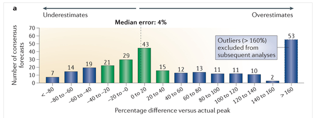
How good are sales predictions for newly approved drugs?

Not very (via Derek Lowe at  In the Pipeline)

Forecasts

There’s a wide spread around the true value. There’s less than a 50:50 chance of being within 40%, and a substantial chance of being insanely overoptimistic. Derek Lowe continues

Now, those numbers are all derived from forecasts in the year before the drugs launched. But surely things get better once the products got out into the market? Well, there was a trend for lower errors, certainly, but the forecasts were still (for example) off by 40% five years after the launch. The authors also say that forecasts for later drugs in a particular class were no more accurate than the ones for the first-in-class compounds. All of this really, really makes a person want to ask if all that time and effort that goes into this process is doing anyone any good at all.