Posts written by Thomas Lumley (2645)

avatar

Thomas Lumley (@tslumley) is Professor of Biostatistics at the University of Auckland. His research interests include semiparametric models, survey sampling, statistical computing, foundations of statistics, and whatever methodological problems his medical collaborators come up with. He also blogs at Biased and Inefficient

October 9, 2013

Briefly

imp-pie


  • Rachel Kumar is a data scientist who tests fitness trackers:  she still says “it’s unclear how you use this data. I know if I’ve been active or not, and the histograms don’t tell me anything else.” 
  • Algorithms: “They have biases like the rest of us. And they make mistakes. But they’re opaque, hiding their secrets behind layers of complexity. How can we deal with the power that algorithms may exert on us? How can we better understand where they might be wronging us?” by Nicholas Diakopoulos.
  • An example: according to a new rating of Faculty Media Impact, MIT’s top department is Sociology. MIT doesn’t actually have a sociology department.
October 8, 2013

100% protection?

The Herald tells us

Sunscreen provides 100 per cent protection against all three types of skin cancer and also safeguards a so-called superhero gene, a new study has found.

That sounds dramatic, and you might wonder how this 100% protection was demonstrated.

The study involved conducting a series of skin biopsies on 57 people before and after UV exposure, with and without sunscreen.

There isn’t any link to the research or even the name of the journal, but the PubMed research database suggests that this might be it, which is confirms by the QUT press release. The researcher name matches, and so does the number of skin biopsies.  They measured various types of cellular change in bits of skin exposed to simulated solar UV light, at twice the dose needed to turn the skin red, and found that sunscreen reduced the changes to less than the margin of error.  This looks like good quality research, and it indicates that sunscreen definitely will give some protection from melanoma, but 100% must be going too far given the small sample and moderate UV dose.

I was a also bit surprised by the “so-called superhero gene”, since I’d never seen p53 described that way before. It’s n0t just me: Google hasn’t seen that nickname either, except on copies of this story.

Death rate bounce coming?

A good story in Stuff today about mortality rates.

A Ministry of Health report shows while death rates are as low as they have even been since mortality data was collected, men are far more likely to die of preventable causes than women.

Heart Foundation medical director Professor Norman Sharpe said it is a gap that will continue to widen as a “new wave” of health problems caused by obesity start showing up in the statistics.

The latest mortality data, gathered from death certificates and post-mortem examinations, shows there were 28,641 deaths registered in New Zealand in 2010.

While the number of actual deaths is increasing, up 8 per cent since 1990, this was because of a growing and ageing population.

Death rates overall have dipped about 35 per cent, meaning statistically we are more likely to survive to a ripe old age.

There aren’t any of the problems I complained about in last year’s story on this topic: there’s a clear distinction between increases in rates and the impact of population size and aging, and the story admits that the problems with preventable deaths it raises are projections for the future.

While on this topic, I will point out a useful technical distinction between rates and risks.  Risks are probabilities; they don’t have any units and are at most 100%. Lifetime risks of death are exactly 100%, and are neither increasing nor decreasing.  Rates are probabilities for an interval of time; they do have units (eg % per year). Rates of death can increase or decrease, as the one death per customer is spread out over shorter or longer periods of time.

October 7, 2013

Caricatures in language space

There’s an interesting (and open-access) paper in the journal PLoS One that I would have expected to attract more media attention both for its results and for its visualisations.

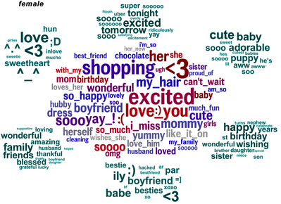
The researchers looked at words that distinguished people by age and gender (or, to be precise, what they had told Facebook were their age and gender). Here’s the female half of the graphic showing male/female distinguishing words (the full image, here, ‘contains language’)

facebook-gender


The clump in the middle are the words that are the most effective evidence that the writer is female. That doesn’t mean these words are especially frequent in women’s Facebook posts, just that they are much less frequent in men’s posts. The green clumps are the most-distinguishing topics, as identified statistically, with the words that define those topics.

Analyses like this are bound to come up with results that look like a caricature, since they are obtained in much the same way that a caricature is drawn, by finding and highlighting the most extreme and distinctive aspects.

Briefly

  • There’s not as many of you as we thought: the new Census figures are out with the total population. There will be no new Maori-roll electorate, but the North Island will get a new general-roll electorate. Fortunately, the NZ redistricting procedure is very boring, compared to, say, Pennsylvania. Election nerds are reduced to arguing about the potential impact on electorates such as Epsom.
  • All the more-interesting results from the Census are still to come: here’s their release timetable
  • The US did not get its monthly unemployment figures last month, because the Bureau of Labor Statistics is shut down. Pew Research has a list of the other data the government won’t be releasing
  • A couple of articles from the online magazine Nautil.us: one on statistics in the courtroom (US-oriented, but still interesting) and one on coincidences.
  • Almost coincidentally, James Curran is giving a public lecture this Thursday, 7pm, on forensic statistics: his professorial inaugural lecture.  Everyone welcome.
October 5, 2013

Living and mowing

From 3News tonight, spoiling a story that was otherwise accurate and reasonable (if one-sided).

A new bridge in the Auckland suburb of Bayswater cost the Auckland Council $2.5 million. It would be about the same to bridge the gap between the minimum wage and a living wage for council staff.

The bridge is a one-off cost; the wage increase is an annual cost. This isn’t a sensible comparison.

Given the preoccupations of the Auckland media this week a better comparison would be to the $3 million quoted as the savings for not mowing the berms in the old Auckland City area (especially as these savings are presumably achieved partly by not paying the type of contractor who currently gets less than the ‘living wage’).

I refer the Honorable Member to the answer given some moments ago

There’s an interesting story in Stuff today about an increased risk of death in people who drink lots of coffee. One of the interesting things about it is that the Herald has the same story about two weeks ago. And when I say “the same story”, I mean almost word for word the same AAP story.  I wasn’t convinced then (neither was Andrew Gelman), and it hasn’t gotten any more convincing.

The other interesting thing about the story is that the research paper was published in Mayo Clinic Proceedings. “What’s interesting about Mayo Clinic Proceedings?”, you ask, having never heard of it.  That’s my point. There are some scientific journals whose press releases you’d expect the media to monitor, and you’d expect to see stories about research papers with popular appeal. Mayo Clinic Proceedings is not really one of those journals, and it isn’t clear how this research came to the attention of AAP.

October 3, 2013

People who bought this theory also liked…

An improved version of study that Stuff and StatsChat reported on more than a year ago has now appeared in print. The study found that people who have non-standard beliefs about the moon landings or Princess Diana’s death are also likely to have non-standard beliefs about climate change or health effects of tobacco. It improves on the previous research by using a reasonably representative online survey rather than a sample of visitors to climate debate blogs.

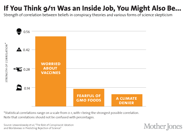
Mother Jones magazine in the US summarised some of the results in this graph of correlations

conspiracies6_2


That’s a horrible graph partly because, contrary to what the footnote says, correlations are not in fact restricted to be between 0 and 1, but between -1 and 1: and in fact the three correlations shown were negative in the research and have been turned around for more convenient display.

The title is misleading: only one of the six `conspiracist ideation’ questions was about 9/11, and it wasn’t a yes/no question, and it wasn’t really about it being an inside job (ie, performed by the government), but about the government allowing it to happen. In the same way, the other three variables aren’t simple yes/no questions, but scores based multiple questions, each on a 5-point scale.

A more-technical point is that correlations, while appropriate in the paper as part of their statistical model, aren’t really a good way to describe the strength of association.  It’s easier to understand the square of the correlation, which gives the proportion of variability in one variable explained by the other.  That is, the conspiracy-theory score explains about 25% of the variation in the vaccine score,  just over 1% of the variation in the GM Foods score, and just under 1% of the variation in the climate change score.

(via @zentree)

October 2, 2013

Cough, choke, history

If the PubMed research database is still surviving the US government shutdown, you can read a paper published 63 years ago today on lung cancer

In England and Wales the phenomenal increase in the
number of deaths attributed to cancer of the lung provides
one of the most striking changes in the pattern of

mortality recorded by the Registrar-General. For example,
in the quarter of a century between 1922 and 1947 the
annual number of deaths recorded increased from 612 to
9,287, or roughly fifteenfold. This remarkable increase is,
of course, out of all proportion to the increase of population

Some people were arguing that the increase was just due to better diagnosis of lung cancer, and even  those who believed in a real increase weren’t sure of the reason

Two main causes have from time to time been put forward:
(1) a general atmospheric pollution from the exhaust

fumes of cars, from the surface dust of tarred roads, and
from gas-works, industrial plants, and coal fires; and
(2) the smoking of tobacco.

Richard Doll and Austin Bradford Hill decided to compare histories of smoking in lung cancer patients and those in hospital for other reasons. As you know, they found that the lung cancer patients were much more likely to be heavy smokers. It’s also interesting to read what other possibilities they considered, and how they tried to rule them out.

This sort of study isn’t completely definitive, and, famously, the eminent statistician and geneticist (and heavy smoker) R. A. Fisher was never convinced. He thought that genetic factors might well be responsible. Further evidence was provided by experiments in animals (such the ‘smoking beagles‘ of Duke University) showed that smoking really could cause cancer. Also, much more recently, studies of twins and studies that actually measured genotypes showed that genetic differences weren’t a big enough contributor to lung cancer to explain the correlation.

In contrast to, say, alcohol or opium, tobacco has been a public health problem only for about a century: tobacco smoking became very widespread in men during the first world war. With a bit of effort and some luck, future generations might see it as an inexplicable historical anomaly, like a deadly version of canasta.

Data journalism links

The Data Journalism handbook online

This book is intended to be a useful resource for anyone who thinks that they might be interested in becoming a data journalist, or dabbling in data journalism….

Lamentably the act of reading this book will not supply you with a comprehensive repertoire of all if the knowledge and skills you need to become a data journalist. This would require a vast library manned by hundreds of experts able to help answer questions on hundreds of topics. Luckily this library exists and it is called the internet. Instead, we hope this book will give you a sense of how to get started and where to look if you want to go further. Examples and tutorials serve to be illustrative rather than exhaustive.

And one of the additional resources on the internet: Cathy O’Neil’s On Being a Data Skeptic.