Posts written by Thomas Lumley (2645)

avatar

Thomas Lumley (@tslumley) is Professor of Biostatistics at the University of Auckland. His research interests include semiparametric models, survey sampling, statistical computing, foundations of statistics, and whatever methodological problems his medical collaborators come up with. He also blogs at Biased and Inefficient

October 1, 2013

Making up numbers

Bob Jones, in the Herald

But although the offenders are male, 99.999 per cent of men are not rapists and feel just as outraged as women do about it.

He’s obviously just pulled that number out of his head (or somewhere else round and inappropriate), since it would imply only about 20 male rapists in New Zealand. About 20 times that number were convicted and sent to prison just last year for sexual assault or aggravated sexual assault.

A lot of men have a hard time believing that rape is as common as it is — either because they can’t imagine doing it, or because they do it and don’t think it’s rape. But there are good-quality high response-rate surveys showing that lots of women have been raped, and if only a tiny minority of men are rapists, they have to be very busy.

Bob Jones is off by at least three, and quite likely more than four orders of magnitude. That must be close to a record.

(update)

September 30, 2013

For advertising purposes only

Bogus polls are only useful for advertising, but as long as they are honest about it, that’s not a problem.

As a meritorious example, consider Forest & Bird’s Bird of the Year poll, which starts today. It exists to raise awareness of NZ birds and to get stories in the media about them, but it’s not claiming to be anything else.

At the time of writing, the kereru, ruru, and albatross were tied for first place. They’ve got more security to prevent multiple voting than the newspapers do — you can only vote once per email address — but it’s still just a self-selected poll of a tiny fraction of the population.

Radio NZ science broadcaster Allison Ballance is lobbying for the albatross, which is an excellent choice, but the only official StatsChat advice is to watch out for the penguins.

September 28, 2013

Gambling at 19-1

The IPCC report is out. We know the earth has been getting hotter: that’s just simple data analysis. The report says

It is extremely likely that more than half of the observed increase in global average surface temperature from 1951 to 2010 was caused by the anthropogenic increase in greenhouse gas concentrations and other anthropogenic forcings together. The best estimate of the human induced contribution to warming is similar to the observed warming over this period. 

Here, “extremely likely” is defined as 95-100% confidence. Since we (fortunately) don’t get a long series of potential climate catastrophes to average over, the probabilities have to be interpreted in terms of (reasonable) degrees of belief rather than relative frequency, which can be made concrete by equivalents to investment or gambling.

That is, the panel concludes no-one should be betting against a human cause for climate change unless they get better than 19-1 odds (and possibly much better, depending on where in the 95-100% range they are).  Suppose we have an opportunity to reduce greenhouse gas concentrations, which will cost $20 million, and that the money is completely wasted if the climate models are basically wrong, but which will bring in $21 million, for a $1 million profit, if the models are basically right. The evaluation as “extremely likely” means we should take these opportunities.  Investments that have, say, a net loss of $10 million if there isn’t anthropogenic warming and a net saving of $1 million if there is, are very good value.  For mitigation efforts, the odds are even more favourable: the world unquestionably has been warming, so mitigation is likely to be worthwhile even if the reason isn’t CO2.

I don’t think current policies are anywhere near the 19-1 threshold. I’d be surprised if a lot of them even made sense  if the climate was offering even money.


September 27, 2013

Nuclear warming?

From the Guardian, some time ago

Jeremy Clarkson had a point – and that’s not something you hear me say every day (indeed, any day) – when in a recent Sun column he challenged the scientists […] who had described a slab of ice that had broken away from Antarctica as “the size of Luxembourg”.

“I’m sorry but Luxembourg is meaningless,” said Clarkson, pointing out that the standard units of measurement in the UK are double-decker London buses, football pitches and Wales. He could have added the Isle of Wight, Olympic-sized swimming pools and Wembley stadiums to the list.

These journalist units of measurements are useful only to the extent that they are more familiar and easily understood than the actual numbers.

From The Conversation, more recently, David Holmes begins

The planet is building up heat at the equivalent of four Hiroshima bombs worth of energy every second. And 90% of that heat is going into the oceans.

This image comes originally from John Cook, who writes
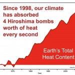
bomb

So I suggest a sticky way to communicate global warming is to express it in units of Hiroshima bombs worth of heat. This ticks all the sticky boxes:

  • It’s simple – nothing communicates a lot of heat like an A-bomb.
  • It’s unexpected – whenever I explain this to audiences, their eyes turn into saucers. Almost noone realises just how much heat our climate system is accumulating.
  • It’s concrete – nobody has trouble conceptualising an A-bomb. Well, much of the younger generation don’t know about Hiroshima – when I test-drived this metaphor on my teenage daughter, she asked “what’s Hiroshima?”. But it’s easily recommunicated as an atomic bomb.
  • It tells a story – the idea that second after second, day after day, the greenhouse effect continues to blaze away and our planet continues to build up heat.
  • The only downside of this metaphor is it is emotional – the Hiroshima bomb does come with a lot of baggage. However, this metaphor isn’t used because it’s scary – it’s simply about communicating the sheer amount of heat that our climate is accumulating. I’ve yet to encounter a stickier way of communicating the scale of the planet’s energy imbalance.

I think he’s wrong about the  downside.  The real downside is that the image of Hiroshima has nothing to do with heat production.  The Hiroshima bomb was important because it killed lots of people, many of them civilians, ended the war, and ushered in the age of nuclear weapons where a small number of military or political leaders had the ability to destroy industrial civilisation and kill the majority of our species (which nearly happened, 30 years ago today).

If we set off four Hiroshima-scale bombs per second, global warming would become a relatively unimportant side issue — and in fact, nuclear weapons are much more widely associated with nuclear winter.

You could also invoke public health concerns and describe the heat accumulation as equivalent to everyone in the world smoking seven cigarettes per second (1185 cal/cig: data). That would be wrong in the same ways.

Displaying uncertainty

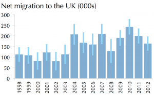
Currently making the rounds of the Internet, a barchart that animates to show uncertainty, from Oliver Hawkins. The basic data are on immigration to the UK, and a traditional way to show the uncertainty (if you were going to both) would be with error bars. Click on the image to go to the animated version.

uncertainty-bar


Those of you who are NZ high-school teachers or students may recognise this idea from Chris Wild’s Visual Inference Tools

How many deaths would be prevented by lowering the blood alcohol limit to 0.08%?

Well, obviously, none. The limit is already 0.08%.

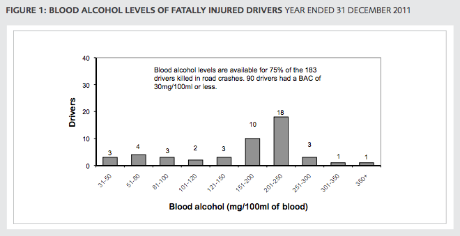
However, there are still deaths caused by people who drive over the limit.  From crash data for drivers only, in 2011, there were a lot more crashes where the driver was above 0.08% than between 0.05% and 0.08%, and a larger fraction of these will have been caused by alcohol rather than just being coincident with alcohol.

bac


Just as lowering the limit 0.08% prevented some, but not all, crashes where the drivers were above 0.08%, lowering the limit to 0.05% would prevent some, but not all, crashes where the driver is above 0.05%.

The Herald says

Alcohol Healthwatch director Rebecca Williams said the statistics clearly showed 20 people would still be alive if the Government had responded to calls for a lower alcohol limit.

which seems completely indefensible.

I don’t have any personal stake in the 0.08% limit — I don’t have a car and can afford taxis. And I’m not denying the real dangers of drink driving: according to estimates from NZ data the risk at 0.08% is about three times that at 0.05%.  But it’s dishonest to assume that all deaths where the driver was over 0.05% would be eliminated by the change, and to pretend there are no costs from the change.  We should be arguing this using the best available estimates of the benefits and costs.

And if you think the costs are irrelevant because there’s no limit on the value of a life, what about all the other ways to save lives? There are plenty of competing options, even if you think it’s only New Zealand lives that are valuable.


September 25, 2013

Just one poll

A recurring point on StatsChat is that single election polls don’t have a large enough sample size to track short-term changes in opinion. Some form of averaging is necessary.

The excuse for pointing this out again is the Herald-Digipoll result with an increase of 6.8% since the previous poll in June. Since the poll has a 3.6% margin of error for a single estimate, its margin of error for changes is about 5%, so 6.8% is quite impressive.

On the other hand, Danyl Mclauchlan just tweeted a nice interactive plot of aggregrated poll results. I can’t embed it because WordPress is scared of SVG graphics, but the key chunk is here and you can click for the interactive plot

polls


The highlighted points are past Herald-DigiPoll results, and there is indeed a big jump since June, but there’s almost no change since March. This poll seems to have given more variable results for Labour than the other polls do.

The conclusion: it’s too early to tell whether the change of management at Labour has affected opinion. But it’s probably more than a year until the election. We can wait a few weeks for the polls.


[Update: I’m apparently wrong about the excess variability in the Labour results, according to Peter Green on Twitter. Statisticians can overinterpret numbers just as much as the next guy]

[Further update: Twittering establishes that all the obvious suggestions for potentially-better ways to smooth the data have been tried.]

Briefly

  • Big Data and Due Process: fairly readable academic paper arguing for legal protections against harm done by automated classification (accurate or inaccurate)
  • The Herald quotes Maurice Williamson on a drug seizure operation

“The harm prevented from keeping these analogues away from communities has been calculated at $32 million,” Mr Williamson said.

Back in 2008, Russell Brown explained where these numbers come from. As you might expect, there is no reasonable sense in which they are estimates of harm prevented. They don’t measure what communities should care about.

  • Levels of statistical evidence are ending up in the US Supreme court. At issue is whether  a press release claiming that a treatment”Reduces Mortality by 70% in Patients with Mild to Moderate Disease” is fraud when the study wasn’t set up to look at mortality and when the reduction wasn’t statistically significant by usual standards.  Since a subsequent trial designed to look at mortality reductions convincingly failed to find them, the conclusion implied by the press release title is untrue, but the legal argument is whether, at the time, it was fraud.
  • From New Scientist: is ‘personalised’ medicine actually bad for public health?


—ing margins of error

A bit of background, for non-computer people.  Sensible programmers keep their programs in version-control systems. Among other things, these store explanatory messages for each change to the code.  In a perfect world, these messages would be concise and informative descriptions of the change. Our world is sadly imperfect.

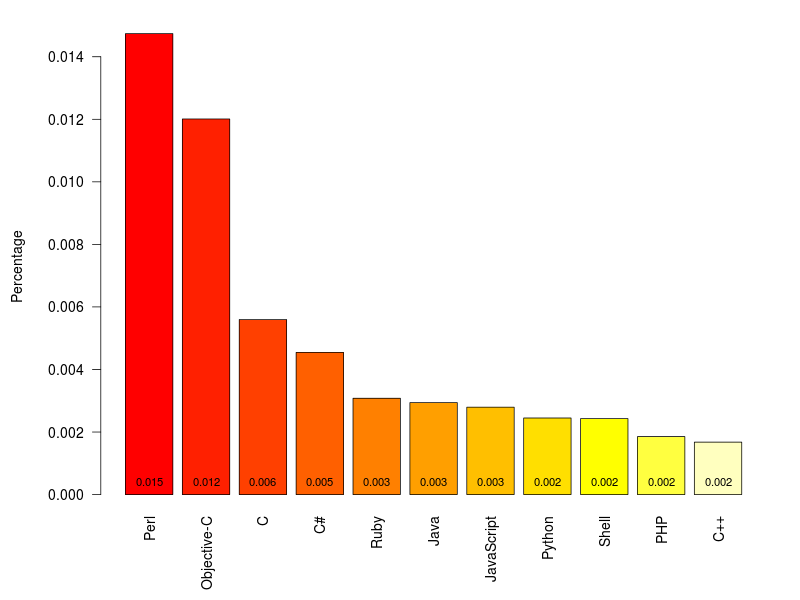
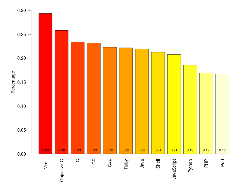
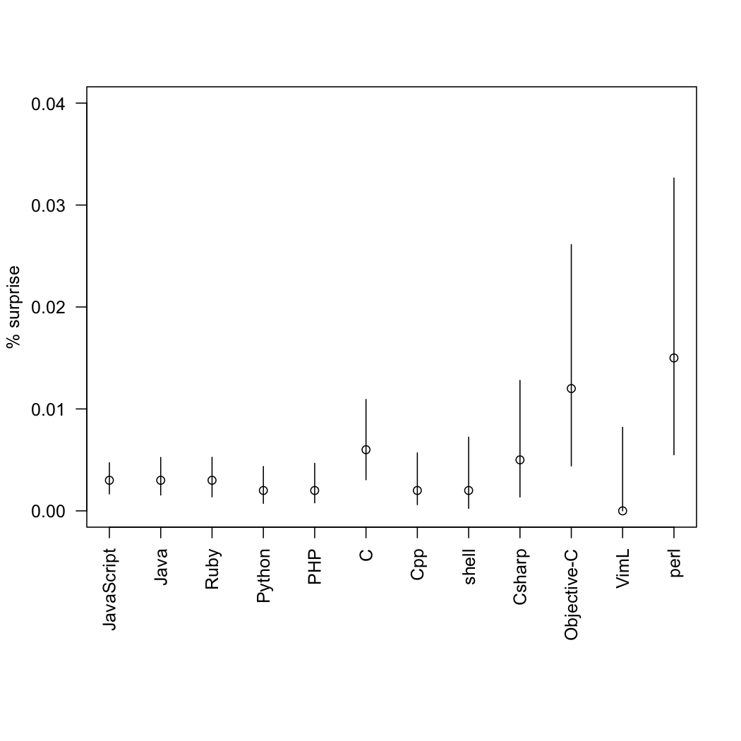
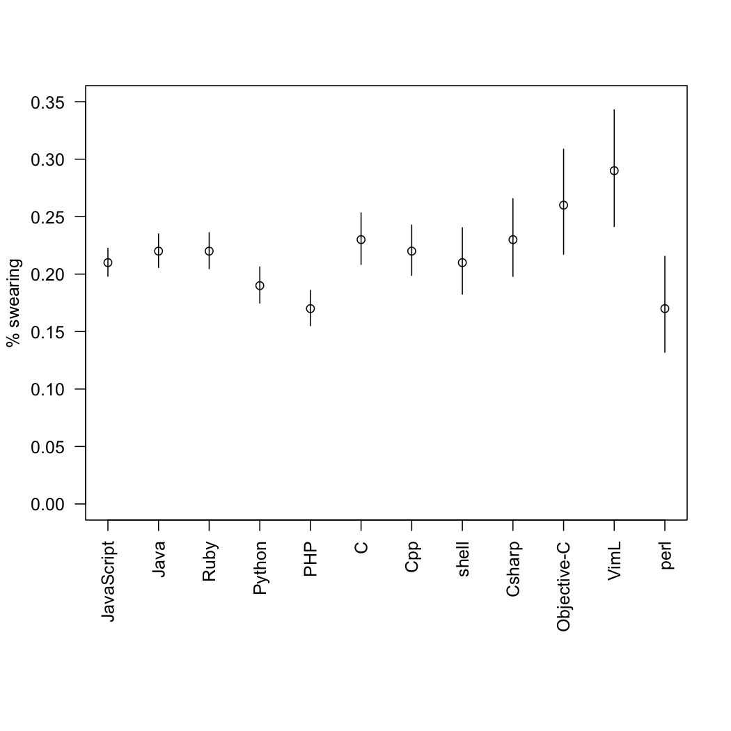
Ramiro Gomez has worked through the archives of change messages on the largest public version-control site, github, to look for “expressions of emotional content”, such as surprise and swearing, and divided these up by the programming language being used. Programmers will not be surprised to learn that Perl has the highest rate of surprise and that the C-like languages have high rates of profanity. If you want to find which words he looked for, you’ll have to read his post.

git-bar-surprisegit-bar-swearing


He notes

Even though a minimum of 40,000 samples per languages seemed adequate to me (I wanted to include Perl), different sample sizes result in varying accuracy, which is a problem and a bit like comparing apples and oranges. Statisticians will probably deny any value of such an approach, still I think it can serve to develop some hypotheses.

Statisticians have no problem with varying sample sizes, but we would like uncertainty estimates.  That’s especially true for the ‘surprise’ category, where the number of messages is very small.

So, as a service to programmers of an inquiring disposition, here are the proportions with confidence intervals. They are slightly approximate, since I had to read the sample sizes off the graph.

git-surprisegit-swearing


(via @TheAtavism and @teh_aimee)

September 24, 2013

Student-friendly radar charts

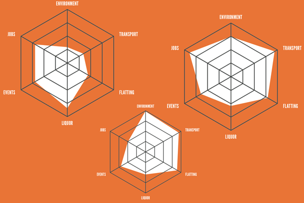
The Critic, the student magazine of Otago, has an interesting feature on the council elections, rating the candidates on six issues determined by polling to be important to students. One of the ways they present the candidate ratings is with radar plots

radar-critic


These show the rating for each of the issues on six radial axes, connected to form the white polygon.  Candidates who are more ‘student-friendly’ on these issues will end up with larger polygons, and the different shapes show that there are significant tradeoffs between, say, a candidate who is in favour of drinking and (quality) loud music, and one who is sound on environment and transport.

This is a pretty good use of radar plots. Their main limitations are that the ordering of the axes can have a big effect on the visual impression, and that evaluating tradeoffs quantitatively is hard. Neither is a really serious limitation here, and both are problems common to many ways of displaying multivariate data.

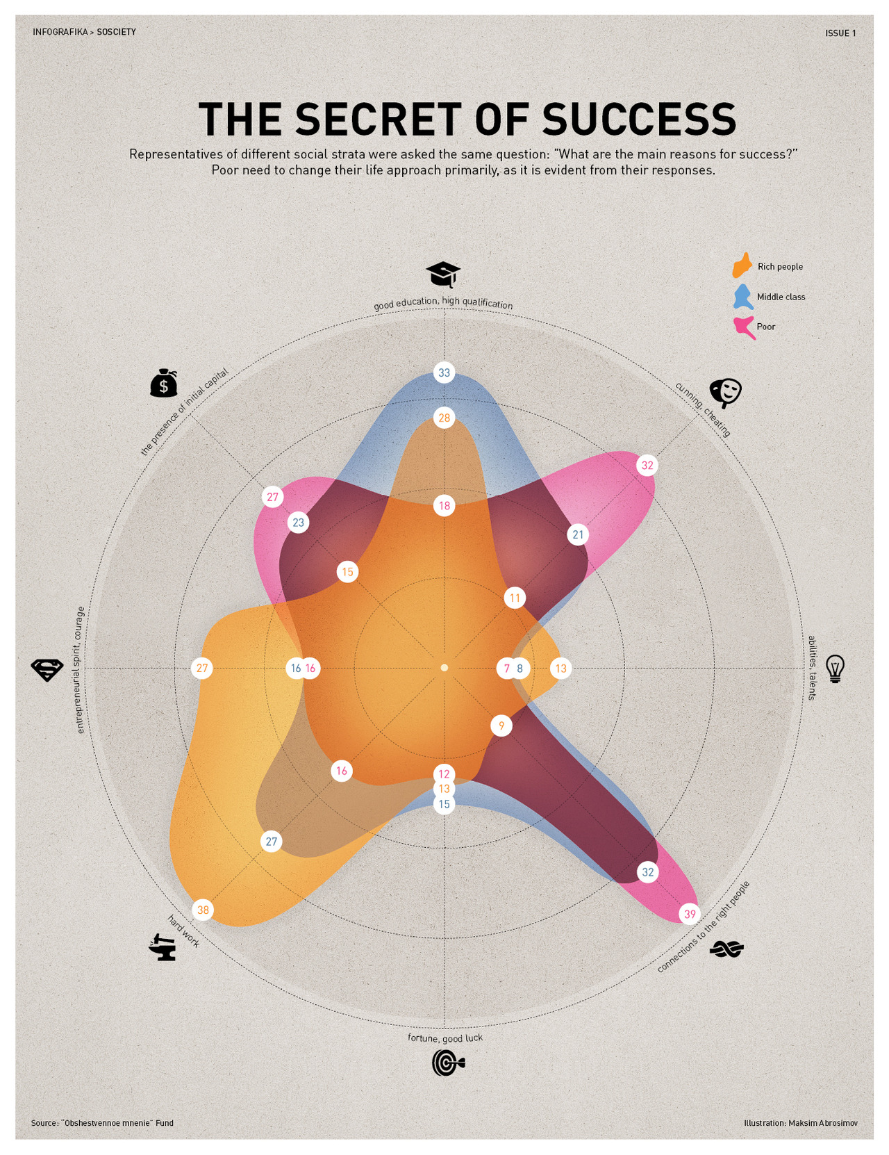
Here’s another radar chart, originally from INFOGRAPHIKA magazine, rescued from its unfair banishment to wtfviz.net.

radio-success


This one shows how people rated the importance of eight factors in success, split up by their income.  It’s interesting to see how much higher  connections, initial capital, and cheating were rated as important by the poor, and how the rich thought hard work was the key factor, not being very impressed even by education.   It’s clear that each group likes the story that makes them look good; less clear who is more correct.  What’s a bit depressing is how small a role anyone thinks is played by luck.