Posts written by Thomas Lumley (2645)

avatar

Thomas Lumley (@tslumley) is Professor of Biostatistics at the University of Auckland. His research interests include semiparametric models, survey sampling, statistical computing, foundations of statistics, and whatever methodological problems his medical collaborators come up with. He also blogs at Biased and Inefficient

September 23, 2013

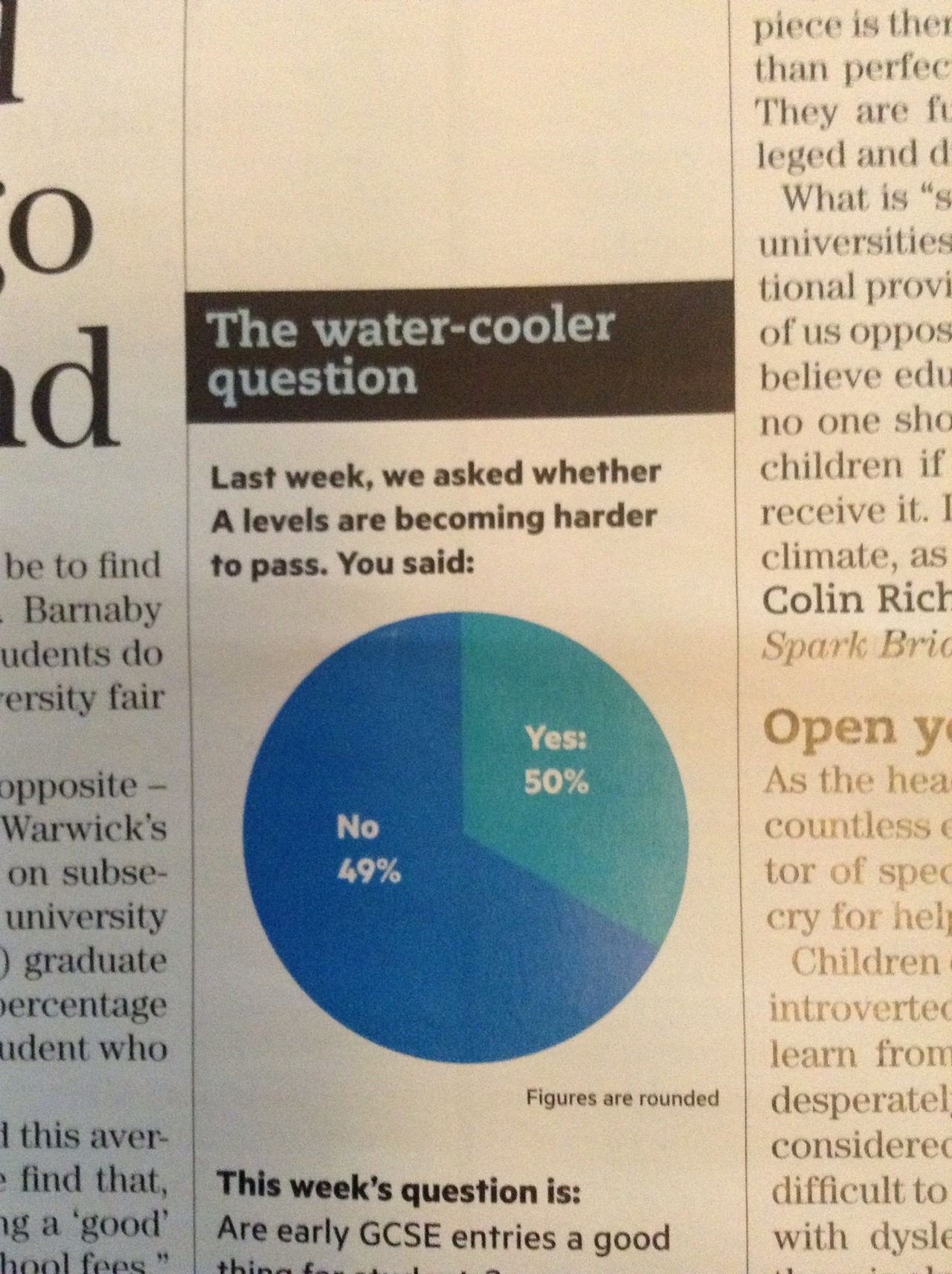
Unclear on the pie chart concept

The pie-chart problems that Melbourne’s Herald-Sun had with their bogus polls appear to be spreading. This one is from wtfviz.net (via @TimHarford), and apparently comes from Britain’s TES magazine.

tespie

I suppose it’s encouraging that this sort of thing seems only to happen for bogus polls, not for actual data.


Real estate data visualisation

Det Mackey suggested we look at Grieg’s Hamilton and their graphs.

Some of these are quite good.

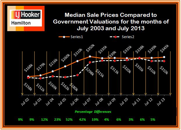
For example, this one shows how median sale price and CV change over time. The increase of sale price relative to government valuation in the boom is clear, as is the lack of increase since then.  Also, the variations in the median CV would give some idea of the extent to which differences in median price are due to changes in which houses are selling, versus changes in how much they are selling for.  The lack of a legend on the two series is a bit unfortunate, but it’s pretty obvious which is which. A graph like this would improve a lot of the newspaper stories about real estate prices.

CV-v-MS-July-2002-2013-3

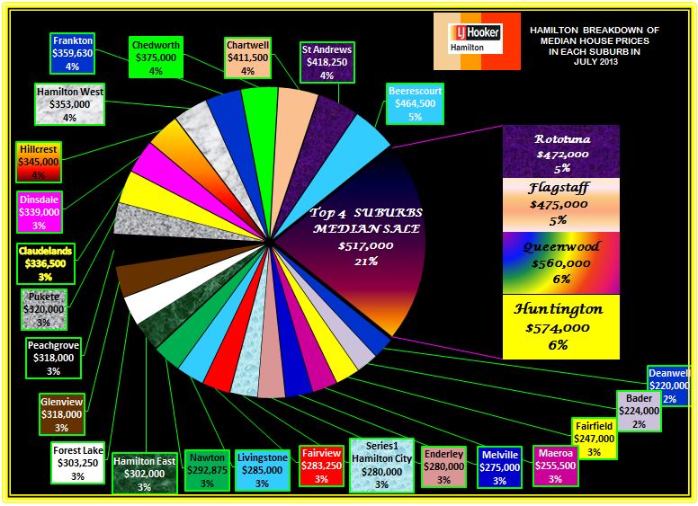
This graph, on the other hand, I think is supposed to show a comparison of median sale price across suburbs.  Apart from aesthetic objections, it doesn’t really work because median sale prices by suburb are not components of a total in any meaningful way, so the ‘pie’ metaphor isn’t doing any useful work.

Suburban-Median-Prices-July-2013


The other graphs on the site fall somewhere in between: they convey information, but often in ways that could have been more effective.


September 22, 2013

Briefly

  • Careers: The number of people getting statistics degrees in the US has doubled in the past five years (and they’re still able to get jobs)
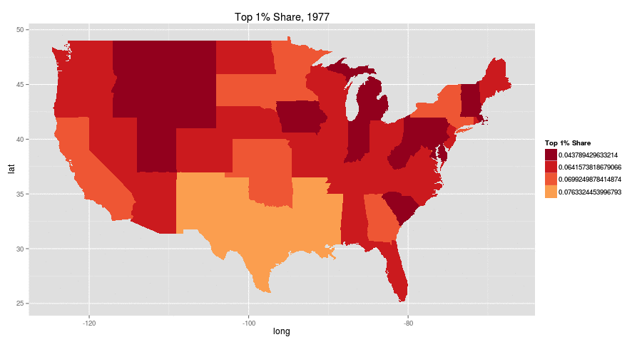
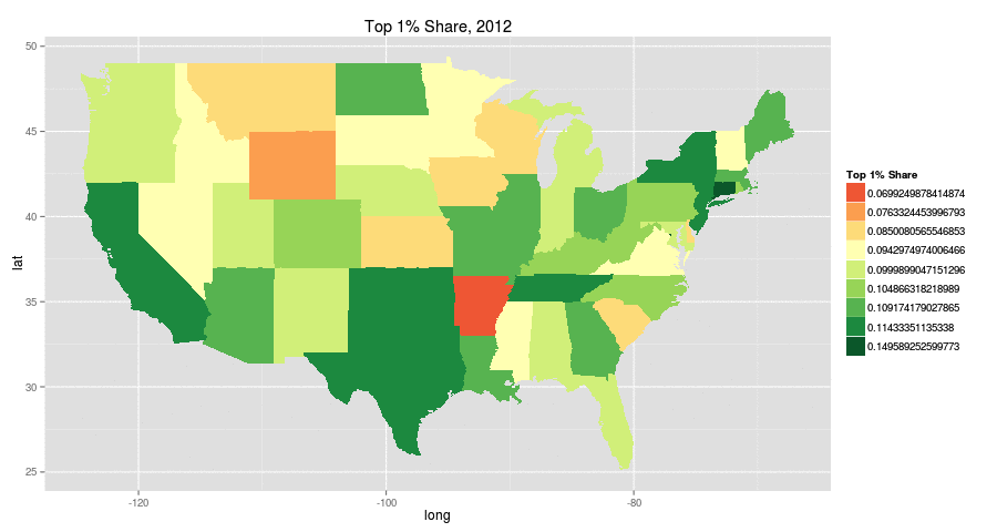
  • Increasing inequality in the US from 1977 to 2012 (it happens in other places too): top 1% share of income.  The colour choice is a bit unfortunate (red: more equal, green:less equal). There are animated pictures and more inequality measures in the original

aqzaxe9-1aqzaxe9

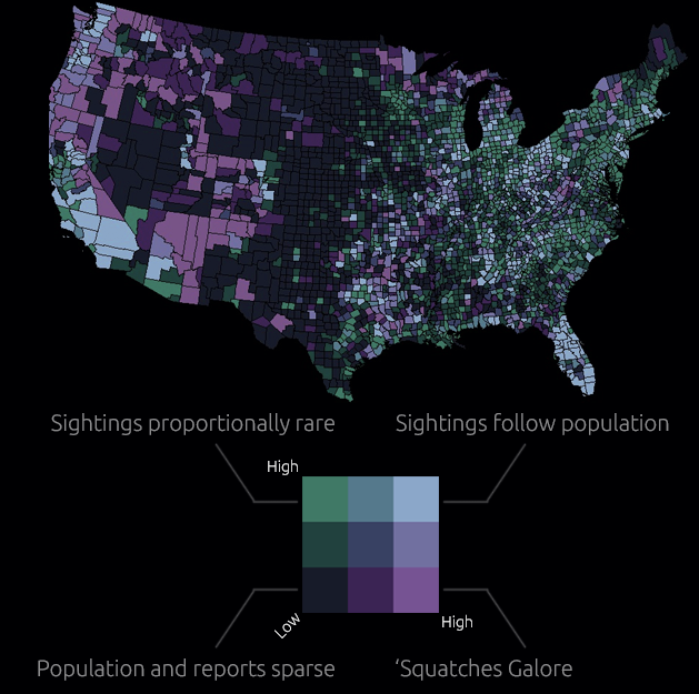
  • Map of sasquatch sightings in the US. The original has all the sightings as well as this map cross-referenced with population density. Remember, just because you can measure it doesn’t mean it exists

sasquatch

  • Software for drawing data-based maps: CartoDB. Has both free and paid versions.  Worth a look if you do maps.
September 21, 2013

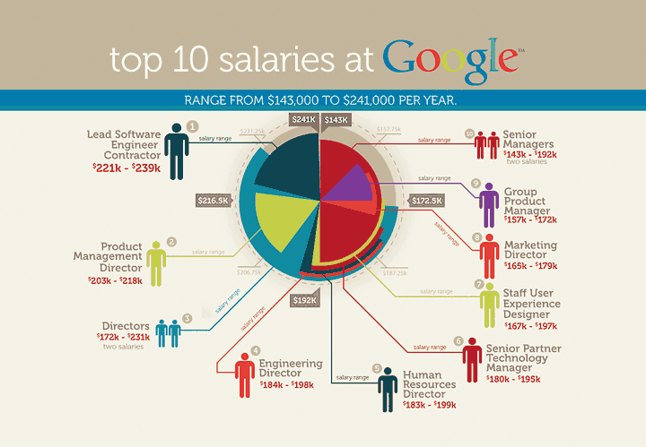
Pie chart of the week

Originally from jobvine.co.za, via a Harvard Business Review piece on data visualisation, this graph is supposed to show salary ranges for different positions.

from jobvine.co.za


It really doesn’t.  Read the HBR story for a better version.

September 19, 2013

It depends who you ask

The NZ Herald 

Privacy concerns are leading to “virtual identity suicide” with large numbers of Facebook users deleting their accounts, according to new scientific research.

A study investigating the phenomenon identified privacy as the biggest reason people are turning against the social network giant.

The new scientific research (not linked, journal not named)

The primary source for our convenience sample of Facebook quitters was the Website of the online initiative Quit Facebook Day. On this Website, Facebook users had the possibility to announce their intention to delete their account on May 31, 2010, which was declared as the Quit Facebook Day.

And what was the point of Quit Facebook Day?

In our view, Facebook doesn’t do a good job in either department. Facebook gives you choices about how to manage your data, but they aren’t fair choices, and while the onus is on the individual to manage these choices, Facebook makes it damn difficult for the average user to understand or manage this. We also don’t think Facebook has much respect for you or your data, especially in the context of the future.

So, how surprising is it that Quit Facebook Day quitters are more concerned about privacy than people who keep using Facebook?

Silver Ferns’ secret weapon

From One News NZ, a story about Bobby Wilcox, the team’s performance analyst, who has a PhD in Statistics from our department

She’s been one of the Silver Ferns most integral members for nine years, yet she’s largely anonymous outside…


[the video comes with a very annoying ad, sadly]

Petitions and polls

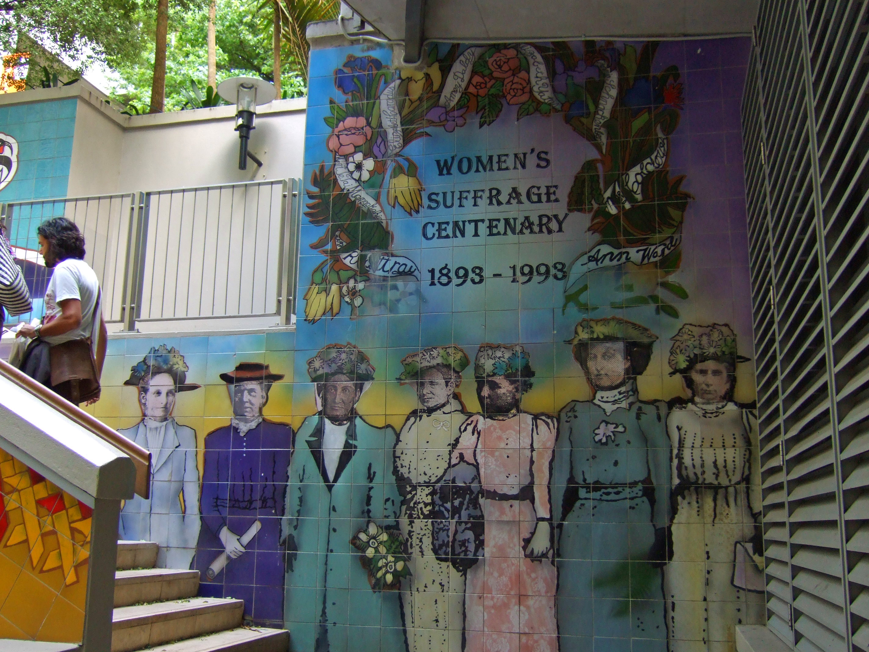
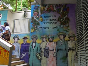
Today is the 120th anniversary of women’s suffrage in New Zealand, with commemorations in a range of places, including the Centenary fountain in Khartoum Place, Auckland
Khartoum_Place2


The petition for women’s suffrage, signed by about 24000 women, was submitted to Parliament in July 1893
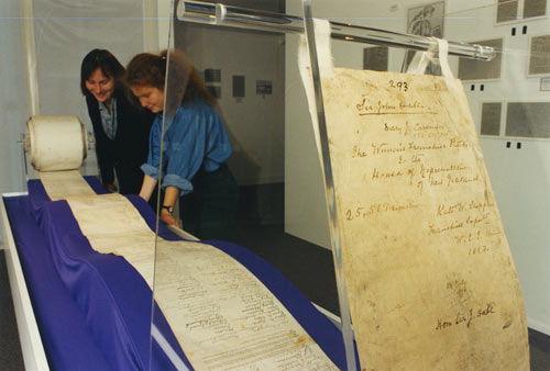
and the names of the petitioners have been digitised and made available at New Zealand History Online.

I haven’t been able to work out exactly what the adult female population of NZ was at the time, but the digital yearbook says that there were 305287 non-Maori females, that 30.94% were married and 4.11% widowed, and that there were 67000 never-married females 15 and older.  Depending on how many of the never-married 15+ were 21 or older, this gives perhaps 150000, so about 16% of the non-Maori adult female population signed the petition. That compares to modern petitions with about 2.4% of voting-age people opposing marriage equality and about 10% for the anti-asset-sales petition (though these are targeting the entire NZ voting population, not just women).

Presumably, rather more than 16% of women were in favour of getting the right to vote, but it’s always difficult to track people down and get them all to sign.  In 1893 there wasn’t an alternative: sampling hadn’t been invented, and would likely have been impractical  — certainly, calling random phone numbers wouldn’t have got you very far.

Today, we have much more accurate ways of estimating the proportion of people who support some government action. Petitions, like demonstrations, are mostly useful for signalling to the government that some issue they weren’t  aware of is actually important.  For example, the petition against animal testing for legal highs would have been effective to the extent that the government wasn’t aware people cared about the issue. For anyone who was aware this was a political issue, a well-conducted opinion poll would be more informative and should be both less expensive and more effective than a petition.

Referendum petitions, as in New Zealand and some parts of the US, are an example of this principle: if an issue can get the support of 10% of the NZ voting population, it’s probably important enough to be worth serious consideration and debate.  The threshold is weaker in many places. For example, in California a petition need only get 5% of the number of people who voted in the last election for state governor, which currently comes to under 2% of the adult population.

Briefly

  • An interactive graphic showing variation as well as trends in unemployment in the US. From eager eyes
  • Some people just can’t do simple mathematical computations, but  for those that can, they can easily be distracted by political bias. Grist describes a nice experiment by psychologist Dan Kahan and colleagues
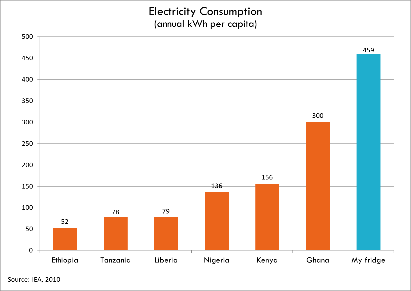
  • Your refrigerator uses more power than many people in AfricaElectricity-consumption-Todd-Moss
September 18, 2013

Probably overselling it

The Herald has a story about hazards of coffee. The picture caption says

Men who drink more than four cups a day are 56 per cent more likely to die.

which is obviously not true: deaths, as we’ve observed before, are fixed at one per customer.  The story says

It’s not that people are dying at a rapid rate. But men who drink more than four cups a day are 56 per cent more likely to die and women have double the chance compared with moderate drinkers, according to the The University of Queensland and the University of South Carolina study.

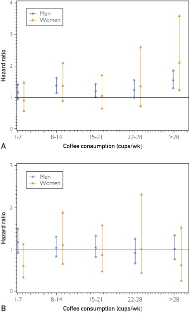
What the study actually reported was rates of death: over an average of 17 years, men who drink more than four cups a day died at about a 21% higher rate, with little evidence of any difference in men.  After they considered only men and women under 55 (which they don’t say was something they had planned to do), and attempted to control for a whole bunch of other factors, the rate increase went to 56% for men, but with a huge amount of uncertainty. Here are their graphs showing the estimate and uncertainty for people under 55 (top panel) and over 55 (bottom panel)

FPO-1


There’s no suggestion of an increase in people over 55, and a lot of uncertainty in people under 55 about how death rates differed by coffee consumption.

In this sort of situation you should ask what else is already known.  This can’t have been the first study to look at death rates for different levels of coffee consumption. Looking at the PubMed research database, one of the first hits is a recent meta-analysis that puts together all the results they could find on this topic.  They report

This meta-analysis provides quantitative evidence that coffee intake is inversely related to all cause and, probably, CVD mortality.

That is, averaging across all 23 studies, death rates were lower in people who drank more coffee, both men and women. It’s just possible that there’s an adverse effect only at very high doses, but the new study isn’t very convincing, because even at lower doses it doesn’t show the decrease in risk that the accumulated data show.

So. The new coffee study has lots of uncertainty. We don’t know how many other ways they tried to chop up the data before they split it at age 55 — because they don’t say. Neither their article nor the press release gave any real information about past research, which turns out to disagree fairly strongly.


September 17, 2013

What you’re not paying for medicines

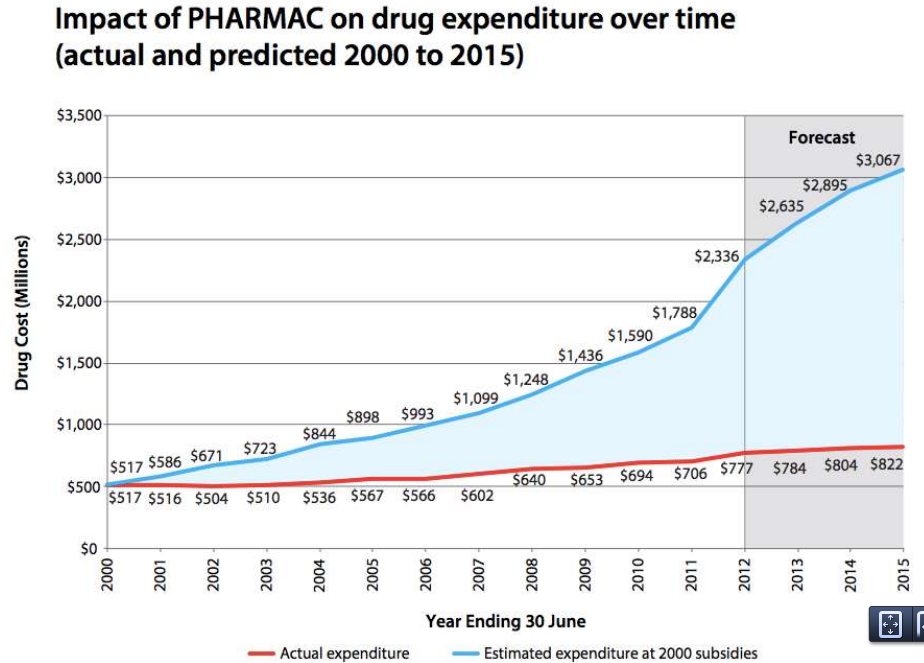
From Pharmac’s annual report for 2012 (via @sudhvir), a graph comparing actual government expenditure on subsidised drugs (red) with what would be projected under pre-Pharmac subsidy policies (blue)

BUVq0j2CEAAlYtj


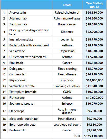
This table from the report shows some of how this was done. It shows the twenty drugs on which the most money was spent

top20


Many of these are new (any drug whose name ends in ‘b’ is likely to be new), but they are mostly drugs that are genuinely better, at least for a subset of patients, than the alternatives.  The top of the list, atorvastatin, lowers cholesterol more effectively than the cheaper simvastatin. It’s the best selling drug of all time, but in New Zealand is used only in a relatively small set of  people whose cholesterol doesn’t go down enough on simvastatin. Adalimumab was a breakthrough in serious rheumatoid arthritis, and trastuzumab is the revolutionary breast cancer treatment sold as Herceptin.

Further down the list, candesartan is a blood pressure drug that can be used in people who have side-effects with some other blood pressure drugs. In Australia, candesartan and its relatives are used very widely; here they are used only when other drugs are insufficient or not tolerated.

Pharmac isn’t perfect, and I think it’s underfunded, but it does a very good job of getting most of the benefit of modern pharmaceutical medicine at a very low price.