Posts written by Thomas Lumley (2645)

avatar

Thomas Lumley (@tslumley) is Professor of Biostatistics at the University of Auckland. His research interests include semiparametric models, survey sampling, statistical computing, foundations of statistics, and whatever methodological problems his medical collaborators come up with. He also blogs at Biased and Inefficient

September 15, 2013

Sometimes you don’t need to do the maths

On Friday, Stuff had a story about 10 pairs of twins in the same school in Wellington.

At this point I was going to break out the Stats New Zealand website and find out how many pairs of twins of school age there are in the country, and work how many schools you’d expect to have these sorts of numbers.  But when I went back to search for the story I found

  • A Herald story from last September, with 14 sets of twins in a Dunedin school
  • A Stuff story from last October, with 4 sets, in Timaru
  • A Stuff story from April, with 9 sets, in Manurewa
  • A Stuff story from June, with 3 sets in the same class, Palmerston Nth
  • A Stuff story from August, with 5 sets of twins and two of triplets, in Timaru

That’s just the past year, since the stories go on back in the past, and even stretch to other countries: a Stuff story from June was about 24 sets of twins in an Illinois school.

At some point it must be hard to keep pretending this is a surprise.
 

Briefly

crop-nautilus-rx

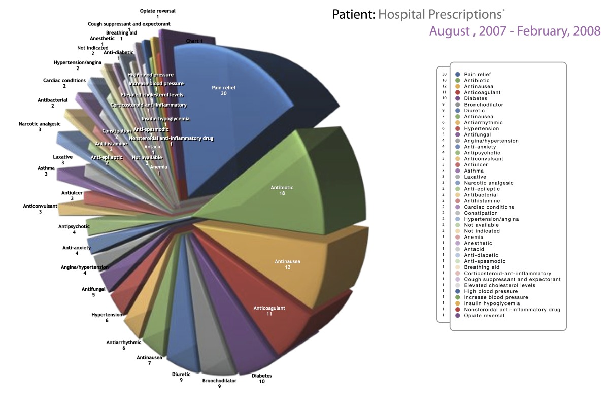
To be fair, the purpose of the chart probably is just to look ugly and complicated, not to convey quantitative information

  • A fascinating statistic: 1/3 of emergency calls (111 number) are due to pocket dialing from mobile phones. Since nearly 50% are real, that means Kiwi butts are responsible for twice as many calls as pranks and cranks.
September 14, 2013

Not how election polls work

The Dominion Post has a story (via @LewSOS) on the Wellington mayoral elections.

John Morrison is leading incumbent Celia Wade-Brown in the race for the Wellington mayoralty, according to a poll of Dominion Post readers.

Mr Morrison, who has been a city councillor for the past 15 years, had support from 27 per cent of the 635 readers surveyed last week – while Ms Wade-Brown trails on 17 per cent.

They don’t say how the survey was done — it’s not clear how you would get a representative sample of Dominion Post readers.  For all we can tell, it might just be a bogus poll.  It’s also not clear, on this topic, why Dominion Post readers are even the population you would want, since the story continues

Of those surveyed, 275 were eligible to vote in the Wellington City Council elections.

You’d at least expect that the voting preferences would be broken out by eligibility.

Sadly, no.

September 13, 2013

How dangerous are weddings?

According to the Herald, the ACC wants us to be careful about weddings — about getting injured at them, that is.

Weddings are supposed to be the happiest day of your life – try telling that to the hundreds of people who make ACC claims for injuries at ceremonies.

From tripping on the bride’s dress to swallowing the ring, nuptials can be surprisingly hazardous.

New figures show at least 600 people made claims to the ACC between 2010 and 2012.

So, how does the 600 claims over three years compare to what you’d expect from an average day?

The ACC accepted 1.7 million new claims last year, which gives about 0.4 claims per person per year, or about 0.001 per person per day.

There were about 20 000 marriages in New Zealand last year, so about 60 000 over 2010-2012, giving about 0.01 ACC claims per marriage.  The 600 reported claims would then be about what you’d expect if there were 10 person-days of exposure per marriage.

My experience is that wedding celebrations typically involve more than ten people, and, with setup and rehearsals, often more than one day.  It looks as though weddings, like Christmas, are actually safer than ordinary days.

What we die of

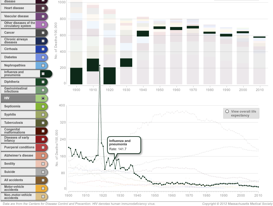
An interesting piece in Slate on longevity (via @juhasaarinen).  Unlike the typical story using life expectancy, it’s by someone who seems to understand what it means. There’s also an interactive graph of how causes of death have changed over time, which is notable for having the best use of a creative y-axis scale I’ve seen in a long time.

If you look at ‘influenza and pneumonia’, there is a general decrease with a dramatic spike in 1919. It’s so dramatic that it pops out of the top of the lower panel and spikes into the upper panel. This is the famous Spanish Flu pandemic — the same  rate in today’s New Zealand would mean over 25000 deaths.  Fortunately the three flu pandemics we’ve had since then have all been much less nasty.

flu


It’s also worth noting that nearly all the decline in infections as a major cause of death happened before antibiotics became widely available in the mid-1940s. That’s the reason I’m not really convinced that antibiotic resistances is going to kill us all, though it’s certainly worth avoiding.


Stats on Radio NZ

Last night’s edition of Our Changing World had two segments by University of Auckland statisticians called James.

Allison Ballance and James Russell talked about seabirds and rat eradication


Ruth Beran and James Curran talked about forensic statistics


Briefly

From this morning’s Twitter feed

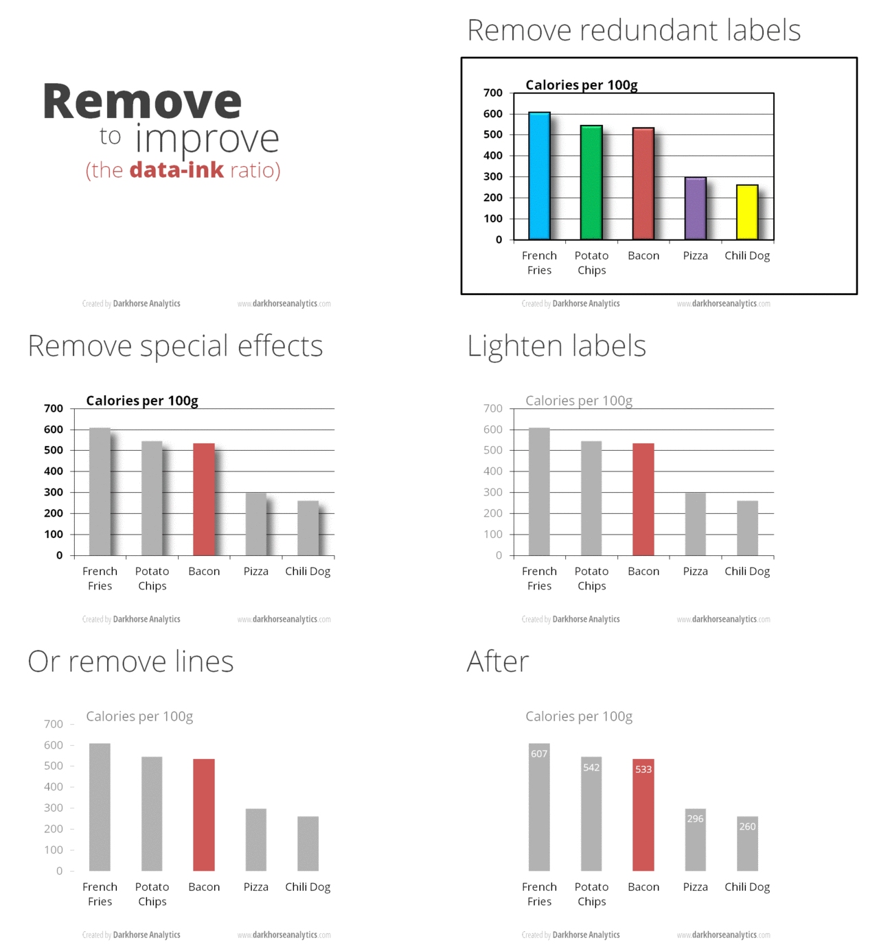
  • An animated GIF (click on it to wake it up) showing how to improve a barchart by removing junk. [from Darkhorse Analytics: Data looks better naked]

data-ink


  • Data journalism: how the data sausage gets made.  Jacob Harris describes how he collected and summarised data on meat recalls in the US
  • The Royal Statistical Society has repeated the simple maths test they gave politicians last year, this time for senior professionals and managers. Less than half of them could give the probability of getting two heads from tossing two coins.
  • However, the same Royal Statistical Society news item ends “The figures have been weighted and are representative of all GB adults (aged 18+)”. This seems to me to fall in the “not even wrong” category. The target group aren’t remotely representative of all British adults, and I’d be surprised if it was even possible to reweight them to the national age distribution.
  • Cathy O’Neill (mathbabe.org) asks why rankings of eg, cars or universities don’t allow the user to change priorities for different attributes (as the OECD Better Life Index does, for example)
September 12, 2013

Rape survey

The Herald had a story on Tuesday about a UN survey of men in nine areas in Asia/Oceania asking about rape and violence against women.  The story is pretty good, and actually has links to the articles in the medical journal Lancet.

Because of the wide publicity and the large scale of the survey I think it’s worth nailing down some of the details to make it harder to dismiss.  (more…)

September 11, 2013

Lottery calculations

Even so often, one of the NZ lottery jackpots gets to be unusually large and we see an increasing stream of search engine hits from people looking for ways to win.

Via @mapcaptenor, here’s an analysis of the USA’s Powerball lottery, with the conclusion

The one sentence takeaway: no matter how big the jackpot gets, you should only buy Powerball tickets for their entertainment value.

In fact, an economics argument can get you this conclusion much more easily. All the facts you have about the lottery are available to pretty much anyone in the country, as is the opportunity to buy tickets. Unless you think you are one of the top handful of smartest investors in New Zealand, you should assume that other people will draw the same conclusion as you about whether it’s worth buying tickets. If you think it’s worth buying, so will quite a lot of other people, and collectively you’ll buy up enough tickets to ensure that the expected benefit falls to nearly zero.


Was Göring a good father?

The Herald, like many other news sources worldwide, has picked up on a paper in the Proceedings of the National Academy of Sciences. Like the other glamorous top science journals, PNAS publishes some top-level science, and also some that is perhaps not quite up to the standard.

The story says that men with smaller testicles make better fathers, based on a fairly weak correlation in a relatively small sample of new fathers. As Dr Isis points out, this sample only included 9 dads who did more childcare than the mothers.

If you look at the paper (which you can’t, unless you have a subscription), you find that there was a moderately strong relationship between testosterone levels in the blood and the ‘parenting quality’ questionnaire. When the researchers compared men with similar levels of testosterone and similar working hours, there was no correlation between testicle size and parenting, but if testosterone and hours at work were ignored there was fairly weak evidence of a correlation between testicle size and parenting.  (The researchers presented their evidence using p-values, with p=0.08 , not up to usual standards. I think it would be unconvincing with other ways of measuring evidence as well)

The Discussion section of the paper starts out

Collectively, these data provide the most direct support to date that the biology of human males reflects a trade-off between mating and parenting effort.  

which is, apparently unintentionally,  a pretty damning criticism.

Oh, the post title? Anyone old and British should be able to explain it