Posts written by Thomas Lumley (2645)

avatar

Thomas Lumley (@tslumley) is Professor of Biostatistics at the University of Auckland. His research interests include semiparametric models, survey sampling, statistical computing, foundations of statistics, and whatever methodological problems his medical collaborators come up with. He also blogs at Biased and Inefficient

April 26, 2013

Life expectancy doesn’t mean that

Tony Cooper has nominated a Bloomberg statistic (being reprinted in NZ) on life expectancy for Stat of the Week.

The `Sunset Index‘ purports to be the average number of years of life after you stop working, with figures ranging from 23.44 for Singapore to 1.49 for Nigeria. New Zealand is somewhere in the middle, with an index of 15.98.  It really isn’t credible that Nigerians who leave the workforce at age 50 die an average of 18 months later, so what have they done wrong?

Bloomberg have calculated life expectancy at birth, and subtracted the retirement age, but if you reach retirement, you’ve already avoided dying for a long time.  The life expectancy at retirement could be quite different from life expectancy at birth.  Since this difference is likely to vary between countries, the `Sunset Index’ won’t even be correct in relative terms.

So, how bad does it get?  If you look at life expectancy data for Nigeria you see that, indeed, life expectancy at birth is about 50 years, but that life expectancy at age 50 is 70.7 years for men and 72.6 for women. The true `Sunset Index’ value would be about 21, and Bloomberg are off by a couple of decades.

The error is less severe in other countries: infant and child mortality has a big impact on life expectancy at birth,  and in Nigeria about one child in seven dies before age 5. Here are a few corrected values for the Sunset Index

  • Singapore: 25
  • Nigeria: 21
  • Iran: 21
  • New Zealand: 20
  • USA: 16.5
  • Bangladesh: 13

The US is near the bottom of the corrected index because it combines a late retirement age (by Bloomberg’s definition — full Social Security eligibility) with only moderately good life expectancy.
April 25, 2013

Internet searches reveal drug interactions?

The New York Times has a story about finding interactions between common medications using internet search histories.  The research, published in the Journal of the American Medical Informatics Association, looks at search histories containing searches for two medication names and also for possible symptoms.  For example, their primary success was finding that people who searched for information on paroxetine (an antidepressant) and pravastatin (a cholesterol-lowering drug) were more likely to search for information on a set of symptoms that can be caused by high blood sugar.  These two drugs are now known to interact to cause high blood sugar in some people, although this wasn’t known at the time the internet searches took place.

This approach is promising, but like so many approaches to safety of medications it is limited by the huge number of possibilities.  The researchers knew where to look: they knew which drugs to examine and which symptoms to follow. With the thousands of different medications, leading to millions of possible interacting pairs and dozens or hundreds of sets of symptoms it becomes much harder to know what’s going on.

Drug safety is hard.

Infographic of the week

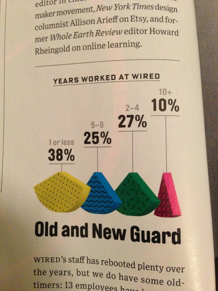
Every so often, someone comes up with a creative way to make pie charts less informative.  This week’s innovation comes to you from Wired magazine.

explodedpie

Note that it’s structured like a bar chart, except that all the `bars’ are the same height, and the wedges are turned at different angles, to make the widths harder to estimate.  The numbers are presented as if their heights mean something, but actually not.

There are also some subtleties to the design.  For example, at first glance you might think the left-to-right order of the wedges reflects the time period each one corresponds to, so that the fact they aren’t largest to smallest means something. Sadly, no.

(via @acfrazee and @kwbroman)

An exam with cheating allowed

Statistical decision theory is about making decisions in the presence of uncertainty. We can’t know everything, but we still need to make choices.  In decision theory we assume that the world isn’t out to get us — if cigarette smoke is toxic, it is so regardless of whether or not we study it, and whether or not we’re trying to stamp it out. Murphy’s Law is true, but only as an engineering design principle, not a fact about the malevolence of Nature.

Game theory is the evil twin of decision theory — it’s about making choices in the presence of competition, when the other players aren’t precisely out to get you, but they are out to do the best for themselves.  There are a few examples of game theory in medical statistics: how do you set up regulations so that making effective drugs is more profitable than making ineffective ones? how do you use new antibiotics, given that resistance will inevitably develop? Typically, though, game theory works best in ecology, where natural selection ensures that organisms behave as if they were trying to maximise their numbers of descendants given the behaviour of other organisms.

A UCLA professor teaching a course in behavioural ecology decided to try to make his students really appreciate the problems of cooperation and competition that arise in game theory:

A week before the test, I told my class that the Game Theory exam would be insanely hard—far harder than any that had established my rep as a hard prof.  But as recompense, for this one time only, students could cheat. They could bring and use anything or anyone they liked, including animal behavior experts. (Richard Dawkins in town? Bring him!) They could surf the Web. They could talk to each other or call friends who’d taken the course before. They could offer me bribes. (I wouldn’t take them, but neither would I report it to the Dean.) Only violations of state or federal criminal law such as kidnapping my dog, blackmail, or threats of violence were out of bounds.


April 24, 2013

Age-period-cohort

Stuff has a story using data from the NZ General Social Survey.  The data say that people 15-29 are more likely to feel lonely than older people.  The story says that this is a generational change caused by Facebook (they put it a bit less baldly, but that’s the message).

When you find differences between age groups, there are two broad classes of explanations. Epidemiologists call them “age” and “cohort” effects.  An age effect is actually due to age: teenagers today argue with their parents more than 40 year olds do, because that’s what teenagers are like.  Toddlers read less than adults, because they haven’t learned yet. When today’s teenagers get older they will argue with their parents less than they now do; when today’s toddlers get older they will read more than they now do.

Cohort effects are common to a group of people born at the same time.  For example, older New Zealanders are more likely to regard Anzac Day as very important, but we wouldn’t expect today’s teenagers to develop a greater appreciation for it as they get older.  Older people also, on average, have less formal education than 25-35 year olds, but again, todays young Bachelors and Masters graduates are not going to lose their degrees as they age.

So, is the difference in feelings of loneliness between 15-29 year olds and older people an age effect or a cohort effect?  Stuff seems pretty sure it’s a cohort effect — “Generation Net” — but the data say absolutely nothing one way or the other.  Since the NZ General Social Survey started in 2009, there isn’t enough historical data to answer the question, and the US General Social Survey (which has been going since 1972) doesn’t routinely ask a ‘loneliness’ question. The British Social Attitudes Survey, as is so often the case with UK publically-funded data collection, won’t let you see much without becoming a registered user.

There are good reasons to be skeptical about the cohort interpretation.  In 1995, well before social media, Robert Putnam wrote an essay, Bowling Alone, about a rapid decline in social connectedness in the US.  And in the 1920s, the Middletown studies blamed the same sort of changes on the new technologies of radio, film, and automobiles.

However tempting it is to say that the kids these days are different, you do actually need some evidence. More evidence than their constant facebooking and twittering, and showing no respect, and look at what they wear and their music is just noise and they need to get off your lawn.


[update: The Herald has a more balanced story]

April 23, 2013

When ‘self-selected’ isn’t bogus

Two opportunities for public comment that will expire soon, and where StatsChat readers might have something to say

  • Stats New Zealand wants to hear from people who use Census data.  They have a questionnaire on how you use the data, and how this might be affected if they change the Census in various ways. It’s open until Friday May 3
  • Public submissions on the new ‘legal highs’ bill close on Wednesday May 1.  The bill is here. You can make a submission here.  The Drug Foundation have a description and recommendations here

This sort of public comment is qualitative, rather than quantitative.  Neither the Select Committee nor Stats New Zealand is likely to count up the number of submissions taking a particular view and use this as a population estimate, because that would be silly.  What they should be aiming for is a qualitatively exhaustive sample, one that includes all the arguments for or against the bill, or all the different ways people use Census data.

April 22, 2013

Briefly

  • Roger Peng comparing the recent Excel Economics incident to an earlier case of scientific fraud in cancer bioinfomatics

One has to wonder if the academic system is working in this regard. In both cases, it took a minor, but personal failing, to bring down the entire edifice. But the protestations of reputable academics, challenging the research on the merits, were ignored. I’d say in both cases the original research conveniently said what people wanted to hear (debt slows growth, personalized gene signatures can predict response to chemotherapy), and so no amount of research would convince people to question the original findings.

April 19, 2013

Are Adam and Steve waiting out there?

Graeme Edgeler says on Twitter

I know many gay couples will want to marry quickly, but there *must* be a couple named Adam & Steve and we should totally let them go first.

Should we expect an Adam and Stephen couple? This is an opportunity to use public data and simple probability to get a rough estimate.

StatsNZ reported just over 5000 cohabiting male couples in 2006. That’s an underestimate of male couples, but probably an overestimate of those planning to marry soon.

I remembered seeing Project Steve, from the National Center for Science Education.  They collect signatures supporting the teaching of evolution from scientists named Stephen (after Stephen J. Gould) — they are currently up to 1268 — and make the point that under 1% of US males are named Stephen.

It turns out that they get this information from the US Census.  The most recent data is 1990 (and, of course, is US) so it’s not ideal, but it will give us a rough idea.  Stephen comes in at 0.54%, and when you add in Stephan, Esteban, Stefano, it still is no more than 0.6%.  Adam is 0.259%.

Under random assignment, then, there would be less than a 1 in 10 chance that there’s a couple called Adam and Steve living together in NZ, and even then they might well not be planning to get married.


[Update: Brendon correctly points out that I missed ‘Steven’, which is actually the most common variant. Apart from demonstrating that I’m an idiot, this doesn’t change the basic message.]

April 18, 2013

Briefly

chch

April 17, 2013

Visualising New York income inequality

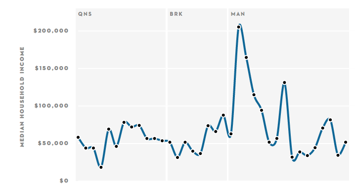
From the New Yorker, a set of graphs showing how median household income varies along each subway line, based on the census tract containing each station.

Here’s the graph if you take the A-train:

atrain

(via @brettkeller)