Posts written by Thomas Lumley (2645)

avatar

Thomas Lumley (@tslumley) is Professor of Biostatistics at the University of Auckland. His research interests include semiparametric models, survey sampling, statistical computing, foundations of statistics, and whatever methodological problems his medical collaborators come up with. He also blogs at Biased and Inefficient

April 4, 2013

Describing risk

From “Decision Science News”, a post on communicating risks to the general public (eg, in newspapers)

infogrid


They give a list of approaches to use less often (relative risks, single-event probabilities as fractions, conditional probabilities) and approaches to use more often (frequencies with an explicit reference group).

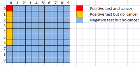
They don’t mention David Spiegelhalters ‘micromorts‘, or the useful `number needed to treat’ for describing screening or treatment probabilities, though the latter is implicit in their examples.  The picture above shows a hypothetical situation where you would need to screen 81 100 people, and have six false positive diagnoses, in order to have one true positive diagnosis. In terms of the traditional conditional probabilities  that’s a test with 100% accuracy in detecting cases  and better than 90% accuracy in detecting non-cases, which sounds much more useful than the situation revealed by the picture.

April 3, 2013

Infographic of the day.

Our only Prime Minister has tweeted an infographic of the new crime figures

key


In his defense, I will first concede that Mr Key is not regarded as an unbiased source of information, so he doesn’t have the same responsibilities that journalists do.

Still.

One of the basic and classical problems with representing numbers by pictures (apart from the choice of picture) is scaling.  The crime rate was 16% lower in 2012 than in 2008. The blue bottle is 16% smaller in every dimension than the red bottle.  If you just look at the size of the picture, the area of the blue bottle is nearly 30% smaller than the red bottle. If you take the visual metaphor seriously, these bottles have volume, and the volume of the blue bottle would be 40% smaller.

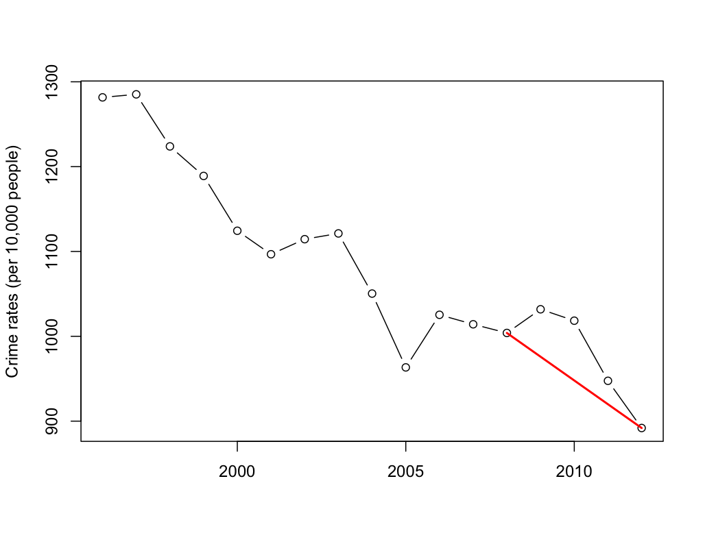
One of the other basic and classical problems discussed in books on misleading statistical graphics is picking two points out of a time series. Using data from Stats New Zealand, we can plot 17 years.

keygraph


Crime has been decreasing for a long time, at roughly the same rate.  Mr Key’s graph corresponds to the red line.

Briefly

Crime news vs crime data

If you actually look at the data, neither the Herald nor Stuff comes off well in today’s crime figure reports.  Stuff has the headline “Crime drop due to ‘tag and release'”, and it’s not until the third paragraph that they admit the ‘tag and release’ impact is on court workloads and has nothing to do with  number of crimes reported.  The Herald says

Crime is at its lowest level in 24 years but the percentage of offences that police solve is also dropping – less than half of all cases.

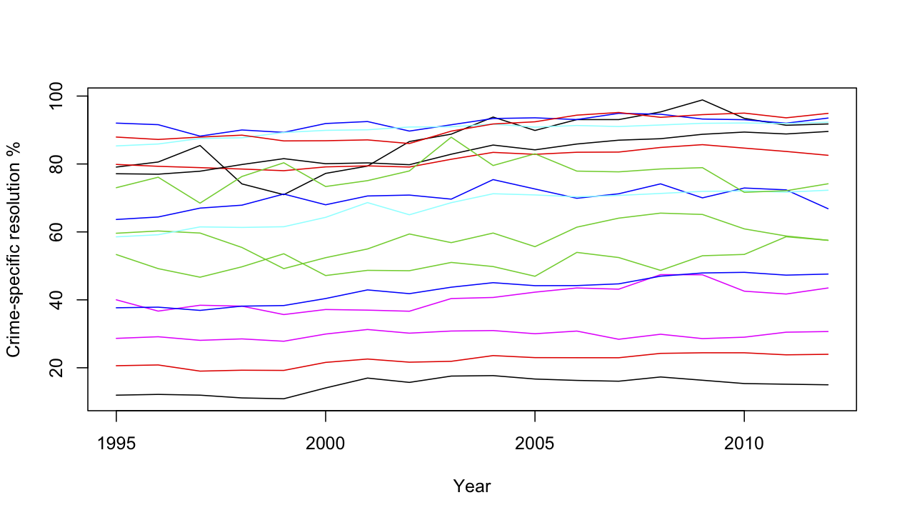
This is at least technically true, but the drop they are talking about is less than one percentage point, when the resolution rate differs between types of crime by about 90 percentage points. Even a small change in the relative numbers of different offenses would make a one percentage difference in overall resolution rate meaningless.  Here, using data from Stats New Zealand are the resolution rates for 16 categories of crime over the past 18 years.

crime-specific

I haven’t tried to label them all, but at the top are homicides, acts intended to cause injury, illegal drug offenses, and offenses against justice procedures and government operations.  The reasons vary:  the resolution rate for violent crimes is high because police put a lot of effort into solving them;  the rate is high for drug offenses because they aren’t usually reported except when the police discover them.  At the low end are burglary and unlawful entry, where the vast majority of cases are never resolved.  If anyone is trying to sell you a policy based on a small change in the average of these, without accounting for variation in proportions, you should keep a firm grip on your wallet.

Against that background, what does the trend in resolution rate look like?

overall


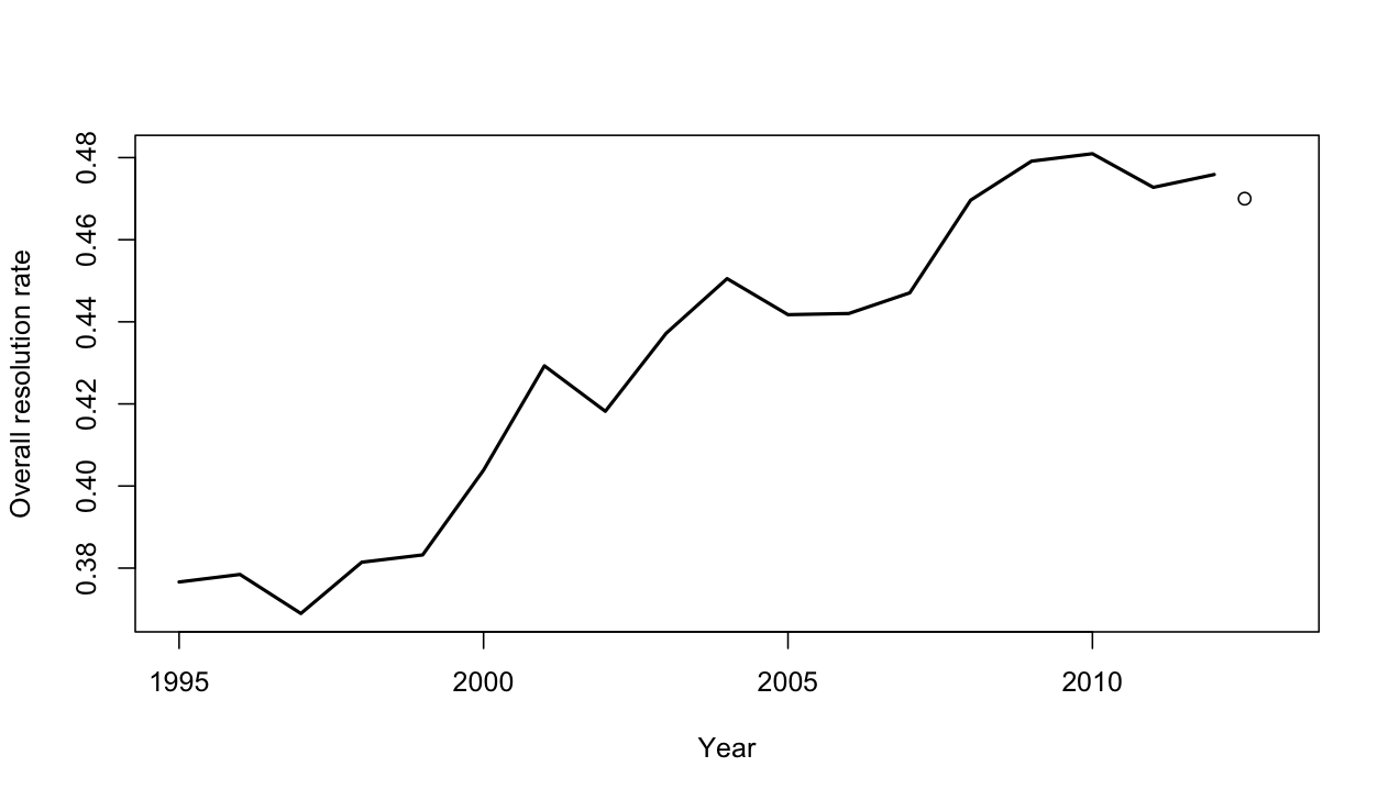
The lines show the past 18 fiscal years, the dot shows todays data for the 2012 calendar year.  It’s possible that the resolution rate is flattening out at its peak of 48%, or even decreasing slowly over the past few years, but it’s hardly convincing evidence of a trend.


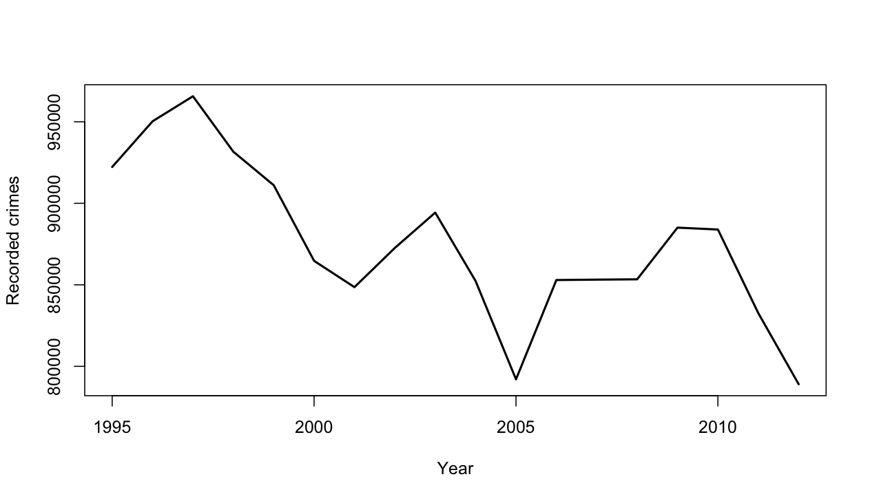
The change in recorded crimes over time is also a fairly noisy trend, but generally downwards even before we account for population growth

recorded


It’s also worth pointing out that preventing crime is important, but catching criminals is beneficial primarily as a means of preventing crime.  A low crime rate with few crimes resolved is far preferable to a high crime rate with most crimes resolved.   The easiest way for the police to increase the resolution rate would be to put more effort into catching drug users, but it would be hard to regard that as the most socially useful way to spend their time and taxpayers money.


April 1, 2013

Briefly

Despite the date, this is not in any way an April Fools post

  • “Data is not killing creativity, it’s just changing how we tell stories”, from Techcrunch
  • Turning free-form text into journalism: Jacob Harris writes about an investigation into food recalls (nested HTML tables are not an open data format either)
  • Green labels look healthier than red labels, from the Washington Post. When I see this sort of research I imagine the marketing experts thinking “how cute, they figured that one out after only four years”
  • Frances Woolley debunks the recent stories about how Facebook likes reveal your sexual orientation (with comments from me).  It’s amazing how little you get from the quoted 88% accuracy, even if you pretend the input data are meaningful.  There are some measures of accuracy that you shouldn’t be allowed to use in press releases.
March 31, 2013

A simple genetics question

A rocket scientist and winner of the National Medal of Technology and Innovation died recently, and has an obituary in the New York Times.  The first paragraph of the obituary is about family and cooking.

Can you guess how many X chromosomes the scientist had?


[Yes, of course,  writing about her family is fine, especially as family life was clearly very important to her. But leading with beef stroganoff?]

[Update: the NYT has thought better of the stroganoff:  See Newsdiffs for the comparison of old and new versions]

Briefly

Easter trading rules don’t appear to forbid blogging today, so a few links

  • Using words like “common”, “uncommon”, “rare”, “very rare” to describe risks of drug side-effects is recommended by guidelines,  and patients like it better than numbers, but it leads to serious overestimation of the actual risks (PDF poster, via Hilda Bastian)
  • A map of gun deaths in the US since the Sandy Hook shootings
  • Stuff’s small-business section says: “Scientists believe the Kiwifruit virus Psa came to New Zealand in a 2009 shipment of flowers.” I hope it’s just the newspaper, not the scientists, that thinks Psa is a virus
  • Another story about petrol prices in the Herald, linked to remind you all that the government collects and publishes data.  You can find it, even if AA, the petrol companies, and the media can’t.  This time AA seems to be right: the importer margin is about 4c above the trend line, which itself is up 5c on last year.
March 30, 2013

Confirmation bias

From the Waikato Times, two quotes from a story on emergency services

He would not comment on what motivated the fracas or whether it was gang-related.

“We’re not jumping to conclusions.”

and

Though science dismisses any link between human behaviour and the moon, it’s cold comfort for hospitality staff and emergency workers who say the amount of trouble often spikes when the moon is at its brightest.

Ms Gill said staff reported that “the full moon often has an impact on the nature of presentations through ED”.

Science doesn’t dismiss a link.  There’s nothing unscientific about the idea of a link. It’s  just that people have looked carefully and it’s not true.

(via @petrajane)

March 29, 2013

Unclear on the concept: average time to event

One of our current Stat of the Week nominations is a story on Stuff claiming that criminals sentenced to preventive detention are being freed after an average of ‘only’ 11 years.

There’s a widely-linked story in the Guardian claiming that the average time until Google kills new services is 1459 days, based on services that have been cancelled in the past.  The story even goes on to say that more recent services have been cancelled more quickly.

As far as I know, no-one has yet produced a headline saying that the average life expectancy  for people born in the 21st century is only about 5 years, but the error in reasoning would be the same.

In all three cases, we’re interested in the average time until some event happens, but our data are incomplete, because the event hasn’t happened for everyone.  Some Google services are still running; some preventive-detention cases are still in prison; some people born this century are still alive.  A little thought reveals that the events which have occurred are a biased sample: they are likely to be the earliest events.   The 21st century kids who will live to 90 are still alive; those who have already died are not representative.

In medical statistics, the proper handling of times to death, to recurrence, or to recovery is a routine problem.  It’s still not possible to learn as much as you’d like without assumptions that are often unreasonable. The most powerful assumption you can make is that the rate of events is constant over time, in which case the life expectancy is the total observed time divided by the total number of events — you need to count all the observed time, even for the events that haven’t happened yet.  That is, to estimate the survival time for Google services, you add up all the time that all the Google services have operated, and divide by the number that have been cancelled.  People in the cricket-playing world will recognise this as the computation used for batting averages: total number of runs scored, divided by total number of times out.

The simple estimator is often biased, since the risk of an event may increase or decrease with time.  A new Google service might be more at risk than an established one; a prisoner detained for many years might be less likely to be released than a more recent convict.  Even so, using it distinguishes people who have paid some attention to the survivors from those who haven’t.

I can’t be bothered chasing down the history of all the Google services, but if we add in search (from 1997),  Adwords (from 2000), image search (2001), news (2002),  Maps, Analytics, Scholar, Talk, and Transit (2005), and count Gmail only from when it became open to all in 2007, we increase the estimated life expectancy for a Google service from the 4 years quoted in the Guardian to about 6.5 years.  Adding in other still-live services can only increase this number.

For a serious question such as the distribution of time in preventive detention you would need to consider trends over time, and differences between criminals, and the simple constant-rate model would not be appropriate.  You’d need a bit more data, unless what you wanted was just a headline.

March 28, 2013

Briefly

  • And since it’s a long weekend coming up: something that’s not remotely statistics, but is Quite Interesting. Siouxsie Wiles has another bioluminescence animation up on Youtube, on the Hawaiian bobtail squid, invisibility cloaks, and quorum sensing.