Posts written by Thomas Lumley (2645)

avatar

Thomas Lumley (@tslumley) is Professor of Biostatistics at the University of Auckland. His research interests include semiparametric models, survey sampling, statistical computing, foundations of statistics, and whatever methodological problems his medical collaborators come up with. He also blogs at Biased and Inefficient

March 27, 2013

Sensor data and the monitored life

The Herald’s has two good stories recently (and other outlets are similar) about new data collection and analysis with smartphone apps.   If you read the stories carefully there’s been an outbreak of synecdoche in the newsroom — they are actually stories about new sensors that collect data, and smartphone apps that can be used to monitor the sensors — but that’s a minor detail.

As sensors based on electronics and micromechanics become cheap, it’s easy to collect more and more data.  This can be valuable — measuring blood glucose, or pollutants in the air — but it can also get out of hand.  Epidemiologist Hilda Bastian gives us this cartoon of the “Self-Stalker 5000” and writes about evidence-based monitoring in her blog at Scientific American

Self-Stalker-5000


and Nick Alex Harrowell points out

The stereotype application could be defined as “bugging granny”. We’re going to check some metrics at intervals, stick them into a control chart, and then badger you about it.

To be fair, he’s worrying most about sensors that don’t send to a smartphone app, but many of the same principles apply.

Does data visualisation matter?

“I wish there were more examples where data viz actually mattered. The case studies for us to lean on are sparser than they should be.”

Amanda Cox, NY Times chartmaker, interviewed at Harvard Business Review.  Includes a graph showing how the same unemployment report might be viewed by partisans of opposing parties.

Why PDFs are not open data

The US non-profit journalism group Pro Publica has written a number of good stories recently about drug company payments to doctors.  They used the data that some US states force the drug companies to release.  They have a new story explaining why this isn’t as easy as it sounds, since there was no requirement that the data be released in any useful form.  For example, a lot of it was in PDF files.  As they write

Here’s how a PDF works, deep down: It positions text by placing each character at minutely precise coordinates in relation to the bottom-left corner of the page. It does something similar for other elements like images. A PDF knows about shapes, characters and their precise positions on the page. Even if a PDF looks like a spreadsheet — in fact, even when it’s made using Microsoft Excel — the PDF format doesn’t retain any sense of the “cells” that once contained the data.

They used a wide range of techniques: in some cases they could use the grid cells on the tables to work out which digits belonged to the same number, but in other cases they basically had to treat the PDF file as an image and use optical text recognition software on it, just as you would for a scanned bitmap. Most people wouldn’t go to these heroic lengths, and would rapidly decide to investigate other exciting stories.

Even Excel spreadsheets are only useful open data formats if they are structured so that it’s easy for a computer to find and extract the actual numbers from the worksheet. Stats NZ , who realise this, try to have data available both as Excel spreadsheets designed for visual display and in some useful downloadable form. Some other sources of NZ official data are not as helpful.

(via @adzebill on Twitter)

March 26, 2013

Salience bias

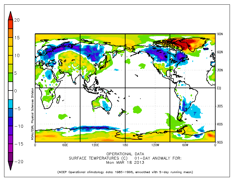
There’s been a lot of news recently about cold weather and snow in parts of the far Northern hemisphere that have  people living in them, especially English-speaking people.   As has typically happened with newsworthy cold snaps in recent years, this is balanced by unseasonably warm weather in parts of the far North that don’t have many  people living in them.

33


There are good reasons why the TV news doesn’t have much coverage of unseasonably warm weather in northern Greenland and the Arctic icecap. For a start, the local broadcasting infrastructure sucks.  It’s still important to remember that we only hear about weather in a fairly small fraction of the world.

March 25, 2013

Intergenerational inequality

The United States has surprisingly low social mobility: in every country, the children of the rich are more likely to be rich than the children of the poor, but the US is even worse than most Western countries.

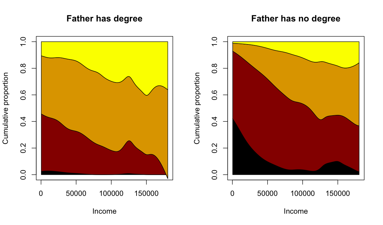
Felix Salmon links to some graphs by Evan Soltas, looking at mobility in terms of education, with data from the US General Social Survey. He finds that people whose fathers did not go to university are much less likely to go to university themselves (unsurprising), and that this is true at all levels of income (more interesting).

I’ve repeated what Soltas did, but smoothing[1] the relationships to remove the visual noise, and also restricting to people aged 25-40 (rather than 18+)

ineq


In each panel, black is less than high school, dark red is high school, light brown is university or junior college and yellow is postgraduate. These are plotted by family income (in inflation-adjusted US dollars).  The left panel is for people whose fathers had at least a junior college degree; the right is those whose fathers didn’t.

The difference is striking, and as Soltas says, may imply a greater long-term value for encouraging education than people had thought.


[1] For people who want the technical details:  A sampling-weighted local-linear smoother using a Gaussian kernel with bandwidth $10000, ie, svysmooth() in the R survey package. Bandwidth chosen using the ‘Goldilocks’ method[2]

[2] What? $3000 is too wiggly, $30000 is too smooth, $10000 is just right.

March 24, 2013

Some interactive graphics

These might perhaps be evidence for or against the previous post

Puzzles, eye candy, or bling?

Stephen Few writes a blog called “Visual Business Intelligence”, which if you know that “Business Intelligence” is a euphemism for “Data Analysis”, or “Statistics” is clearly in our field.

He has a recent post complaining about a new release of the “visual business intelligence” tool Tableau, in particular, its apparent enthusiasm for bubble charts and word clouds, and other things that don’t really work.  Early marketing, now removed, for this version actually used the heading “Crave more bling?” to describe the features.

As he points out in detail, bubble charts and word clouds are always and everywhere less informative than bar charts.  You should go read the whole thing. And perhaps his gallery of bad examples.

I learnt about Few’s post from a column (The Data Trail) in the Vancouver Sun. Under the headline In Defense of Eye Candy, Bling,and Tableau 8, Chad Skelton writes

There’s just one problem: bar charts are kind of boring.

A lot of people who create data visualizations — whether reporters, non-profits or governments — are fighting tooth and nail to get people to pay attention to the data they’re presenting in an online world crowded with endless distractions. And when you’re trying to make someone take notice  – especially if the subject is census data or transit figures — a little eye candy goes a long way.

Data visualizations aren’t just a way to present data. They’re often also the flashing billboard you need to get people to pay attention to the data in the first place.

He has a point, but this argument wouldn’t fly in other parts of journalism.  An editor would be unlikely to admit: “Yes, the story about numbers on benefit gave the wrong impression about blame, but a clear story explaining it was just the state of the economy would be boring”. When it comes to text or headlines, ‘tabloid journalism’ is an indictment, not a defense.

“Bling”, in particular,  is  perhaps an unintentionally honest term from the marketers. You wear bling primarily to prove you can afford it; you draw interactive packed bubble charts to prove you know how.

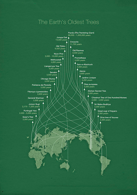
A more positive defense of complex infographics is that they function not as bling, but as art, and more importantly, as puzzles. As art, they are enjoyable to look at, but as puzzles, they are fun to explore. Andrew Gelman gives this example, by Michael Paukner (original here)
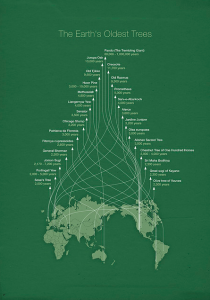
tree

He notes

The headache is, I believe, part of the point. First, if the lines were direct you wouldn’t get the pretty Christmas tree pattern. Second, the investment required in following the lines makes you appreciate what you’ve learned. Third, the curvy lines are themselves a puzzle; as you trace them, you gradually learn the meaning of the y-axis.

It’s a familiar idea in education that you absorb information better if you have to do something discover it rather than just being fed it. If that’s why less-informative graphs and infographics are appreciated, perhaps we should be glad of evidence it isn’t only kids and scientists that still think it’s fun to find things out for themselves.

But if that’s the reason, it also warns of the limits of the strategy.  These displays are, actually, less efficient and accurate at conveying information.  In a situation where information does need to be conveyed efficiently and accurately, bling or eye candy wouldn’t matter so much, but puzzles need to be avoided.


 

March 23, 2013

It’s dry

How dry is a 100m soil moisture deficit, which we have over a lot of the country (yellow, on the NIWA soil moisture maps)?

  • 100mm over 1 hectare is 1 million litres
  • A typical full section in Auckland is about 0.07 hectares [ok, I can’t do simple arithmetic, and the US has made me think in acres]
  • Water at the tap costs $1.343/ 1000 litres

So, a 100mm moisture deficit over the area of a city section would need about $1000 of tap water to make up.


When you have two numbers

Last month, Statistics New Zealand released the travel and migration statistics for January.  Visits from China and Hong Kong were notably lower than the past year. This was attributed to Chinese New Year being in February. The media duly reported all this.

Now, Statistics New Zealand has released the travel and migration statistics for January.  Visits from China and Hong Kong were notably higher than the past year. This was attributed to Chinese New Year being in February. The media duly reported all this.

It seems obvious that you’d want to combine the two months, so that the Chinese New Year effect drops out. I haven’t seen anyone do this yet:

  • Visitors from China: Jan+Feb 2012: 23300+15300=38600
  • Vistors from China: Jan+Feb 2013 18800+31500=50300

For Hong Kong the January figures aren’t in the press release, but the change is: there were 2200 more than last year in February, and 1500 fewer in January, for an increase of 700.

So, a fairly big increase in visitors from these countries over the past two years.

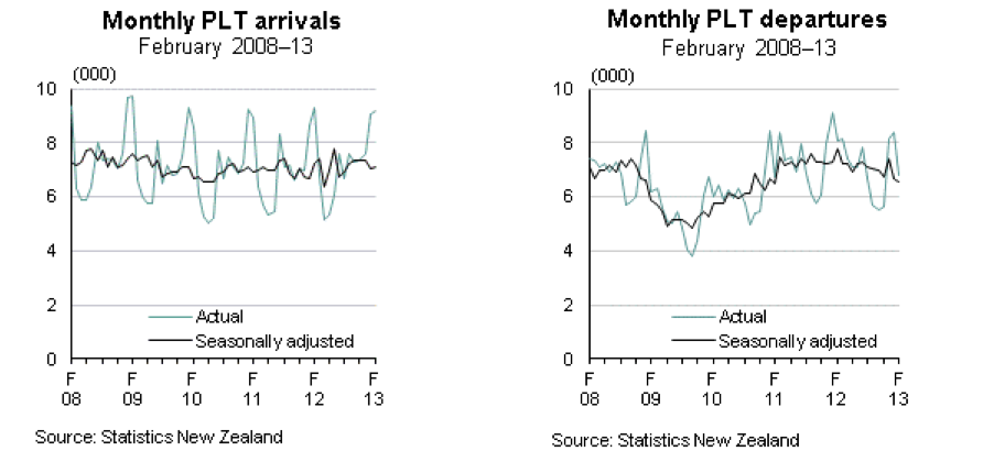
Net migration was also up a bit, and here I think a longer time series than the media reported would be useful.  The full time series in the Stats NZ release looks like

migration


Arrivals are pretty constant.  Departures are slowly declining, but are still much higher than in the 09/10 minimum.

March 22, 2013

Briefly

  • A post at Scientific American about covering clinical trials, for journalists and readers.  It’s a summary from the Association of Health Care Journalists annual conference. Starts out “My message: Ask the hard questions.”
  • Asking the hard questions is also useful in covering surveys.  Stuff reports “Kiwi leaders amongst the world’s riskiest”,
  • New Zealand leaders are among the most likely in the world to ignore data and fail to seek a range of opinions when making decisions

    with no provenance except that this was based on a 600,000 person survey of managers and professionals by SHL.  Before trying to track down any more detail, just think: how could this have worked? How would you get reliable information to support those conclusions from each of 600,000 people? 

  • You may have heard about the famous Hawthorne experiment, where raising light levels in a factory improved output, as did lowering them, as did anything else experimental. The original data have been found and this turns out not to be the case.