Posts written by Thomas Lumley (2645)

avatar

Thomas Lumley (@tslumley) is Professor of Biostatistics at the University of Auckland. His research interests include semiparametric models, survey sampling, statistical computing, foundations of statistics, and whatever methodological problems his medical collaborators come up with. He also blogs at Biased and Inefficient

April 10, 2013

Another NZ blog

JustSpeak is

a non-partisan network of young people speaking to, and speaking up for a new generation of thinkers who want change in our criminal justice system.

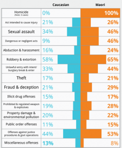
I’m linking because they have a good visualisation of the recently-released police crime statistics, comparing the proportion of apprehensions leading to prosecution among Maori and Pakeha youth. The back-to-back bar charts take advantage of the brain’s ability to detect lack of symmetry.

youfcrime

I probably would have left out the homicide category, which has too few to compare, and it would be interesting to see if small gaps between the categories help.

The real problem is in interpretation.  It’s hard to say what you’d expect just from economic differences and differences in where people live, without any differences in how they are treated by police. A higher proportion of prosecutions could mean the police are using their discretion to prosecute more Maori youth, but a lower proportion of prosecutions could just as easily have been interpreted as harassment of innocent Maori youth.


What genetics is good for

There’s an article in Nature News about one of the most interesting findings from large-scale genomic studies.  People with mutations in a gene called PCSK9 have low levels of cholesterol, and since the protein produced by that gene is active outside cells, it is relatively easy to target.  Also, people with mutations in both of their copies of the PCSK9 gene seem to be healthy, so it looks as though it should be a safe target for treatment

Synthetic antibodies against PCSK9 reduced LDL (bad) cholesterol by 73% in initial trials in a small group of patients, which is huge. There’s a huge trial going on at the moment to see if this translates to a reduction in heart attacks, strokes, etc.  It could still easily fail — several other drugs giving big cholesterol improvements have turned out not to prevent heart disease — but it is very promising.

Why science journalism matters

Britain is currently having a measles epidemic.

Measles has been a preventable illness for decades, but the vaccination rate dropped after the widely-publicized and bogus claims of a link to autism. The measles epidemic is especially severe in southwest Wales, in the circulation area of a paper that was especially anti-vaccination.

There are many examples where the media just reported uncertainty within the scientific community. This was not one of them.

April 9, 2013

We’re all mutants?

From the Herald (actually from the Independent)

The rise in the number of overweight children in Western countries may be as much to do with their genes as their diet and exercise levels,

In fact, just about the only completely uncontroversial fact about the increase in obesity is that it is entirely due to environmental changes of some sort. There’s disagreement on precisely which environmental changes, and on the likely public health impact, but not on the general principle. The reason is very simple: the genes of this generation’s children came from their parents, with almost no changes. There simply hasn’t been enough time for genetic differences to contribute.

The research paper is looking for mechanisms: they aren’t studying a representative population sample, but a group of 1500 children with severe obesity.  Most of the genetic variants they found are very rare, and did not show up in the previous huge genetic study of weight and height that combined genetic data on quarter of a million people. That means these genetic variants can’t contribute much even to explaining or predicting which children are overweight. The last sentence of the research paper is illustrative of the point of the research

 As we observed a significant enrichment for CNVs that deleted GPCRs, which are key targets for drug development, these findings may have potential therapeutic implications.

In English: there were lots of mutations that affected one particular type of cell signalling molecule, one that we’re pretty good at turning on and off with drugs. This could be useful.

April 8, 2013

Explore your budget

Keith Ng’s annual NZ Budget visualization seems to be up. Go play.

You might also like last years’ one.  And possibly even the 2011 radioactive space donut.

Briefly

  • Interesting post on how extreme income inequality is. The distribution is compared to a specific probability model, a ‘power law’, with the distribution of earthquake sizes given as another example. Unfortunately, although the ‘long tail’ point is valid, the ‘power law’ explanation is more dubious.   Earthquake sizes and wealth are two of the large number of empirical examples studied by Aaron Clauset, Cosma Shalizi, and Mark Newman, who find the power law completely fails to fit the distribution of wealth, and is not all that persuasive for earthquake sizes. As Cosma writes

If you use sensible, heavy-tailed alternative distributions, like the log-normal or the Weibull (stretched exponential), you will find that it is often very, very hard to rule them out. In the two dozen data sets we looked at, all chosen because people had claimed they followed power laws, the log-normal’s fit was almost always competitive with the power law, usually insignificantly better and sometimes substantially better. (To repeat a joke: Gauss is not mocked.)


All clinical trial results should be published

If you’re one of the 40,000 or so people who has signed the Alltrials petition you will have received an email from Ben Goldacre asking for more help.

The  Declaration of Helsinki, the major document on research ethics in medicine, already states

30. Authors, editors and publishers all have ethical obligations with regard to the publication of the results of research. Authors have a duty to make publicly available the results of their research on human subjects and are accountable for the completeness and accuracy of their reports. They should adhere to accepted guidelines for ethical reporting. Negative and inconclusive as well as positive results should be published or otherwise made publicly available. Sources of funding, institutional affiliations and conflicts of interest should be declared in the publication. Reports of research not in accordance with the principles of this Declaration should not be accepted for publication.

The petition is trying to get these principles enforced. Publication bias isn’t just a waste of the voluntary participation of (mostly sick) people in research. Publication bias means we don’t know which treatments really work.

In my first job (as a lowly minion) in medical statistics, my boss was Dr John Simes, an oncologist. Back in the 1980s he had shown that publication bias in cancer trials gave the false impression that a more toxic chemotherapy regimen for ovarian cancer had substantial survival benefits to weigh against the side-effects.  Looking at all registered (published and unpublished) trials showed the survival benefit was small and quite possibly non-existent.  The specific treatment regimens he studied have long been outmoded, but his message is still vitally important.

These examples illustrate an approach to reviewing the clinical trial literature, which is free from publication bias, and demonstrate the value and importance of an international registry of all clinical trials.

Nearly thirty years later, we are still missing information about the benefits and risks of drugs.

For example, influenza researchers have used detailed simulation models to assess control strategies for pandemic flu. These simulation models need data about the effectiveness of drugs and vaccines.  When the next flu pandemic hits, we really need these models to be accurate, so it’s especially disturbing that Tamiflu is one of the drugs with substantial unpublished clinical trial data.

April 6, 2013

Gun deaths visualisation

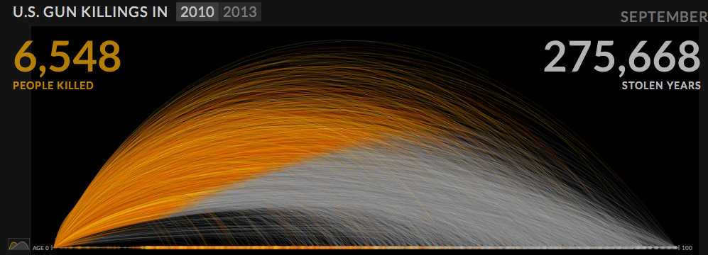
Periscopic, a “socially conscious data visualization firm” has produced an interactive display of the years of life lost due to gun violence in the US, based on national life expectancy data. Each victim appears as a dot moving along the arc of their life, and then dropping at the age of death. More and more accumulate as you watch.

guns


Of course, it’s important to remember that this display gets a lot of its power from two facts: the USA is very big, and we know the names and ages of death of gun victims.  You couldn’t do the same thing as dramatically for smoking deaths, and it would look much less impressive in a small country.


Also, Alberto Cairo has a nice post using this as an example to talk about the display of uncertainty.

(via @hildabast)


April 5, 2013

Frontpage news

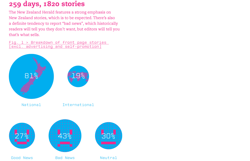
James Wendelbourn, a graphic designer, has summarized the content of the NZ Herald front page every day for a year.

He’s made a series of infographics about it, at sellingthenewz.tumblr.com, for example

frontpage


I don’t really like the graphics from the point of view of presentation of quantitative information, but the actual content is interesting.

As always with this sort of thing, you might disagree with the classifications, but they are generally reasonable: I like the division of ‘consumer’ news into “outrage”, “shopping”, and “other”.

April 4, 2013

Infographic meh.

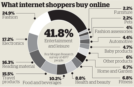
The Herald has produced this Stat of the Week nomination

BuyOnlineApr13


The obvious problem is that the percentages add up to about 170%, not 100%. That’s why the bar labelled “41.8%” is only about 1/4 of the circle.These are not mutually exclusive categories, and in fact someone who is in one of these categories is actually more likely to be in others.

The most interesting results from the underlying data would be about which purchases go together. Is there an more-or-less consistent ordering of things so that someone who buys food and beverages online will also buy reading materials and electronics online, or is it more complicated?  That’s probably the sort of information that Roy Morgan Research would like to sell you, with the overall proportions as a teaser — selling detailed survey reports is their business.

On the other hand, while the ribbon adding up to a full circle is irrelevant because there isn’t a meaningful total, it’s hard to get very worked up about it.  A table, or a ‘forest plot’ of points and margin of error would be a bit more informative — it’s not clear what the margin of error in the smaller categories is like.

I’m slightly more worried about the fact that reading isn’t counted as leisure, somewhat more worried that it’s news that more people use the internet now than ten years ago, and much more worried that the graph says it refers to 4977 people but the text of the story says 12000 people.