Posts written by Thomas Lumley (2645)

avatar

Thomas Lumley (@tslumley) is Professor of Biostatistics at the University of Auckland. His research interests include semiparametric models, survey sampling, statistical computing, foundations of statistics, and whatever methodological problems his medical collaborators come up with. He also blogs at Biased and Inefficient

March 16, 2013

Do scientists read newspapers or blogs?

A new paper surveyed neuroscientists in Germany and the US about where they get information on science-related news stories.

Based on the response of some 250 scientists (fairly evenly divided between the countries), the researchers found that scientists tended to give more weight to the influence of traditional media. For instance, more than 90 percent of neuroscientists in both countries said they relied on traditional journalist sources – both in print and online – to follow news about scientific events compared to around 20 percent for blogs.

Not surprisingly, the internet coverage of this paper has been fairly hostile (traditional media seems not to have covered it).

There’s a good  summary of the reaction by science writer Deborah Blum, but count me on the bemused side.  I do use traditional media to learn that particular science stories exist, but rarely to find out more about them.

March 15, 2013

Briefly

Better evidence in education

There’s a new UK report by Ben Goldacre, “Building Evidence into Education”, which has been welcomed by the Teacher Development Trust

Part of the introduction is worth quoting in detail:

Before we get that far, though, there is a caveat: I’m a doctor. I know that outsiders often try to tell teachers what they should do, and I’m aware this often ends badly. Because of that, there are two things we should be clear on.

Firstly, evidence based practice isn’t about telling teachers what to do: in fact, quite the opposite. This is about empowering teachers, and setting a profession free from governments, ministers and civil servants who are often overly keen on sending out edicts, insisting that their new idea is the best in town. Nobody in government would tell a doctor what to prescribe, but we all expect doctors to be able to make informed decisions about which treatment is best, using the best currently available evidence. I think teachers could one day be in the same position.

Secondly, doctors didn’t invent evidence based medicine. In fact, quite the opposite is true: just a few decades ago, best medical practice was driven by things like eminence, charisma, and personal experience. We needed the help of statisticians, epidemiologists, information librarians, and experts in trial design to move forwards. Many doctors – especially the most senior ones – fought hard against this, regarding “evidence based medicine” as a challenge to their authority.

In retrospect, we’ve seen that these doctors were wrong. The opportunity to make informed decisions about what works best, using good quality evidence, represents a truer form of professional independence than any senior figure barking out their opinions. A coherent set of systems for evidence based practice listens to people on the front line, to find out where the uncertainties are, and decide which ideas are worth testing. Lastly, crucially, individual judgement isn’t undermined by evidence: if anything, informed judgement is back in the foreground, and hugely improved.

This is the opportunity that I think teachers might want to take up.

Pi(e) day

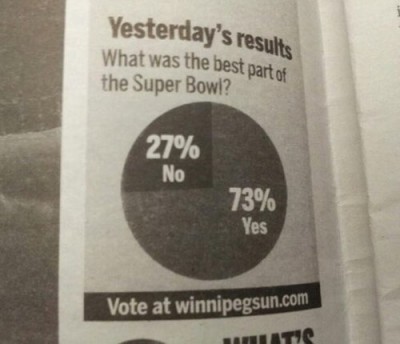
Today in the USA is National Pi Day (they write their dates funny, and they’re a day behind, so it’s 3.14.2013 there). The Washington Post has a set of the best and worst pie charts to celebrate.  Many of them are classics, but there was one I hadn’t seen before, showing that it’s possible to do even worse with a pie chart of a bogus poll than the Herald-Sun does.

pie9

March 14, 2013

Who is buying our real estate?

Interesting data in Stuff today:

The latest BNZ and Real Estate Institute residential market survey found 9 per cent of house sales were to people offshore. 

Of those offshore buyers, 18 per cent were from Britain, 15 per cent from China and 14 per cent from Australia.

and many of the offshore buyers were immigrating, not just investing.  In fact,

just 1.2 per cent of house sales in Auckland were to Chinese buyers not intending to move here.

The only thing the story is missing is some mention of how people got the false impression that high house prices were the fault of Chinese investors.

Could it have been something they read, perhaps?

March 13, 2013

Briefly

“A small, easily checkable fact needs to be checked; a larger but greyer assertion, not so much — unless it is defamatory,” they write. “Thus, verification for a journalist is a rather different animal from verification in scientific method, which would hold every piece of data subject to a consistent standard of observation and replication.”

Is epidemiology 90% wrong?

There’s been a recent recurrence of the factoid that 90% of results in epidemiology are wrong. For example, @StatFact on Twitter posted ‘Empirical evidence is that 80-90% of the claims made by epidemiologists are false.’ with a link to a talk by Stanley Young at the National Institute of Statistical Sciences.  I replied “For suitable values of ‘claim’ and ‘false'”, and if you don’t want to read further, that’s a good summary. (more…)

March 12, 2013

It’s dry

Interesting new interactive drought map from Stuff.

I’m not 100% convinced it’s better than a couple of contour maps, but it’s probably the best interactive graph I’ve seen in the NZ mainstream media. (via Mike “@adzebill” Dickison on Twitter)

Non-sampled poll reporting

As the Novopay debacle continues, Stuff and the Herald are both reporting a survey done of its members by the Post-Primary Teachers Association. At Stuff, the story begins:

Nearly 36 per cent of secondary school staff are not reporting their Novopay glitches, a survey has found, casting doubt on the Government’s claims of an improvement in the payroll system.

The Post Primary Teachers’ Association found that 38.2 per cent of staff were underpaid, overpaid or not paid at all during the February 20 pay cycle.

That compares with only 1.9 per cent of staff who logged problems with the system, as reported by Novopay Minister Steven Joyce using PricewaterhouseCoopers figures.

In the Herald:

Up to 1600 teachers did not report complaints through official channels over mistakes with their pay administered through the Novopay pay roll system, according to a union survey.

The Post Primary Teachers Association surveyed 4500 teachers for the pay period ending February 20 and found 36 per cent had not formally reported errors with their pay because they were either “too embarrassed” or feared putting school administrators under more pressure.

In this case the PPTA report is easily available (59 page PDF), so we can find out what was actually done.  The union surveyed all its (roughly 18000) members, using an online poll. They received 4659 responses from members, of whom 1712 were affected.

Obviously, teachers who had experienced problems would be more likely to respond, especially if the reason they hadn’t complained to the local administrators was because they didn’t want to put them under more pressure. The PPTA report handles this issue very well. On page 13 they give calculated Novopay error rates under the assumption that 100% of those with problems responded, and under the assumption that the responses are representative. This gives upper and lower bounds, and the lower bound is substantially higher than Novopay is claiming.

In the media stories, things are a bit confused.  The 36% or 38% are proportions assuming the responses were representative. The numbers in the vicinity of 1600 look like the number assuming that everyone adversely affected responds, perhaps minus an estimate of how many of them Novopay reported. I haven’t been able to reconcile them with the PPTA report.  In any case, neither paper accurately described how the data were collected, even though this was made clear by the PPTA.

 

March 11, 2013

Suppressio variation, suggestio falsi

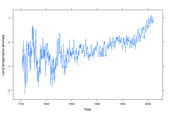
The global mean land-surface temperature reconstruction from the Berkeley Earth Surface Temperature project (other reconstructions are very similar), looks like this:

Rplot001

I’ve scaled the axes using Bill Cleveland’s method of “banking to 45 degrees“, that is, so the median of the slope is 45 degrees.  Based on his research, this seems to give close to optimal perception of patterns. (more…)