Posts written by Thomas Lumley (2645)

avatar

Thomas Lumley (@tslumley) is Professor of Biostatistics at the University of Auckland. His research interests include semiparametric models, survey sampling, statistical computing, foundations of statistics, and whatever methodological problems his medical collaborators come up with. He also blogs at Biased and Inefficient

March 11, 2013

How could we test this?

As you will have heard, there is reasonable evidence that an infant has been cured of HIV infection, by giving fairly high doses of antiretroviral drugs immediately after birth.  If this case continues to hold up to investigation, what next?

You would normally want to do a randomized trial, to get evidence that this wasn’t just a one-off fluke, but that’s going to be hard.  Obviously, parents would be very reluctant to have their children randomized. To make matters worse, since the usual antiretroviral treatments are almost completely effective in preventing mother:child transmission, anymost infected infants in Western countries will have been born to mothers who either didn’t know they were infected or knew and were unable to get normal medical care.  This is not a group you want to target for research, for both practical and ethical reasons.   The same issue arises in countries where mother:child transmission is more common. Antiretroviral treatment to prevent transmission is simpler and less expensive than the potentially-curative treatment treatment for the infant, so any system that is able to deliver the cure reliably would rarely need to.

On the other hand, if this (relatively drastic) treatment really does work, not having a randomised trial is likely to slow its acceptance.  Back in the late 1980s, a new lung-bypass technique for premature infants was invented.  This technique, ECMO, appeared to dramatically improve survival, but it required major surgery.  Researchers at the University of Michigan tried a novel ‘play the winner’ trial design that was intended to reduce the number of infants randomized to an ineffective treatment. In a sense, this worked.  The trial ended up randomising 11 infants to ECMO, all of whom survived, and one to standard treatment, who died.  Unfortunately, the trial design was sufficiently unusual and unfamiliar that people didn’t seem to be able to interpret the results (it’s been the subject of multiple statistics papers). A similar design was used in a follow-up trial at Harvard, ending up with 28 infants given  ECMO (with one death) and 10 given standard treatment (with four deaths). Again, there wasn’t consensus on what the result meant, and it wasn’t until after a third, standard randomised trial was done that the treatment was widely used — and if the standard trial had been done first, fewer infants would have been randomised to standard care, and infants outside the trial would have gotten the treatment earlier.

Individual-level randomisation may well not be possible to do efficiently and ethically.  Another approach, in some country that is making efforts to provide prophylaxis against mother:child transmission and that believes treating infected infants is feasible, would be a stepped-wedge design.  This design takes advantage of the fact that we can’t do everything at once.  If treatment is being rolled out across a developing country, some areas will get it first and some will get it later.  Rather than a haphazard allocation (or one based on where the health ministry officials have relatives, or where the international TV representatives want to film) using a truly random order allows evaluation of the effectiveness of treatment policy while still delivering treatment to as many people as possible, as fast as possible.   This design also has the advantage of testing a real public-health question: does a policy of treating infected infants result in fewer infected children?  It’s conceivable, especially in a country where health care is expensive and there’s a lot of prejudice against HIV-positive people, that having treatment available for infected infants could reduce the use of HIV testing and prophylaxis by pregnant women, and the net effect could be negative.

March 10, 2013

Bad news, good graphic

From NIWA, soil moisture across the country (via @nzben on Twitter), compared to the same time last year and to the average for this date.

smd_map


Update: If I had to be picky about something: that light blue colour. It doesn’t really fit in the sequence.

Update: Stuff also has a NIWA map, and theirs looks worse, but it’s based on rainfall over just the past three weeks (and, strangely, labelled “Drought levels over the past six days”)

Your media on drugs

Last night, 3News had a scare story about positive drug tests at work.  The web headline is “Report: More NZers working on drugs”, but that’s not what they had information on:

New figures reveal more New Zealanders were caught with drugs in their system at work last year.

…new figures from the New Zealand Drug Detection Agency reveal 4300 people tested positive for drugs at work last year.

but

The New Zealand Drug Detection Agency says employers are doing a better job of self-regulating. The agency performed almost 70,000 tests last year, 30 percent more than in 2011.

If 30% more were tested, you’d expect more to be positive. The story doesn’t say how many tested positive the previous year, but with the help of the Google, I found last year’s press release, which says

8% of men tested “non-negative” compared with 6% of women tested in 2011.

Now, 8% of 70000 is 5600, and even 6% of 70000 is 4200. Given that the majority of the tests are in men, it looks like the proportion testing positive went down this year.

The worst part of the story statistically is when they report changes in proportions of which drug was found as if this was meaningful.  For example,

When it comes to industries, oil and gas had an 18 percent drop in positive tests for methamphetamine, but showed a marked increase in the use of opiates.

That’s an increase in the use of opiates as a proportion of those testing positive.  Since proportions have to add up to 100%, a decrease in the proportion positive tests that are for methamphetamine has to come with an increase in some other set of drugs — just as a matter of arithmetic.

Stuff‘s story from January just as bad, with the lead

Employers are becoming more aware of the dangers of drugs and alcohol in the workplace as well as the benefits of testing for them.

and quoting an employer as saying

“And, we have no fear of an employee turning up to work and operating in an unsafe way, putting themselves and others at risk.”

as if occasional drug tests were the answer to all occupational health and safety problems.

The other interesting thing about the Stuff story is that it’s about a different organisation: Drug Testing Services, not NZ DDA — there’s more than one of them out there! You might easily have thought from the 3News story that the figures they quoted referred to all workplace drug tests in NZ, rather than just those sold by one company.

Given the claims being made, the evidence for either financial or safety benefits is amazingly weak.   No-one in these stories even claims that introducing testing has actually reduced  on-the-job accidents in their company, for example, let alone presents any data.

If you look on PubMed, the database of published medical research, there are lots of papers on new testing methods and reproducibility of test results, and a few that show people who have accidents are more likely than others to test positive.  There’s very little even of before-after comparisons: a Cochrane review on this topic found three before-after comparisons. Two of the three found a small decrease in accident rates immediately after introducing testing; the third did not.  A different two of the three found that the long-term decreasing trend in injuries got faster after introducing testing; again, the third did not.   The review concluded that there was insufficient evidence to recommend for or against testing.

There’s better evidence for mandatory alcohol testing of truck drivers, but since those tests measure current blood alcohol concentrations, not past use, it doesn’t tell us much about other types of drug testing.


March 8, 2013

Eat bacon and die

The Herald, under the arguably-overstated headline Eating processed meats could cut your life short, have the reasonable lead

A diet packed with sausages, ham, bacon and other processed meats appears to be linked to an increased risk of dying young, a study of half a million people across Europe suggests.

The main problem with the summaries of risk that reported in the story is that they are for the people who eat the highest amount of processed meat.  It’s notable that nowhere in the Herald story do they tell you how high this consumption level was, either as a fraction of the participants or as a weight or number of servings. (3News did better)

It’s probably true that you would have lower risk if you ate less processed meat than this highest-consumption group, but you probably already do — they were the top half a percent of the 450000 participants, and they averaged more than 160g per day, or 1.1kg per week.

There are also problems with how the statistics get translated into deaths.  The study estimated hazard ratios, which compare the rates of death for high and low processed meat consumption, and then try to turn these into proportions. The Herald quotes a study researcher as saying

“Overall, we estimate that 3 per cent of premature deaths each year could be prevented if people ate less than 20 grams of processed meat per day.”

This should get the response “define ‘premature'”, but it’s actually more carefully phrased than in the research paper, which says

We estimated that 3.3% (95% CI 1.5% to 5.0%) of deaths could be prevented if all participants had a processed meat consumption of less than 20 g/day.

suggesting that  3.3% of vegetarians would be immortal.

Turning hazard ratios into information about life expectancy or premature death is tricky.  David Spiegelhalter’s microlives are useful here. The study estimates a hazard ratio of 1.18 for 50g extra per day of processed meat.  If that really is due to the meat, not to other differences in health risk,  and if it really is approximately constant across all types of processed meat, it corresponds to about 2 microlives per 50g — about an hour of life per serving, or about the same as four cigarettes.

There are reasons to be a bit skeptical about the magnitude of the results: the study didn’t find any evidence of higher risk in people who eat a lot of red meat, contradicting previous studies.  Also, the analysis used statistical techniques to correct for measurement error in meat consumption, but not in any of the other risk factors they analysed.  If people with high processed meat consumption are also at higher risk in other ways (which they are), this analysis will tend to shift the apparent risk towards processed meat.

Still, I shouldn’t think anyone is really surprised that bacon’s not a health food.

Recreational genotyping and ancestry

There’s a fuss at the moment in Britain over the recreational genotyping companies that purport to tell you where your ancestors came from.  One of the stories that provoked this, was the claim that over 1 million Brits are descended from Roman soldiers. For example, in the Telegraph, under the headline “One million Brits ‘descended from Romans'”

The Romans departed abruptly in the early fifth century, leaving behind relics of their rule including Hadrian’s Wall along with a host of towns, roads and encampments.

But perhaps the most enduring sign of their legacy is in our genes, experts claim, with an estimated million British men descending from the invading forces.

The first sign that something is wrong is that ‘one million Brits’ turns into ‘a million British men’.  What about the women?  The reason for the `one million’ estimate is the same as the reason it’s just men — the ‘experts’ are looking only at male-line descent, via the Y chromosome. In fact, the number of British men descended from Roman soldiers is probably more like 25 million.  That is, there’s a general principle that anyone in the distant past is either a direct ancestor of no-one in the present, or of almost everyone in the present.

If you go back 100 generations to the time of Roman occupation of Britain,  you would have 1267650600228229401496703205376 ancestors.  That’s roughly a bazillion times the number of people alive then, so there is a lot of overlap.  If you look just at pure male-line ancestors, from whom you inherited a Y chromosome, you either have none (if you don’t have a Y chromosome) or one. It’s clear why the ancestry-mongers want to simplify their sales pitch by focusing on the Y chromosome (and on mitochondrial DNA, which is inherited through the female line), but it’s not clear why anyone should listen to them.

Even if you live in Britain and your Y chromosome came from someone in Roman legions, it didn’t necessarily come via the British occupation.  After all, lots of men have migrated to Britain since then: the Vikings and the Normans back in History, and more recently from all over the world. Some of them would have had Roman-looking Y chromosomes too.  And even the idea of a ‘Roman’ Y-chromosome is a bit dodgy.  Broadly speaking, a group of Y chromosomes tends to get attributed to the region in the world where it is seen most today (unless that’s, say, the US). There’s no guarantee that this is where the Y-chromosome group was common 1000 years ago.

There is some potential for using whole-genome data to say something more meaningful about relatively recent ancestry, but to be useful even that needs to come with uncertainty estimates, which will often be huge.

Sense about Science have put out a good information sheet, but the basic message is that at the moment anything interesting someone tells you about your distant ancestors based on genetic information, they could tell you equally well without bothering to do any genotyping.

March 7, 2013

Briefly

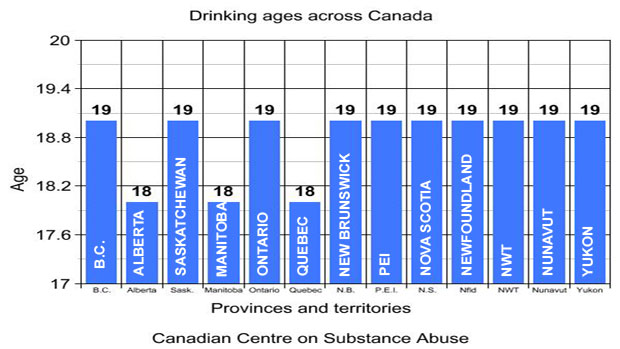
  • From the frozen north: the most pointless bar graph I’ve seen in a long time.

 li-drinking-graph

  • A website with interviews in data science and analytics, currently featuring UoA graduate Hadley Wickham, in his role as Chief Scientist of RStudio


  • From the Herald, a successful HRC-funded randomised trial of an NZ-invented inhaler for asthma.  They don’t link to the paper and editorial (which are not in ‘the prestigious Lancet medical journal’, but in the perfectly respectable Lancet Respiratory Medicine journal)


  • The US Census Bureau has released data on commute times, collected in the American Community Survey.  The Census Bureau has an infographic (sigh),  but since the data are available, other people can do better, in this case the New York public radio station WNYC (via)


March 6, 2013

Storytelling with data

presentation  from Jonathan Corum, who works at the New York Times. 

Read it for the content, and read it to see how a speech with slides can be turned into an effective webpage.

This is based on his keynote talk at the Tapestry conference, which was held just before the Computer-Assisted Reporting conference I mentioned last weekend.

(via)

Twitter is not a random sample

From Stuff,

If you’ve ever viewed Twitter as a gauge of public opinion, a weathervane marking the mood of the masses, you are very much mistaken.

That is the rather surprising finding of a new US study, which suggests the microblog zeitgeist differs markedly from mainstream public opinion.

Apart from being completely unsurprising, this is a useful thing to have data on.  The Pew Charitable Trusts, who do a lot of surveys, compared actual opinion polls to tweet summaries for some major political and social issues in the US, and found they didn’t agree.

Along the same lines, it was reported last month that Google’s Flu Trends overestimated the number of flu cases this year (after having initially underestimated the H1N1 pandemic), probably because the high level of publicity for the flu vaccine this year made people more aware.

These data summaries can be very useful, because they are much less expensive and give much more detail in space and time than traditional data collection, but they are also sensitive to changes in online behaviour. Getting anything accurate out of them requires calibration to ‘ground truth’, as a previous generation of Big Data systems called it.

March 5, 2013

Biomarkers and the underpants gnomes

The Gnomes appeared in an episode of South Park. They had a detailed business plan:

  1. Steal underpants
  2. ???
  3. Profit!

I’ve just been pointed to a story `Make your own cancer diagnostic test’, from a newsletter of the Stanford Medical School, about a year ago.  The idea seems to be

  1. Find a biomarker
  2. ???
  3. Diagnostic test!

That is, the story describes how you could use the massive databases of knowledge about gene expression, and the ability to order up inexpensive samples and assays, to find a cancer biomarker, a protein that was present in large quantities in people with a specific type of cancer, but not in healthy people.

There are a few problems before you even get that far, like the fact that most proteins don’t wander around in the blood but stay inside cells or attached to membranes, but those issues could be handled without too much difficulty.  There’s also the possibility that the particular type of cancer you’re looking at doesn’t put large quantities of any unique protein into the blood, but let’s ignore that one.

The real problem is that what you end up with is a strategy for diagnosing cancer in people who already know they have it.  For a diagnostic test to be useful, it has to diagnose cancer accurately, with few false positive, and do it well before you would otherwise know about.  That’s hard.  There are plenty of known protein biomarkers for cancer, but very few of them (some people would say none of them) are currently useful for early detection

To drive this point home: ten years ago, a paper appeared in Proceedings of the National Academy of Sciences, describing a better version of  this proposed search strategy for biomarkers.  It worked, in the sense that they discovered new biomarkers for multiple types of cancer.  With a decade of followup, how many of these have been turned into new diagnostic tests? Not a lot.

NZ language maps

There’s a new information paper from the Royal Society of New Zealand, on languages. We have 160 of them, which is a lot, but the paper says we could do with more coherent policy about them.

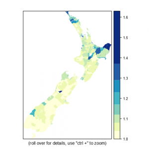
It’s accompanied by some neat interactive maps, produced by Paul Behrens and Jason Gush from the Royal Society and Paul Murrell from our department. The map of average number of languages per person across the country is visually dominated by the largely-rural areas where te reo Maori is widely spoken

Multilingualism1


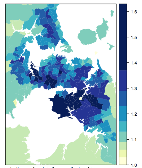
but if you zoom in to Auckland, the detail gets dramatically more complicated.  I speak 0.286 fewer languages than average for my neighbourhood.

aucklang


There are also national maps for  NZ Sign, Samoan, and all other languages combined.