Posts written by Thomas Lumley (2645)

avatar

Thomas Lumley (@tslumley) is Professor of Biostatistics at the University of Auckland. His research interests include semiparametric models, survey sampling, statistical computing, foundations of statistics, and whatever methodological problems his medical collaborators come up with. He also blogs at Biased and Inefficient

February 22, 2013

Drug safety is hard

There are new reports, according to the Herald, that synthetic cannabinoids are ‘associated’ with suicidal tendencies in long-term users.  One difficulty in evaluating this sort of data is the huge peak in suicide rates in young men.  Almost anything you can think of that might be a bad idea is more commonly done by young men than by other people, so an apparent association isn’t all that surprising.  There is also the problem with direction of causation — the sorts of problems that make suicide a risk might also increase drug use — and difficulties even in getting a reasonable estimate of the denominator, the number of people using the drug. Serious, rare effects of a recreational drug are the hardest to be sure about, and the same is true of prescription medications.  It took big randomized trials to find out that Vioxx more than doubled your rate of heart attack , and a study of 1500 lung-cancer cases even to find the 20-fold increase in risk from smoking.

In this particular example there is additional supporting evidence. A few years back there was a lot of research into anti-cannabinoid drugs for weight loss (anti-munchies), and one of the things that sank these was an increase in suicidal thoughts in the patients in the early randomized trials.  It’s quite plausible that the same effect would happen as a dose of the cannabinoid wears off.

In general, though, this is the sort of effect that the proposed testing scheme for psychoactive drugs will have difficulty finding, or ruling out.

February 20, 2013

Is there a 3-strikes law for piecharts?

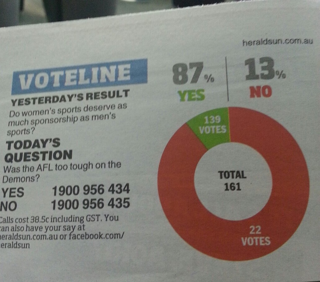
The Herald-Sun pie chart saga continues (thanks to @danfairbairn and @PeteHaitch on Twitter).   Can we get their piechart license suspended pending training and re-examination?

Can we revoke their piechart license?


This example further complicates the question of how they actually make these graphs.  In this one, the angle is at least approximately right, the percentages are right apart from being incorrectly rounded, but the graph is backwards.  We’ve also seen examples where the angles were completely wrong, but the two groups were correctly identified. It’s hard to see how an automated system could cause such a bewildering variety of problems, but it’s also hard to see how a real person could be so totally clueless about pie charts.


We can haz margin of error?

Generally good use of survey data in a story from Stuff about the embattled Education Minister.  They even quote a competing poll, which agrees very well with their overall statistic.

The omission, though, relates to the headline figure: “71pc want Parata gone – survey”.  That’s a proportion “among voters from Canterbury”.   Assuming that they don’t mean “voters” in any electorally-relevant sense, just respondents, we would expect about 120 of the 1000 respondents to be from Canterbury. The maximum margin of error is a little under 10%.

The fact that one region has 71% wanting Ms Parata gone when the overall national average is 60% would actually not be all that notable on its own. Since we already expect her to be less popular in ChCh, the difference is worth writing about, but if it’s worth a headline, it’s worth a margin of error.

February 19, 2013

Terminology

Most of the Stats department is currently moving from the leafy park-like north end of campus back to the glass and concrete Tower of Science. While we’re in transit, here’s a bogus poll on statistical terminology.

Distributions can be classified as to whether they produce more outliers or fewer outliers than a normal distribution. The terms are “platykurtic” (same Greek root as platypus, meaning “flat”) and “leptokurtic” (Greek root meaning “thin”)

Update: answer, and potentially discussion, in the comments

International cooperation

Ben Goldacre mentions the current UK discussion over whether Members of Parliament go to prison at a higher rate than people in general.  He points out that age, gender, and social class distributions are different for MPs, and suggests someone does an adjustment.

Here’s a preliminary attempt. Firstly, note that the data (and the claims) have been about prevalence rather than incidence — MPs as a fraction of the UK prison population, not as a fraction of sentences.  I got prison population data from a Parliament briefing paper, and MPs in prison data from Channel 4’s Factcheck

  • I don’t have detailed age data for MPs, though it could certainly be determined, but at least we can restrict from the whole British population to adults (51 million)
  • The UK adult population is very close to 50:50 on gender, 502/648 MPs are male, 63318 out of 66818 (adult) prisoners

So, 0.79% of male MPs were in prison, compared to 0.24% of adult males in the UK. No female MPs, compared to 0.01% for the female population. Gender-standardised, that’s a relative rate of 3.0

The other important variable is social class.  The briefing paper on the prison population says that `almost three-quarters’ of prisoners were on benefits immediately before entry, and Factcheck says 5.5 million people in Britain are on benefits (and presumably MPs aren’t). I don’t have data on how this varies by gender, either for prisoners or for the population, so I’ll do it separately from the gender standardisation

We have 0.61% of MPs (not on benefits) in prison, and one-quarter of 68818 prisoners out of (51 million – 5.5 million) people not on benefits in prison, which comes to 0.037%, for a relative rate of 16.

So, among adults not on benefits, (people who would otherwise be) MPs are 16 times more likely to be in prison.

User fees and road costs

Last month, there was an interesting report from a US group called The Tax Foundation  on the fraction of US state and local road costs contributed by registration fees, tolls, petrol taxes, and other charges for road users.  It turned out to average about 1/3 — that’s just actual monetary costs, not the costs that drivers impose on others through congestion or carbon emissions.

In New Zealand, the fraction for local roads seems to be higher — if you look at the Funding Assistance Rates that say how much the NZ Transport Agency pays toward council road maintenance, operation, and renewal, it varies around roughly 50% (for Wellington, it happens to be 44%). According to NZTA, the rest of the money comes through mechanisms that don’t specifically target drivers, such as council rates.

So, why did I single out the 44% for Wellington? Well, that’s where anyone not at the wheel of a car is apparently a `guest’ on the roads. Or, with unsettling plausibility, `roadkill’.

February 18, 2013

Colour schemes

Two more colour-scheme producers

  • I Want Hue: takes random colours from a user-specified range and uses Science k-means clustering to make them more distinct. Has nice demonstrations on colour theory. 
  • Colorscheme Designer: standard colour-space patterns, user-adjustable. Can show the impact of all the important types of impaired colour vision.

From Twitter #rstats

February 17, 2013

Census time

I just got my census form, so it must be about time to write about the NZ Census.  As I wrote when the West Island had theirs, it’s a good occasion to think about what the census is good for.  You might think that the success of surveys means that the census is no longer necessary, but as landline phones steadily become a less important part of people’s lives, the census (or some substitute) is actually increasingly vital to calibrate surveys.  In fact, part of my research is on the most effective ways of using this sort of information.

The primary problem with surveys is non-response — you can’t get hold of people, or you do catch them and they tell you to get far away and let them have dinner. Good survey organisations have ways to entice people into responding, but they also rely heavily on reweighting: if your survey under-represents families with young children, you can increase the weight given to those you did find, and reduce the bias.

This reweighting technique isn’t perfect, but it really does work.  The world’s largest telephone survey, the US Behavioral Risk Factor Surveillance System, used not to call cellphones.  It now does, providing an opportunity to compare the real cellphone results with the attempts to reweight.  Here are results from Michigan and Utah comparing a basic reweighting approach with a more sophisticated one, for landlines only and for landlines and cellphones. The improved reweighting approach (raking) made a big difference for the landline-only sample, moving it much closer to the landline+cellphone sample. So, reweighting really works.

Reweighting needs good data for the population, so every well-conducted survey from marketing research to opinion polls to the unemployment rate depends on the census, or some substitute.  In Scandinavian countries, the substitute is large administrative databases and record linkage.  We don’t have these, they’d be expensive to set up, and generally in English-speaking countries people don’t want them.  If you don’t have that sort of database, you need either a complete census or a mandatory survey of a random sample of people.

The United States uses both approaches: every ten years they have a complete census as required by the US Constitution, and in between they have the mandatory-response American Community Survey, which samples about 1% of the population each year.  In the US, the American Community Survey is both cheaper and more accurate than adding an extra census at five-year intervals.  In NZ it’s not clear — because of the smaller and more urban population, a sufficiently large survey might not be much less expensive than a five-yearly census.

What we want to avoid is the Canadian approach, where they decided to put nearly all the questions in a new, voluntary survey. The head of Statistics Canada resigned, and while he was forbidden by law to reveal the advice he had given to the government, he could say

I want to take this opportunity to comment on a technical statistical issue which has become the subject of media discussion. This relates to the question of whether a voluntary survey can become a substitute for a mandatory census.

It cannot.


[ps: the National Business Review has a story with quotes from me]

Briefly

  • Reconstructing the path of the Chelyabinsk meteorite in Google Earth
  • Researchers analysing internet commerce randomized trials (re)discover and solve a lot of problems in experimental design (via both Ben Goldacre and Andrew Gelman)
  • From Nature News: stem-cell research in Texas.  The company is outraged by “FDA’s decision to regulate your own stem cells as a drug”. That’s FDA requiring safe manufacturing — the company hasn’t even started clinical trials yet.
  • 80 patient groups sign up to the AllTrials campaign.
February 16, 2013

Visual perception illustration

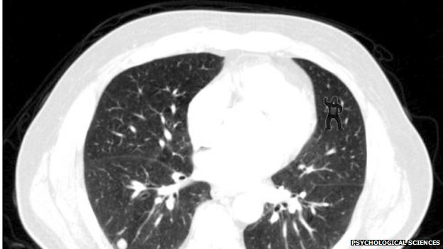
This CT-scan picture illustrates an important perception issue for graphics.  Look carefully at the image, especially at the pattern of white spots.

_65896739_asd

Click through when you’re done
(more…)