Posts written by Thomas Lumley (2645)

avatar

Thomas Lumley (@tslumley) is Professor of Biostatistics at the University of Auckland. His research interests include semiparametric models, survey sampling, statistical computing, foundations of statistics, and whatever methodological problems his medical collaborators come up with. He also blogs at Biased and Inefficient

February 28, 2013

Unclear on the concept

The whole point of the Alltrials.net campaign is to prevent selective publication of clinical trial results.  The problem is that drug companies (and everyone else) publish only about half of their trials and are more likely to publish results if they are positive, distorting the available evidence. The only fix is not to let them be selective.

Roche has responded to the campaign by saying it will set up a panel to approve requests for access to anonymised patient data.  That’s nice, and it will be helpful for certain types of research, but it completely misses the point of the AllTrials campaign.

As Tracey Brown, of the British organisation Sense about Science, comments: “Which bit of All and Trials do they not understand?”
February 27, 2013

A school-based randomised trial

From the Herald (taken from the Daily Mail)

Volunteering is good for the heart as well as the soul, researchers say.

In fact, the research didn’t examine either the soul or the heart, but they did look at weight, cholesterol, and biochemical measurements related to inflammation.

The study, published in the journal JAMA Pediatrics, tested 106 teenagers from Vancouver. Those involved in altruistic activities had lower levels of cholesterol and inflammation.

The paper is here, and even if you can only see the abstract, you can see the story missed an important issue. This was actually a randomised trial:

Intervention  Weekly volunteering with elementary school–aged children for 2 months vs wait-list control group.

That is, the researchers took all the students from a high school in western Canada (presumably Vancouver, though it doesn’t say).  These students are required to do some volunteer work as part of the standard curriculum, and they were randomised to do it in first or second semester.

The article doesn’t address the possibility that the volunteering might have involved an increase in exercise: even just at the level of standing up and moving around vs sitting in front of a screen.  Also, as the researchers admit, this is a very small study, intended as a pilot for larger-scale research, and they may just have been lucky.  It’s still interesting to see the reductions in cholesterol and biochemical markers of inflammation.

February 26, 2013

Compared to what?

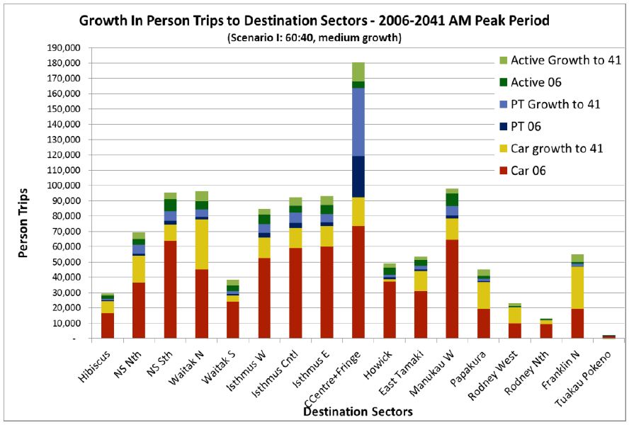
The Auckland Transport Blog presents a dramatically bad example of organising and displaying what would otherwise be quite useful information

ITP-Destination-Demand


The legend indicates that the graph is trying to show three pairs of now vs future comparisons: car trips, public transport trips, and whatever ‘Active’ means (?walking and cycling, perhaps), and geographical variation.

Unfortunately, the stacking means that the easiest comparison is current car trips (red bars) vs all future trips (total bar length).   For example, in the City Centre and Fringe bar, the large projected growth in public transport is mixed up visually with the relatively large current public transport use.  The geographical variation would probably be clearer if the bars were sorted by current volume  rather than north to south, since then you would be able to see projected differences between currently similar areas.

As a relatively minor problem, the colour scheme also highlights growth in car trips more than it really deserves.

That’s not how polling works

I was struck by the Herald headline this morning “Gay marriage fans on top in objector’s poll”, which goes on to say

The Family First lobby group has published a poll which finally concedes what all other polls in the past year have shown – that more New Zealanders now support gay marriage than oppose it.

The poll of 1000 people by blogger David Farrar’s Curia Research has found 47 per cent think same-sex couples should be allowed to marry, against 43 per cent who think “civil unions are sufficient for same-sex couples”.

“Objector’s”, in the singular, would appear to refer to David Farrar, but as you would expect from the rest of his political beliefs, he’s firmly on the record as supporting marriage equality.  Assuming the apostrophe belongs after the “s”, meaning Family First, it still shouldn’t be relevant to the sampling that the poll was funded by them, though it might be surprising that they published the results (Curia also published the full results; I don’t know if they needed Family First’s permission to do so).

The level of support is still a bit lower than in some other polls. I’d guess that’s because of the phrasing of the question,

In 2004, Parliament legislated to allow same sex couples to register a civil union, amending over 150 pieces of legislation to give legal rights and recognition to same-sex couples. Do you think Parliament should change the definition of marriage to allow same-sex couples to marry, or do you think civil unions are sufficient for same sex couples?

compared to the Colmar Brunton question

Question: In New Zealand same-sex couples can enter into a Civil Union, but they are not able to get married. Do you think same-sex couples should be able to get married?


February 25, 2013

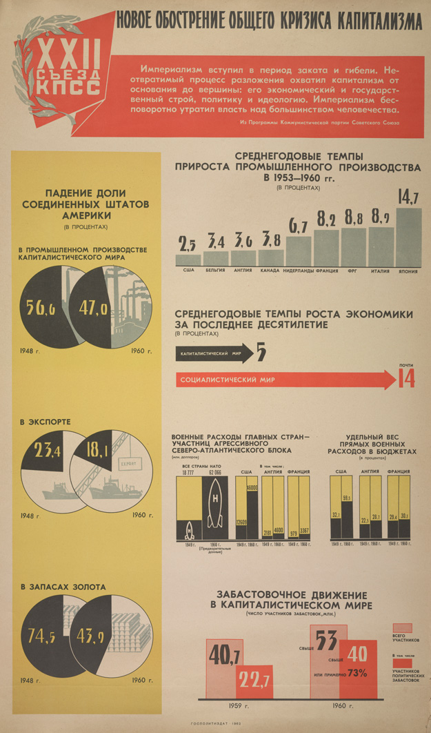
Infographics: so 1980s Soviet

Based on a tweet from Luis Apiolaza (@zentree), I found a bunch of genuine Soviet-era Pravda infographics (the rest of the site is good, too).


These are actually better than a lot of the modern crop.  They certainly handle piecharts better than the Herald-Sun.

Probably most of the numbers are made up, but it’s not as if the numbers on modern infographics are all that good.

Economic data mining needs theory

Via the new Observational Epidemiology blog, it is possible to talk about stochastic complexity in reasonably plain English


But that’s not the worst part

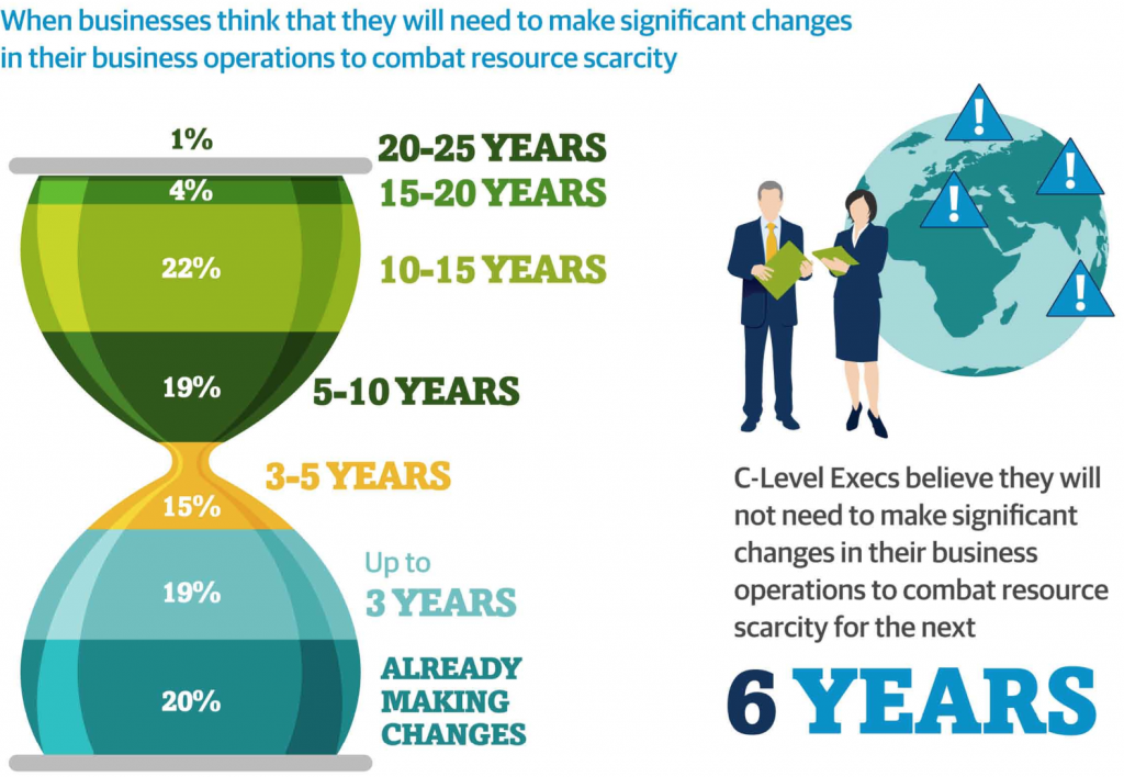
Andrew Gelman passes on this infographic from the Carbon Trust

hourglass


His correspondent points out that the colour scheme is awful, and that the hourglass metaphor would only make sense if the ‘pinch point’ in the hourglass was ‘now’, not 3-5 years in the future.

But that’s not the worst part: Andrew points out that the teeny orange area is actually highest rate per year over the whole time period, a fact that’s masked by the design.

But that’s not the worst part.  The data in the graph come from telephone interviews with some unspecified set of senior executives (CEO, CIO, CTO, COO, etc) selected in an unspecified way with an unspecified response rate, from companies of varying but unspecified size in varying but unspecified industries, so it isn’t really as if the numbers mean much anyway.

Where to cut?

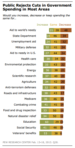
A US survey (see Wonkblog coverage) asked respondents about cutting government spending both overall, and in 19 specific areas.  Most people were in favour of overall cuts, but none of the 19 areas got a majority in favour of decreased funding (click to embiggen, as usual)

a good graph for a change


Even among self-identified Republicans, only two areas had majority support for cuts: unemployment benefits and foreign aid, which make up less than 3.5% of the federal budget.

The graph is pretty good, but some indication of the relative size of these areas (perhaps by the thickness of the bars) might improve it.

February 23, 2013

Buy low, sell high?

From the Herald

Expectations of house price inflation continue to climb in ASB’s latest quarterly survey and are close to their all-time high 10 years ago.

The same seller’s market is reflected in a drop in the net balance of people who consider it a good time to buy a house

That doesn’t make sense to me.  If people expect house prices to keep rising, ie, that houses now are cheaper than in the future, they should want to buy.  Is the market confused, or is it the Herald (or, of course, me)?

When in doubt, randomise.

There has been (justified) wailing and gnashing of teeth over recent year-9 maths comparisons, and the Herald reports that a `back to basics’ system is being considered

Auckland educator Des Rainey, who did the research with teachers to test his home-made Kiwi Maths memorisation system, said the results came as a shock to the teachers and made him doubt his programme could work.

But after a year of practising multiplication and division on the Kiwi Maths grids for up to 10 minutes a day, the students more than doubled their speed.

This program looks promising, but why is anyone even talking about implementing a major nationwide intervention based on a small, uncontrolled before/after comparison measuring a surrogate outcome?

That is, unless you believe teachers and schoolchildren are much less individually variable than, say, pneumococci, you would want a randomised controlled comparison, and since presumably Des Rainey would agree that speed of basic arithmetic is important primarily because it’s a foundation for actual numeracy, you’d want to measure the success of the program based on numeracy tasks rather than on arithmetic speed. The results being reported are what the medical research community would call a non-randomised Phase IIa efficacy trial — an important stepping stone, but not a basis for policy.

Of course, that’s not how education works, is it?