Posts written by Thomas Lumley (2645)

avatar

Thomas Lumley (@tslumley) is Professor of Biostatistics at the University of Auckland. His research interests include semiparametric models, survey sampling, statistical computing, foundations of statistics, and whatever methodological problems his medical collaborators come up with. He also blogs at Biased and Inefficient

February 12, 2013

Conditional probabilities

Usually when someone confuses the probability of A given B and the probability of B given A they don’t really understand that these are different, and you have to point it out and explain it carefully. Richard David Prosser manages to be self-refuting,

And he added: “If you are a young male, aged between say about 19 and about 35, and you’re a Muslim, or you look like a Muslim, or you come from a Muslim country, then you are not welcome to travel on any of the West’s airlines…”

He accepted that most Muslims are not terrorists, but said it’s “equally undeniable” that “most terrorists are Muslims”.

actually pointing out himself that p(terrorist|Muslim) and p(Muslim|terrorist) are not remotely similar.  In the same way, although most members of the Pakistan cricket team are Muslims, most Muslims are not members of the Pakistan cricket team.

That doesn’t handle the further pointless complication of ‘people who look like Muslims’, who, as far as I have been able to tell, are not over-represented among terrorists, but this site might be helpful for calibration.

February 11, 2013

Petrol-price data

Stuff reports on rising petrol prices:

All three retailers said refined fuel costs had been steadily rising since the beginning of the year and those costs were now being passed onto customers.

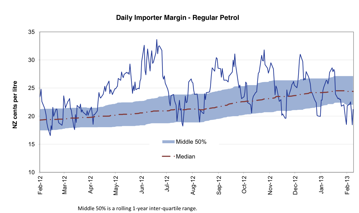
Wouldn’t it be nice if you could get data on this, rather than just believing the petrol companies? Well, you can

The Ministry of Economic Development carries out weekly monitoring of “importer margins” for regular petrol and automotive diesel.  The weekly oil prices monitoring report is reissued every Tuesday with the previous week’s data.

The purpose of this monitoring is to promote transparency in retail petrol and diesel pricing and is a key recommendation from the New Zealand Petrol Review

And if you look at the current graphs, the ‘importer margin’ has been declining since the start of the year, implying increasing pressure on retailers.  On the other hand, the importer margin is about the same as it was this time last year, and as the median from the year before that, so the ‘increasing’ pressure on retailers is partly just business returning to normal.


They also have the underlying data to download.

Real-estate stories: a comparison

Both the Herald and Stuff have stories based on the latest release from Quotable Value. The stories are pretty similar, though the Herald has speculation about the impact on the Reserve Bank rate setting.

Good points:

  • The Herald links to the original media release
  • Stuff points out that prices are still not above the 2007 peak when inflation is taken into account. This isn’t in the media release, but it’s not rocket science and it’s good to see reporters doing it.


February 10, 2013

Two of these things belong together

From an op-ed column in the New York Times, describing three countries

But there is one thing all three have in common: gigantic youth bulges under the age of 30, increasingly connected by technology but very unevenly educated.

If I tell you two of these countries are Egypt and India, can you guess the third?  Anyone? Anyone? Bueller?

It might take a while: in the real world, the third country Friedman includes is better known for instituting draconian (but successful) population-growth controls thirty years ago.

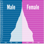
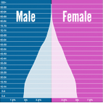
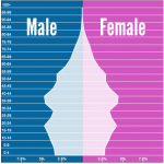
Here are the population age distributions for Egypt, India, and somewhere else, from populationpyramid.net.

egyptindiachina


(via)

Is cherry-picking season finally over?

Ben Goldacre writes in the New York Times about the need for all clinical trials to be published

The Food and Drug Administration Amendments Act of 2007 is the most widely cited fix. It required that new clinical trials conducted in the United States post summaries of their results at clinicaltrials.gov within a year of completion, or face a fine of $10,000 a day. But in 2012, the British Medical Journal published the first open audit of the process, which found that four out of five trials covered by the legislation had ignored the reporting requirements. Amazingly, no fine has yet been levied.

An earlier fake fix dates from 2005, when the International Committee of Medical Journal Editors made an announcement: their members would never again publish any clinical trial unless its existence had been declared on a publicly accessible registry before the trial began. The reasoning was simple: if everyone registered their trials at the beginning, we could easily spot which results were withheld; and since everyone wants to publish in prominent academic journals, these editors had the perfect carrot. Once again, everyone assumed the problem had been fixed.

But four years later we discovered, in a paper from The Journal of the American Medical Association, that the editors had broken their promise: more than half of all trials published in leading journals still weren’t properly registered, and a quarter weren’t registered at all.

There’s a new campaign and petition at Alltrials.net, and if you’re in Auckland, you can hear Ben Goldacre in May at the Auckland Readers and Writers Festival

Netflix owns your brains

Netflix has commissioned an American remake of the brilliant UK television series House of Cards. That’s not especially relevant to StatsChat, but apparently they did it with Big Data and Data Science, so it must be right.

Andrew Leonard at Salon bemoans how this is turning us into puppets

Netflix’s data indicated that the same subscribers who loved the original BBC production also gobbled down movies starring Kevin Spacey or directed by David Fincher. Therefore, concluded Netflix executives, a remake of the BBC drama with Spacey and Fincher attached was a no-brainer, to the point that the company committed $100 million for two 13-episode seasons.

“We know what people watch on Netflix and we’re able with a high degree of confidence to understand how big a likely audience is for a given show based on people’s viewing habits,” Netflix communications director Jonathan Friedland told Wired in November. “We want to continue to have something for everybody. But as time goes on, we get better at selecting what that something for everybody is that gets high engagement.”

The strategy has advantages that go beyond the assumption of built-in popularity. Netflix also believes it can save big on marketing costs because Netflix’s recommendation engine will do all the heavy lifting. Already, Netflix claims that 75 percent of its subscribers are influenced by what Netflix suggests to subscribers that they will like.

Felix Salmon (who is generally a believer in data) is not impressed


It should go without saying, of course, that dropping $100 million on a 26-episode remake of a great TV show is never a no-brainer. For one thing, for all that the original series is extremely good, it was also very timely, coming as it did at the end of Margaret Thatcher’s transformation of the Prime Minister’s office into something much more powerful and Presidential than the UK had ever seen. The BBC series tapped into Britain’s fear of the possible implications of that power, as well as the fact that Richard III and Macbeth are deeply rooted in the national psyche.

More generally, remakes are inherently dangerous things: what producers think of as a “proven formula” more often turns out to have been a unique and inimitable confluence of creative electricity. And it goes without saying that the better the original was, the less likely it is that the remake will surpass it.

Note that $100 million for 26 episodes is about 30% more than ‘Glee‘ costs, which in turn is about 50% more than the average prime-time drama.  Will this be an investment no-brainer in the same sense as Florida real-estate? You might very well think so. I couldn’t possibly comment.


February 6, 2013

The checklist: a worked example

The Herald has a story about increased stroke risk in young adults using cannabis.  Let’s run it past the JOHN HUMPHRYS checklist:

  • Just observing people:  X
  • Original information unavailable:  ?. The abstract should be available, but I can’t find it on the conference website — it will probably be out soon.  It looks as if this story may have leaked early.
  • Headline exaggerated:  The headline is fine.
  • No independent comment: X.
  • Higher risk: X.  Absolute risks are not given, and are extremely low in “young adults”
  • Unjustified advice:? The advice that cannabis smoking is probably bad for your health is justified, but not by this study.
  • Might be explained by something else: X.  Tobacco, for example, which is mentioned in the story but dismissed without justification.
  • Public relations puff: no real problem here.
  • Half the picture: this one’s ok, though the publication bias issue could have been mentioned — this is the first study to find a link, but was it the first to look for one?
  • Relevance unclear: this isn’t a problem
  • Yet another single study: X
  • Small: X only 160 strokes, only 12 or 13 in cannabis users.

It’s not that all stories should pass all checks on the list — sometimes small observational studies can be important or at least interesting.  The problem (as with the Bechdel test) is that such a small fraction of stories pass the checks.


[Update: forgot the link originally]

January 28, 2013

More lottery nonsense

From Stuff, on this week’s Lotto

The winner chose the six lucky numbers they played regularly but, in a clever move, chose to play the same numbers on 10 different lines with each Powerball number. That way they were ensured to win Powerball if their lucky numbers came up.

This strategy doesn’t increase the chance of winning Powerball, because you can’t increase the chance except by cheating or magic.   If they match the six numbers they are certain to win Powerball, rather than having only a 10% chance, but this is exactly compensated by their ten-fold lower chance of having a ticket that matches all six numbers.

The strategy does reduce the chance of winning the first division, by a factor of ten, but increases the fraction of the first-division prize that they snag (in this particular win, from 1/4 to 10/13). Over all, the strategy reduces expected winnings compared to ten random picks. On the other hand, if you cared primarily about average expected return you wouldn’t be playing Lotto.

More misplaced creativity

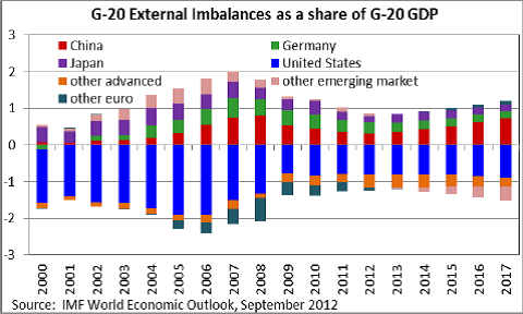
I encountered a new form of awful graph yesterday.  You can think of it as a 3-d bargraph seen from a very bad angle so that the bars get in each other’s way. Or a line graph without the lines.


I think the interpretation is that the height of each coloured segment is the trade imbalance (if it’s the smallest positive or largest negative one), the difference between the trade imbalance and the next lower one (if it’s positive) or the difference between the trade imbalance and the next higher one (if it’s negative).  If two countries/regions have the same trade imbalance, one of them will be nearly invisible.

When the ordering of countries changes, things get even more confusing.  For example, the pink band switches from an almost-invisible slice at the top in 2012 to an almost-invisible slice at the bottom in 2013.  I don’t know what happens to the dark green band after 2012.

The point of the graph appears to be that the light green band is above the red one: Germany’s trade surplus is larger than China’s.  (via)

January 27, 2013

Auckland rent data: too hard basket

Juha Saarinen, on Twitter, asks for data addresses the Auckland rent shock headlines.

Detailed data on new rentals are available from the ‘market rent’ pages at MoBIE, but there doesn’t seem to be any way to download the whole thing, just individual neighbourhoods.  And it’s a long weekend.