More misplaced creativity
I encountered a new form of awful graph yesterday. You can think of it as a 3-d bargraph seen from a very bad angle so that the bars get in each other’s way. Or a line graph without the lines.
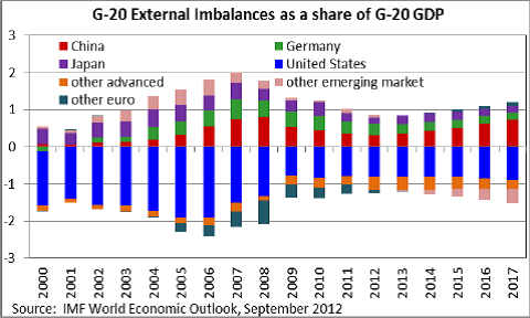
I think the interpretation is that the height of each coloured segment is the trade imbalance (if it’s the smallest positive or largest negative one), the difference between the trade imbalance and the next lower one (if it’s positive) or the difference between the trade imbalance and the next higher one (if it’s negative). If two countries/regions have the same trade imbalance, one of them will be nearly invisible.
When the ordering of countries changes, things get even more confusing. For example, the pink band switches from an almost-invisible slice at the top in 2012 to an almost-invisible slice at the bottom in 2013. I don’t know what happens to the dark green band after 2012.
The point of the graph appears to be that the light green band is above the red one: Germany’s trade surplus is larger than China’s. (via)
Thomas Lumley (@tslumley) is Professor of Biostatistics at the University of Auckland. His research interests include semiparametric models, survey sampling, statistical computing, foundations of statistics, and whatever methodological problems his medical collaborators come up with. He also blogs at Biased and Inefficient See all posts by Thomas Lumley »