Posts written by Thomas Lumley (2645)

avatar

Thomas Lumley (@tslumley) is Professor of Biostatistics at the University of Auckland. His research interests include semiparametric models, survey sampling, statistical computing, foundations of statistics, and whatever methodological problems his medical collaborators come up with. He also blogs at Biased and Inefficient

December 10, 2012

Briefly

I’ve been away or busy for a couple of weeks, so here are some collected links on statistics, graphics, the media, and risk

December 4, 2012

Journalism after printing presses

From the Tow Center for Digital Journalism, at Columbia University, a new report: “Post Industrial Journalism: Adapting to the Present”

This essay is written for multiple audiences–traditional news organizations interested in adapting as well as new entrants (whether individual journalists, news startups or organizations not previously part of the journalistic ecosystem)–and those organizations and entities that affect the news ecosystem, particularly governments and journalism schools, but also businesses and nonprofits.

We start with five core beliefs:

  • Journalism matters.
  • Good journalism has always been subsidized.
  • The internet wrecks advertising subsidy.
  • Restructuring is, therefore, a forced move.
  • There are many opportunities for doing good work in new ways.

Making Nate Silver cry

Stuff tells us

Polls have Labour closing in on Nats

A One News-Colmar Brunton poll released last night and taken a week after Labour’s leadership spat, saw the party’s vote lift 3 percentage points to 35 per cent, with the Greens up one on 13 per cent.

and later on

The One News poll of 1000 had a margin of error of 3.1 per cent.

 If you have been paying attention, you know that (a) the margin of error for a change is about 1.4 times larger than the margin of error in a single proportion, and (b) much more importantly, the useful thing to do with election polls is not to report each one separately, but to take some sort of average.

Did they have another poll? Well, the story goes on to say

 Meanwhile, a 3News-Reid Research poll, also released yesterday, showed Labour on the rise at 34.6 per cent, up 1.6 percentage points. The Greens improved 1.3 to 12.9 per cent, while National was down 1.8 at 47 per cent.

It doesn’t make as good a lead, because Labour was only up 1.6%, not 3% in this poll.  But if there are two polls, perhaps there are even more out there.

The poll of polls at pundit.co.nz shows a steady trend towards higher support for Labour, and a trend towards lower support for the Greens (with a bit more variation around the trend).  Their last update (including these two polls) put Labour up by 1% and Greens up by 0.2%.  But that would be less newsworthy.

House prices yet again

In another story bemoaning the affordability of housing outside Auckland, the Herald also tells us

The median sale price of a home in central Auckland is now $690,000 – slightly up on the previous quarter and 12.5 per cent on the 2007 boom.

That’s still down on the 2007 boom in real terms.  The story was followed the very next day by

Auckland real estate asking prices fell 2 per cent last month

The signal to noise ratio in real-estate industry press releases is not all that high.

December 2, 2012

An easy question

The Herald (quoting the Daily Mail) asksIs chocolate the new Viagra?“.

No, it isn’t. (more…)

November 29, 2012

You are feeling sleepy

Stuff has a story about an increase in sleeping-pill prescriptions in young people.

The increase in prescriptions is real. What’s more dubious is the explanation that it reflects an increase in sleeping difficulties is being caused by electronic devices, rather than trends in treatment.  It’s not that it’s implausible for gadgets to affect sleep — the mechanisms are fairly clear — it’s more that there isn’t any evidence supplied that sleeping problems are becoming hugely more common.

With the help of the Google and PubMed, I found a few papers looking at time trends in sleep. A recent US paper looked at time-use studies from 1975 to 2006, and found that

Unadjusted percentages of short sleepers ranged from 7.6% in 1975 to 9.3% in 2006.

A Finnish study  found about a 4% decrease in average sleep duration from 1972 to 2005, about half a minute per year.

Other research in both kids and adults seems to agree that sleep duration is decreasing slowly, but not by anything like enough to justify Stuff’s lead:

Your tablet computer, smartphone or other mobile device could be the reason you are not sleeping – and the ubiquitous devices are being cited as a possible cause for a 50 per cent jump in the number of young people scoffing sleeping pills.

It doesn’t make matters better that the “50 per cent jump” is really just for one region in NZ (the Waikato). Or that taking a single 165mg tablet per night is described as “scoffing sleeping pills”.

Happy little tweeps

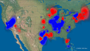
Via Stuff, Twitter heat maps composed by SGI, showing positive and negative sentiment on Twitter on particular topics.

This one is from the US election, and it shows the good and bad aspects of the heatmap.  Since the information is in the colour scale, you don’t have the problem we saw earlier this week


On the other hand, you do have the problem that high population density regions are the ones that show up — giving a perhaps-misleading impression in this image that there was overwhelmingly more positive sentiment than negative about the US election results.

[update: wrong map initially]

November 27, 2012

Do you feel lucky?

The Herald (as our Stat-of-the-Week nomination points out) is claiming

Manukau is the luckiest Lotto suburb in Auckland, the Herald can reveal.

This looks as if it’s claiming that tickets bought in Manukau have been more likely to win.  If this was true, it would still be useless, because future lotto draws are independent of past ones.

It’s even more useless because there is no denominator: not tickets sold, not people in the suburb, not even number of Lotto outlets in the suburb.

What the statistic, and the accompanying infographic, really identifies is the suburbs that lose the most money on Lotto.  That’s why Manukau and Otara are ‘lucky’ and Mt Eden and Remuera are ‘unlucky’, the sort of willfully perverse misrepresentation of the role of chance that you more usually see in right-wing US outlets.

November 25, 2012

XKCD on denominators

XKCD on the data visualisation equivalent of forgetting that Auckland is larger than Wellington

I’m looking at you, Facebook

Clarity begins at home

Stuff’s story on the World Giving Index would have been better just using it as a hook for a discussion of charities in NZ, but they couldn’t stop themselves from referring to details. Which turn out to be wrong.

For example

The World Giving Index, which compares countries’ charitable behaviour in giving money, time and helping a stranger, found New Zealand was slightly less giving than in 2010 when New Zealand and Australia were found to be the most generous, with 57 per cent of people doing some charitable work.

It’s not 57% of people (unless you think those behaviours are independent).  The index value of 57 is the average of the proportions for the three things that the survey actually measured.  The value of 57 is exactly the same as in the previous survey.  NZ went down in the ranking because other countries increased their Giving Index value.

Fundraising Institute of New Zealand chief executive James Austin is quoted as saying

“When you start boiling it down, even though they are very sophisticated in the way they put their statistics together, everything from exchange rates has an impact on it,”

Either he wasn’t asked a question about the World Giving Index, or he doesn’t understand it either. This isn’t an inventory of actual monetary sums given. It’s just an average of three percentages: % who volunteered time, % who gave money, % who helped a stranger. Exchange rates really don’t come into it.

The story also doesn’t mention the cautionary note in the Australasia section of the World Giving Index report

 It is important to note that these surveys were conducted before devastating floods crippled Queensland, Australia in January 2011, and the tragic earthquake that struck New Zealand in February 2011, so any change in giving behaviour after these disasters is not captured in this year’s analysis.

That’s useful context for the poll-based claim in the story

A Sunday Star-Times poll of 763 readers reflected the World Giving Index, with 53 per cent of respondents having changed the way they donate in the past 12 months. More than half of those who had changed their habits admitted to donating less money.

So, this poll actually had very different findings from the World Giving Index survey, possibly because it was asking completely different questions, but possibly because it was about a non-overlapping period of time.

And we haven’t even got to margins of error or sampling bias.