Posts written by Thomas Lumley (2645)

avatar

Thomas Lumley (@tslumley) is Professor of Biostatistics at the University of Auckland. His research interests include semiparametric models, survey sampling, statistical computing, foundations of statistics, and whatever methodological problems his medical collaborators come up with. He also blogs at Biased and Inefficient

December 20, 2012

Proper use of denominators

The Herald, and the Ministry of Transport, are reporting rates for motor vehicle crashes and casualties, not just totals:

Statistically, Dunedin is New Zealand’s worst city for motor vehicle crashes and casualties but authorities say the numbers are dropping.

Last year the city recorded 364 injury crashes. Auckland had 2903, and Christchurch 715.

However, Dunedin had the highest number of crashes per 10,000 population (29), ahead of Palmerston North (24) and Napier (23).

Population is not the ideal way to standardise road crashes (especially in high-tourism areas), but it’s a lot better than not doing anything.  When we looked at crashes at intersections, back in March, it didn’t make a lot of difference whether we standardised by population, number of registered vehicles, or vehicle-miles travelled.

December 19, 2012

Slightly more dead

The Herald’s story  (via Medical Daily) about a report in the BMJ slightly misses the point. The lead says

A new report, published in the British Medical Journal, claims activities like having a couple of drinks, smoking, eating red meat and sitting in front of the TV can cut at least 30 minutes off a person’s life for every day that do it.

None of this is new. What’s new, and the point of the report, is the idea of quoting all these risks in terms of expected life lost, denominated in ‘microlives‘.   David Spiegelhalter, who is Professor for the Public Understanding of Risk, writes in the report:

We are bombarded by advice about the benefit and harms of our behaviours, but how do we decide what is important? I suggest a simple way of communicating the impact of a lifestyle or environmental risk factor, based on the associated daily pro rata effect on expected length of life. A daily loss or gain of 30 minutes can be termed a microlife, because 1 000 000 half hours (57 years) roughly corresponds to a lifetime of adult exposure. From recent epidemiological studies of long term habits the loss of a microlife can be associated, for example, with smoking two cigarettes, taking two extra alcoholic drinks, eating a portion of red meat, being 5 kg overweight, or watching two hours of television a day. Gains are associated with taking a statin daily (1 microlife), taking just one alcoholic drink a day (1 microlife), 20 minutes of moderate exercise daily (2 microlives), and a diet including fresh fruit and vegetables daily (4 microlives). Demographic associations can also be expressed in these units—for example, being female rather than male (4 microlives a day), being Swedish rather than Russian (21 a day for men) and living in 2010 rather than 1910 (15 a day). This form of communication allows a general, non-academic audience to make rough but fair comparisons between the sizes of chronic risks, and is based on a metaphor of “speed of ageing,” which has been effective in encouraging cessation of smoking.

There was a BBC documentary on this subject back in October (a 5-minute clip is available).

December 17, 2012

Turkey arithmetic

Stuff’s story about the price of Christmas food has the headline “Festive food hits Kiwis’ wallets”, and the even more misleading HTML page title “Christmas Dinner Takes Bigger Dent from Wallets.”  The story says

A traditional Christmas dinner with roast chicken or lamb, seasonal vegetables, nibbles and pavlova will set you back about $67.31, up from $54.60 in 2002.

The problem, as usual with stories comparing past and current prices, is that dollars are smaller than they used to be.  In this case the CPI isn’t really the answer — $54.60 in 2002 money is worth about $70 in today’s money, but that just tells us Christmas dinner has gone up less than the average for the CPI basket of goods.

The dent in wallets really depends on how the price compares to income.  If the price had increased as fast as mean household income it would now be $76.38, if it had increased as fast as median household income it would now be $77.55, and if it had increased as fast as the minimum wage it would be $92.18 (StatsNZ, MoBIE).


Unscientific polls of scientists

The graph below is an overly-creative variation on barplots, which I think confirms the principle “if you want to write the data values on the graph, it’s probably a bad graph”.

Good thing it wasn't two hours

The data are supposed to be “time per day spent using mobile apps”.  Presumably it’s mean time per day, though I can’t tell whether the mean is restricted to people who spend non-zero time.  The graphs come from a “study” conducted by the “Science Advisory Board®”.  The “Science Advisory Board®” is an online survey panel for market research, where biomedical scientists are the market.  Or as they put it

The Board is an independent, worldwide panel of life science and medical professionals that convenes electronically to voice their opinions on a wide range of topics.

Here “convenes electronically” means “gets sent survey links by email”, and since I’m not a “member”, in my case this means spam about a survey on lab equipment.

The “Science Advisory Board®” homepage includes various things aimed at making their study samples feel like a community. There’s also widget that cycles through their past few days of Twitter feed at a rate of about one every five seconds, and, rather surprisingly for a company that wants to give the impression of solid opinion research, a clicky bogus poll™.

Briefly

  • A zombie story:  Stuff has an opinion piece about chocolate and intelligence, based on the joke article in the New England Journal of Medicine back in October. We covered what was wrong with it then, and showed that you get better correlation with the number of letters in the country’s name than with chocolate consumption.  [Update: the piece is really from an Australian publication, with a light makeover for the Kiwi audience.]
  • A better joke.  An article in the Canadian Medical Association Journal looks at the impact on clinical trials if the world ends on December 21, as the Mayan calendar does not give the slightest suggestion will happen.
  • Language Log examines the inability of journalists around the world to get the basic numbers right in reporting a study on water chlorination and allergies (a story that the NZ media seem to have had the good sense not to pick up).
  • “Good data-driven journalism both publishes as much data as possible, and uses the data to drive conclusions, rather than simply dropping numbers into a foreordained article.”  Felix Salmon, complaining about a New York Times story.
  • The American Statistical Association has a new prize for “Causality in Statistics Education”, aimed at encouraging the teaching of basic causal inference in introductory statistics courses.
December 15, 2012

Experiment with your vegetables

The Herald has a story on anticancer compounds in broccoli that is actually pretty good. Even the headline only says “Broccoli compound can kill cancer”.

Like all early-stage lab research, the findings will almost certainly not lead to improved treatments, and they don’t provide an additional reason to eat broccoli, but the story does describe what the research found.

December 13, 2012

Sure beats paying for your ads

Back in August, we commented on a bogus survey run by a sex toy store, which Stuff thought was news.

Now, three months later, the store has put out another press release(probably NSFW) from the same survey and this time we have two different stories in Stuff and even the Herald thinks it’s news. At least the Otago Daily Times didn’t fall for it.

Again we have figures quoted to a tenth of a percentage point from small subgroups of 1500 respondents (gays, people from Gisborne, 55-59 year olds), which would be meaningless even if this was a real survey.

Sigh.


December 11, 2012

(Almost) all the world’s powerplants

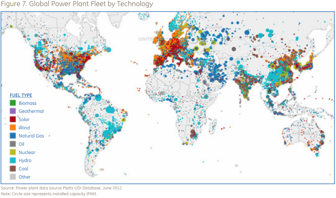
From GE, via Ezra Klein’s blog at the Washington Post, this is supposedly a map of all the powerplants in the world, by size and type.

It looks as though they are missing a few.

NZ data/graphics site

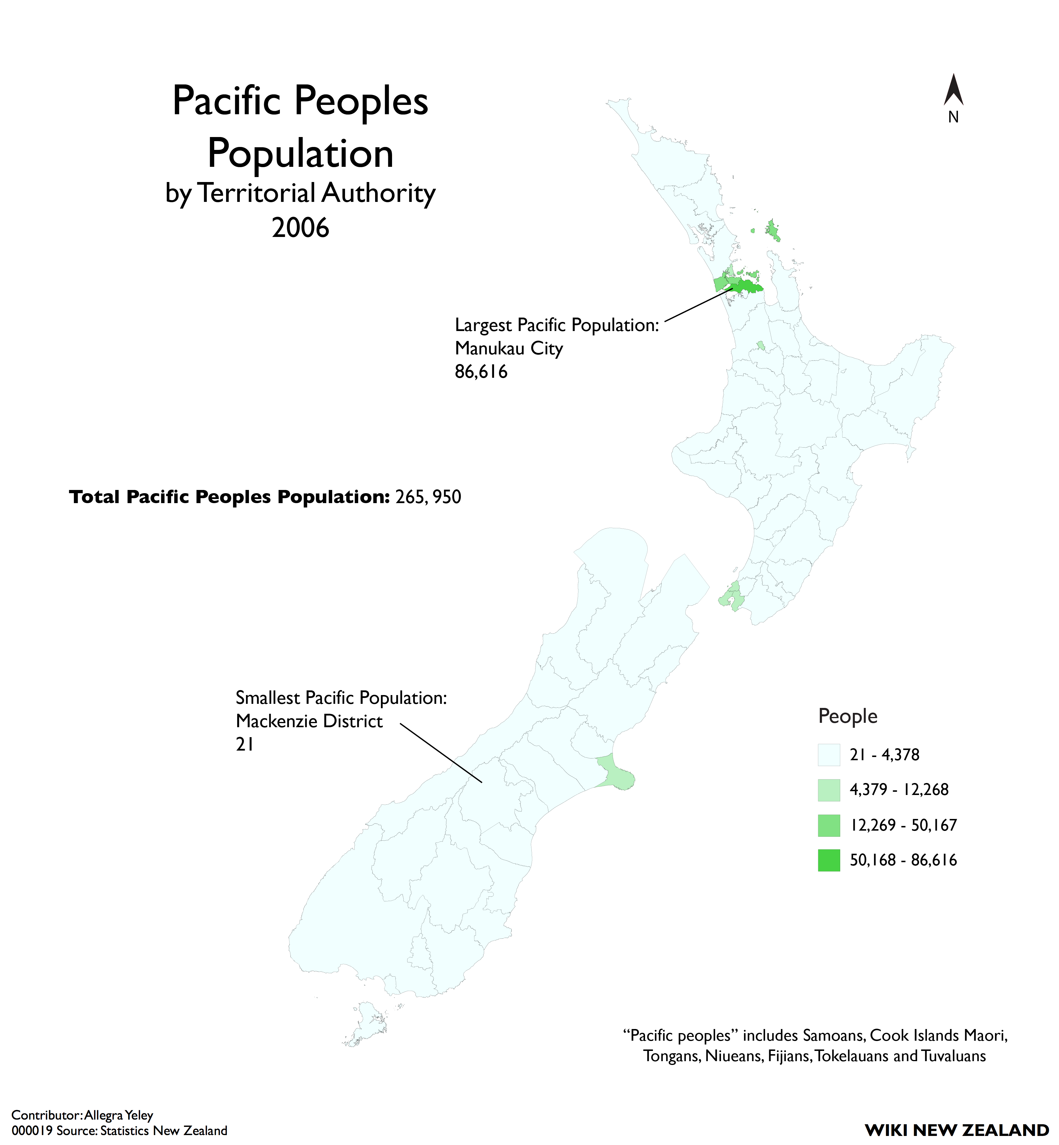
Wiki New Zealand bills itself as “A collaborative website making data about New Zealand accessible for everyone.”

They have lots of graphics of comparative data on New Zealand, with comparisons within the country, over time, and compared to other countries.

Two quibbles: it would be nice if the data source links gave a bit more information on how to find the data than just, eg, pointing to StatsNZ Infoshare.  Also, the thematic maps are currently all of total population counts, without any denominators.

December 10, 2012

Won’t somebody think of the children

The Herald warns us

More than four in ten UK parents say that their children have been exposed to internet porn, an official survey reveals.

In the fifth paragraph we find

The Daily Mail is campaigning for an automatic block on online porn to protect children

which should make any reader sceptical about the numbers.  This is a scare story from a foreign source notorious for its creative use of numbers and its obsession with sex, and a story where they actually admit they are lobbying. It’s bad enough getting science stories from the Daily Mail; this sort of thing really suggests a news shortage.

We don’t get told what actual questions were asked, how the sample was gathered, or any of the other basic survey details.  More importantly, we don’t even get told anything about the age range of the children, which makes a big difference in this case.  We do learn

Almost a third say their sons or daughters have received sexually explicit emails or texts and a quarter say they have been bullied online or on their phones.

Neither of these issues would be affected by the proposed internet filtering, and both are very different from internet porn in that they are almost exclusively between kids who know each other in real life.

Perhaps the journalists are too young to know that porn existed before the Internet, and teenagers were occasionally exposed to it. You can get a more useful perspective from danah boyd and from a report from Harvard’s cyberlaw clinic that contains actual research.