Posts written by Thomas Lumley (2645)

avatar

Thomas Lumley (@tslumley) is Professor of Biostatistics at the University of Auckland. His research interests include semiparametric models, survey sampling, statistical computing, foundations of statistics, and whatever methodological problems his medical collaborators come up with. He also blogs at Biased and Inefficient

November 25, 2012

Is family violence getting worse?

Stuff thinks so, but actually it’s hard to say.  The statistics have recently been revised (as the paper complained about in April).

The paper, and the Labor spokewoman, focus on the numbers of deaths in 2008 and 2011: 18 and 27 respectively.

The difference between 18 and 27 isn’t all that statistically significant: a difference that big would happen by chance about 10% of the time even assuming all the deaths are separate cases.  It’s pretty unlikely that the 50% difference reflects a 50% increase in domestic violence, but it might be a sign that there has been some increase. Or not.

The Minister doesn’t do any better: she quotes a different version of the numbers, women killed by their partners (6 in 2008, 14 in 2009, 9 in 2011), as if this was some sort of refutation, and points to targets that just say the government hopes things will improve in the future.

There’s no way that figures for deaths, which are a few tenths hundredths of a percent of all cases investigated by the police, are going to answer either the political fingerpointing question or the real question of how much domestic violence there is, and whether it’s getting better or worse.  It’s obvious why the politicians want to pretend that their favorite numbers are the answer, but there’s no need for journalists to go along with it.
Some houses are more expensive than others

From the Herald

It’s almost as good as claiming Lotto’s first-division prize – the winners in Auckland’s frantic housing market are selling their properties for hundreds of thousands of dollars above their official valuations.

Statistics show that in the past six months there have been at least nine properties that sold for $500,000 or more above their CV

My first instinct is to look up the number of houses listed for sale in Auckland over the past six months, and point out that this is about 0.025% of listings, so it compares to winning the lottery on more than one dimension.

But more importantly, the council valuation is almost completely irrelevant to whether the seller has done well out of the deal.  The seller doesn’t pay the council valuation to anyone. The costs to the seller (after taking inflation into account) are the purchase price, interest, maintenance, improvements, and rates,  and only the last is affected even slightly by the new council valuations.

headline vs story

From Stuff: the headline figure is a 3-year total

Judges’ partners claim $500k

but then the story does the arithmetic

There are about 170 judges in New Zealand, meaning the annual amount claimed by partners averaged less than $1000 per judge.

 They could also have noted it was a bit under 3% of the total claims for judges expenses.
November 24, 2012

Why real data is important in teaching

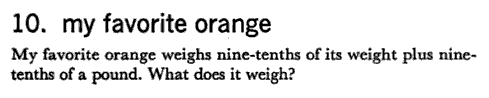
Proving that adding words to an algebra problem doesn’t automatically give it real-world context:

From Intriguing Mathematical Problems, Dover Publications, and Dan Meyer

Thanks, Textbooks adds: This brings up several more important questions:

  • Who has a “favorite” orange?
  •  How long have you had this orange that you’ve bonded with it so much?
  • Who has an equation to calculate the weight of an orange?
  • Is it your favorite because it happens to weigh nine pounds!?

(via)

[Other observations from Thanks, Textbooks  include:  I’m less concerned with the question, “What does the scale read?”  and more concerned with the question, “Why the hell are we lubricating a hamster?”]


November 23, 2012

Bus prediction

Today in the US is Thankgsiving, and it is traditional to be relentlessly positive, each large amounts of turkey, and collapse in front of the football game.

In partial observance of the tradition, I want to praise the new bus prediction system display.  The predictions are still too optimistic about remote buses, but at least the new display lets you tell which predictions are based on actual bus locations and which ones are just based on the timetable (eg).


November 22, 2012

Are old apes really happier?

Prompted by a comment from Cosma Shalizi (who, irritatingly, is right as usual), I tried some simulated data on the great ape midlife crisis, and I’m now even less impressed with the paper.

There’s very strong evidence in the paper that the youngest apes are rated as happier by their handlers, and that the relationship with age is not linear.  What’s less clear is that there is a U-shape.

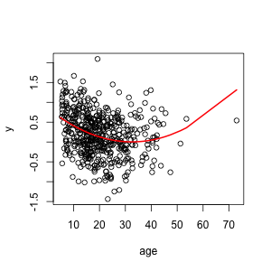
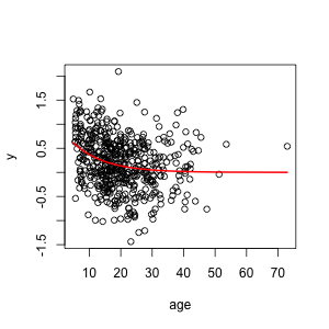
I simulated data where the score decreased sharply at young ages and then flattened out, but didn’t go up again in old age, and analysed as the researchers did in the paper.  This is what the data and true relationship look like:

Fitting the model used in the research paper gives a U-shape, because the model they fitted can only give U-shapes. As in the paper, the minimum is in middle life.  The statistical significance for the non-linear term is better than in the paper.

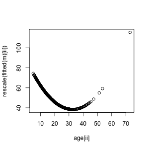
In the paper, the fitted U-shape was rescaled to have mean 50 and standard deviation 10, and the raw data weren’t displayed, making the relationship look much stronger:

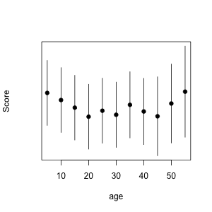
And, as in the paper, the banded model in the Appendix is at least consistent with a U-shape.

So, you can get the results in the paper with no midlife crisis at all. Now, you don’t necessarily get results like these: if you run the code with different sets of random numbers you get results this good maybe half the time. And of course, you could also get those results with a true U-shape.

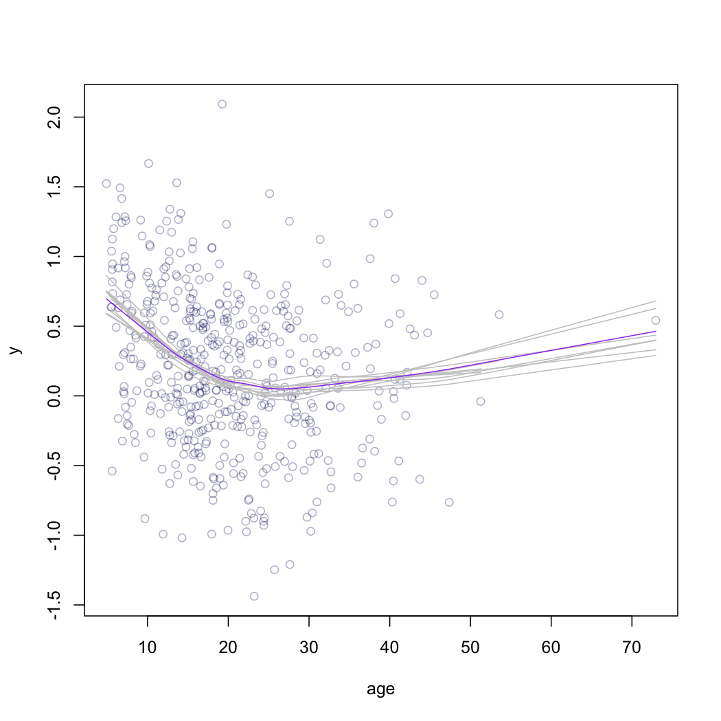
The point is that the results in the paper are not strong evidence for a U-shape, and the graphs and tables in the paper give the impression of much stronger evidence than they actually contain.  A much better graph would use a scatterplot smoother, to draw a curve through the data objectively, and something like bootstrap replicates of the curve to give a real impression of uncertainty.  This doesn’t give a formal test, but at least it shows what the data are saying.

It would take some thought to come up with a good formal test, but a graph like this one should be a minimum threshold. If there really is evidence of a midlife crisis in apes this graph would show it, and if there isn’t, it wouldn’t. (more…)

Fly away home

With the summer holiday season approaching we’ve had requests for a post on the relative safety of driving and flying.

To a large extent this depends on where you are going: if you’re heading from Auckland to the Coromandel then I’d recommend driving, but if you want to spend some time on a beach in the Cook Islands your chances of getting there safely by car are distressingly low.

Clearly we need to rephrase the question.  Two possibilities are:

  • for a destination where either flying or driving makes sense, which one is safer?
  • if you compare a typical holiday road-trip to a typical holiday flight, which is safer?

We should also think about what risks to include: for a long plane flight the chance of a pulmonary embolism is higher than a crash, possibly much higher depending on your other risk factors.

The risk of a `fatal incident’ on a flight is largely independent of the length of the flight, and based on US data is about eight deaths per hundred million flights.  The risk is probably lower in NZ, since the figure includes the September 11 terrorist attacks.

The risk of death from car crash when driving in the US is about 4 per billion kilometers.  I don’t have good figures for NZ, but it’s a bit higher here. On the other hand, there’s a lot of variation depending on how you drive.

So, for a trip of 500km (eg, Auckland-Wellington), we’re looking at an average figure of about eight deaths in crashes per hundred million flights and about 200 deaths in crashes per hundred million car trips. Flying wins by a huge margin

University of Otago research estimates the risk of pulmonary embolism at about 0.5 per million short flights and about 1.3 per million long flights.  Estimates of the risk of death with pulmonary embolism in modern times seem to be around 10-20%, giving death rates of about 50-100 5-10 per hundred million short flights or 120-250 12-25 per hundred million long flights.  Flying still wins for the Auckland-Wellington route, even if driving doesn’t increase pulmonary embolism risk at all (it probably increases it but by less than driving)

If you compare a 500km drive with a long-haul intercontinental flight the numbers get less clear.  Flying to London could possibly be more dangerous than driving to Wellington, especially if you are a safe driver but at relatively high risk of blood clots.

After all these calculations it’s important to keep a sense of perspective. Driving is pretty safe. Flying is even safer.

November 21, 2012

Not so much poor and huddled masses

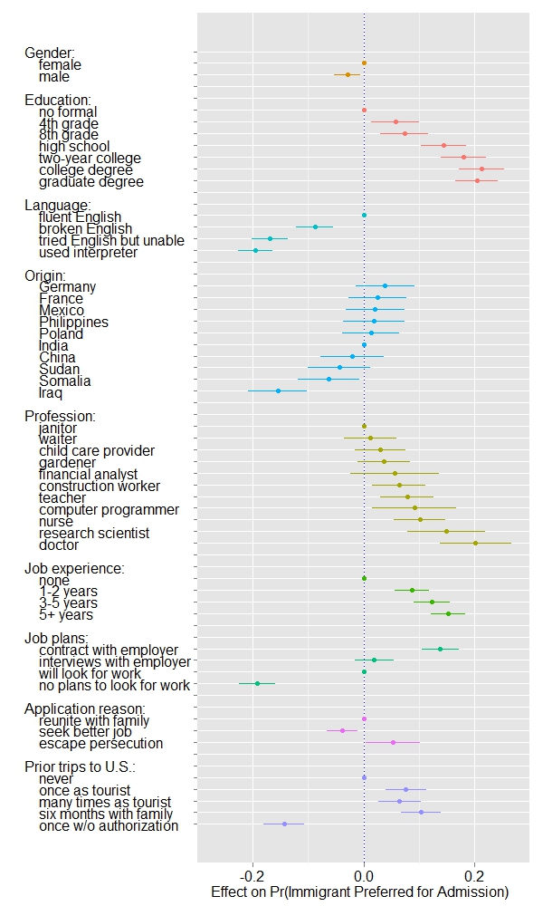
Nice presentation of interesting results on US opinions of immigration.  Participants were given two hypothetical immigrants with characteristics chosen from these options, and asked which one they would prefer to admit, and regression models were then used to estimate the impact of each characteristic.   Country of origin had a surprisingly small impact; otherwise it was pretty much what you might expect.  The story has more details, including a comparison by political affiliation, which reveals almost no disagreement.

While on the topic, you should read Eric Crampton’s proposal that anyone completing a (sufficiently real) degree in NZ should be eligible for permanent residence: not only boosting our education export industry, but attracting young, ambitious, educated immigrants. I think it’s a good idea, but I’m obviously biased.

November 20, 2012

Avoiding midlife uncertainty

Stuff and the Herald have the identical AP story, so you can read either one

Chimpanzees in a midlife crisis? It sounds like a setup for a joke. But there it is, in the title of a report published in a scientific journal: ‘Evidence for a midlife crisis in great apes.

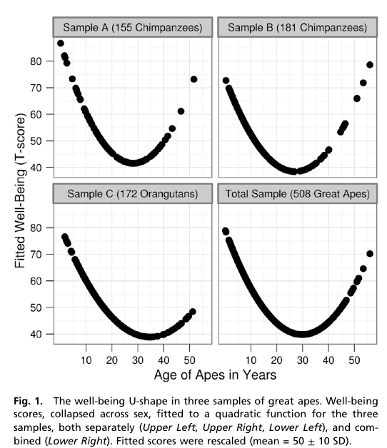
The researchers asked handlers to estimate ‘well-being’ for 508 great apes: 172 orang-utans, the rest, chimpanzees.  They fitted a statistical model to look for a decrease in mid-life followed by an increase, and got dramatic graphs

The x-axis is in years, showing the trough of despondency in the mid-thirties.  The y-axis isn’t in anything — the curves were rescaled to look similar and the numbers are arbitrary.

The reason the curves look so dramatic is partly the higher-than-wide shape of the graph, but mostly the lack of any indication of uncertainty. The data are actually consistent with a wide range of flatter or steeper U-shapes and with the `mid-life’ crisis happening anywhere over quite a range of years.  I can’t be more precise than that, because the researchers don’t even provide the necessary information to compute the uncertainty in the curve [they give uncertainties in regression coefficients, but not correlations between them].

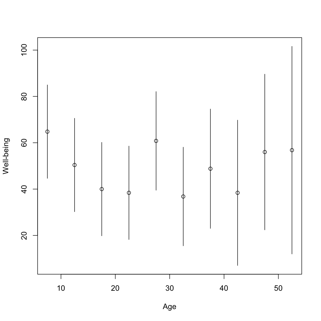
However, they do have an appendix that looks at chopping up age into five-year bands and estimating the midlife crisis that way.  They don’t give a graph, but they do give enough information to draw one. It’s not as impressive.

The U-shaped pattern does seem to probably be real (though the extent to which the so-called mid-life crisis is really the apes’ problem rather than than the handlers’ problem isn’t clear), but the graphs in the research paper are overselling it. Badly.

[Update: the intervals in the plot are +/- 1.4 standard errors for the coefficient. This should be in the ballpark for a 95% interval for the mean for that age group]

The data speaks for itself

Stuff,  September 19

The myth of feckless youth which does not understand the value of money should be laid to rest, new research from online deposit bank RaboDirect suggests.

Stuff, today

The overwhelming majority of young Kiwis do not believe in long-term financial planning and most give no thought to budgeting.

In both cases the actual stories are better than the leads would suggest.