January 26, 2026
Briefly
- From the BBC “Vitamin D deficiency linked to hospital admissions”. This is from a large British study correlating vitamin D levels in the blood with hospital admissions for respiratory infections. You might say “Someone ought to do a clinical trial to see if giving people vitamin D reduces infections or if it’s just correlation”. Someone has, here in NZ. Also, if you combine all the trials on this question you get an estimate of somewhere between a 10% reduction and a 4% increase. It’s still possible that it works in people with especially low vitamin D or something, but across a range of diseases randomised clinical trials of vitamin D have been robustly disappointing in comparison to correlational studies.
- From Derek Lowe, a post on extremely bad clinical trial conduct. This isn’t fraud by Big Pharma — if it counts as fraud, Big Pharma is a victim (along with some, but possibly not all, of the trial participants)
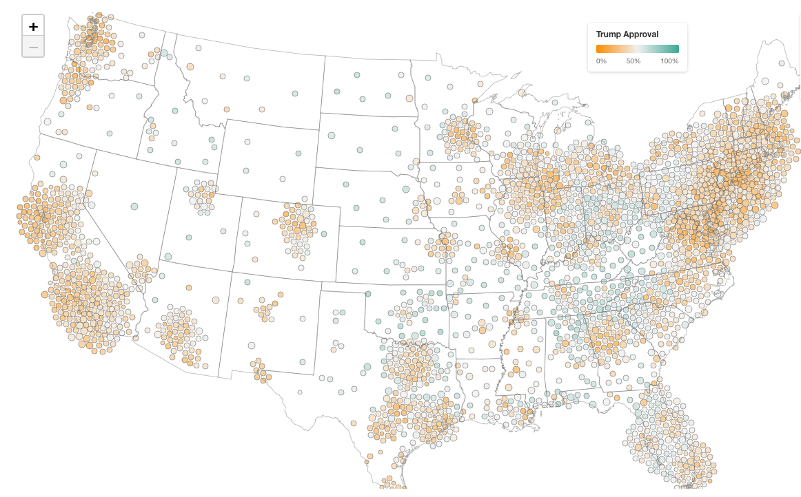
- “A very detailed map of Trump’s job approval” from Strength In Numbers (click to embiggen). “The basic idea is that we fit a model predicting approval based on demographics and geography, then use Census data to weight those predictions by the actual population composition of each area. Election results are used to calibrate estimates to sensible baselines, so we have a real-world check against our survey data. It lets us produce reliable estimates even for places where we only have a handful of direct survey respondents.”
- From the Guardian, Australian supermarket online prices per each can be very different from the in-store per-kg prices. Most dramatically, green capsicums were allegedly 50% more expensive per each.
- Bogus polls show increases in church attendance by young adults: Pew Research


Recent comments on Thomas Lumley’s posts