Posts written by Thomas Lumley (2645)

avatar

Thomas Lumley (@tslumley) is Professor of Biostatistics at the University of Auckland. His research interests include semiparametric models, survey sampling, statistical computing, foundations of statistics, and whatever methodological problems his medical collaborators come up with. He also blogs at Biased and Inefficient

October 11, 2018

Carefully taught

Q: It’s shocking how computers can be so sexist

A: Not really the computers; more the users

Q: But they took this computer program and showed it lots of people’s applications, and it downrated the ones from women

A: Yes, but that’s because they also trained it with information about which applications they thought were best, and it learned from them that women’s applications weren’t as good

Q: Couldn’t it just have seen that more men that women were accepted because more men applied, and over-generalised?

A: Not really. It should be looking at the probability of acceptance, which wouldn’t be affected by overall proportions, but would be affected by human bias.

Q: Could the bias all have come in via word associations, like in that ‘how to make a racist AI’ blog post.

A: Perhaps. But only if they weren’t really trying. In particular, however the bias came in, they should have been aware of the potential and audited the results. I mean, this is a respectable organisation; you’d assume they were that responsible

Q: That sounds like a simple piece of advice

A: Yes, but even 30 years later, people are still making the same mistakes

Q: Wait, what? Aren’t we talking about Amazon?

A: No, St George’s Hospital Medical School, London.  In the BMJ in 1988, based on a program written in the 1970s

October 5, 2018

Briefly

  • “Data for Sale” at Stuff, on data ethics
  • “How a math genius hacked OkCupid to find true love” at Wired
  • Chris Knox interviews Cathy O’Neil, who is in New Zealand for a Stats NZ ‘Data Summit’.  StatsChat readers will already be familiar with Dr O’Neil aka mathbabe.org
  •  ‘People disagree about what fairness looks like. That’s true in general, and also true when you try to write down a mathematical equation and say, “This is the definition of fairness.”’ An interview with Dr Kristian Lum  of the Human Rights Data Analysis Group
  • A group at Johns Hopkins Dept of Biostatistics have been working to reduce the scarcity value of data science. They have a new program: “excited to announce the first part of our new system, a new set of massive online open courses called Chromebook Data Science. These MOOCs are for anyone from high schoolers on up to get into data science. If you can read and follow instructions you can learn data science from these courses!” (There’s obviously a potential conflict of interest here with Auckland’s data science programs, but I think there’s a separate market for in-person training where you can ask questions)
  • “Which neighborhoods in America offer children the best chance at a better life than their parents? The Opportunity Atlas uses anonymous data following 20 million Americans from childhood to their mid-thirties to answer this question.” There’s an obvious difficulty with any dataset like this — if you’re looking at people in their mid-thirties, they were children quite a while ago and things may have changed.  Still interesting to explore.
October 4, 2018

Australia votes for a shag

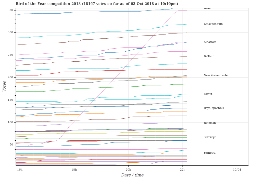
It’s time for StatsChat’s favourite bogus poll: Forest & Bird’s Bird of the Year.

In contrast to most bogus online polls, Bird of the Year doesn’t pretend to be anything more than a publicity stunt, and no-one seriously believes the huge year-to-year variation in the results has any real meaning in popular opinion

Bird of the Year still has more quality control than most bogus polls. They require a unique email address per vote, and this year have monitoring by Dragonfly Data Science.

Dragonfly noticed an apparent attempt to hack the vote last night, with a large number of votes from a single Australian IP address for the cormorants or shags, kawau in te reo.

Yes, Bird of the Year is a joke. But any other online clicky poll is at least as much of a joke.

(PS: for the sake of people whose tolerance for this sort of thing is lower than yours, if you tweet about Bird of the Year, use the hashtag)

October 2, 2018

International comparisons

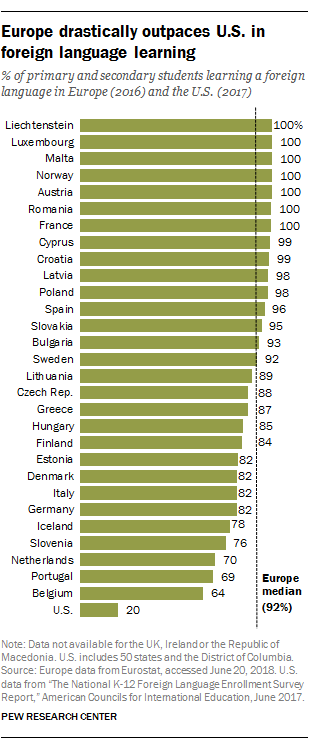
From Pew Research, via Twitter

That list of European countries, presumably intended to give the most meaningful comparison to the USA, is a bit unusual.

It includes Malta and Cyprus and Lichtenstein, but doesn’t include Ireland or the UK.


Pharmac rebates

There’s an ‘interactive’ at Stuff about the drug rebates that Pharmac negotiates. The most obvious issue with it is the graphics, for example
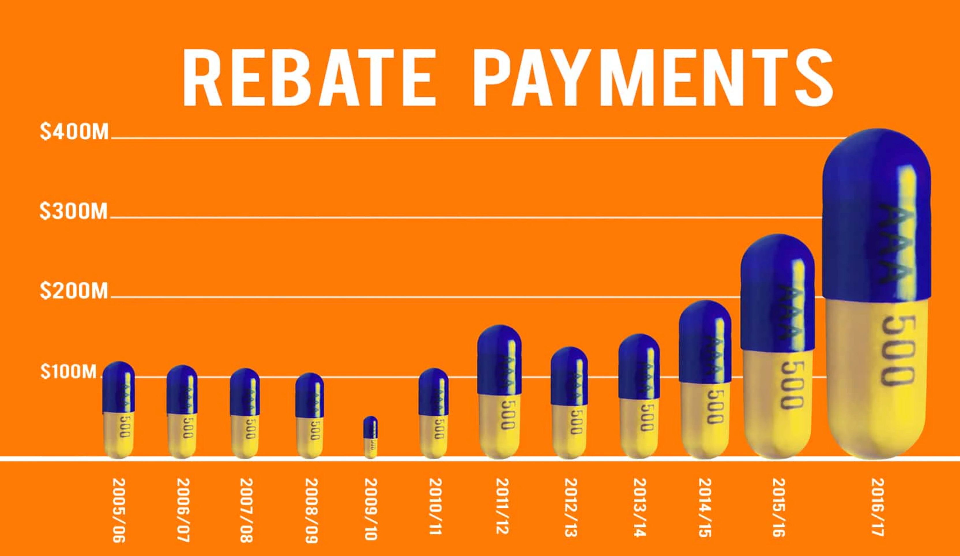
and
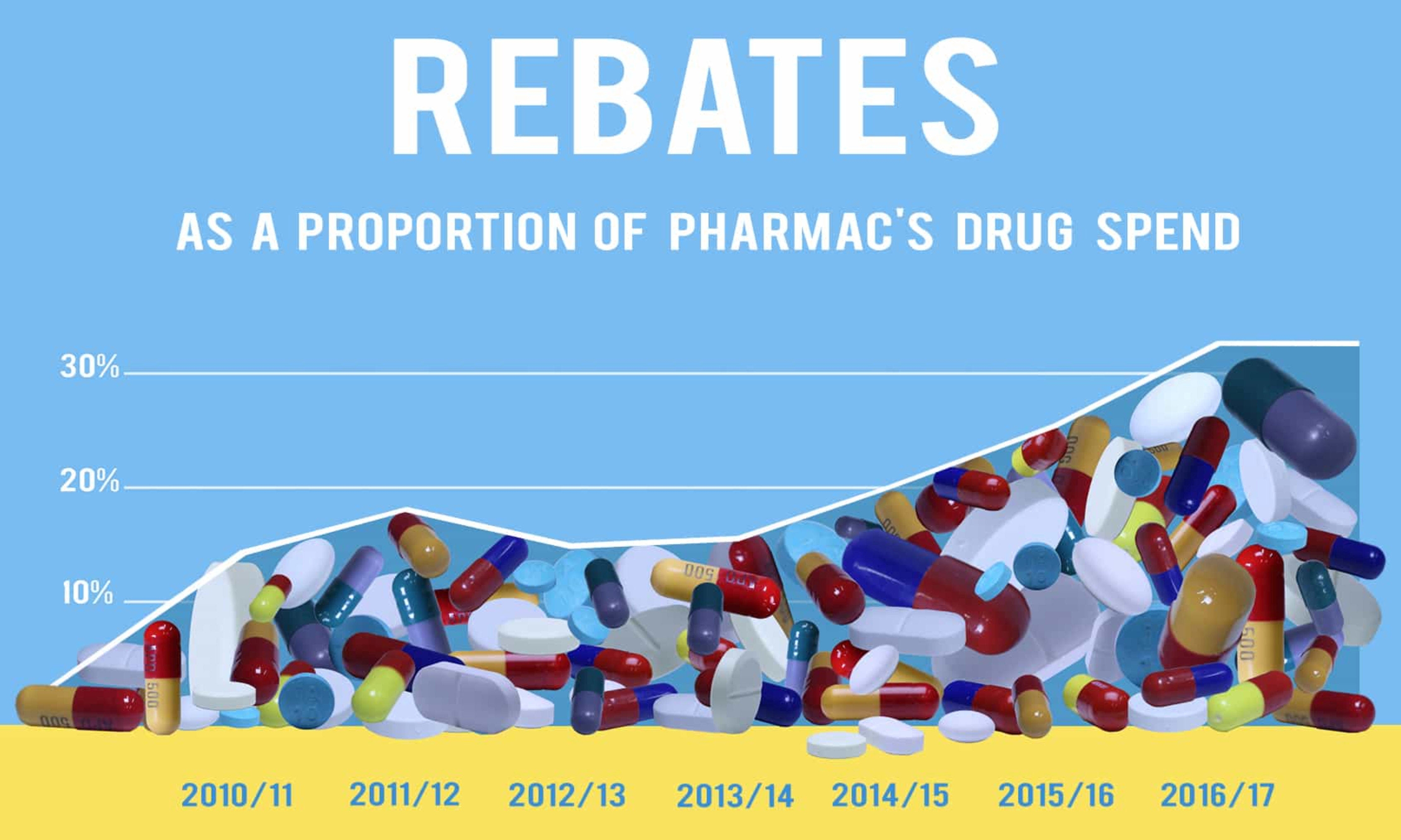
The first of these is a really dramatic illustration of a well-known way graphs can mislead: using just one dimension of a two-dimensional or three-dimensional thing to represent a number. The 2016/7 capsule looks much more than twice as big as the puny little 2014/15 one, because it’s twice as high and twice as wide (and by implication from shading, twice as deep).  The first graph also commits the accounting sin of displaying a trend from total, nominal expenditures rather than real (ie, inflation-adjusted) per-capita expenditures.

The second one is not as bad, but the descending line to the left of the data points is a bit dodgy, as is the fact that the x-axis is different from the first graph even though the information should all be available.  Also, given that rebates are precisely not a component of Pharmac’s drug spend, the percentage is a bit ambiguous.  The graph shows total rebates divided by what would have been Pharmac’s “drug spend” in the improbable scenario that the same drugs had been bought without rebates. That is, in the most recent year, Pharmac spent $849 million on drugs. If rebates were $400m as shown in the first graph, the percentage in the second graph is something like ($400 million)/($400 million+$849 million)=32%.

More striking when you listen to the whole thing, though,  is how negative it is about New Zealand getting these non-public discounts on expensive drugs.  In particular, the primary issue raised is whether we’re getting better or worse discounts than other countries (which, indeed, we don’t know), rather than whether we’re getting good value for what we pay — which we basically do know, because that’s exactly what Pharmac assesses.  

Now, since the drug companies do want to keep their prices secret there must be some financial advantage to them in doing so, thus there is probably some financial disadvantage to someone other than them.   It’s possible that we’re in that group; that other comparable countries are getting better prices than we are. It’s also possible that we’re getting better prices than them.  Given Pharmac’s relatively small budget and their demonstrated and unusual willingness not to subsidise overpriced new drugs, I know which way I’d guess.

There are two refreshing aspects to the interactive, though.  First, it’s good to see explicit consideration of the fact that drug prices are primarily not a rich-country problem.   Second, it’s good to see something in the NZ mass media in favour of the principle that Pharmac can and should walk away from bad offers. That’s a definite change from most coverage of new miracle drugs and Pharmac.

September 27, 2018

Reading clickbait

Q: Did you see women who own horses live 15 longer than those who don’t?

A: Fifteen what?   [thanks, David Hood]

Q: Years.

A:  There’s an obvious reasons why women who own horses would live longer than those who don’t. Horses are expensive; women who can afford them will be more affluent than average. There could easily be other confounding factors, too

Q: But 15 years?!

A: Ok, that’s a lot. But remember, this is just an observational study — and it might not even be a representative sample. It could be some sort of clicky bogus poll

Q: Where they ask people if they own a horse and how old they were when they died? Yeah right.

A: Um. Ok. Maybe not a bogus poll. But 15 years just isn’t plausible, and it’s obviously not a randomised trial.

Q: “The double blind study followed women in different age groups over a forty year time frame to capture this objective data.”

A: Double blind?

Q: What it says.

A: How could you possibly have a double blind study of horse ownership?

Q: They could get alpacas instead. Or virtual reality games about horses. Or something.

A:  That’s not double blind. That’s active-control. Double blind would mean you got an alpaca instead of a horse AND YOU COULDN’T TELL! Is there a link to the research?

Q: I hoped you’d find it, like you usually do.

A:

Q:

A: Really?

Q:

A: Ok. One of the other copies of this story says the lead scientist is Gary Cockburn.  There are three papers on the PubMed database with a “G Cockburn” as author. None is even slightly related to this story.  There are seven papers with a “Cockburn” as author and some reference to “horse”. None is even slightly related to this story. AND YOU CAN’T HAVE A DOUBLE BLIND STUDY OF HORSES!

Q: They made it up?

A:  This is why you shouldn’t follow those links at the bottom of the page


Briefly

September 21, 2018

Lotto: no, you’re still not going to win

There’s a story about Lotto on Stuff that starts off promisingly

Forty Kiwis took out Lotto First Division on Wednesday night – the most first division winners in a single draw in the game’s 30-year-history.

With that many winners sharing the $1 million prize, they’re only getting $25,000 each.

This is one of the big reasons that you can’t just divide the prize by number of possible combinations and get the expected value of a ticket.

Further down, though we get this

Despite these overwhelming odds there are times when it makes mathematical sense to buy a Lotto ticket.

That’s when Powerball jackpots get so large the value of the prize pool is greater than the amount spent on tickets.

Technically, this is true. The problem is you don’t know the amount spent on the tickets, because NZ Lotto doesn’t tell anyone. So as a strategy, it’s useless.  The link goes to another story headlined Why professors of statistics play Lotto too, when the prize is big enough.  That surprised me, so I read on to see who these professors of statistics were.

There are two professors mentioned in the story, Martin Hazelton of Massey and Peter Donelan of the university currently known as Vic.  You should definitely pay attention to their opinions: Martin, in particular, is probably the country’s top statistical theorist.

They don’t, however, say they “play Lotto too, when the prize is big enough”.  Professor Hazelton doesn’t say anything on that issue. Professor Donelan is quoted right at the end of the story

“In my household, if it was up to me, I wouldn’t bother to buy one,” Donelan said.

But he suspects some stats professors do: “I expect some do regardless of what they know.”

And that’s probably true. Nothing wrong with Lotto as an entertainment — the monetary return on investment is low, but the same is true for beer, movies, rugby, or twilight walks on the beach — but it will very rarely “make mathematical sense.”


September 17, 2018

Briefly

  • Are we being misled by precision medicine? New York Times
  • When people search for a phrase that does not have natural informative results, it’s easy for manipulators to control the results. Take, for example, “did the Holocaust exist?” danah boyd on search and media manipulation
  • Should the Norfolk (UK) police be using a predictive model to decide whether a burglary is worth spending effort on? IEEE Spectrum is somewhat more negative than I would be.
  • Interesting piece at Slate about a story relating social media and hate crimes in Germany
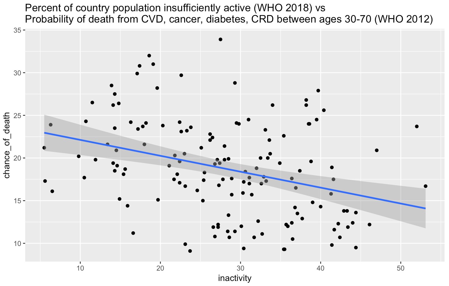
  • Correlations can be confusing. This, from David Hood on Twitter, shows that countries where more people get the recommended amount of exercise have more deaths from heart disease, cancer, lung disease, diabetes.  That’s also what trends over time would say.  Presumably the (real) benefits of exercise are smaller than the benefits of wealth and modern health care, but it’s a neat example.   Note that this isn’t chance correlation in small samples with many variables to choose from, unlike the famous spurious correlations website


September 12, 2018

Tracking down the numbers

There was a story on Radio NZ last night, and then in other places

The research is the first in the world to measure the impact of taking numerous medications on fractures in the elderly.

Its findings show elderly people taking several high-risk medications for sleeping, pain or incontinence are twice as likely to fall and break bones as those taking no medication.

As the story says, overmedication in elderly people is known to be a problem — people get put on medications and then not taken off them, and there are interactions, and it’s not good.  Some — even many– of the drugs are necessary, of course, but these researchers aren’t the only people who think there should be more regular review of what all medications someone is taking.

This research is trying to quantify the impact on falls and fractures, using a large NZ data set of everyone in NZ who was being evaluated for publicly funded long-term community services or aged residential care.  Together with the high-quality NZ prescription data, it’s a good opportunity to look at a large enough group of people to measure fractures.

The media stories all seem to come from the Otago press release. The press release doesn’t include a link to the research paper. It doesn’t even give the journal name. The implication that no-one who reads the story could possibly care about the details is a bit insulting.

I’m assuming the research paper is this one, which is new and has the right topic and authors. The analysis is a bit tricky: a lot of people die without having fractures, and you have to decide how to count them in the denominator over time.  They did a sensible analysis, if not exactly the one I would have done.

There’s one problem, though: that paper says, in the Results section of the Abstract:

The estimated subhazard ratio was 1.52 (95% confidence interval: 1.28, 1.81) for those with DBI>3 compared with those with DBI=0 in the adjusted analysis.

That is, the paper’s best estimate is a 50% higher rate of fractures in people taking multiple potentially-risky drugs compared to none. 50% higher is still a problem — they estimate that about 1 in 8 fractures could be prevented if everyone could be taken off these drugs (which, of course, not every one can) — but 50% higher isn’t twice as high, and I couldn’t find the “twice as high” number in the paper.