Posts written by Thomas Lumley (2645)

avatar

Thomas Lumley (@tslumley) is Professor of Biostatistics at the University of Auckland. His research interests include semiparametric models, survey sampling, statistical computing, foundations of statistics, and whatever methodological problems his medical collaborators come up with. He also blogs at Biased and Inefficient

November 27, 2018

NZ Census updates

Setting the record straight?

Brian Wansink, a prominent food researcher from Cornell, was forced to retire earlier this year. Andrew Gelman has some good perspectives. Wansink’s research was on contextual effects on eating — eg, the impact of plate size — and a bunch of these papers have now been retracted.

This week, Wired has a Thanksgiving-themed article about his research. It includes this quote from an email he sent to colleagues ahead of his retirement

“We may believe that our papers have been unfairly retracted. But what they can’t retract is the impact these have had on people’s lives and the impact they will continue to have.”

That’s a perfect summary of the problems with studies that over-promise and are over-publicised.  Whether the research was done well or not, it’s going to stick.  Subsequent developments — whether modifications, replication failures, or retractions — never get the impact of the original claim.

November 26, 2018

Briefly

  • “Rather than assume algorithms will produce better outcomes and hope they don’t accelerate discrimination, we should assume they will be discriminatory and inequitable unless designed specifically to redress these issues.” Lucy Bernholz
  • ” Introduction of [a predictive risk screening tool] resulted in a statistically significant increase in emergency hospital admissions and use of other [National Health] services without evidence of benefits to patients or the [National Health Service].” In the academic journal BMJ, so a bit more technical
  • Why the NY Times map of the US election results is so good: a Twitter thread
  • Stacey Kirk in the Sunday Star-Times on the campaign to get Pharmac to pay for one of the most expensive drugs in the world.
  • Interesting interactive in the Herald about quality-of-life and work in NZ cities.  It’s very economist in style.  That’s true on the good sense that it appreciates high house prices are a signal that lots of people want to live somewhere and low house prices are a signal that lots of people don’t.  It’s also true in the bad sense that there some places where not many people want to live, but the people who do live there really like it — and this sort of analysis suppresses that variation in preferences.
  • Interesting book on data science and data use: “Data Feminism”

Privacy and mathwashing

The Herald has a story from the Washington Post on an “AI” screening tool for babysitters, that allegedly uses both computer vision and text processing to screen social media for risk factors.   Here are three quotes from it:

1. A company co-founder says

Parents, he said, should see the ratings as a companion that “may or may not reflect the sitter’s actual attributes.”

But the danger of hiring a problematic or violent babysitter, he added, makes the AI a necessary tool for any parent hoping to keep his or her child safe.

The first thing to note about this is that you could make the same claims about astrology or handwriting analysis or a tarot reading. There’s no quantitative information about accuracy given, and it’s hard to see how the company could even know much how accurate its ratings were, or how biased. It’s not even for sure that the risk rating is positively correlated with risk to kids; the company seems careful not to make even a claim this weak.


2.

Parents could, presumably, look at their sitters’ public social media accounts themselves. But the computer-generated reports promise an in-depth inspection of years of online activity, boiled down to a single digit: an intoxicatingly simple solution to an impractical task.

If the algorithms actually predicted risk better and were less biased than typical employers there might be an advantage to this: your social media would be shared with a faceless US company rather than your potential employer, so there might be less actual privacy invasion — after all, some faceless US companies already have your social media. It might be less embarrassing than your boss knowing what your favourite member of the appropriate sex calls you. The computer could also be set up to ignore irrelevant information like whether you talk about your sexual orientation online.   With the setup as it is, that’s not the case, and one of the biggest risks is the completely unfounded appearance of both accuracy and objectivity — “mathwashing” as the jargon puts it.


3.

Where she lives, “100 per cent of the parents are going to want to use this,” she added. “We all want the perfect babysitter.”

One of the significant risks of automating human judgement is that it can go viral. There’s a limit to how well ordinary human prejudices can scale — you’ve got some chance of finding someone who has different biases. The prejudices of one computer checklist, though, can keep someone completely out of an employment sector.

November 16, 2018

What do statisticians do all day?

Yesterday and today we had talks by our postgraduate students about their short research projects

  • An investigation into criticism of the FST software. (forensic DNA analysis: you want it to be right)
  • Comparison of accuracy between different algorithms for solving the Normal Equations in Regression Analysis (It’s hard to get big rounding errors nowadays)
  • Multi-catchment Streamflow Modelling by Reduced-rank Regression (improving hydropower modelling)
  • A Study on Equity in Academic Outcomes in First Year Statistics Courses (Could do better)
  • Costs and Financing of Routine Immunisation (estimating cost components in low-middle income countries)
  • Statistical Examination of the Relationship between Maternal Diet, Metabolome and Gestational Diabetes Mellitus (predicting diabetes is hard, especially in the future)
  • Robustness of Spatial Capture-Recapture Models to Misspecified Detection Functions (if you’re listening for whales or gibbons, how close do you need to be?)
  • An Examination of Participant Perspectives on the Scampy Tool (teaching the ideas of randomness at an introductory level)
  • Who lives in deprived places? The association between individual and area level socioeconomic position (guessing someone’s income from where they live isn’t all that reliable)
  • Is LIBS a reliable technology for the forensic analysis of glass? (more forensics, but with lasers)
  • De-batching data from a complex experiment (life would be simpler if you didn’t have to worry about lab ‘batch effects’ when studying ocean acidification)
  • Optimal path in random graphs (maths about really big networks)
  • Spatial Distribution of fish on the Chatham Rise (if you want to count them, you need to know where to look)
  • Exploring climate variables (in particular, extreme values like hottest place, rainiest day)
  • Interactive Tools for Climate Data (for browsing through NZ historical weather data)
  • How old is that mud: Convex Biclustering Applied in Tephrostratigraphy of the Orakei Basin (Looking for volcanic ash layers in mud samples)
  • Comparison of Methods for Inferring Granger Causality (time series techniques for economists)
  • Predicting Patronage (how does Patreon support vary over time, and can you predict it?)
  • Expected Information Matrices for Some Poisson Variants. (Calculations and software for some new counting models)
November 7, 2018

Graph of the week

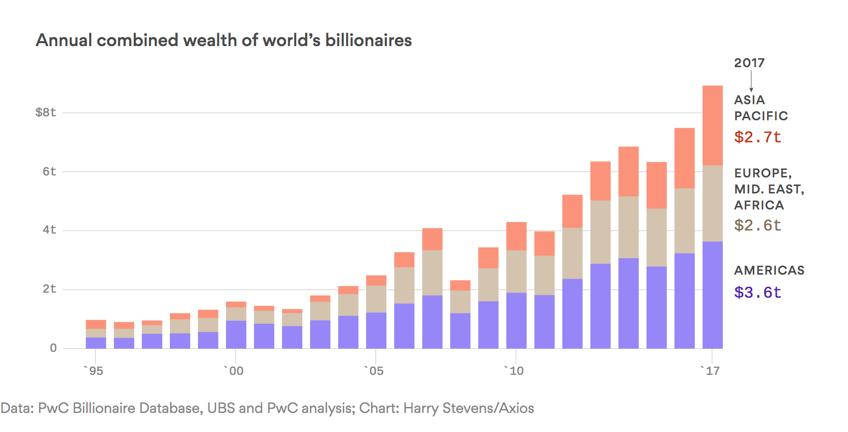
From Axios

The wealth of the world’s billionaires rose by $1.4 trillion in 2017, the largest annual increase ever.

The details: Nearly all of that increase was driven by the Asia-Pacific region, and specifically China, where billionaire wealth rose 39%.

The graph is not well designed for illustrating the claim about billionaires: in a stacked bar chart like this it is easy to compare the first level, the sum of the first two, and the sum of all three, but not the top level.  If the chart had been stacked the other way up it would be more obvious that it doesn’t seem to go along with the claim.

Measuring the height of the bars in MacOS Preview (because it’s not possible to read the graph to high enough precision) I get 35 pixels increase in the Asia-Pacific region and 46 in the rest of the world, so the growth in the Asia-Pacific region actually is less than half the total growth.  Estimating the total growth by counting pixels does agree with the $1.4 trillion total, so what has gone wrong?

Clicking through to the UBS/PwC press release gives a bit more detail:

Chinese billionaires increased in number to 373 in 2017 from 318 in 2016 and their wealth rose by 39 percent to USD 1.12 trillion

So, the net increase in total wealth for Chinese billionaires is about $0.44 trillion. That hardly qualifies as “nearly all” of the increase for the Asia-Pacific region, let alone for the world

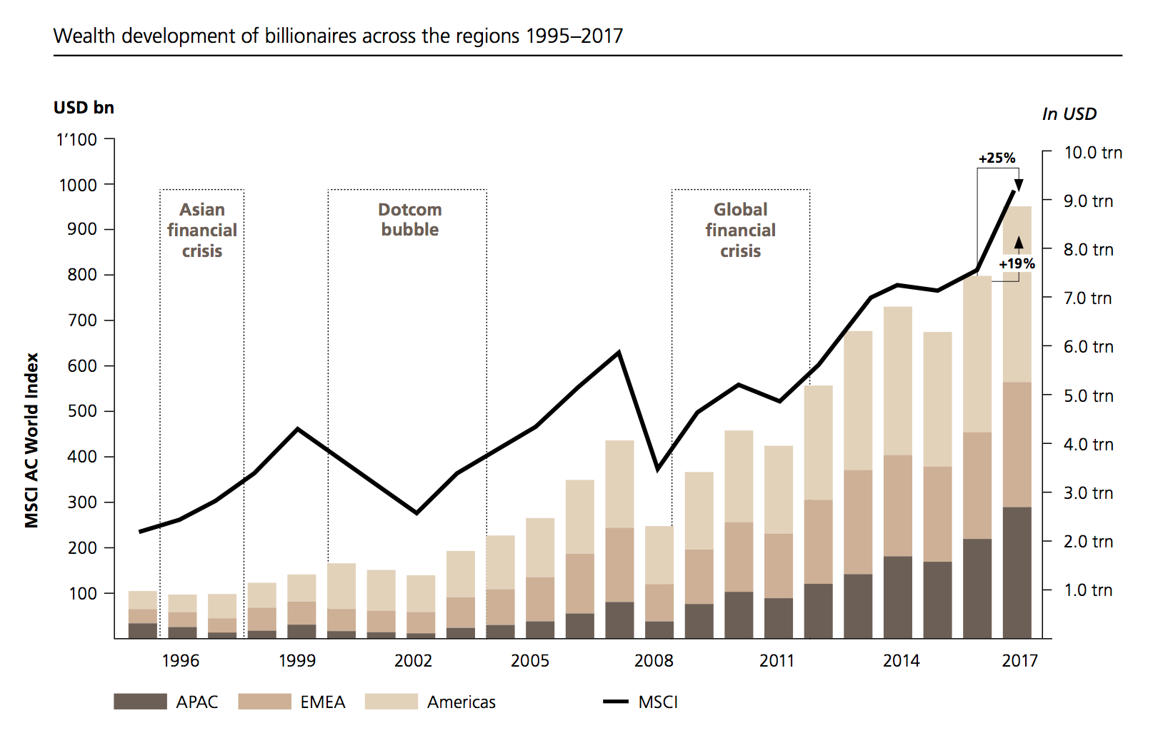
The original source is the the UBS/PwC Billionaires report. Their graph is better (apart maybe from the second y-axis). Not only is it the right way up for looking at increases in Asia vs the rest of the world, but it’s got tick marks on the right-hand axis where they’re actually useful. And it shows some historical context.

Normally I wouldn’t go to this much effort for a business news item — but the Axios Edge newsletter where I read this is edited by Felix Salmon, who is usually better at the difference between “nearly all” and “nearly half”


P.S. Yes, I did think of titling this post Crazy Rich Asians. No, I’m not sorry I didn’t.

October 31, 2018

Briefly

  • “even though men [in China] were responsible for 4.6 times more traffic incidents, news reports about accidents caused by women were 3.8 times more common in Chinese publications than articles about accidents caused by men” from Sixth Tone
  • You have about one week left to submit comments to the review of the Statistics Act (if you are NZ or otherwise care about NZ official statistics)
  • “Simple questions such as: “I wonder how they know that?”; “Is that better or worse than I might have expected?”; “What exactly do they mean?” often unlock far more insight than narrow technical queries.Tim Harford 
  • Halloween costume names generated by a neural network, as an illustration of how they work. By Janelle Shane, in the New York Times
  • Nice detailed description of a election forecasting model from Montgomery Blair High School, nearly in Washington DC.
  • Worthwhile Canadian Institution (or, the value of trusted official statistics in the ‘truth decay’ era)
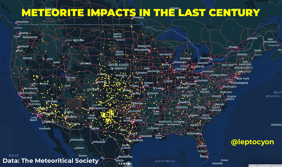
  • From Reddit, a map of recorded meteorite impacts in the last century in the US.

    “Recorded” is doing a lot of the work here. Meteorite impacts have no preference as to longitude and a relatively weak preference for being closer to the equator.  The map also over-represents areas further from the equator, making the density look lower, but these factors must be relatively weak compared to the likelihood of an impact being recorded


October 17, 2018

Briefly

  • The Crime Machine: two podcast episodes (with transcripts) on New York City police and the good and bad effects of trying to measure crime and police effort
  • You may have heard that Senator Elizabeth Warren had a genetic ancestry test. Carl Zimmer has a very good Twitter thread on what the results don’t mean
  • The Robots Learn By Watching Us’. Bloomberg columnist Matt Levine on training computers to behave like humans in stock picking and employment
  • The New York Times has a map of every building in the United States.
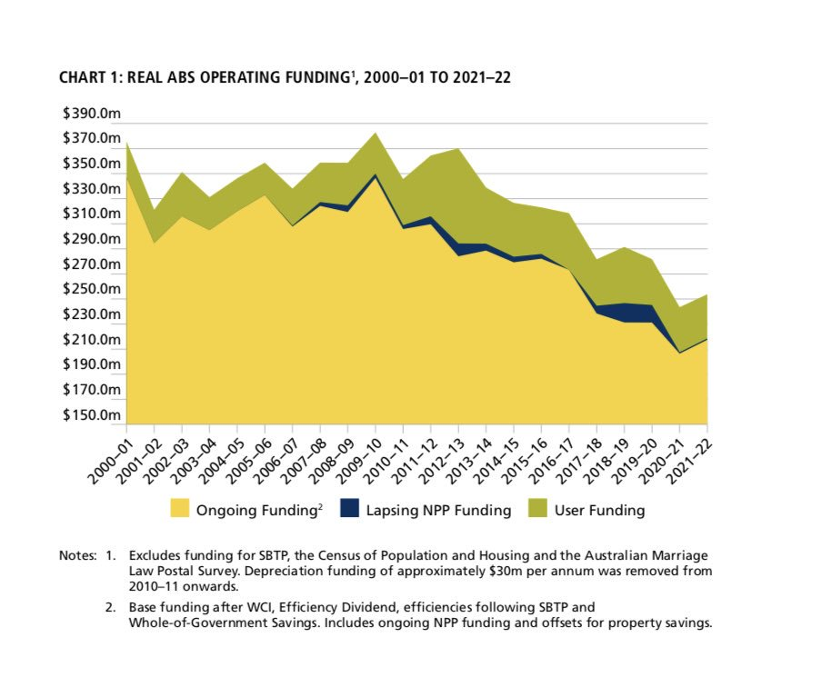
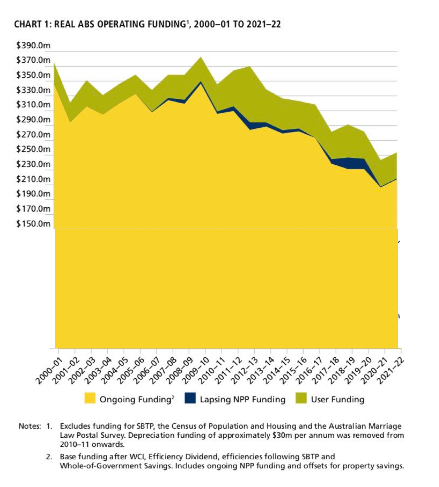
  • The Australian Bureau of Statistics is having its funding cut over time, which is probably not a good thing (via).  This graph, though:
    For barcharts and other area charts, the area is carrying the information, so you can’t just chop the bottom half off the graph. I put it back on:
  •  
October 16, 2018

Restart a heart

I see from Twitter that it’s World Restart A Heart Day,  encouraging people to learn CPR. Which you should do. It’s not hard. Nowadays there are even Spotify playlists of songs with the right beat for chest compressions.

However, two statistical points:

  1. Even if you don’t know CPR, the nice people at the ambulance service (111 emergency number in NZ) can tell you what to do. This works well enough that there have been randomised trials (in the US) comparing the effectiveness of different sets of instructions
  2. The success rate of CPR in real life is not as high as on television. If you give someone CPR it’s quite likely not to work, and that won’t be your fault. The success rate of CPR is still higher than no CPR.
October 11, 2018

Briefly

  • How good is ‘good’? YouGov looks at how various words rate in the UK. “Average” gets 5 on a 10-point scale, which is more positive than I think it would rate here, though they didn’t ask about “a bit average” or “pretty average”
  • Nepal introduced a ban on internet porn. It cut Nepal’s traffic to porn site xHamster by about 50%. For about two weeks.  (not NSFW apart from being about porn)
  • The UK has a Statistics Authority to remind government and parliament not to misuse official statistics. This week, in correspondence with the Department for Education: “figures were presented in such a way as to misrepresent changes in school funding.
    In the tweet, school spending figures were exaggerated by using
    a truncated axis, and by not adjusting for per pupil spend.”  (Note: using nominal, aggregate figures rather than real, per capita figures to report spending and truncating bar chart axes are just as wrong here as in the UK)
  • Seek.co.nz are promoting their guide to salaries on Twitter again. This is based on advertised salaries/wages for positions advertised on Seek, not actual money paid to any group — and, for example, I’d be pleasantly surprised if “Kitchen and Sandwich Hands” actually averaged over $41,000 annual wages.