Posts written by Thomas Lumley (2645)

avatar

Thomas Lumley (@tslumley) is Professor of Biostatistics at the University of Auckland. His research interests include semiparametric models, survey sampling, statistical computing, foundations of statistics, and whatever methodological problems his medical collaborators come up with. He also blogs at Biased and Inefficient

November 17, 2017

Lotto

Q: Can I improve my chances of winning Lotto by…

A: No.

Q: But….

A: No.

Q: …

A: Just no.

Q: … by buying a ticket?

A: Ok, yes. But not by very much.

Q: You sound like you’ve been asked about Lotto odds a lot.

A: There’s a larger-than-usual jackpot in the NZ Powerball

Q: Enough to make it worth buying a ticket?

A: If you like playing lotto, sure.

Q: No, as an investment.

A: I refer the honourable gentleman to the answer given some moments ago

Q: Huh?

A: No.

Q: But $35 million. And a 1 in 38 million chance of winning. And 80c tickets.  Buying all the tickets would cost less than $30 million. So, positive expected return.

A: If you were the only person playing

Q: And if I’m not?

A: Then you might have to share the prize

Q: How many other people will be playing?

A: Lotto NZ says they expect to sell more than a million tickets

Q: Compared to 38 million possibilities that doesn’t sound much

A: That’s tickets. Not lines.

Q: Ah. How many lines?

A: They don’t say.

Q: Couldn’t the media report that instead of bogus claims about a chemist in Hawkes Bay selling better tickets?

A: Probably not. I don’t think Lotto NZ tells them.

Q: That story says it would take 900 years to earn the money at minimum wage. How long to get it by playing Powerball?

A: At, say, ten lines twice per week?

Q: Sure.

A: 36900 years.
November 15, 2017

Summarising house prices

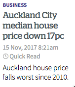
From the Herald (linking to this story)

pricefall

To begin with, “worst” is distinctly unfortunate now we’ve finally got a degree of political consensus that Auckland house prices are too high. “Best” might be too much to hope for, but at least we could have a neutral term.

More importantly, as the story later concedes, it’s more complicated than that.

It’s not easy to decide what summary of housing prices is ideal.  This isn’t just about mean vs median and the influence of the priciest 1%, though that comes into it.  A bigger problem is that houses are all individuals.  Although the houses sold this October are, by and large, not the same houses that were sold last October, the standard median house price summary compares the median price of one set of houses to the median price of the other set.

When the market is stable, there’s no real problem. The houses sold this year will be pretty much the same as those sold last year. But when the market is stable, there aren’t interesting stories about real-estate prices.  When the market is changing, the mix of houses being compared  can change. In this case, that change is the whole story.

In Auckland as a whole, the median price fell 3.2%. In the old Auckland City — the isthmus — the median price fell 17%. But

Home owners shouldn’t panic though. That doesn’t mean the average house price has fallen by anything like that much.

The fall in median has been driven largely by an increasing number of apartments coming onto the market in the past year.

That is, the comparison of this October’s homes to last October’s homes is inappropriate — they aren’t similar sets of properties.  This year’s mix has many more apartments; apartments are less expensive; so this year’s mix of homes has a lower median price.

The story does admit to the problem with the headline, but it doesn’t really do anything to fix it.  A useful step would be to separate prices for apartments and houses (and maybe also for townhouses if they can be defined usefully) and say something about the price trends for each.   A graph would be a great way to do this.

Separating out changes in the mix of homes on sale from general house price inflation or deflation is also helpful in policy debates. Changing the mix of housing allows us to lower the price of housing by more than we lower the value of existing houses, and would be valuable for the Auckland public to get a good feeling for the difference.

Bogus poll headlines justified

The Australian postal survey on marriage equality was a terrible idea.

It was a terrible idea because that sort of thing shouldn’t be a simple majority decision.

It was a terrible idea because it wasn’t even a vote, just a survey.

It was a terrible idea because it wasn’t even a good survey, just a bogus poll.

As I repeatedly say, bogus polls don’t tell you anything much about people who didn’t vote, and so they aren’t useful unless the number voting one particular way is a notable proportion of the whole eligible population. In the end, it was.

A hair under 50% of eligible voters said ‘Yes’, just over 30% said ‘No’, and about 20% didn’t respond.

And, in what was not at all a pre-specified hypothesis, Tony Abbott’s electoral division of Warringah had an 84% participation rate and 75% ‘Yes’, giving 63% of all eligible voters indicating ‘yes’.


PS: Yay!

November 4, 2017

A few details

Seeing a headline like

kumara

might cause an unwary person to think that eating purple kumara would reduce their risk of colon cancer by seventy-five per cent.

You, of course, would be suspicious and would want to read the story.

He found that when fed to three generations of mice bred with colon cancer, using the same gene which caused the disease in humans, purple kumara reduced the number of polyps by two-thirds or more.

So, the study is in mice. Mutant mice.  And it didn’t reduce the risk of colon cancer in these mice — which was basically 100% — it reduced the number of developing tumours.

It’s true that the mutation is one that occurs in people, too. About one in ten thousand people is born with the mutation that the mice had — these people have the mutation in every cell in their bodies, and they all get colon cancer if they don’t have major surgery.  And in the majority of ordinary people who get colon cancer, part of the  process is a mutation in this same gene in one cell.  So, the mutant mice are relevant.  There isn’t any problem with the research being in mice, just with the headline. Especially as further down in the story we hear about the equivalent dose of kumara in humans

“To eat 1kg of sweet potato every day is too hard.”

and that the kumara seems to have most potential as a way to produce a concentrated extract.

So far, there’s not much evidence either way on whether anthocyanins (basically, purple food other than beets or dragonfruit) really prevent cancer in humans.  Animal studies such as this one give good reasons to be hopeful; the history of other micronutrient-based prevention trials give good reasons to be skeptical.


Types of weather uncertainty

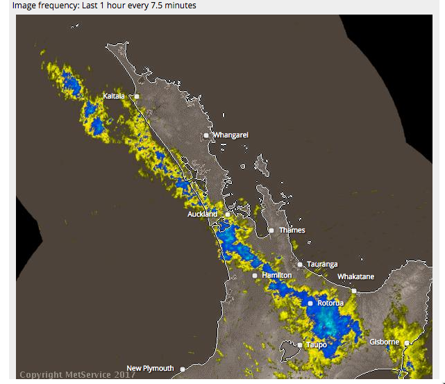
From the MetService rain radar
rain

If the band of rain were moving north-east, small uncertainties in its motion and orientation would mean that you’d know there would be half an hour of rain in Auckland, but not exactly when.

If it were moving south-east (as it is), small uncertainties in the motion and orientation mean that you know it will rain for a long time somewhere, but not exactly where.

One way to communicate the difference between these two predictions would be to show a set of possible realisations of rainfall.  For NW movement, you’d get a set of curves each with a single hump but at different times. For SW movement you’d get a much wider range of curves, where some showed no rain and others showed half a day or all day. I don’t know enough about ensemble forecasting to be sure, but I think this would be feasible

In principle, the common ‘patchy torrential downpours’ Spring rain pattern would show as rain curves each with different short periods of rain. I don’t think the technology is up to that using genuine predictions, but it might be possible to predict that we’re going to get that sort of weather and simulate the ensemble curves.

Current forecast summaries are mostly (except for hurricane paths) about averages: the probability of rain,  the expected amount, the worst-case amount. As technology progresses we will increasingly be able to do better than averages.


October 31, 2017

Creativity and chartjunk

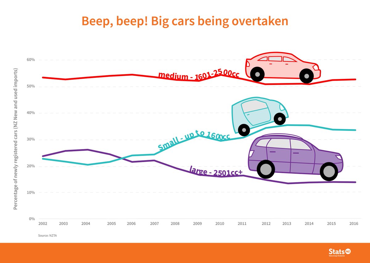
The StatsNZ twitter account has been tweeting creatively decorated graphs.  The first one I noticed was
cars
which prompted a discussion on Twitter about why the graph actually still worked well even though you’d normally want to avoid this sort of thing.

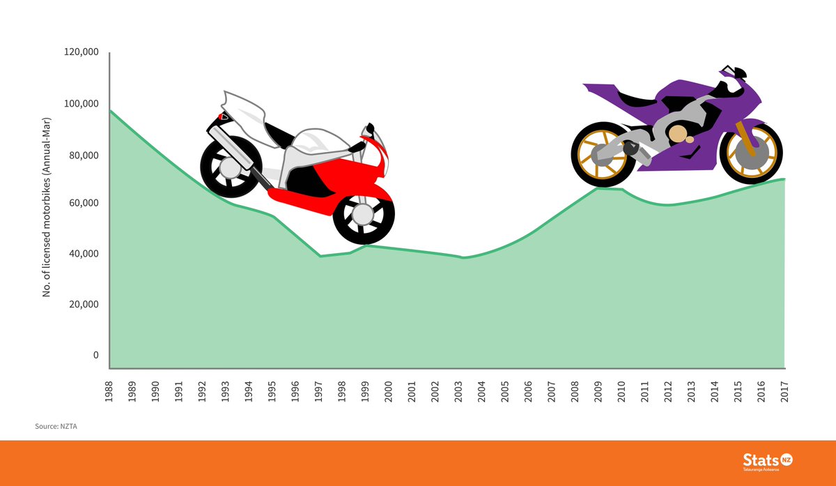
Then, a few days ago, I saw this one via Harkanwal Singh
bikes
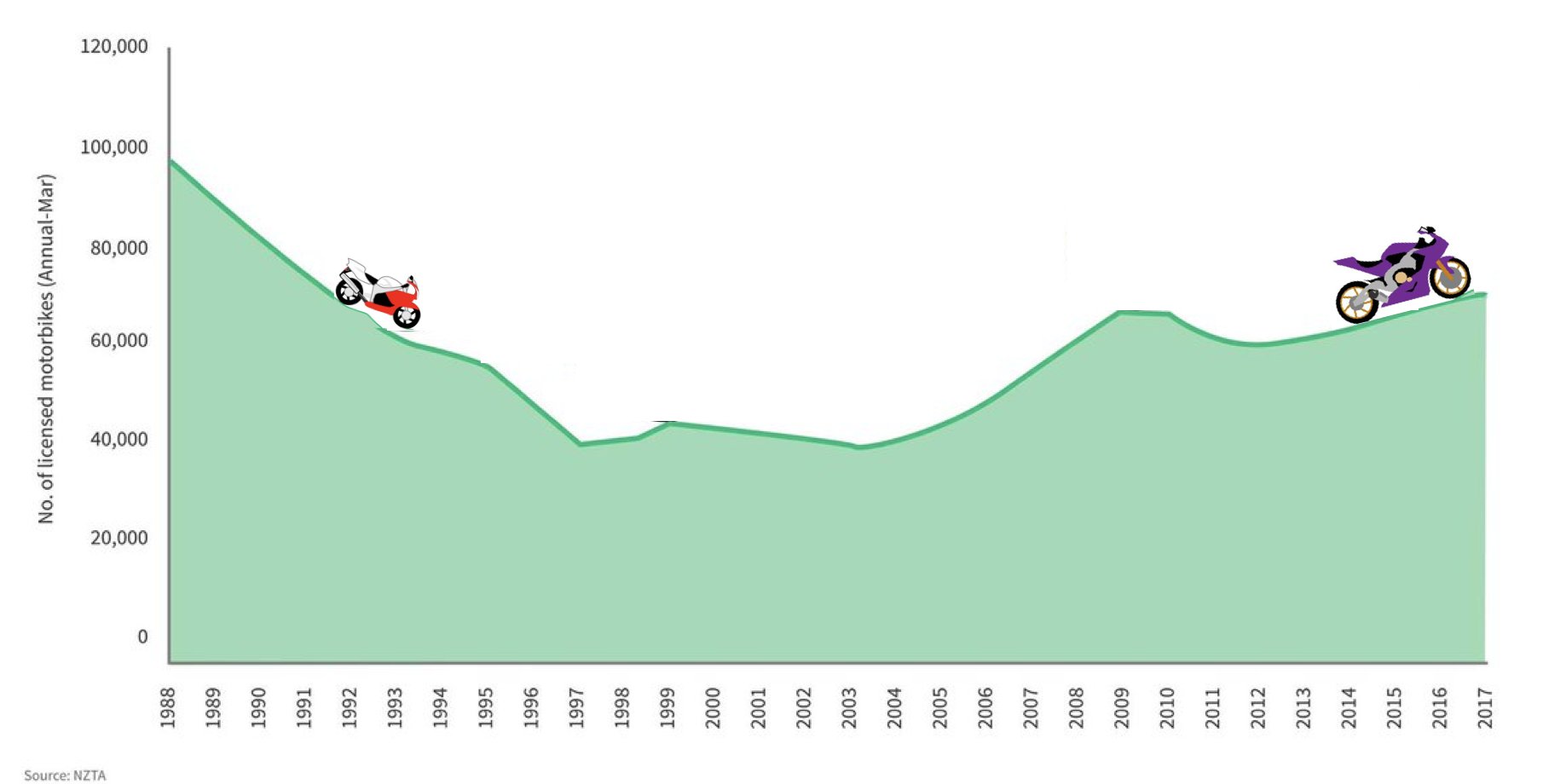
Unlike the cars, which worked as labels, the motorbikes don’t do anything except provide a distraction. They’re a bit better at a smaller size, where they reinforce the local trends in the graph, but I still don’t think they’re a net positive
bike-small

Then today (again via Harkanwal)
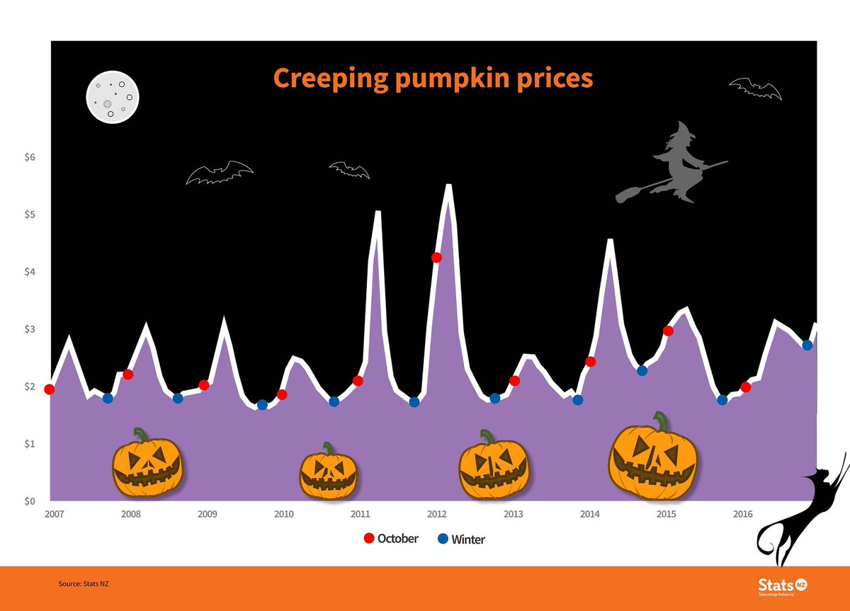
pumpkins

Yes, ok, I get that it’s a joke. But pumpkins prices rise  at this time of year in New Zealand because it’s Spring. Halloween isn’t a big driver. And most of our pumpkins aren’t even orange (which is why Stuff has a story on alternative things to carve). And winter isn’t a single point in time. And the decoration distracts from the potentially-important observation that prices didn’t really drop last winter.  And the vertical axis doesn’t say what the units are (average retail price per kilogram, it turns out).

And… just no.

Figure.NZ has the version you want if you’re after information.

October 30, 2017

Past results do not imply future performance


A rugby team that has won a lot of games this year is likely to do fairly well next year: they’re probably a good team.  Someone who has won a lot of money betting on rugby this year is much less likely to keep doing well: there was probably luck involved. Someone who won a lot of money on Lotto this year is almost certain to do worse next year: we can be pretty sure the wins were just luck. How about mutual funds and the stock market?

Morningstar publishes ratings of mutual funds, with one to five stars based on past performance. The Wall Street Journal published an article saying (a) investors believe these are predictive of future performance and (b) they’re wrong.  Morningstar then fought back, saying (a) we tell them it’s based on past performance, not a prediction and (b) it is, too, predictive. And, surprisingly, it is.

Matt Levine (of Bloomberg; annoying free registration) and his readers had an interesting explanation (scroll way down)

Several readers, though, proposed an explanation. Morningstar rates funds based on net-of-fee performance, and takes into account sales loads. And fees are predictive. Funds that were good at picking stocks in the past will, on average, be average at picking stocks in the future; funds that were bad at picking stocks in the past will, on average, be average at picking stocks in the future; that is in the nature of stock picking. But funds with low fees in the past will probably have low fees in the future, and funds with high fees in the past will probably have high fees in the future. And since net performance is made up of (1) stock picking minus (2) fees, you’d expect funds with low fees to have, on average, persistent slightly-better-than-average performance.

That’s supported by one of Morningstar’s own reports.

The expense ratio and the star rating helped investors make better decisions. The star rating and expense ratios were pretty even on the success ratio–the closest thing to a bottom line. By and large, the star ratings from 2005 and 2008 beat expense ratios while expense ratios produced the best success ratios in 2006 and 2007. Overall, expense ratios outdid stars in 23 out of 40 (58%) observations.

A better data analysis for our purposes would look at star ratings for different funds matched on fees, rather than looking at the two separately.  It’s still a neat example of how you need to focus on the right outcome measurement. Mutual fund trading performance may not be usefully predictable, but even if it isn’t, mutual fund returns to the customer are, at least a little bit.


Briefly

  • From Politico“Is Washington Bungling the Census?”
  • From Wired: China’s planned ‘Social Credit’ score
  • A McDonalds promotion in Canada advertises some high-level prizes and a 1 in 5 chance of winning. Some guy bought 100 orders of large fries, thinking he’d get forty prizes (2 tickets per order).  It’s actually two half-tickets per order, so he won 23 prizes. Mostly cheeseburgers. The moral: (a) read the instructions, and (b) most of the prizes are always just cheeseburgers (or the moral equivalent in other lotteries).
  • rawgraphs.io is a new tool for producing fairly attractive graphs quickly from spreadsheet data
  • [update] I nearly forgot Chris McDowall’s graphs of electorate vs party vote in the NZ election, from the Spinoff
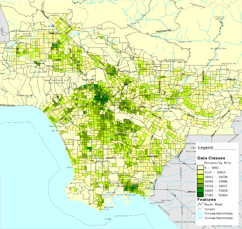
  • Computer maps: then


and now (from Wikipedia)

814px-LACountyPopDensity

October 25, 2017

Not science yet

Three weeks ago there was a story in the Herald headlined Research reveals that divorce does run in the family (via Antonio Rinaldi on Twitter). The headline, as you’d expect, got the news wrong: the first sentence of the story is

Numerous studies have shown that children of divorced parents are more likely to get divorced when compared to those who grew up with parents who remained married.

The new claim was that divorce ‘runs in the family’ for genetic reasons. The researchers say

“Nearly all the prior literature emphasised that divorce was transmitted across generations psychologically.

“Our results contradict that, suggesting that genetic factors are more important.”

Now, when someone comes up with a finding that contradicts previous research and that they claim even they were surprised by, I’d want pretty good evidence. I’d want to look at what they actually found, and to see some discussion of how much the evidence is specific to adoptive families in a fairly homogeneous society such as Sweden.  In a perfect world, I’d want the story to have some independent input from someone who knows what ‘heritability’ means.  And I’d still worry about publication bias — maybe the academic journal would have published a paper saying ‘no, it’s still just environment’, but I bet the Herald wouldn’t have a story.

How good is the evidence in the story? Well, it has a link to the Daily Mail.

It’s pretty common for British science linkbait that turns up in the NZ papers to just link to the UK media. But here the research paper doesn’t even exist yet. The story says “will be published in an upcoming issue Journal Psychological Science.” Three weeks later, it’s still upcoming — this isn’t the usual problem of the embargo ending the day before a paper actually appears.

I can’t find a preprint or any other source of details, and as far as I can tell, the primary source for this story is a press release from Virginia Commonwealth University.

This isn’t science news.  It’s academic marketing.

October 23, 2017

Questions to ask

There’s a story in a lot of the British media (via Robin Evans on Twitter) about a plan to raise speed limits near highway roadworks. The speed limit is currently 50mph and the proposal is to raise it to 55mph or 60mph.

Obviously this is an significant issue, with potential safety and travel time consequences.  And Highways England did some research. This is the key part of the description in the stories (presumably from a press release that isn’t yet on the Highways England website)

More than 36 participants took part in each trial and were provided with dashcams and watches incorporating heart-rate monitors and GPS trackers to measure their reactions.

The tests took place at 60mph on the M5 between junction 4a (Bromsgrove) to 6 (Worcester) and at 55mph on the M3 in Surrey between junction 3 and 4a.

According to Highways England 60% of participants recorded a decrease in average heart rate in the 60mph trial zone and 56% presented a decrease on the 55mph trial.

That’s a bit light on detail — how many more than 36; does 60% decrease mean 40% increase; are they saying that the 4 percentage point difference between 55 and 60mph is enough to matter or not enough to matter?

More importantly, though, why is a heart rate decrease in drivers even the question?  I’m not saying it can’t be. Maybe there’s some good reason why it’s reliable information about safety, but if there is the journalists didn’t think to ask about it.

A few stories, such as the one in the Mirror, had a little bit more

“Increasing the speed limit to 60mph where appropriate also enables motorists who feel threatened by the close proximity of HGVs in roadworks to free themselves.”

Even so, is this a finding of the research (why motorists felt safer, or even that they felt safer)? Is it a conclusion from the heart rate monitors? Is it from asking the drivers? Is it just a hypothetical explanation pulled out of the air?

If you’re going to make a scientific-sounding measurement the foundation of this story, you need to explain why it answers some real question. And linking to more information would, as usual, be nice.