August 15, 2016
Graph of the week
From a real estate agent who will remain nameless
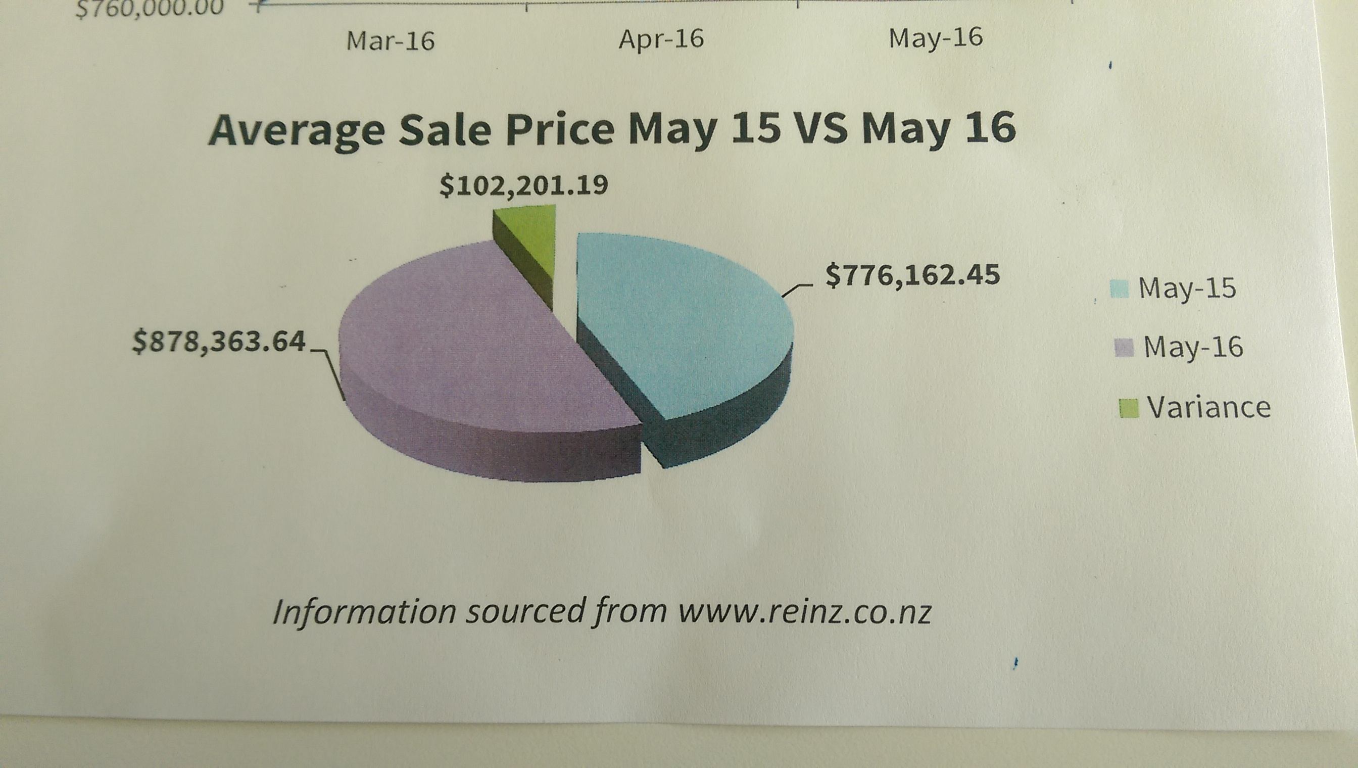
Another example of the rule ‘if you have to write out all the numbers, the graph isn’t doing its work.”

Thomas Lumley (@tslumley) is Professor of Biostatistics at the University of Auckland. His research interests include semiparametric models, survey sampling, statistical computing, foundations of statistics, and whatever methodological problems his medical collaborators come up with. He also blogs at Biased and Inefficient
From a real estate agent who will remain nameless
Another example of the rule ‘if you have to write out all the numbers, the graph isn’t doing its work.”
Disease risk awareness is one of the ways the media can help public health, and infections caused by waterborne organisms are one of the world’s leading public health problems. That’s not why this story is at the top of Stuff’s front page:
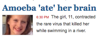
If you click through, you find that she was in the US, that primary amoebic meningoencephalitis is extremely rare — with about three cases a year in the US — and that the last NZ case was during the Muldoon administration.
The children around the world who die every minute from more common water-borne infections mostly aren’t the right sort of children to make good clickbait in New Zealand.
There’s just been a review of the handling of statistics by the BBC, from a review panel chaired by a former UK National Statistician, {Dame,Dr} Jil Matheson. The report was generally favourable, but made a set of recommendations that any organisation communicating or reporting statistics should think about:
The BBC should do much more to contextualise statistics so that audiences understand their significance, particularly when it comes to ‘big numbers’.
The BBC should be better and braver in interpreting statistics for the audience to help them make sense of them. The review found that audiences were “frustrated” with a tendency to simply present different sets of statistics from either side of an argument.
The BBC should do more to go beyond the headlines and investigate figures underlying sources. The Panel warned of the dangers of reporting statistics “straight from a press release.”
More should be done to ensure that all BBC presenters are able to confidently challenge misleading/inaccurate statistical claims made by interviewees.
The BBC should take a more consistent approach to presenting risk, such as in reporting of health-related statistics, although the report considers that the BBC generally performs better than other broadcasters.
The BBC must be clear about significance in reporting statistics – there is a tendency to focus on change, but it is important to explain when a change is not in fact significant, such as in unemployment, GDP or inflation statistics.
More can be done to increase the BBC’s statistical capacity, including how to better identify, use and develop in-house expertise and to ensure non-specialist journalists have access to statistical expertise.
The BBC needs to develop and standardise its guidance for staff on reporting statistics, to ensure that it is applying standards consistently.
(ht @SciComGuy)
Both the Herald and Stuff have a new story about men not being interested in dating intelligent women. Stuff does slightly better by not having it on the web front page.
Now, this issue isn’t breaking news. Ask an intelligent woman, or if you’re unfortunate enough not to know any, consider the Glasses Gotta Go listing at TV Tropes. What does the story add to what we know from history, Hollywood, and everyday experience? Well, they have data. From 560 people. Who were all undergraduates. At Columbia University in New York. In speed-dating sessions.
It is difficult to understate the extent to which Columbia undergraduate speed-dating is representative of the romantic diversity of the human race. So why would researchers from Poland do their research there? And while the experiment might be useful in comparing scientific theories of mate choice, why would it be news in New Zealand?
It’s news because a research paper just came out using the data — and presumably someone put out a press release. The paper is paywalled, but the original research report from 2014 is available.
If you look at the description of the data, one striking feature is that they come from a (highly recommended) 2007 statistics textbook (here they are). Andrew Gelman writes about the source of the data here. His link to the research where the data were collected (from 2002 to 2004) is dead, but another link is here. The original researchers were at Columbia, so for them Columbia undergraduates were a natural choice to study.
There’s nothing wrong with reanalysing the data, and Iyengar and Fisman are to be commended for making them available. And I suppose the line
As part of a new speed dating study, scientists from the Warsaw School of Economics, analysed the results from more than 4000 speed-dates.
isn’t actually untrue. But it sure is open to misinterpretation.
Anyway, while I’ve got the data, let’s us have a look. Here are graphs I drew for men’s and women’s decisions (similar to the ones in the report)
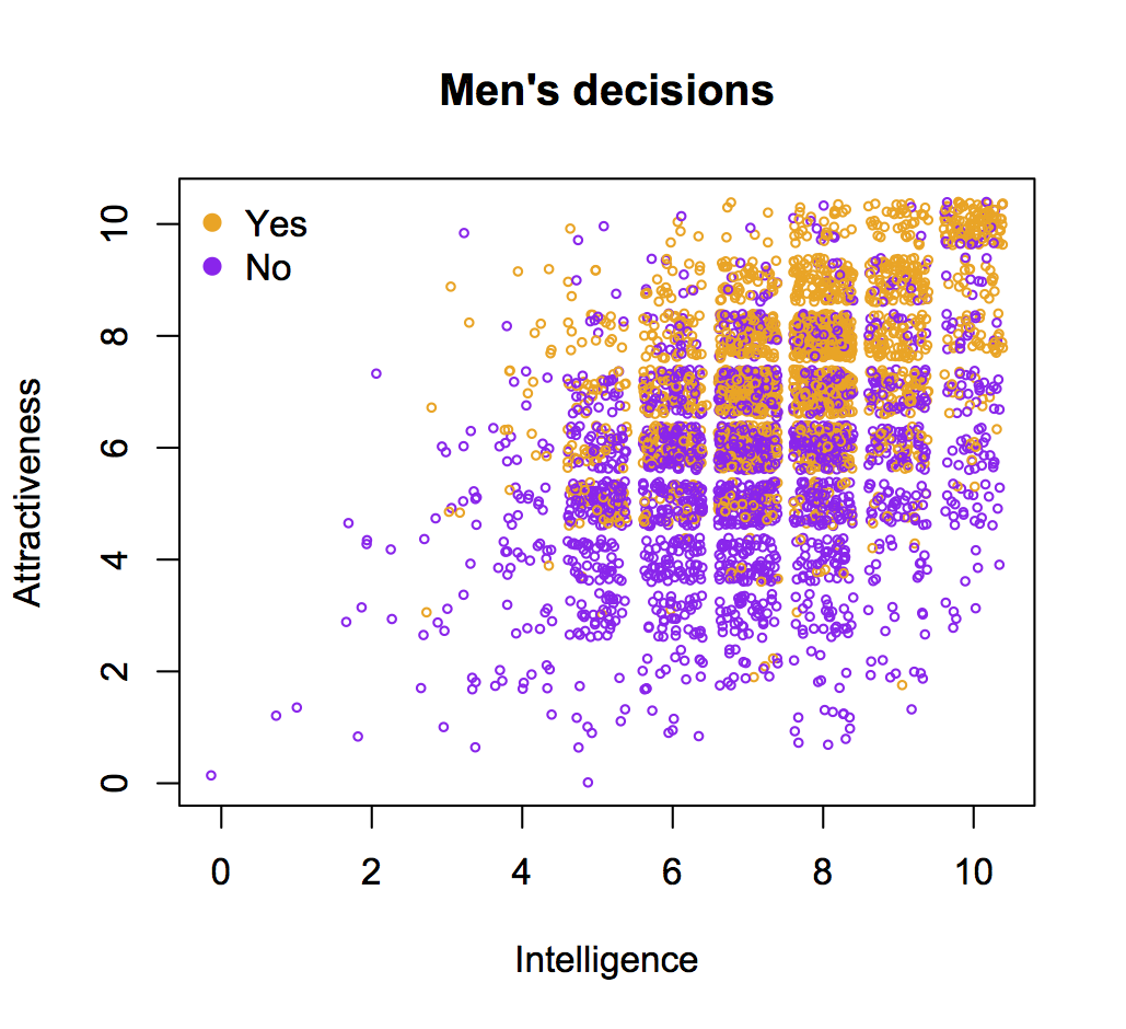
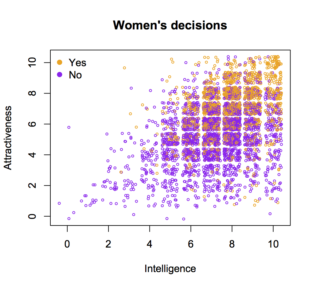
The effect is there: the probability of a positive decision is highest when men rated intelligence as either 8 or 9, not as 10. But it’s weaker than I think the story suggests — what’s more dramatic is that men were unlikely to rate women as ’10’ in intelligence.
More importantly, if the correlation wasn’t there, we wouldn’t believe the data and it wouldn’t end up on the front page — this is news to confirm our beliefs, not to inform us.
Momentum is an actual property of physical objects, and explanations of flight, spin, and bounce in terms of momentum (and other factors) genuinely explain something. Electoral poll proportions, on the other hand, can only have ‘momentum’ or ‘bounce’ as a metaphor — an explanation based on these doesn’t explain anything.
So, when US pollsters talk about convention bounce in polling results, what do they actually mean? The consensus facts are that polling results improve after a party’s convention and that this improvement tends to be temporary and to produce polling results with a larger error around the final outcome.
Andrew Gelman and David Rothschild have a long piece about this at Slate:
Recent research, however, suggests that swings in the polls can often be attributed not to changes in voter intention but in changing patterns of survey nonresponse: What seems like a big change in public opinion turns out to be little more than changes in the inclinations of Democrats and Republicans to respond to polls.
As usual, my recommendation is the relatively boring 538 polls-plus forecast, which discounts the ‘convention bounce’ very strongly.
And, finally, a nice note on how to display agree-disagree data and similar:
@visualisingdata yes! reminds me of best practices for Likert scales. 3 min photoshop👇 pic.twitter.com/fODo20I2LG
— RJ Andrews (@infowetrust) August 2, 2016
This appeared on Twitter
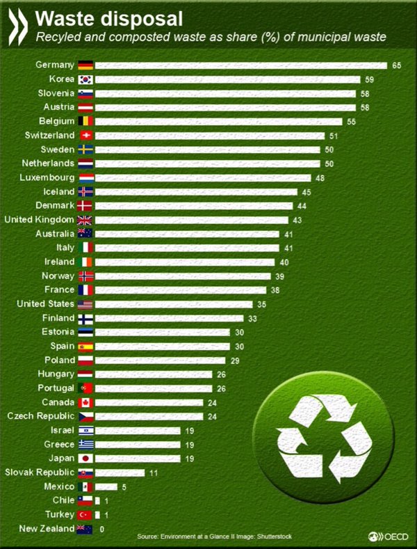
Now, I could just about believe NZ was near the bottom of the OECD, but to accept zero recycling and composting is a big ask. Even if some of the recycling ends up in landfill, surely not all of it does. And the garden waste people don’t charge enough to be putting all my wisteria clippings into landfill.
So, I looked up the source (updated link). It says to see the Annex Notes. Here’s the note for New Zealand
New Zealand: Data refer to amount going to landfill
The data point for New Zealand is zero by definition — they aren’t counting any of the recycling and composting.
When the most you can hope for is that the lies in the graph will be explained in the footnotes, you need to read the footnotes.
Q: Did you see the Sausages of DOOM are back?
A: In the Herald? Yes.
Q: They say “Swapping a sausage for whole grain toast, a few tomatoes or a handful of nuts could lead to a much longer life, research has shown.” How much longer?
A: The research goes to great lengths not to answer that question, but we could ignore all those the details and assume the number applies to that question and is reliable.
Q: Well, the story does, so let’s do that.
A: Ok. A bit less than a hour.
Q: That’s not very long.
A: One sausage isn’t very much.
Q: But they mean one sausage less every day, surely.
A: In that case, a bit less than an hour per day.
Q: Where does that number come from?
A: If you look at the biggest risk you can find anywhere in the research report, it’s a hazard ratio of 1.34 for an additional 3% of your energy intake from meat protein. On average 3% in the US or here is about 75 Calories, so about 19g of protein. That’s about two sausages (Freedom Farms has nutritional info easily available, others are probably similar). So we’re looking at a hazard ratio of 1.16 per daily sausage. One ‘microlife‘ per day is about a hazard ratio of 1.09.
Q: What’s that in cigarettes?
A: Two or three.
Q: Where did you find the research report? There’s a link in the story, but it just goes to the publisher’s home page.
A: It’s here. Open access, too.
Q: If I ask you about those details you mentioned ignoring, will I regret it?
A: Yes.
Q: I’m going to ask anyway.
A: Ok. The research was trying to estimate the difference in risk from a replacement of animal protein with plant protein, making no change in fat, calories, carbohydrates, or anything else.
Q: So we’d have to replace the sausage with low-carbohydrate toast with a lot of margarine?
A: Butter. Saturated fat has to stay the same, too.
Q: But they found a huge difference between processed and unprocessed red meat! That’s the same protein, just chopped up, maybe with different amounts of fat and some preservatives. How could it be the protein that’s doing it?
A: Well, obviously it can’t. They must be picking up other things about diet as well.
Q: What do they say about that?
A: They say the other factors might affect how much effect animal protein has on you, but they couldn’t explain the overall effect
Q: But..
A: They also said that the risk difference between people with healthy and unhealthy lifestyles could maybe be explained by fish and chicken protein being less harmful than red meat protein
Q: Really?
A: Those with unhealthy lifestyles consumed more processed and unprocessed red meat, whereas the healthy-lifestyle group consumed more fish and chicken as animal protein sources, suggesting that different protein sources, at least in part, contributed to the observed variation in the protein-mortality associations according to lifestyle factors
Q: Does that make more sense than it sounds as if it does?
A: I don’t think so.
Q: So sausages are actually healthy?
A: No, but they aren’t dramatically different from last week. And it’s probably not the composition of the protein that’s the biggest problem with them
Public Policy Polling has a history of asking … unusual… questions in their political polls. For example, asking if you are in favour of bombing Agrabah (the fictional country of Disney’s Aladdin), whether you think Hillary Clinton has ties to Lucifer, and whether you would vote for Harambe (the dead, 17-yr old gorilla) if running as an independent against Trump and Clinton.
From these three questions, the Lucifer one stands out: it comes from a familiar news issue and isn’t based on tricking the respondents. People may not answer honestly, but at least they know roughly what they are being asked and how it’s likely to be understood. Since they know what they are being asked, it’s possible to interpret the responses in a reasonably straightforward way.
Now, it’s fairly common when asking people (especially teenagers) about drug use to include some non-existent drugs for an estimate of the false-positive response rate. It’s still pretty clear how to interpret the results: if the name is chosen well, no respondents will have a good-faith belief that they have taken a drug with that name, but they also won’t be confident that it’s a ringer. You’re not aiming to trick honest respondents; you’re aiming to detect those that aren’t answering honestly.
The Agrabah question is different. There had been extensive media discussion of the question of bombing various ISIS strongholds (eg Raqqa), and this was the only live political question about bombing in the Middle East. Given the context of a serious opinion poll, it would be easy to have a good-faith belief that ‘Agrabah’ was the name of one of these ISIS strongholds and thus to think you were being asked whether bombing ISIS there was a good idea. Because of this potential confusion, we can’t tell what the respondents actually meant — we can be sure they didn’t support bombing a fictional city, but we can’t tell to what extent they were recklessly supporting arbitrary Middle-Eastern bombing versus just being successfully trolled. Because we don’t know what respondents really meant, the results aren’t very useful.
The Harambe question is different again. Harambe is under the age limit for President, from the wrong species, and dead, so what could it even mean for him to be a candidate? The charitable view might be that Harambe’s 5% should be subtracted from the 8-9% who say they will vote for real, living, human candidates other than Trump and Clinton. On the other hand, that interpretation relies on people not recognising Harambe’s name — on almost everyone not recognising the name, given that we’re talking about 5% of responses. I can see the attraction of using a control question rather than a half-arsed correction based on historical trends. I just don’t believe the assumptions you’d need for it to work.
Overall, you don’t have to be very cynical to suspect the publicity angle might have some effect on their question choice.
Recent comments on Thomas Lumley’s posts