Posts written by Thomas Lumley (2645)

avatar

Thomas Lumley (@tslumley) is Professor of Biostatistics at the University of Auckland. His research interests include semiparametric models, survey sampling, statistical computing, foundations of statistics, and whatever methodological problems his medical collaborators come up with. He also blogs at Biased and Inefficient

March 29, 2016

Chocolate probabilities

For those of you from other parts of the world, there has been a small sensation over the weekend here about Cadburys chocolate randomisation. One of their products was a large chocolate egg accompanied by eight miniature chocolate bars, chosen randomly from five varieties.  Public opinion on the desirability of some of these varieties is more polarised that for others.

Stuff reports:

But one family found seven Cherry Ripes out of eight bars and most of those complaining to Cadbury say they found at least six Cherry Ripes out of eight. 

Cadbury claimed that it was just bad luck saying the chocolates are processed randomly and the Cherry Ripe overdose was not intentional. 

Both Stuff and The Guardian got advice on the probabilities. They get different answers: Martin Hazelton says seven out of eight being the same (of any variety) is about 1 in 10,000 and the Guardian’s two advisers say there’s nearly a 1 in 100 chance of getting seven Cherry Ripes out of eight (which is obviously less likely than getting seven of eight the same).

With a hundred-fold difference in the estimates, I think a tie-breaker is in order. Also, I’m going to do this the modern way: by simulation rather than by being clever. It’s much more reliable.

I’m going to trust the Guardian on what the five flavours were (since it doesn’t actually matter, I think this is safe).  I’ve put the code and results for 100,000 simulated packages up here.  The number of packs with seven or more bars the same was 44 out of 100,000. There’s obviously some random uncertainty here, but a 95% confidence interval for the proportion goes from 3 in 10,000 to 6 in 10,000, and so excludes both of the published estimates .  Since computing time is nearly free, and the previous run took only 13 seconds, I tried it on a million simulated packs just to be sure, and also separated out ‘seven or more of anything’ from ‘seven or more Cherry Ripes’.

Out of a million simulated packs, 442 had seven or more of some type of bar, and 83 had seven or more Cherry Ripes.  The probability of seven or more of something is between 4 and 5 out of 10,000 and the probability of seven or more Cherry Ripes is between 0.6 and 1 out of 10,000. It looks as though Professor Hazelton’s estimate of ‘a little less than one in 10,000‘ is correct for Cherry Ripes specifically.  The Guardian figures seem clearly wrong. The Guardian is also wrong about the probability of getting at least one of each type, which this code shows to be about 30%, not the 7% they give.

I said I wasn’t going to do this by maths, but now I know the answer I’m going to go out on a limb here and guess that Martin Hazelton’s probability was, in maths terms, P(Binom(8, o.2)≥7), which is the answer I would have given for Cherry Ripes specifically. With Jack and Andrew in the Guardian I think the issue is that they have counted all 495 possible aggregate outcomes as being equally likely, when it’s actually the 32768 390625 underlying ordered outcomes that are equally likely.

The other aspect of this computation is the alternative hypothesis. It makes no sense that Cadbury would just load up the bags with Cherry Ripes and pretend they hadn’t — especially as the Guardian reports other sorts of complaints as well. We need to ask not just whether the reports would be surprising if the bags were randomised, but whether there’s another explanation that fits the data better.

The Guardian story hints at a possibility: clumping together of similar chocolates. It also would be conceivable that the randomisation wasn’t quite even — that, say,  Cherry Ripes were 25% instead of the intended 20%. It’s easy to modify the code for unequal probabilities. Having one chocolate type at 25% doubles the number of seven-or-more coincidences, and more than half of them are now with Cherry Ripes. But that’s quite a big imbalance to go unnoticed at Cadburys, and it doesn’t push the probability a lot.

So, I’d say bad luck is a feasible explanation, but it could easily have been aggravated by imperfect randomisation at Cadburys.

Many lessons could be drawn from this story: that simulation is a good way to do slightly complicated probability questions; that people see departures from randomness far too easily; that Cadburys should have done systematic sampling rather than random sampling; maybe even that innovative maths teachers may have gone too far in rejecting contrived ball-out-of-urn problems as having no Real World use.
March 28, 2016

Briefly

  • “Unlike other projects that map cities by sound, Chatty Maps isn’t measuring volume or ranking neighborhoods as noisy or quiet. Instead, it shows the city across a spectrum of different sounds—as well as the emotions we associate them with.” I’m not convinced, but it’s interesting to look at. (via @teh_aimee)
  • “World Cup fans not responsible for the Zika outbreak”. (Scientific American blog, open-access research paper)   I think ‘responsible’ is the wrong word, but in any case, looking at the genomes of Zika virus specimens suggests that the current virus has been circulating in the Americas since 2013 at least. Also, the three samples from microcephaly cases don’t share any relevant mutation, so the more-severe disease in the current outbreak probably isn’t due to a change in the virus.  You can do a lot with genetics.
  • “Can an algorithm be wrong?” from limn.it
  • “Exposing algorithms” from the Tow Center for Digital Journalism: a summary from a session at the National Institute for Computer-Assisted Reporting conference
March 24, 2016

The fleg

Two StatsChat relevant points to be made.

First, the opinion polls underestimated the ‘change’ vote — not disastrously, but enough that they likely won’t be putting this referendum at the top of their portfolios.  In the four polls for the second phase of the referendum after the first phase was over, the lowest support for the current flag (out of those expressing an opinion) was 62%. The result was 56.6%.  The data are consistent with support for the fern increasing over time, but I wouldn’t call the evidence compelling.

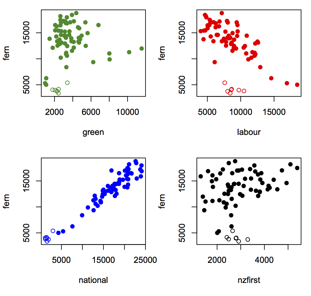
Second, the relationship with party vote. The Herald, as is their wont, have a nice interactive thingy up on the Insights blog giving results by electorate, but they don’t do party vote (yet — it’s only been an hour).  Here are scatterplots for the referendum vote and main(ish) party votes (the open circles are the Māori electorates, and I have ignored the Northland byelection). The data are from here and here.

fleg

The strongest relationship is with National vote, whether because John Key’s endorsement swayed National voters or whether it did whatever the opposite of swayed is for anti-National voters.

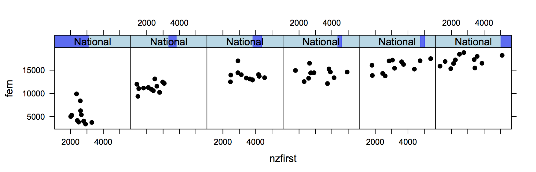
Interestingly, given Winston Peters’s expressed views, electorates with higher NZ First vote and the same National vote were more likely to go for the fern.  This graph shows the fern vote vs NZ First vote for electorates divided into six groups based on their National vote. Those with low National vote are on the left; those with high National vote are on the right. (click to embiggen).
winston

There’s an increasing trend across panels because electorates with higher National vote were more fern-friendly. There’s also an increasing trend within each panel, because electorates with similar National vote but higher NZ First vote were more fern-friendly.  For people who care, yes, this is backed up by the regression models.


Two cheers for evidence-based policy

Daniel Davies has a post at the Long and Short and a follow-up post at Crooked Timber about the implications for evidence-based policy of non-replicability in science.

Two quotes:

 So the real ‘reproducibility crisis’ for evidence-based policy making would be: if you’re serious about basing policy on evidence, how much are you prepared to spend on research, and how long are you prepared to wait for the answers?

and

“We’ve got to do something“. Well, do we? And equally importantly, do we have to do something right now, rather than waiting quite a long time to get some reproducible evidence? I’ve written at length, several times, in the past, about the regrettable tendency of policymakers and their advisors to underestimate a number of costs; the physical deadweight cost of reorganisation, the stress placed on any organisation by radical change, and the option value of waiting. 

Graphics: what are they good for?

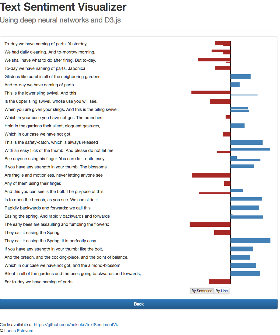
From Lucas Estevem, an interactive text-sentiment visualiser (click to embiggen, as usual)

sentiment

Andrew Gelman, whose class this was a project for, asks what the visualiser is useful for?

An interactive display is particularly valuable because we can try out different texts, or even alter the existing document word by word, in order to reverse-engineer the sentiment analyzer and see how it works. The sentiment analyzer is far from perfect, and being able to look inside in this way can give us insight into where it will be useful, where it might mislead, and how it might be improved.

Visualization. It’s not just about showing off. It’s a tool for discovering and learning about anomalies.

March 22, 2016

Counting sheep

From the Guardian (slightly outside our usual beat, but noted by Robin Evans on Twitter)

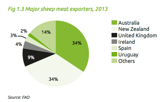
The UK is the world’s third largest lamb exporter – after Australia and New Zealand – with just over a third of the market.

That can’t be true. Even if Australia and New Zealand and the UK were the only exporters, the UK being in third place would mean it had to have less than a third of the market.  The (UK) Agriculture & Horticulture Development Board (PDF) thinks it’s about 9% — yes, that’s not just lamb, but lamb makes up most of the NZ and Oz exports.

sheep

I’m not sure what the ‘just over a third’ really is. It might be the proportion of UK-raised lamb that is exported.

It’s also interesting to see the Guardian slant on the story: that supermarkets should refuse to stock any imported lamb at this time of the year and insist on English lamb raised indoors, out of season.


March 21, 2016

Briefly

  • Many people have hypothesized, plausibly, that giving people risk estimates for disease based on genetics would encourage them to behave more healthily. The available evidence isn’t supportive.
  • Expensive but extremely effective hepatitis C drugs: an example of the sort of thing Pharmac might well want to fund ahead of Keytruda.
March 20, 2016

Hard problems make bad news

Q: Did you see snake venom can cure Alzheimer’s Disease now?

A: I saw the story in Stuff.

Q: Do you have to get bitten by the pretty green snake?

A: No, you don’t, though you’d probably need the compound from the venom injected into your spine. And the snake isn’t green.

Q: So it’s mice? It looks green

A: The photo is of the wrong snake, and the research isn’t even in mice. The last sentence of the story says “The treatment will now be trialled in mice before it can be considered as a viable treatment for humans.”

Q: But it could work?

A: It could, though so far treatments that try to dismantle amyloid plaques have ranged from ineffective to actively harmful in treating the actual disease. There’s even a respectable hypothesis that amyloid starts off as a protective response against lurking bacteria or viruses that activate in the brain in old age. It’s all very unclear and depressing.

Q: But there seem to be lots of natural products that are promising cures. It’s not just the snakes, look at the ‘Read More’ links from the story:

ad

A: The chocolate link isn’t about Alzheimer’s at all. The maple syrup story talks about compounds in maple syrup, and the need for ‘further animal trials’. The ‘cheap pill’ trial “did not investigate whether resveratrol has any effect on memory or improving other symptoms of Alzheimer’s disease.”  The blueberries had a small effect in one tiny, short-term trial and a different small effect in another tiny, short-term trial.  And the sleep disruption isn’t something you could do much about, even if it is more than correlation.

Q: So why are there all these unreliable or preliminary reports being published?

A: Because there isn’t any other good news. If you have a really hard problem, nearly all the people who say they have solutions will be wrong, and won’t have checked their solutions thoroughly.

Q: I see. It’s like aliens.

A: <blinks> Huh?

Q: Lots of serious researchers are looking for alien life, but all the people who say they’ve actually found it are talking about crop circles and UFOs, and everything else is just like “we’ve found a planet that’s not as far from being habitable as the previous ones were”

A: Pretty much.


March 18, 2016

What they aren’t telling you

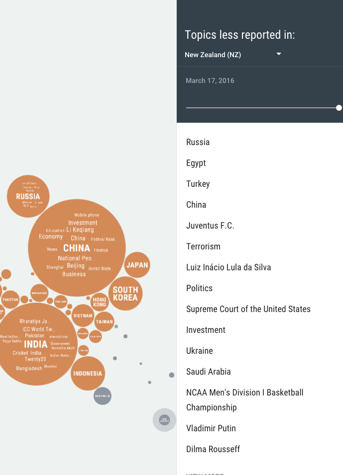
Unfiltered.news is a beautiful visualisation of what news topics are less covered in your country (or any selected country) than on average for the world:

unfiltered

For a lot of these topics it will be obvious why they’re just not that relevant, but not always.

(via Harkanwal Singh)

March 17, 2016

Parental worry clickbait

From the ‘Parenting’ section of the Stuff Life & Style page:

Cduf0BaUsAEOhzt

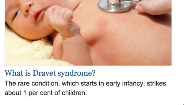
That’s both wrong and implausible.  If Dravet syndrome, a serious epileptic condition, was about as common as, say, autism spectrum disorder, you’d have heard of it already.

The actual rate is about 1 in 20,000, two hundred times lower than the teaser says. If you click through to the story and read it carefully you’ll see that Dravet Syndrome is responsible for about 1% of childhood epilepsy.

So, how did the numbers get so badly messed up? Well, one contributing factor is probably that the story was taken from The Conversation, and whoever did the editing job didn’t read it carefully enough.  As seems to often happen with pieces taken from The Conversation, there’s no attribution either to the original publisher or the authors, and all but two of the nine links in the original have been scrubbed.

The Conversation encourages republication of the pieces they publish, but the Creative Commons license they use requires that republishers attribute the piece and indicate if changes have been made.  I don’t know if the NZ news sites have negotiated an alternative deal, but I can’t see why lack of attribution would be desirable — I thought the by-line was as sacred to journalists as to academics.