The fleg
Two StatsChat relevant points to be made.
First, the opinion polls underestimated the ‘change’ vote — not disastrously, but enough that they likely won’t be putting this referendum at the top of their portfolios. In the four polls for the second phase of the referendum after the first phase was over, the lowest support for the current flag (out of those expressing an opinion) was 62%. The result was 56.6%. The data are consistent with support for the fern increasing over time, but I wouldn’t call the evidence compelling.
Second, the relationship with party vote. The Herald, as is their wont, have a nice interactive thingy up on the Insights blog giving results by electorate, but they don’t do party vote (yet — it’s only been an hour). Here are scatterplots for the referendum vote and main(ish) party votes (the open circles are the Māori electorates, and I have ignored the Northland byelection). The data are from here and here.
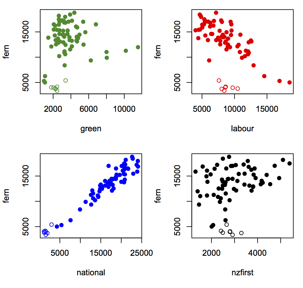
The strongest relationship is with National vote, whether because John Key’s endorsement swayed National voters or whether it did whatever the opposite of swayed is for anti-National voters.
Interestingly, given Winston Peters’s expressed views, electorates with higher NZ First vote and the same National vote were more likely to go for the fern. This graph shows the fern vote vs NZ First vote for electorates divided into six groups based on their National vote. Those with low National vote are on the left; those with high National vote are on the right. (click to embiggen).
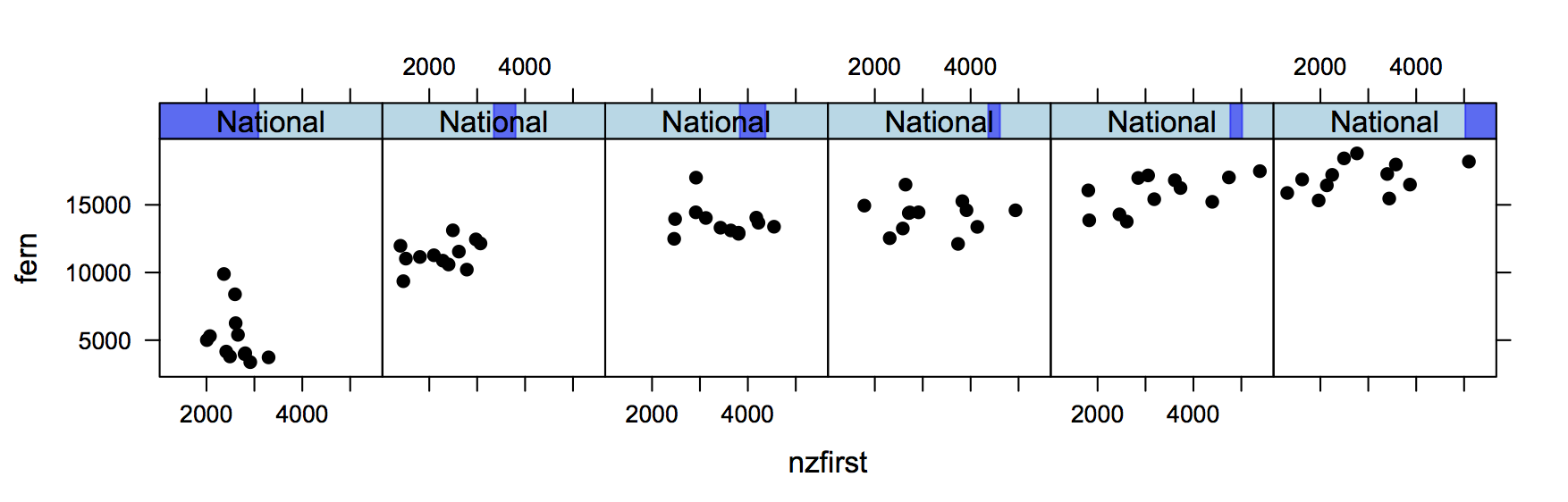
There’s an increasing trend across panels because electorates with higher National vote were more fern-friendly. There’s also an increasing trend within each panel, because electorates with similar National vote but higher NZ First vote were more fern-friendly. For people who care, yes, this is backed up by the regression models.
Thomas Lumley (@tslumley) is Professor of Biostatistics at the University of Auckland. His research interests include semiparametric models, survey sampling, statistical computing, foundations of statistics, and whatever methodological problems his medical collaborators come up with. He also blogs at Biased and Inefficient See all posts by Thomas Lumley »
I used number of votes rather than proportion on both axes of these plots. I did it because it was easier.
Using number of votes is good because that’s what gets added up at the national level for both List seats and the flag choice.
On the other hand, since turnout is correlated with National vote, using number of votes overstates the correlation with National Party support at an individual level.
10 years ago
Not wanting to be overly defensive, but the goal was to measure public support for each flag at the time of the poll, using a question tagged on the end of a poll designed to estimate party support at the time of the poll.
The goal was not predict the referendum result.
I know that probably seems like semantics to many, but if I’d been asked to predict the referendum result I would have designed the poll differently, so that I could have adjusted and analysed the data differently, and I would have carried out the poll at a different time.
I’m pretty happy with our comparison to the final result.
10 years ago
Ok, I suppose that was a bit strong. Still, in election polling, companies *do* talk about getting close to the election result as a figure of merit, and they don’t seem to discourage thinking of polls as of predictive value. The concept of “likely voter” models also seems to undermine this a bit.
10 years ago
So the likely voter question I use is for ‘an election held today’ (rather than an upcoming election), so even then I can’t claim to predict the outcome of an election (and say as much in each poll report). However if we poll close to the election, we’d expect the poll result would be pretty close, and we’d be very concerned if it wasn’t.
If I was asked to predict the referendum result, my response would be we can only measure support for each option at the time of the poll, but let’s poll as close we can to the referendum period, and do a few other things to try and model a likely outcome. Even then, we’d say in the report that we can only gauge how people were feeling during the time we were actually polling.
You’re right though, I do proudly tell clients about my poll results. Some are interested, especially those wondering if landline polling is still a viable option. These days though only about 30% of my surveys (guessing th %) use CATI, and a smaller percentage use RDD, so I’m not have this conversation very often.
10 years ago
There were some news items on police investigating vote theft. The social media bragging that was investigated was about stealing extra votes for the change flag. I wonder whether the underestimation of the change vote is in part due to illicit votes for change?
10 years ago
I’d think the vote theft problem would be about a hundred times too small to explain the underestimation.
10 years ago