Posts written by Thomas Lumley (2645)

avatar

Thomas Lumley (@tslumley) is Professor of Biostatistics at the University of Auckland. His research interests include semiparametric models, survey sampling, statistical computing, foundations of statistics, and whatever methodological problems his medical collaborators come up with. He also blogs at Biased and Inefficient

April 18, 2016

Being precise

regional1

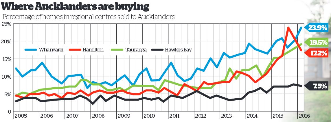
There are stories in the Herald about home buyers being forced out of Auckland by house prices, and about the proportion of homes in other regions being sold to Aucklanders.  As we all know, Auckland house prices are a serious problem and might be hard to fix even if there weren’t motivations for so many people to oppose any solution.  I still think it’s useful to be cautious about the relevance of the numbers.

We don’t learn from the story how CoreLogic works out which home buyers in other regions are JAFAs — we should, but we don’t. My understanding is that they match names in the LINZ title registry.  That means the 19.5% of Auckland buyers in Tauranga last quarter is made up of three groups

  1. Auckland home owners moving to Tauranga
  2. Auckland home owners buying investment property in Tauranga
  3. Homeowners in Tauranga who have the same name as a homeowner in Auckland.

Only the first group is really relevant to the affordability story.  In fact, it’s worse than that. Some of the first group will be moving to Tauranga just because it’s a nice place to live (or so I’m told).  Conversely, as the story says, a lot of the people who are relevant to the affordability problem won’t be included precisely because they couldn’t afford a home in Auckland.

For data from recent years the problem could have been reduced a lot by some calibration to ground truth: contact people living at a random sample of the properties and find out if they had moved from Auckland and why.  You might even be able to find out from renters if their landlord was from Auckland, though that would be less reliable if a property management company had been involved.  You could do the same thing with a sample of homes owned by people without Auckland-sounding names to get information in the other direction.  With calibration, the complete name-linkage data could be very powerful, but on its own it will be pretty approximate.
 

April 17, 2016

Briefly

  • “Statistical bullshit: how politicians poisoned statistics”, by Tim Harford in the Financial Times. An important piece to read, but it’s also worth bearing in mind Daniel Davies’s response on Twitter: “it wasn’t politicians that gave us the replicability crisis…”
  • Graphics: every attempted scoring shot Kobe Bryant made during his career.  Some features (like the three-point line) are obvious, more would probably be clear to basketball fans.  It still misses out a bit on the ‘compared to what?’ scale. How did Kobe’s shots compare to other players’, for example?
  • The dark side of comments. The Guardian analysed the 70 million comments on their website: results not surprising, but depressing.

Although the majority of our regular opinion writers are white men, we found that those who experienced the highest levels of abuse and dismissive trolling were not. The 10 regular writers who got the most abuse were eight women (four white and four non-white) and two black men. Two of the women and one of the men were gay. And of the eight women in the “top 10”, one was Muslim and one Jewish.

And the 10 regular writers who got the least abuse? All men

  • At Slate: maps of cholera: “at CDC headquarters today, five-and-a-half years into the epidemic, they are proudly displaying two historic maps that have everything to do with each other, but they are not telling you why” 
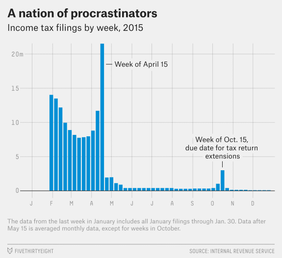
  • From 538: when people in the US file their taxes.
    casselman-taxday-v2

Evil within?

The headlineSex and violence ‘normal’ for boys who kill women in video games: study. That’s a pretty strong statement, and the claim quotes imply we’re going to find out who made it. We don’t.

The (much-weaker) take-home message:

The researchers’ conclusion: Sexist games may shrink boys’ empathy for female victims.

The detail:

The researchers then showed each student a photo of a bruised girl who, they said, had been beaten by a boy. They asked: On a scale of one to seven, how much sympathy do you have for her?

The male students who had just played Grand Theft Auto – and also related to the protagonist – felt least bad for her. with an empathy mean score of 3. Those who had played the other games, however, exhibited more compassion. And female students who played the same rounds of Grand Theft Auto had a mean empathy score of 5.3.

The important part is between the dashes: male students who related more to the protagonist in Grand Theft Auto had less empathy for a female victim.  There’s no evidence given that this was a result of playing Grand Theft Auto, since the researchers (obviously) didn’t ask about how people who didn’t play that game related to its protagonist.

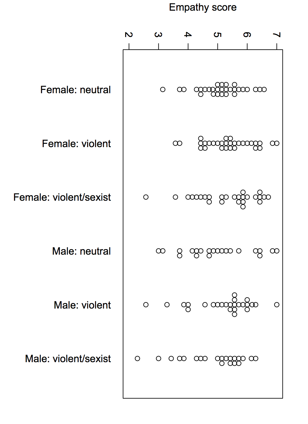
What I wanted to know was how the empathy scores compared by which game the students played, separately by gender. The research paper didn’t report the analysis I wanted, but thanks to the wonders of Open Science, their data are available.

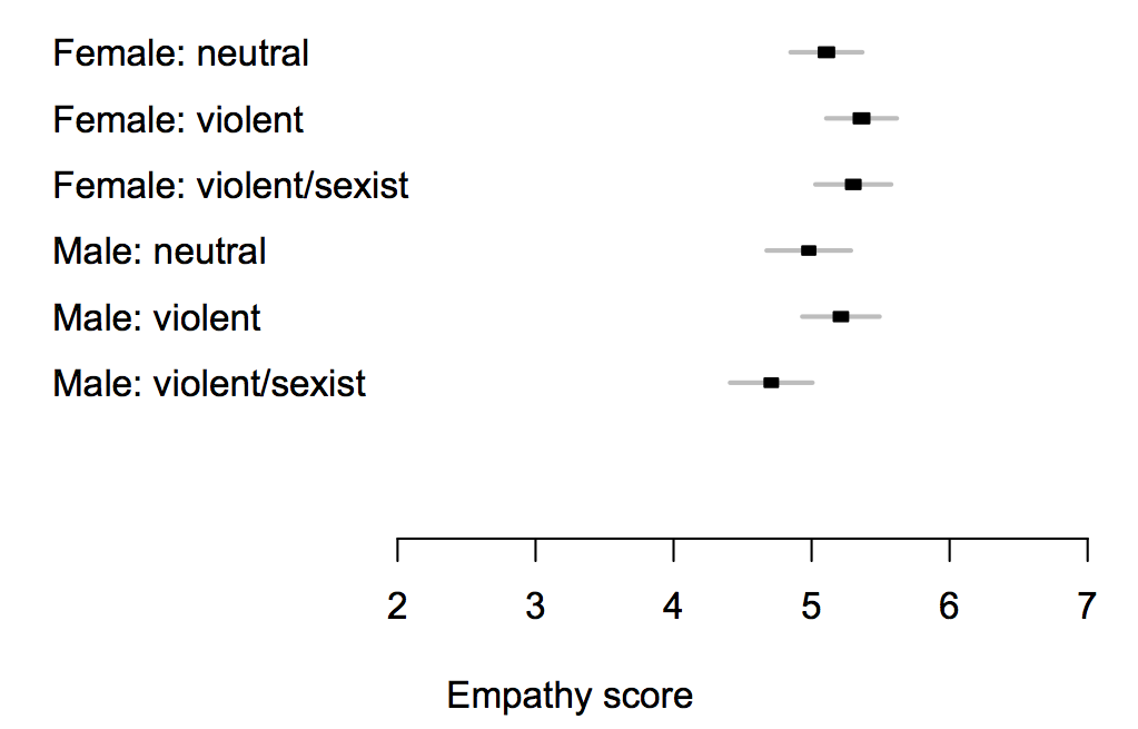
If you just compare which game the students were assigned to (and their gender), here are the means; the intervals are set up so there’s a statistically significant difference between two groups when their intervals don’t overlap.

gtamean

The difference between different games is too small to pick out reliably at this sample size, but is less than half a point on the scale — and while the ‘violent/sexist’ games might reduce empathy, there’s just as much evidence (ie, not very much) that the ‘violent’ ones increase it.

Here’s the complete data, because means can be misleading

gtaswarm

The data are consistent with a small overall impact of the game, or no real impact. They’re consistent with a moderately large impact on a subset of susceptible men, but equally consistent with some men just being horrible people.

If this is an issue you’ve considered in the past, this study shouldn’t be enough to alter your views much, and if it isn’t an issue you’ve considered in the past, it wouldn’t be the place to start.

Overcounting causes

There’s a long story in the Sunday Star-Times about a 2007 report on cannabis from the National Drug Intelligence Bureau (NDIB)

“Perhaps surprisingly,” Maxwell wrote, “cannabis related hospital admissions between 2001 and 2005 exceeded admissions for opiates, amphetamines and cocaine combined”, with about 2000 people a year ending up in hospital because of the drug.

The problem was with hospital diagnostic codes. Discharge summaries include both the primary cause of admission and a lot of other things to be noted. That’s a good thing — you want to know what all was wrong with a patient both for future clinical care and for research and quality control.  For example, if someone is in hospital for bleeding, you want to know they were on warfarin (which is why the bleeding happened), and perhaps why they were on warfarin. It’s not even always the case that the primary cause is the primary cause — if someone has Parkinson’s Disease and is admitted with pneumonia as a complication, which one should be listed? This is a difficult and complex field, and is even slightly less boring than it sounds.

As a result, if you just count up all the discharge summaries where ‘cannabis dependence’ was somewhere on the laundry list of codes, you’re going to get a lot of people who smoke pot but are in hospital for some completely different reason.  And since there’s a lot of cannabis consumption out there, you will get a lot of these false positives.

There are some other things to note about this report, though. The National Drug Foundation says (on Twitter) that they made the same point when it first came out. They also claim


that the Ministry of Health argued against its being published.

Perhaps now the multiple-counting problem has been publicised in the context of hospital admissions the same mistake will be made less often for road crashes, where multiple factors from foreign drivers to speed to alcohol to drugs are repeatedly counted up as ‘the’ cause of any crash where they are present.

April 11, 2016

Missing data

Sometimes…often…practically always… when you get a data set there are missing values. You need to decide what to do with them. There’s a mathematical result that basically says there’s no reliable strategy, but different approaches may still be less completely useless in different settings.

One tempting but usually bad approach is to replace them with the average — it’s especially bad with geographical data.  We’ve seen fivethirtyeight.com get this badly wrong with kidnappings in Nigeria, we’ve seen maps of vaccine-preventable illness at epidemic proportions in the west Australian desert, we’ve seen Kansas misidentified as the porn centre of the United States.

The data problem that attributed porn to Kansas has more serious consequences. There’s a farm not far from Wichita that, according to the major database providing this information, has 600 million IP addresses.  Now think of the reasons why someone might need to look up the physical location of an internet address. Kashmir Hill, at Fusion, looks at the consequences, and at how a better “don’t know” address is being chosen.

April 9, 2016

Movie stars broken down by age and sex

The folks at Polygraph have a lovely set of interactive graphics of number of speaking lines in 2000 movie screenplays, with IMDB look-ups of actor age and gender.  If you haven’t been living in a cave on Mars, the basic conclusion won’t be surprising, but the extent of the differences might. Frozen, for example, gave more than half the lines to male characters.

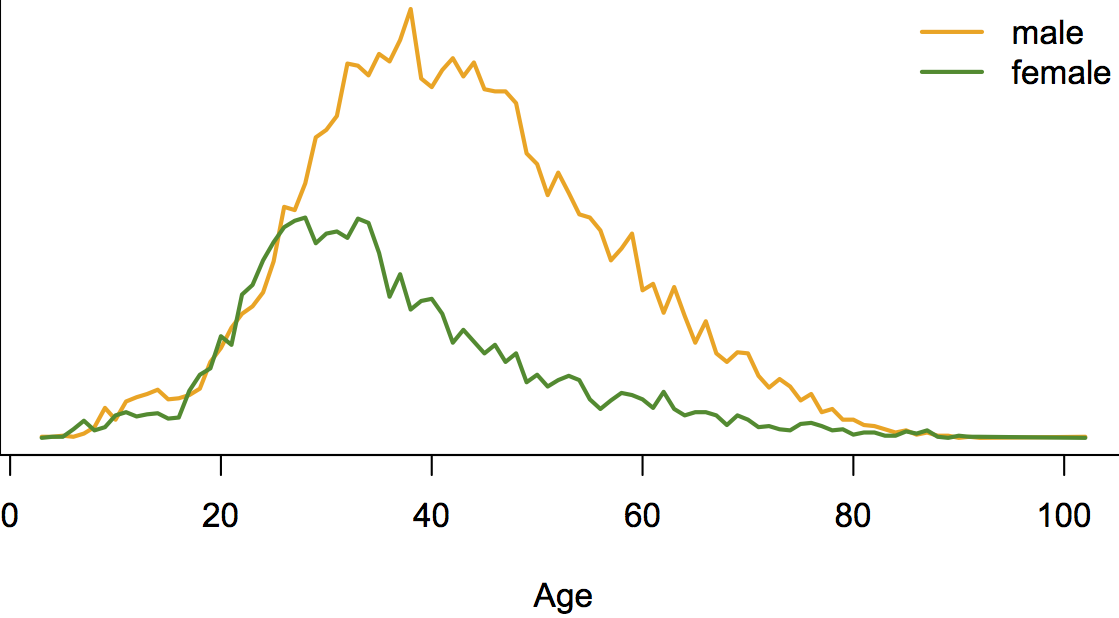
They’ve also made a lot of data available on Github for other people to use. Here’s a graph combining the age and gender data in a different way than they did: total number of speaking lines by age and gender

hollywood

Men and women have similar number of speaking lines up to about age 30, but after that there’s a huge separation and much less opportunity for female actors.  We can all think of exceptions: Judi “M” Dench, Maggie “Minerva” Smith, Joanna “Absolutely no relation” Lumley, but they are exceptions.

Compared to what?

Two maps via Twitter:

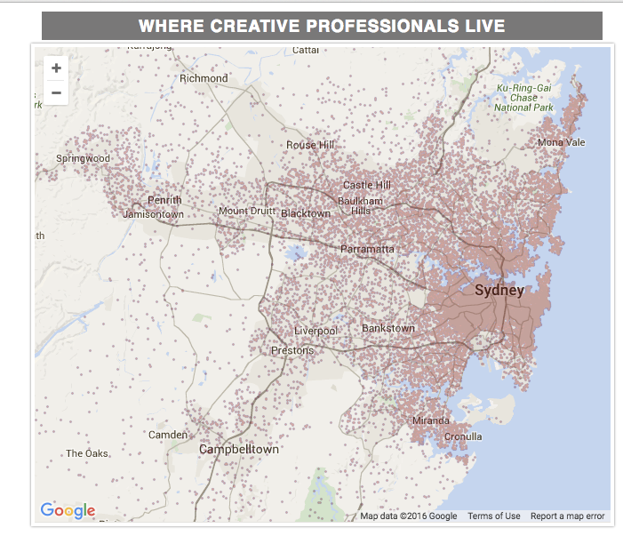
From the Sydney Morning Herald, via @mlle_elle and @rpy

creativemap

The differences in population density swamp anything else. For the map to be useful we’d need a comparison between ‘creative professionals’ and ‘non-creative unprofessionals’.  There’s an XKCD about this.

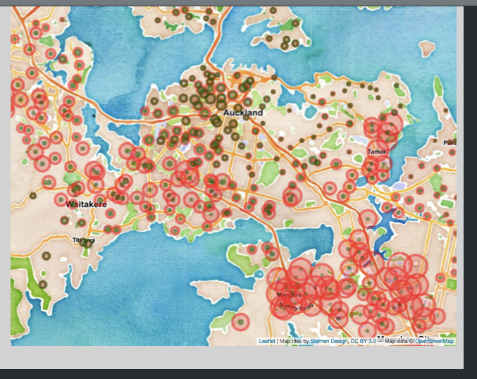
Peter Ellis has another visualisation of the last election that emphasises comparisons. Here’s a comparison of Green and Labour votes (by polling place) across Auckland.

votemap

There’s a clear division between the areas where Labour and Green polled about the same, and those where Labour did much better


April 8, 2016

Briefly

  • A lottery in the US rigged by subverting the random number generator.  That’s harder to do with the complicated balls-from-a-machine we use — and it’s also more obvious when drawing balls from a machine that betting systems based on sophisticated numerical sequences won’t work.
  • The (US) Transport Security Administration has a ‘fast lane’ for more-trusted travellers, who get chosen for screening randomly. They use a randomizer app to make sure it really is random, which is a good idea — people are very bad at random choices. But perhaps it shouldn’t have cost $50k.
  • The Panama Papers are an example of the importance of data skills to journalists.
  • University of Otago research on microRNA may help with Alzheimer’s Disease diagnosis, which is interesting and potentially very useful, but there have been a lot of ‘potential tests’ recently. Also the research is unpublished and they aren’t disclosing yet which microRNAs are involved, so perhaps the publicity could have waited.
April 2, 2016

One weird trick increases donating tenfold?

From the Herald:

US researchers have confirmed a strange link between touching rough surfaces and feeling for others, which could help charities raise more money.

Based on my usual complaints about this sort of claim, you might expect that the research didn’t look at donating money  or that it saw only a tiny difference. No.

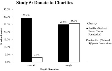
There were five experiments, but only one that involved actual money. People were approached on the street and given a description of  a health-related charity, and asked to donate. One charity was real, working in a familiar disease; the other was fake, working in a real but obscure disease (all the money actually ended up with the real charity).  Half the participants were given the information and donation envelope on a clipboard with rough sandpaper on the back; the other half weren’t.

1-s2.0-S1057740815001035-gr4

When asked to donate to the National Breast Cancer Foundation there was no difference between the rough and smooth clipboards (as you’d expect). When asked to donate to the National Sjögren’s Foundation, 10/34 with sandpaper-backed clipboards said yes compared to only 1/32 with smooth clipboards.

I’m going to go very slightly out on a limb here to say there is no way this ten-fold increase is a real and generalisable phenomenon.  So, what went wrong?  Part of the problem is what Andrew Gelman calls the ‘garden of forking paths’, after the Jorge Luis Borges story — there are many, many possible analyses and they don’t all show this dramatic difference.

For example, there wasn’t a difference in donation probability with the familiar charity. This was consistent with the researchers’ theory, but I’m pretty sure if there had been a difference the researchers wouldn’t have considered it as evidence refuting the theory. Also, the researchers note that they didn’t see a difference in donation amount with the sandpaper, just in donation probability.

Also, if you assume the ten-fold increase was overestimated even a bit, you then get into the problem of sample size. Suppose that the effect was only a two-fold increase rather than ten-fold. That still seems implausibly large to me, but the comparison would then be something like 2/34 vs 1/32 and would be completely unimpressive.  You’d need a sample size something like ten times larger.  And that’s if a bit of sandpaper on the back of a clipboard doubled the number of people who donated.

Still, these findings could have “significant implications for less well-known charities”, as the researchers suggest. If I got approached by a charity using sandpaper on the back of their clipboards, I would tend to think they were (a) poor at evaluating evidence, and (b) not all that honest. I could see that having an impact.

March 30, 2016

Hold the lettuce

Q: Did you see vegetarian diets cause cancer now?

A: No.

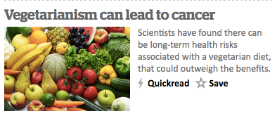
Q: The Herald site front page: headline Vegetarianism can lead to cancer?

vege

A: No

Q: The teaser: “Scientists have found there can be long-term health risks associated with a vegetarian diet, that could outweigh the benefits.”?

A: Well, it depends on what you mean by ‘long-term’, for a start.

Q: How long-term?

A: Centuries, perhaps thousands of years.

Q: How did they find people who were thousands of years old? And why isn’t that the headline?

A: Not people.

Q: I refuse to believe in century-old lab mice.

A: Human populations.

Q: Ok, so if we click through to the story (from the Telegraph) it seems they’re saying your great-grandparents eating lettuce gives you harmful mutations?

A: That’s what the story says, but it’s not what the research says. The research suggests that a mutation that with a modern diet might increase cancer risk arose randomly a long time in the past and became common in a South Asian population where vegetarian diets have been common.

Q: How did the mutation become common?

A: Because it wasn’t true that the long-term health risks outweighed the benefits — there’s genetic evidence of  ‘selection’ in the evolutionary sense, meaning that people with the mutation had more descendants on average.

Q: How much health risk did they find?

A: They weren’t looking at health risks

Q: But “long-term health risks” and “can lead to cancer”?

A: Sadly, yes.

Q: Ok, what were they looking at?

A: They were looking at enzymes that turns one type of fatty acid into another. The mutation makes it easier for the body to synthesis long polyunsaturated acids

Q: Aren’t they good?

A: Some of them, like the DHA and EPA also found in fish, are thought to reduce inflammation and heart disease. But arachidonic acid is thought to increase inflammation, though the American Heart Association isn’t convinced

Q: That’s heart disease. What about cancer?

A: The only links to cancer are pretty speculative — that the mutation could reinforce effects of modern diet in increasing cancer risk.  The contribution of arachidonic acid to that is controversial. But it could be real.

Q: Is there actually a higher cancer rate where they got their vegetarian population from, compared to the control population?

A: No.

Q: That ‘arachidonic acid’ thing. Why does that make me think of spiders?

A: Yes, me too. It’s a false cognate: Latin ‘arachis‘, ‘peanut’, not the mythic Greek technologist Aράχνη that arachnids were named for.