Search results for briefly (337)
July 18, 2022
- Training data for emotions/sentiment from Google appears to be badly wrong (Inconceivable!)
- About 12% of people surveyed in the UK said they knew “a great deal” or “a fair amount” about a non-existent candidate for leader of the Conservative Party. More reassuringly, the proportion who had ‘never heard of’ this candidate was much higher than for the real candidates.
- The New York Times asks what’s the chance that Trump adversaries McCabe and Comey got tax audits — and, much more usefully, shows how the answer to this question depends on how you define the comparison
- Hilda Bastian looks at the evidence on whether female national leaders handled the pandemic better, now that we have more follow-up
- From the President of the Royal Society (of London), the need for data literacy, but also the need to “avoid shoehorning everything to do with numbers into a box labelled “Maths”, which has negative connotations for many. If you use that box as a place to pigeonhole quantitative literacy, you are shooting yourself in the foot.” (disclaimer: he’s a statistician)
- A re-analysis suggests that the vaccine effectiveness data for the Sputnik coronavirus vaccine cannot possibly be correct. Among other red flags, the estimated effectiveness in different age groups was far more similar than would be expected even if the true effectiveness was identical in the groups.
June 15, 2022
- The Herald says House prices: ‘Another bloodbath’ as prices slump again in May for sixth straight month – REINZ figures. Estimates in the story range from 10-15% drop by the end of the year, and maybe 18% peak to trough. In January, the Herald reported that prices had risen 30% in 2021, so even an 18% drop would leave prices about 10% higher than they were at the start of 2021. So even the most optimistic forecast has housing prices pretty much keeping up with inflation over 2021-22.
- Emma Vitz updated her housing price maps for the Spinoff, which you probably saw this time last year
- Len Cook, former Government Statistician of New Zealand and former Chief Statistician of the UK, is Not Happy with the proposed Data and Statistics Bill, replacing the old Statistics Act. As I said on Twitter, you don’t necessarily have to agree with Len, but you do need to pay attention to what he thinks.
- Covid has now killed more White people in the US than Hispanic or Black or Asian, according to a New York Times story. As this Twitter thread points out, that’s because of age differences in the populations of different ethnicities. Mortality rates are lower for White people <45 than Black or Hispanic. The same is true for White people 45-64. And 65-74, and over 75. Because the White population averages older, the total numbers of deaths are higher — but that’s like the way deaths are higher in Australia than New Zealand because the population is larger. Age standardisation is really important if you want to think about reasons for differences between groups
May 20, 2022
- The WHO has released new estimates of Covid mortality. Here’s Jon Wakefield, a statistician at the University of Washington, talking about them on PBS Newshour, Radio New Zealand, BBC’s More or Less, and Checks and Balance, at The Wire in India
- A nice new Australian electoral map, just in time for the election
- Some interesting sound-based data display from NASA. I’m not sure how well it works as communication
- The making of a data visualisation — all the plots that Georgios Karamanis made in the process of looking at some data and making a final graphic
- Media Council ruling on a terrible graph accompanying a column by Shane Reti in the Northern Advocate: “Opinion pieces must be based on a foundation of fact, and should not contain clear errors of fact. There is no doubt that the graphs presented by Dr Reti as justifying his headline and comment in his column were misleading in that they did not fairly show the trend in cases through the period.”
- The sources of data for online panel surveys are more complicated and messy than many people expect: “We began wondering about survey data sourcing when we noticed that since 2018, the Cooperative Election Study has included data from Dynata, Critical Mix, and Prodege. This was a shock to us because among academic researchers, the Cooperative Election Study is widely understood as a survey conducted by YouGov“
- A Twitter thread about Tesco Clubcard, perhaps the first store loyalty programme to focus on data collection
April 19, 2022
- The Herald has a story on a penis size ‘survey’ from a UK online pharmacy specialising in men’s health, who “used Google data to rank the average penis size of 86 countries – and New Zealand has placed 50th”. That’s not an indication of worrying privacy leaks in Android phones; it seems they did just Google for the results. The pharmacy obviously wants to get publicity because being unknown will be its biggest business problem. In the UK, they did well and got a mention in The Sun. Being in the Herald doesn’t do them much good, though.
- ESR is now publishing detailed wastewater Covid data, which is great — the big advantage of wastewater data is that the sampling is independent of Covid prevalence, in contrast to data on testing, where you tend to miss more cases as the prevalence goes up.
- One thing I don’t like about the current ESR graphs is that they use a log scale for viral load and a linear scale for cases, which is one reason the peak for wastewater looks so much broader than the peak for cases (the other reason is that wastewater measures total active cases, not daily new cases)

- Ben Schmidt has made an interactive map of ethnicity in the US, based on Census data — in the sense that it has a dot for each of the 300-odd million people recorded in the Census
- Interesting Twitter thread about the case against the continued existence of Ivory-billed Woodpeckers in the US. Not precisely statistical, but definitely statistics-adjacent.
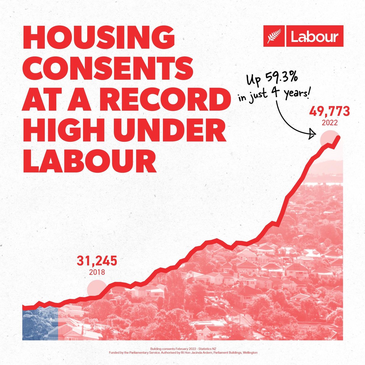
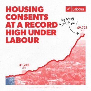
- Somewhat dodgy graphic from Labour about housing consents. If this is an area graph, the axis should go down to zero. It’s not as bad as some I’ve covered in the past, but it’s annoying. The second graph is an edited version where the axis does go down to zero and the areas are meaningful
March 23, 2022
- BBC’s More or Less on the actual evidence for mask use. Probably not 53% reduction in risk. But is it worthwhile? Yes, they say.
- I’m the The Conversation on the benefits of vaccines: modest against infection but pretty good against serious illness
- People are (quantatively) bad at estimating the population income distribution — and everything else
- The USA may be about to stop daylight saving time changes. The Washington Post shows where the impact will fall if they do. It’s probably a good idea, but it’s going to be a pain for some people.
- Trip planning for Ancient Rome
- The problem with caring too much about university rankings is that it may be easier to improve the ranking than to improve the university. Columbia University allegedly submitted dodgy data to US News & World Report to get a better ranking. Now, there are differences between universities, on lots of metrics, and it’s good for people outside the academic or social elites to be able to learn about these differences. The problem is folding them into a ranking and then treating the ranking as the important thing. And if you’re running a ranking system as valuable as that one, you should probably be doing a bit of data checking.
- “When covid testing flipped to home RATs, there was a big drop in the children reported as having covid relative to parents compared to professional tests. Then came people sharing advice on how to swab kids, then easier reporting, and now we seem to be back where we were.” @thoughtfulnz on Twitter

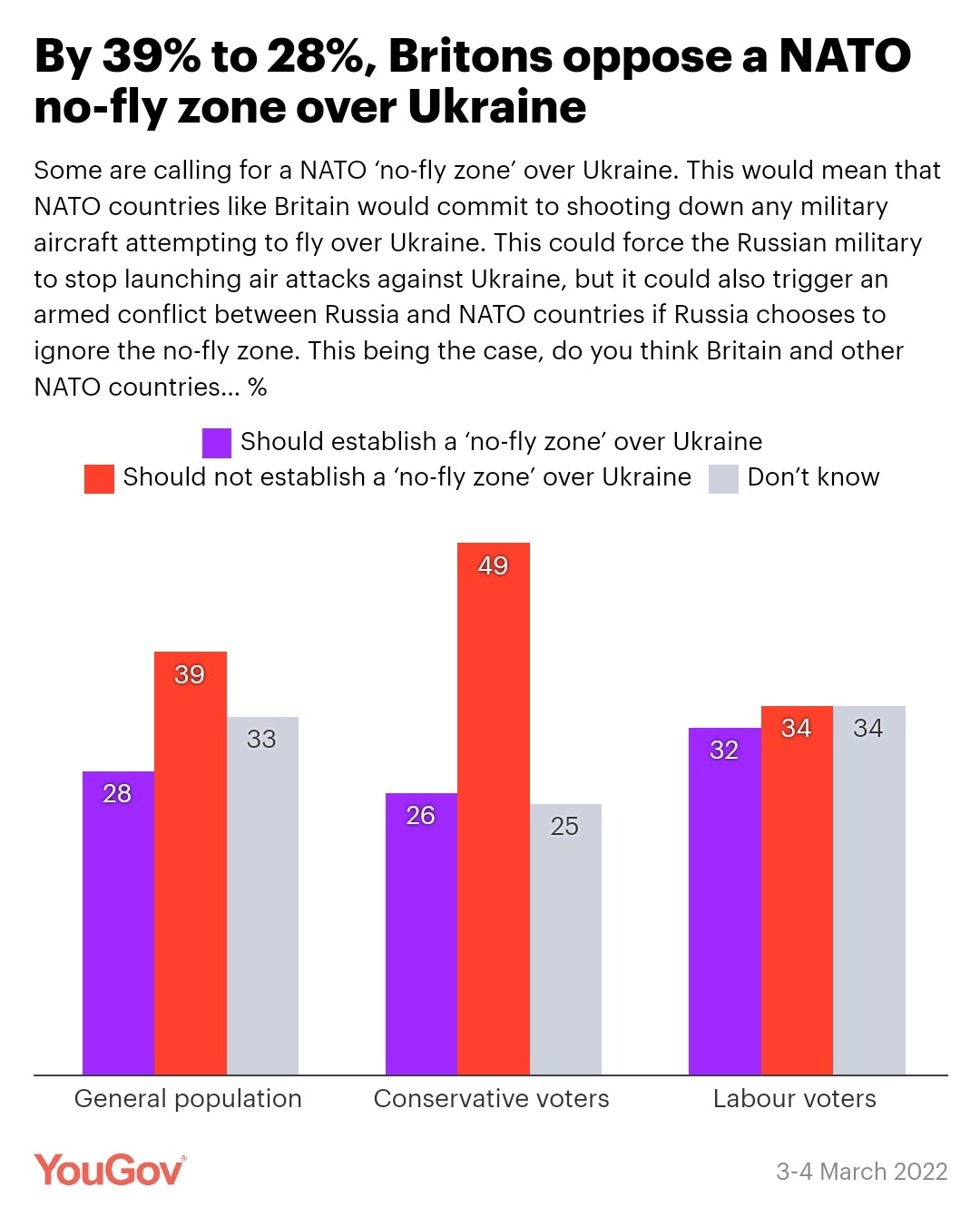
- Phrasing of poll questions is important. Here’s one from the UK about a “no-fly zone in Ukraine” that lays out some of the risks and gets different results from polls that didn’t. (I’m also glad to see a high “Don’t Know” proportion reported.)
March 1, 2022
- Like a lot of news outlets, the Herald and Newshub reported the case of a US teen needing amputations after eating some dodgy leftover lo mein. Fortunately or unfortunately, it’s not true — well, the “after” is true, but the implied “because of” isn’t. The victim had meningoccal disease, which isn’t foodborne, and the connection came only from YouTube. As the Boston Globe and Ars Technica report “The article never mentioned the leftovers again—because the food wasn’t linked to his illness. The lo mein was simply a red herring that the doctors dismissed, according to the article’s editor and director of the clinical microbiology laboratory at Massachusetts General Hospital, Eric Rosenberg.”
- As Siouxsie Wiles says in Stuff, we could really use a Covid prevalence survey now that case counts aren’t a reliable way to assess infection numbers and allow hospitals to predict what they’re going to see in a week or so. As a stopgap, we could use various existing data sources to cobble together an estimate, but a proper random survey like the one the UK has been running would be better. The UK is stopping theirs; the president of the Royal Statistical Society writes about why this is bad
- Interesting US political research: I’ve mentioned quite a few times that opinion polls have a problem with the difference between what people believe and what they say. This research looked at people who say they believe the 2020 US election was really won by Donald Trump, and concludes that most of them actually do believe it.
- On the other hand, YouGov finds substantial differences between the proportion of people who support vaccine mandates for schoolkids and the proportion who think “parents should be required to” have their children vaccinated.
February 16, 2022
- Stats NZ had to take down NZ.Stat, one of the main public interfaces to official statistics. They’re being very helpful by email to people who need the data, but it’s a problem — and it’s not really the right interface for people who just wanted to look up a few numbers. Eric Crampton wrote about why this matters (feel free to ignore the comments about wellbeing indicators)
- The NZ Open Source Assocation awards include one to the Ministry of Health for the Covid trace app, and to the University of Auckland Computational Evolution group for their phylogenetic inference software, BEAST
- Measuring things you don’t have any real way to interpret, from XKCD
- “Creepiness” Is the Wrong Way to Think About Privacy from Slate. It’s a useful heuristic, but it’s not an analysis. As an illustration of how intuitions can be non-generalisable, the chair of George W. Bush’s bioethics council thought eating ice-cream in public was offensive.
- The power of selection bias: “In a series of tweets with an authentic February 7 timestamp, the self-described “industry insider working deep within Nintendo” showed an apparently deep foreknowledge of details that Nintendo wouldn’t officially reveal until the evening of February 9, two days later.”. He did it by making lots of predictions and then deleting all the ones that didn’t pan out.
- Tim Harford explains Arrow’s Impossibility Theorem: it’s hard to take a set of individual preferences and turn them into a group decision
February 10, 2022
- Good discussion of the overinterpretation of opinion polls from Mediawatch. Hayden Donnell jokingly says “That is, of course, except for Mediawatch, which is the only truly objective outlet in town” — but like StatsChat, Mediawatch has the luxury of not commenting on stories where we don’t have anything to say.
- In contrast to well-conducted opinion polls, Twitter polls are completely valueless as a way of collecting and summarising popular opinion. This means that while they’re fine for entertainment (yay @nickbakernz) and collecting reckons from your friends, it’s probably not a good idea to rage-retweet batshit political polls. Let them get 37:0 in favour of banning arithmetic or whatever, rather than 37:1000 against.
- A summary of where the various non-profit Covid vaccines have got to, from Hilda Bastian
- One of the repeated themes of this blog is that you need to measure the right things if you’re going to base decisions on them. The “Drug Harm Index” may not qualify here because it’s not clear decisions are made based on it, but it’s still worth looking at whether it measures harm the right way. As Russell Brown points out, the index would say “that cannabis is New Zealand’s most harmful drug – accounting for $626 million in “community harm” every year. Would you be surprised if I told you more than a third of that was lost GST?”
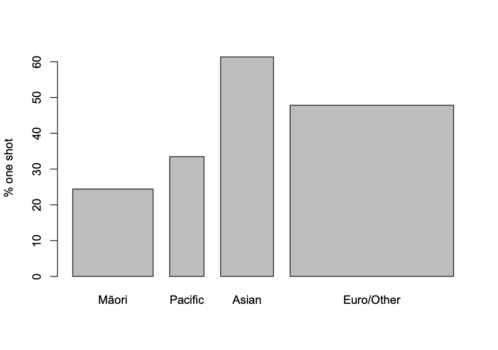
- According to the MoH vaccination data, the vaccine roll-out for kids is going well on average, with 43% having had their first shot, but the differences by ethnicity are about the same as they were for adults. At the start of the Delta outbreak in August (according to Hannah Martin at Stuff) just over 40% of Aucklanders had had a first dose, 33% of Pacific people and 28% of Māori. That’s almost creepily close to the current situation with 5-11 year olds across the country now — the percentage for Māori being slightly lower this time. Equity being a priority doesn’t seem to have had much impact.
- Interesting post from Pew Research on writing survey questions: in particular, ‘agree:disagree’ questions give you more ‘agree’ results than forced choice “pineapple or pepperoni” questions on the same issues.
- In New Zealand there are some issues with denominators for vaccination rates — the population that’s used undercounts minority groups. This seems to be much worse in the UK: from Paul Mainwood on Twitter

January 31, 2022
- The Financial Times reports that the head of Turkey’s official statistics agency has been sacked, and suggests that it’s because the government doesn’t like the inflation data. This is counterproductive; the reasons that inflation estimates are useful rely on people believing them.
- David Epstein has a nice post about the ‘everything in your fridge causes and prevents cancer’ problem
- Entirely separately from the question of how it should be headlined, here’s a Twitter thread about the accuracy of the IHME Covid predictions (for the USA).
- From Russell Brown, a post criticising the ‘Drug Harm Index’
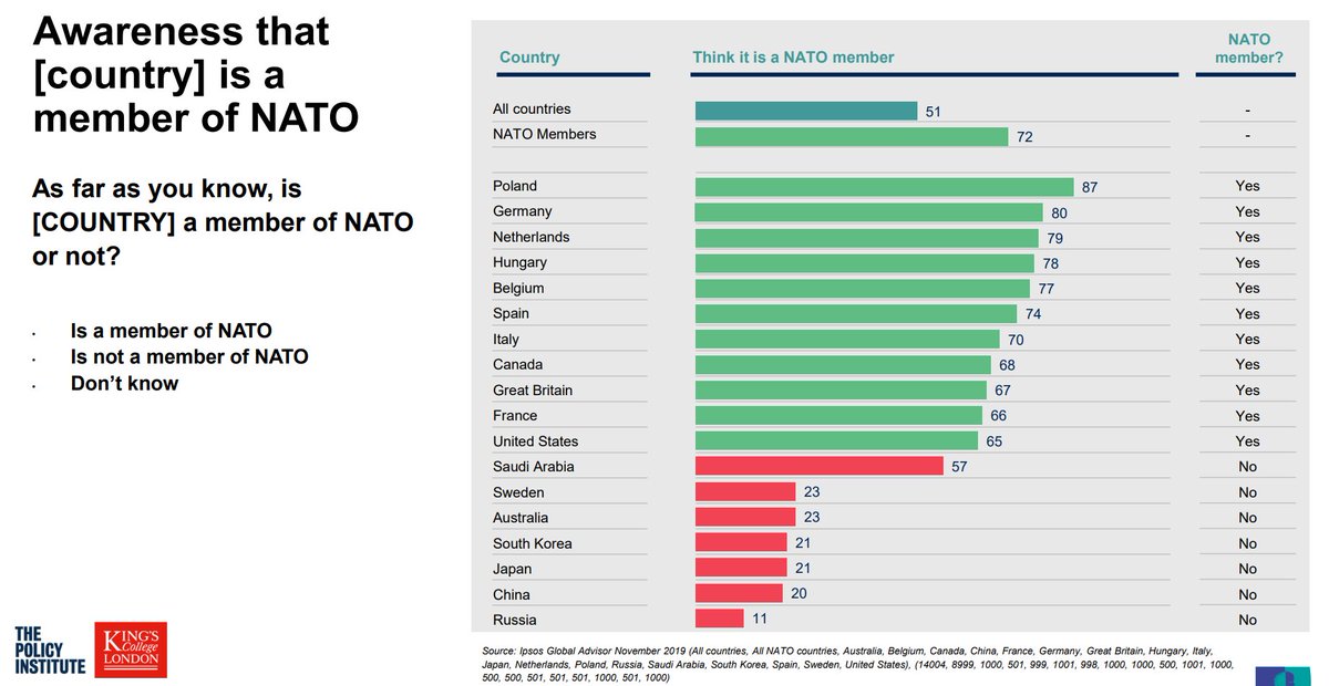
- Via Tobias Schneider on Twitter, some interesting beliefs about NATO membership from this report. The Saudi Arabia, South Africa, and China samples are admitted to tilt wealthy/educated; the others are supposed to be representative. Yes, 11% of Russian respondents say they think Russia is in NATO
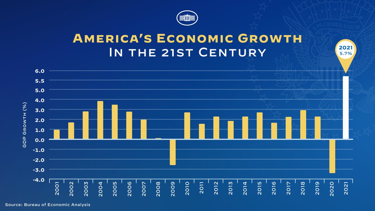
- A pointlessly bad graph from the White House — why would anyone make an obviously distorted y-axis like this when it doesn’t convey a particularly misleading impression?
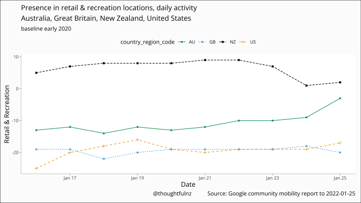
- A graph of Google mobility data (from @thoughtfulnz on Twitter) showing the number of people out and about in retail or recreation locations was a bit higher than pre-Covid, then decreased to about pre-Covid levels after the Omicron traffic lights introduction. From a public health point of view, we could do with being less normal and more like the US and UK, which are much lower than pre-Covid