January 31, 2022
Briefly
- The Financial Times reports that the head of Turkey’s official statistics agency has been sacked, and suggests that it’s because the government doesn’t like the inflation data. This is counterproductive; the reasons that inflation estimates are useful rely on people believing them.
- David Epstein has a nice post about the ‘everything in your fridge causes and prevents cancer’ problem
- Entirely separately from the question of how it should be headlined, here’s a Twitter thread about the accuracy of the IHME Covid predictions (for the USA).
- From Russell Brown, a post criticising the ‘Drug Harm Index’
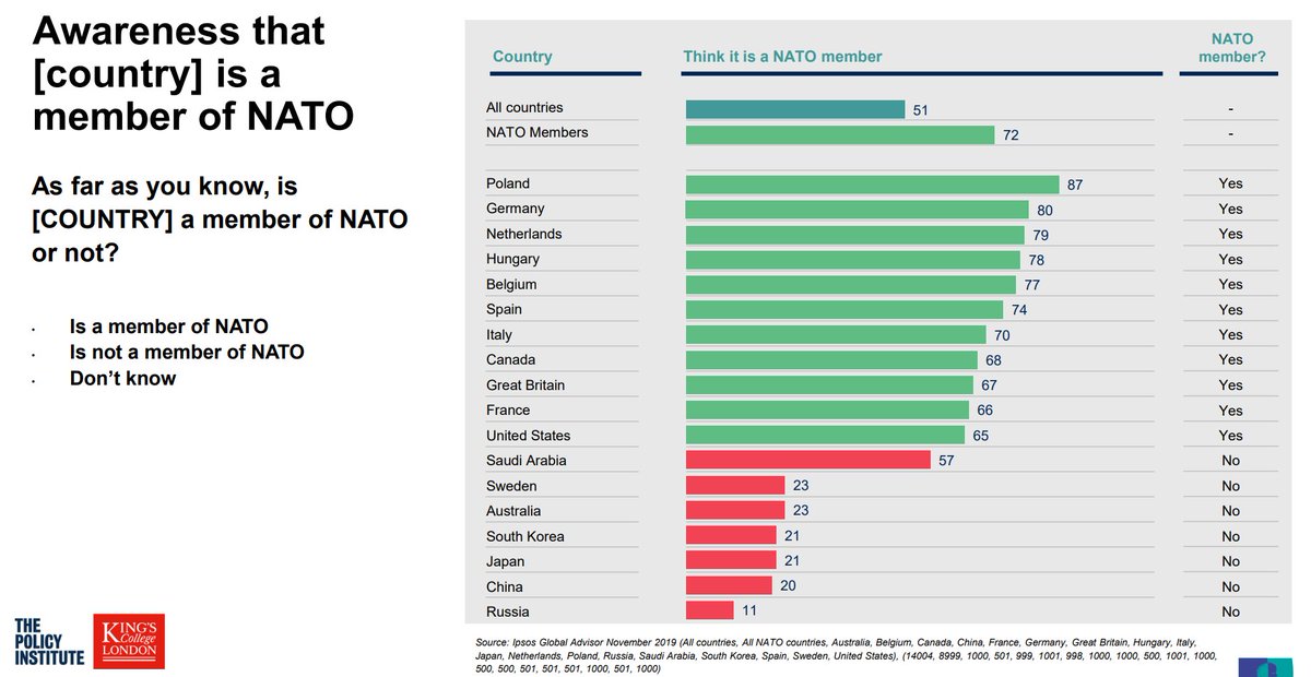
- Via Tobias Schneider on Twitter, some interesting beliefs about NATO membership from this report. The Saudi Arabia, South Africa, and China samples are admitted to tilt wealthy/educated; the others are supposed to be representative. Yes, 11% of Russian respondents say they think Russia is in NATO
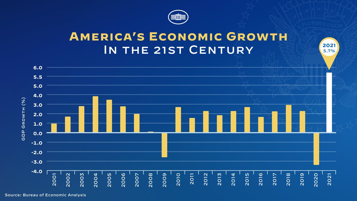
- A pointlessly bad graph from the White House — why would anyone make an obviously distorted y-axis like this when it doesn’t convey a particularly misleading impression?
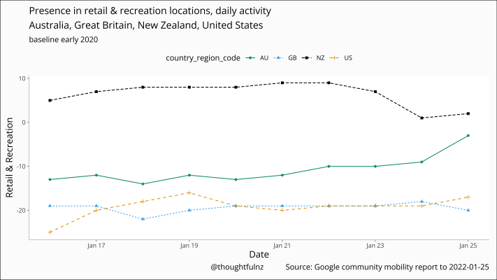
- A graph of Google mobility data (from @thoughtfulnz on Twitter) showing the number of people out and about in retail or recreation locations was a bit higher than pre-Covid, then decreased to about pre-Covid levels after the Omicron traffic lights introduction. From a public health point of view, we could do with being less normal and more like the US and UK, which are much lower than pre-Covid
Thomas Lumley (@tslumley) is Professor of Biostatistics at the University of Auckland. His research interests include semiparametric models, survey sampling, statistical computing, foundations of statistics, and whatever methodological problems his medical collaborators come up with. He also blogs at Biased and Inefficient See all posts by Thomas Lumley »
I’m confused about the Google mobility data comment. Is the graph of the ten days leading up to January 25 in 2022? If so it would make sense that NZ’s line is higher than the UK and the US who (unlike us) are in winter and back at work.
4 years ago
Each country is compared to *itself* in early 2020; that’s the zero line
4 years ago
Aah, thanks for the explanation. I suspect those countries that are post the Omicron peak are behaving with caution; New Zealanders seem to be buying everything we can and getting to the beach before Omicron hits us (or before we induce it…). The difference between stocking up and hunkering down…
4 years ago