Search results for pie chart (66)

March 2, 2023

Pie and anti-pie

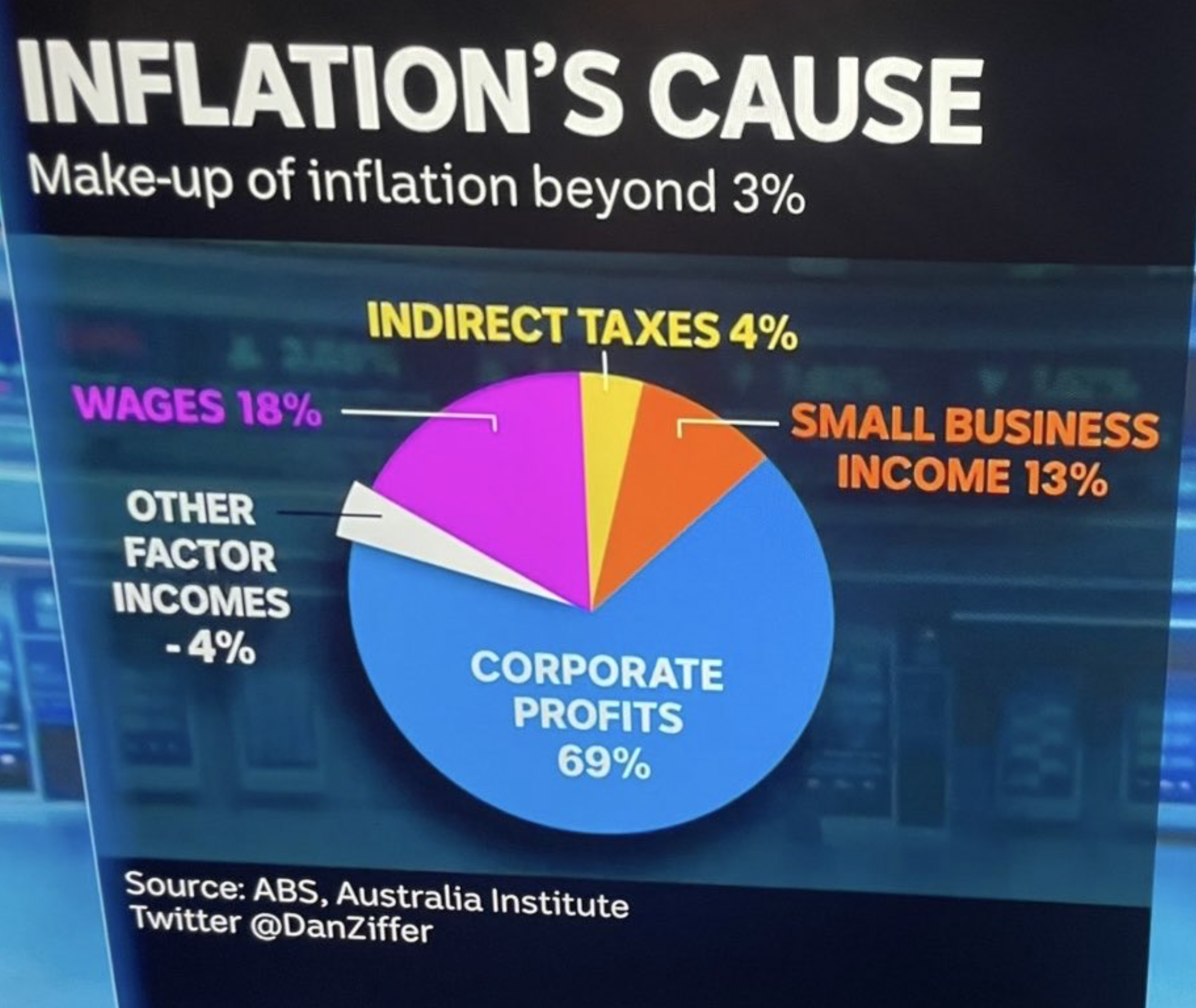
There are other issues with this graph (from the ABC’s Dan Ziffer): these are components of inflation rather than causes, why ‘beyond 3%’?  The big issue, though, is the pie, where the positive number add to 104% and then there’s the negative 4%.

You can’t have negative numbers in a pie chart; that isn’t how pies work.  If you combine 104% of a pie and 4% of an anti-pie, you’ll end up on this list

March 12, 2017

Highchart of the week

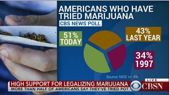
C6mMjf5U8AEC794

It’s not a piechart, because the wedges don’t add up to anything, which is the only possible justification for a pie chart.  On the other hand, unlike the pizzachart it is trying to display numerical data.

Also, “51% of Americans have tried marijuana today” is presumably not the intended reading, but the graphic doesn’t make that as clear as it might.

And the source for the data isn’t a guy named Moe. That’s an abbreviation for Margin of Error.  Google suggests the source is a CBS News Poll (PDF report), but that’s from last year.

(via @seanjtaylor)

March 7, 2017

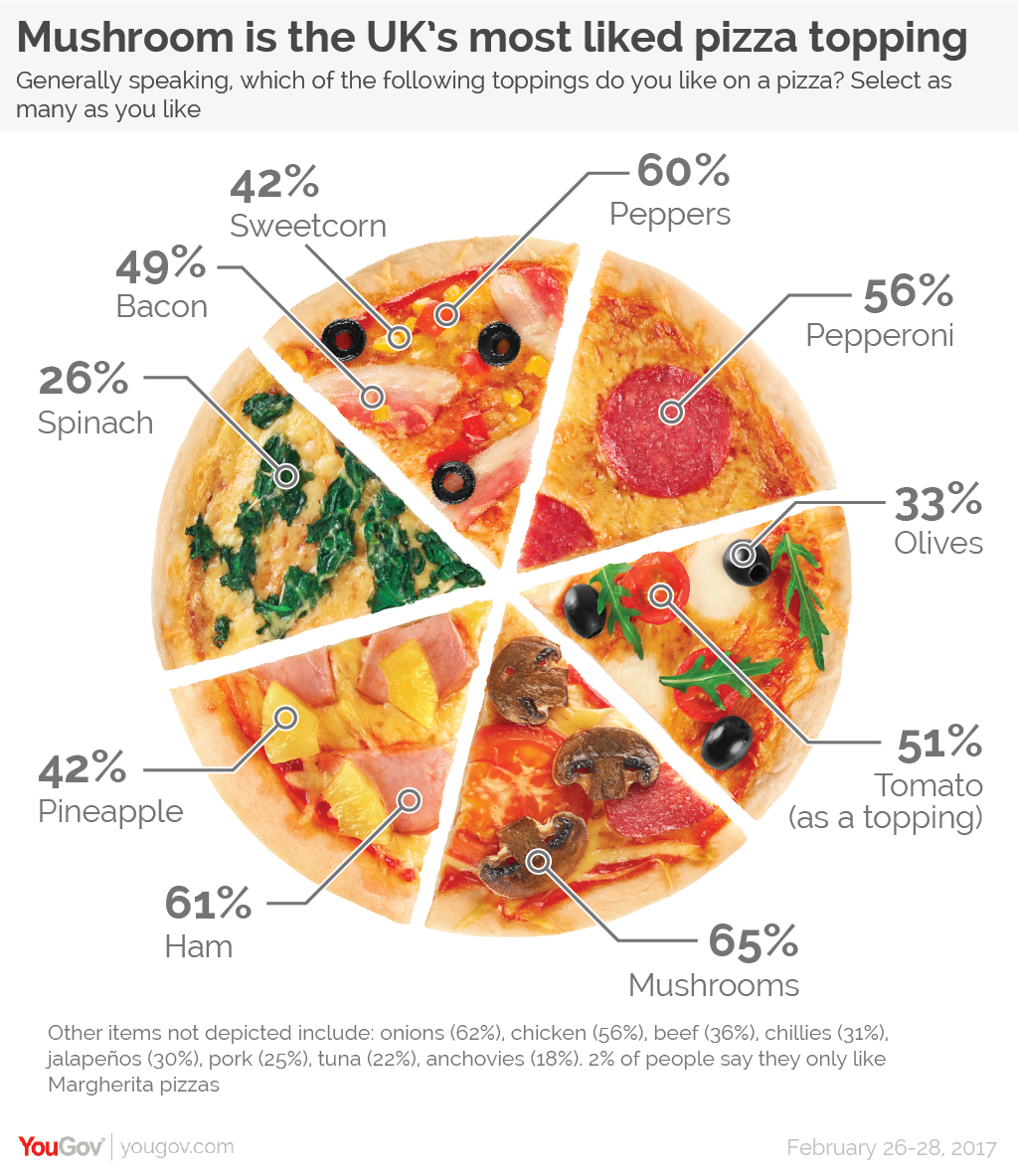
The amazing pizzachart

From YouGov (who seem to already be regretting it).

Pizza-01

This obviously isn’t a pie chart, because the pieces are the same size but the numbers are different. It’s not really a graph at all; it’s an idiosyncratically organised, illustrated table.  It gets worse, though. The pizza picture itself isn’t doing any productive work in this graphic: the only information it conveys is misleading. There’s a clear impression given that particular ingredients go together, when that’s not how the questions were asked. And as the footnote says, there are a lot of popular ingredients that didn’t even make it on to the graphic.


August 18, 2016

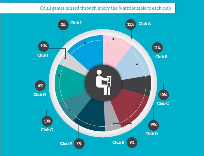
Rigorously deidentified pie

footypie

Via Dale Warburton on Twitter, this graph comes from page 7 of the 2016 A-League Injury Report (PDF) produced by Professional Footballers Australia — the players’ association for the round-ball game.  It seems to be a sensible and worthwhile document, except for this pie chart. They’ve replaced the club names with letters, presumably for confidentiality reasons. Which is fine. But the numbers written on the graph bear no obvious relationship to the sizes of the pie wedges.

It’s been a bad week for this sort of thing: a TV barchart that went viral this week had the same sort of problem.

December 20, 2014

Not enough pie

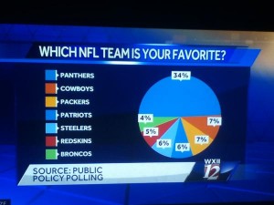
From James Lee Gilbert on Twitter, a pie chart from WXII News (Winston-Salem, North Carolina)

pie

This is from a (respectable, if pointless) poll conducted in North Carolina. As you can clearly see, half of the state favours the local team. Or, as you can clearly see from the numbers, one-third of the state does.

If you’re going to use a pie chart (which you usually shouldn’t), remember that the ‘slices of pie’ metaphor is the whole point of the design. If the slices only add up to 70%, you need to either add the “Other”/”Don’t Know”/”Refused” category, or choose a different graph.

If your graph makes it easy to confuse 1/3 and 1/2, it’s not doing its job.

February 17, 2014

Two charts about animal use in research

Prompted by Siouxsie Wiles’s report of talking to an anti-vivisectionist demonstrator, here are two charts from the annual report of the National Animal Ethics Advisory Committee. These are the people who monitor the use of animals in research, testing, and teaching in New Zealand.

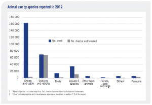
The first chart shows what types of animals are used and what happens to them afterwards

animal-bar

More than half are sheep and cattle, mostly cattle, and mostly subjected to things like breeding or eating different types of feed.  There are quite a lot of mice used in biological research, though the numbers are decreasing (down 24% last year) partly because they are being replaced by zebrafish. None are monkeys.

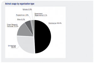
About half of the research is commercial, with about a quarter at universities

animal-pie

Some people will still be opposed to livestock research because they’re opposed to livestock farming. Some people still  disapprove of the use of mice in biomedical research. But anyone who wants to campaign on those issues should be clear that those are the issues.

May 25, 2013

Bar charts are boring: a redesign

At eagerpies, a redesign of a ‘boring bar chart’ according to graphic design principles, with steps including

  • “color exercises an undeniable psychological attraction… It captures and holds attention, multiplies the number of readers, assures better retention of the information and , in short, increases the scope of the message.”
  • We can add further perspicacity to the components of our pie by applying the Japanese concept of Ma. Ma represents space or a pause. It is, as Alan Fletcher describes, “the interval which gives shape to the whole”.
  • The ability to perceive motion was fundamental to our paleolithic survival as saber tooth tigers ate those of us who didn’t see them coming.  By adding motion to our graphic we can capitalize on the base human response to ensure attention is directed where it is most desired.

And if you think the result is going to be a 3D exploded pie chart, you aren’t cynical enough.

A landmark in the (specialised) field of quantitative data visualisation satire.

December 10, 2012

Meet Joshua Dale – Statistics Summer Scholarship recipient

This summer, we have a number of fantastic students who received a Department of Statistics scholarship to work on fascinating projects with our staff members. We’ll be profiling them here on Stats Chat and we’d love to hear your feedback on their projects!

Joshua Dale is working with David Scott on sports prediction.

Joshua Dale - Statistics Scholarship Recipient 2012-2013 Joshua explains:

“David Scott has been predicting the outcome of rugby union and rugby league games using an exponential smoothing method. The predictions have been posted on Stats Chat and his Super 15 predictions have also appeared in the New Zealand Herald. Whilst the predictions have been quite successful and David was equal best amongst the NZ Herald tipping panel in predicting Super 15 games in 2012, it is likely that the method can be improved.

“The project will investigate some possible improvements:

  1. The use of more parameters for home-game advantage;
  2. The use of a power transform of the prediction errors used for updating team ratings;
  3. Adaptive estimation of the smoothing parameter.

“If time permits, the problem of automatic updating of fixture lists from websites will also be considered. The data analysis and optimisation will be primarily carried out using the statistical programming language R. I have taken a couple of computer science papers and I use R a fair bit in statistics courses, which will be a big help with this project.”

More about Joshua:

“I’m just about to finish a Bachelor of Commerce degree where I majored in finance, but also studied several statistics papers as well, enough to gain entry into the Bachelor of Science (Honours) programme in statistics for 2013. During 2012, I had the opportunity to work for the Department of Statistics, both marking assignments and tutoring in the computer labs. This has been an incredibly worthwhile experience, and I plan to do it again next year.

“As a lab demonstrator, students ask you for help with concepts and assignments. I feel because the tutors in the labs are students themselves, they are able to explain concepts in a way that the students can relate to, which makes their learning experience much more enjoyable.

“I like statistics because of its applicability to a huge number of problems. In almost any situation where data is involved, statistics can be used to increase efficiency, improve profitability, make predictions, and help to provide insight into many other areas. It’s also reassuring, in terms of job prospects, that with the heavy use of computers and the internet today, corporations are collecting more data than ever before. Somebody’s got to analyse it!

“In addition to focusing on this project, over summer I will be learning how to program in SAS (a major commercial statistics package), studying for the CFA (Chartered Financial Analyst) exams, and trying to find undervalued stocks to buy on the New Zealand and Australian stock markets. You’ll also find me mountain biking on the weekends, building a petrol-powered bike in the garage, and heading to the Coromandel for New Year.”
March 28, 2020

Briefly

  • An opinion poll on the NZ lockdown, at the Spinoff.  This is notable for being a self-selected online sample, but not a bogus poll — it’s properly reweighted to population totals for age, gender, and region, and this week being on Facebook or Instagram is probably more representative than answering your phone.  Interestingly, 9% of people say they won’t obey the rules, but only  7% say the rules shouldn’t be enforced.
  • XKCD has a … unique  … way to describe the 2m distancing zone.
  • Tableau have graphs of population mobility across the US, purporting to measure the success of social distancing. But they didn’t take interstate highways (where people tend to move rather a lot) into account
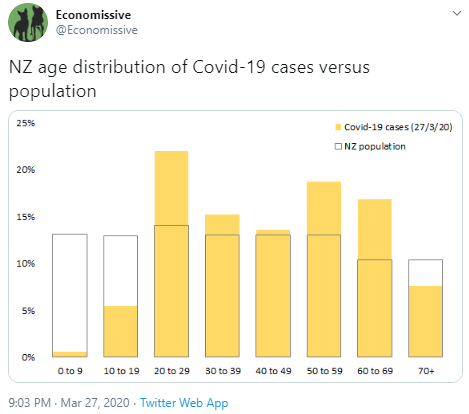
  • A good graph of case age distributions in NZ — answering the basic statistical question ‘compared to what’?
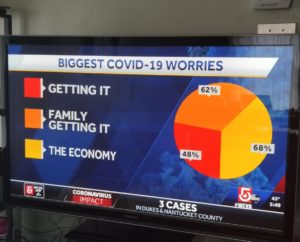
  • A terrible pie chart from ABC news in the US, via several people: these aren’t things that add up
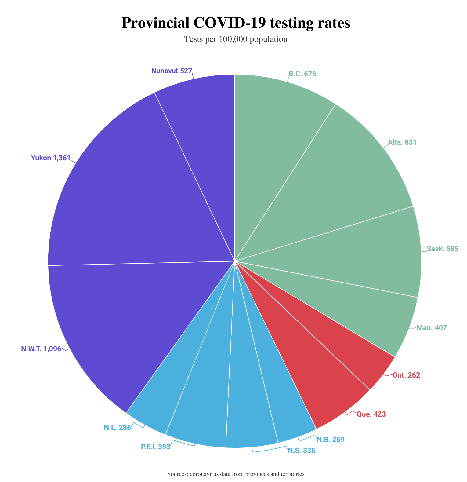
  • And from Macleans.ca: rates per 100k population don’t add up either — Yukon, Nunavut, and the  Northwest Territories have not actually done a third of Canada’s testing
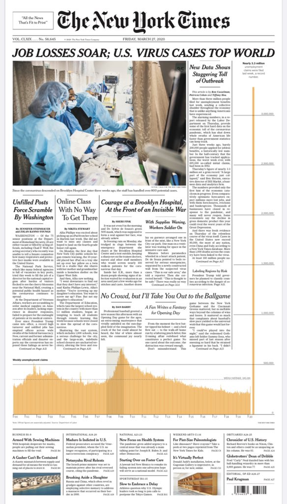
  • On the other hand, this graph of unemployment claims from the New York Times is spectacular.  Depressing, but spectacular.
May 23, 2018

Graph of the week

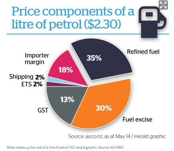
From the Herald (via @aw_nz on Twitter)

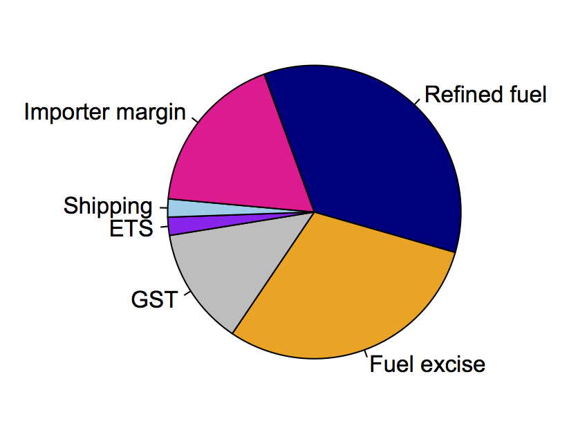
One of the features of pie charts is that it’s relatively hard to judge angles and compare segments. Still, if you get them wrong enough, people can tell.   For example, the taxes — the grey and orange wedges — are clearly more than half the circle, but the numbers add to only 43%.  Less dramatically, the 13% wedge for GST is larger than the 18% wedge for importer margin, and the 30% wedge for fuel excise is larger than the 35% wedge for refined fuel.  You don’t have to be very cynical to wonder whether it’s a coincidence that the tax components are being exaggerated. [update: you don’t, but you’d probably be wrong — see comments]

Here’s an accurate piechart, assuming the numbers are correct: