Search results for pie chart (66)

October 9, 2012

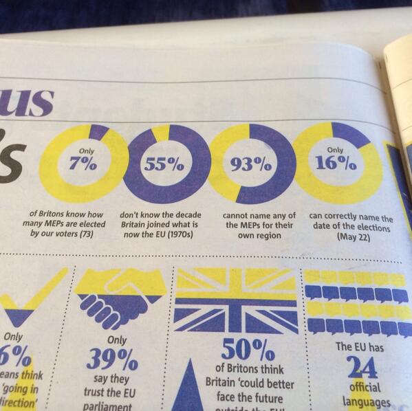
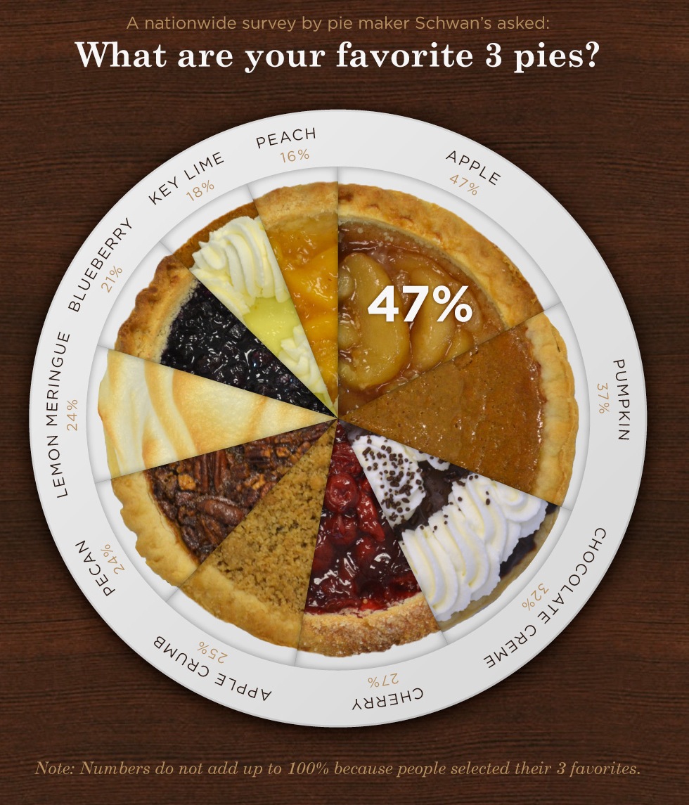
Pie charts with 110% awfulness

Pie charts, as you may have noticed, are not very popular among statisticians, despite the best efforts of the world’s most popular statistics package.  Pie charts with fake 3D are much worse, since the 3-D effects make it harder to see the numbers they can be actively misleading.  But the worst form of pie chart must be the one that gives up on the ‘pie’ metaphor and shows numbers that aren’t even shares of a total.

Stat-of-the-Week nominator Mark points us to this example:

from an otherwise-reasonable post at TechRepublic, on malware-blocking by internet browsers (though it could have done with some consideration of false positives and absolute risk).

The numbers are taken from a report by a professional security lab, but the graphic design is new and original. The report had an inoffensive bar chart, which makes the point much more clearly


August 4, 2012

Pie charts: threat or menace?

Stuff has a story based on a real and useful poll, but summarised with a dreadful graph.  You will have heard statisticians ranting about pie charts and may have wondered whether their medications need to be adjusted.  Here’s why we rant.

Notice that the pie isn’t round; it’s an ellipse.  Presumably we’re supposed to imagine it being tilted away at some angle (in contrast to the table, the headline, and the legend, which are aligned with the page.   Also notice that the wedges have numbers on them — that’s often a sign that the graph can’t be interpreted by itself.  The red wedge looks a lot smaller than the blue wedge.

(more…)

August 17, 2015

More diversity pie-charts

These ones are from the Seattle Times, since that’s where I was last week.

IMAG0103

Amazon.com, like many other tech companies, had been persuaded to release figures on gender and ethnicity for its employees. On the original figures, Amazon looked  different from the other companies, but Amazon is unusual in being a shipping-things-around company as well as a tech company. Recently, they released separate figures for the ‘labourers and helpers’ vs the technical and managerial staff.  The pie chart shows how the breakdown makes a difference.

In contrast to Kirsty Johnson’s pie charts last week, where subtlety would have been wasted  given the data and the point she was making, here I think it’s more useful to have the context of the other companies and something that’s better numerically than a pie chart.

This is what the original figures looked like:

amazon-1

Here’s the same thing with the breakdown of Amazon employees into two groups:

amazon-2

When you compare the tech-company half of Amazon to other large tech companies, it blends in smoothly.

As a final point, “diversity” is really the wrong word here. The racial/ethnic diversity of the tech companies is pretty close to that of the US labour force, if you measure in any of the standard ways used in ecology or data mining, such as entropy or Simpson’s index.   The issue isn’t diversity but equal opportunity; the campaigners, led by Jesse Jackson, are clear on this point, but the tech companies and often the media prefer to talk about diversity.


June 2, 2015

Improving pie-charts

We’ve seen animations of this sort from Darkhorse Analytics before, but this one is special. It shows how to remove unnecessary components from a pie chart to produce something genuinely useful, though, sadly, the procedure doesn’t work for all pie charts.

Click on the picture to start the animation

devourThePie3

(via @JennyBryan)

May 19, 2014

Piechart of the week

Bn-cg6IIEAA0e7J

Yes, it’s a simple swap of two numbers, but if anyone actually read the thing…

(via @WINDY_BUTT)

May 26, 2013

Late autumn piechart-of-the-week

It’s getting on for winter here, and last Thursday was the fourth Thursday in the month before the winter solstice — the season for Thanksgiving weekend.  To celebrate, a pie chart from DegreeSearch.org, whose blog usually contains advice for students, but occasionally branches out into feats of infographic creativity.

pie-chart

May 6, 2013

Frontiers in pie-charts

The `pie’ in pie-chart is a metaphor — the charts are divided into slices in the way that certain kinds of pie are, and the slices add up to the whole pie.

Or, at least, that’s usually the idea.  One of StatChats’s foreign correspondents sent in this effort from the BBC

piefail


This kind of pie doesn’t get divided into slices — it would just fall apart.  And in this graph the slices don’t add up to anything meaningful — for those of you not up on the British sports scene: there are actually more than ten football clubs.  In the graphic we have Premier League teams such as Arsenal and Manchester City mixed in with  Albion Rovers and Brechin City from the Scottish 2nd division.

The pie price pie exemplifies a general rule, if you have to write all the data values on your graph, the graph isn’t doing its share of the work.

March 20, 2013

Frontiers in piecharts

From Bradley Voytek, apparently from Reddit, but unfortunately not further sourced there either

hHm8uJ0


I think the legend at the bottom right just makes this perfect.

February 20, 2013

Is there a 3-strikes law for piecharts?

The Herald-Sun pie chart saga continues (thanks to @danfairbairn and @PeteHaitch on Twitter).   Can we get their piechart license suspended pending training and re-examination?

Can we revoke their piechart license?


This example further complicates the question of how they actually make these graphs.  In this one, the angle is at least approximately right, the percentages are right apart from being incorrectly rounded, but the graph is backwards.  We’ve also seen examples where the angles were completely wrong, but the two groups were correctly identified. It’s hard to see how an automated system could cause such a bewildering variety of problems, but it’s also hard to see how a real person could be so totally clueless about pie charts.


February 12, 2013

Unclear on the pie-chart concept

Everyone recognises pie. Everyone likes pie. So pie must be a good representation of numbers, right?

One important detail: you want bigger numbers to translate into more pie. This would be especially important if the numbers meant anything, but it’s not a good look even if they don’t.

4XMQKnz

From the Herald-Sun, via Juha Saarinen on Twitter.

[Also: could a cynical reader perhaps think the question was a bit slanted?]

[Update: this looks like exactly the same pie chart they used for 56% vs 44% last month]