NZ voting cartograms
One of the problems with electoral maps is the ‘one cow, one vote’ effect: rural electorates are physically bigger, and so take up more of the map. When you combine that with the winner-take-all impact of simple colour schemes, it can look as though National won basically everything instead of just missing out on a majority.
Using a design by Chris McDowall that I linked earlier this year, David Friggens has mapped out the party votes across the country with equal area given to each electorate. These maps show where the votes for each major party came from
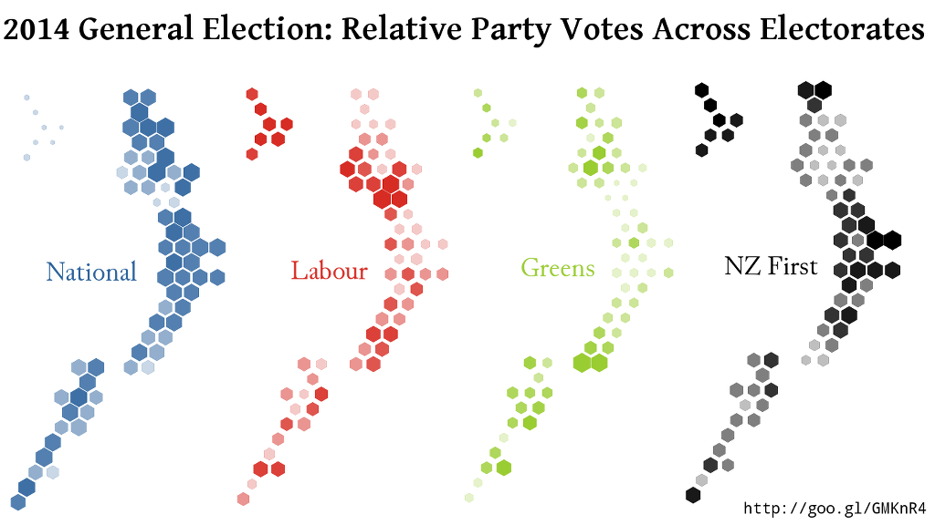
He also has maps for the minor parties, some of which have very localised support.
Thomas Lumley (@tslumley) is Professor of Biostatistics at the University of Auckland. His research interests include semiparametric models, survey sampling, statistical computing, foundations of statistics, and whatever methodological problems his medical collaborators come up with. He also blogs at Biased and Inefficient See all posts by Thomas Lumley »
Looking at the graphs I think “cool presentation of the information”. I also think, in R, base plot() plus hexagon() from plotrix (along with liberal use of apply) should work fairly easily for this style.
10 years ago
Or the ‘hexbin’ package. The real design work was deciding where to put the hexagons.
10 years ago
For anyone wanting to give it a go themselves, here is my go at “how to put the hexagons” as a precursor to where or why to put hexagons.
http://rpubs.com/thoughtfulbloke/hexmap
10 years ago