Graphs: when zero is not a relevant value
Bar charts have a filled area tying the axis to the plotted value, and this only makes sense when the axis is at a true zero. Scatterplots and line plot don’t have the same limitations, and can be useful even when there isn’t a true zero or it isn’t a relevant value.
Here’s the Wikipedia compilation of world average temperature estimates back into deep time:
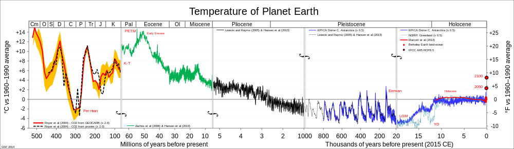
The zero on the graph is the 1960-1990 average, because that’s a reasonable point of comparison. It’s not a true zero; you couldn’t use barcharts.
Here’s the Berkeley Earth estimate of average land temperatures, based on actual thermometer readings at weather stations, using all the data, with open code, data and methods.
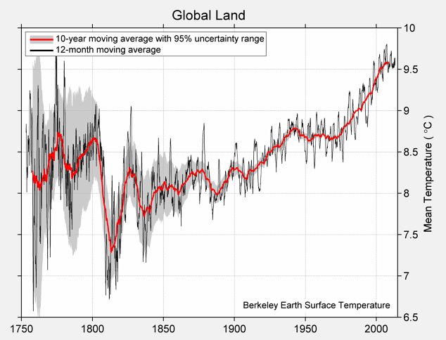
They could have put a zero on the graph by using differences from the average for some period — their data output is difference from the 1951-1980 average — but they presumably thought it was clearer to just label in degrees Celsius and not make everyone do the conversion.
We had a comment suggesting that zero Celsius should be on this sort of graph, and there’s a graph circulating on Twitter that has its baseline at zero Fahrenheit.
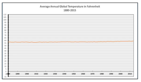
These looks like a deliberately uninformative choice: there’s nothing special about zero Fahrenheit and nothing special about zero Celsius as temperatures either in any absolute sense or as mean global temperatures.
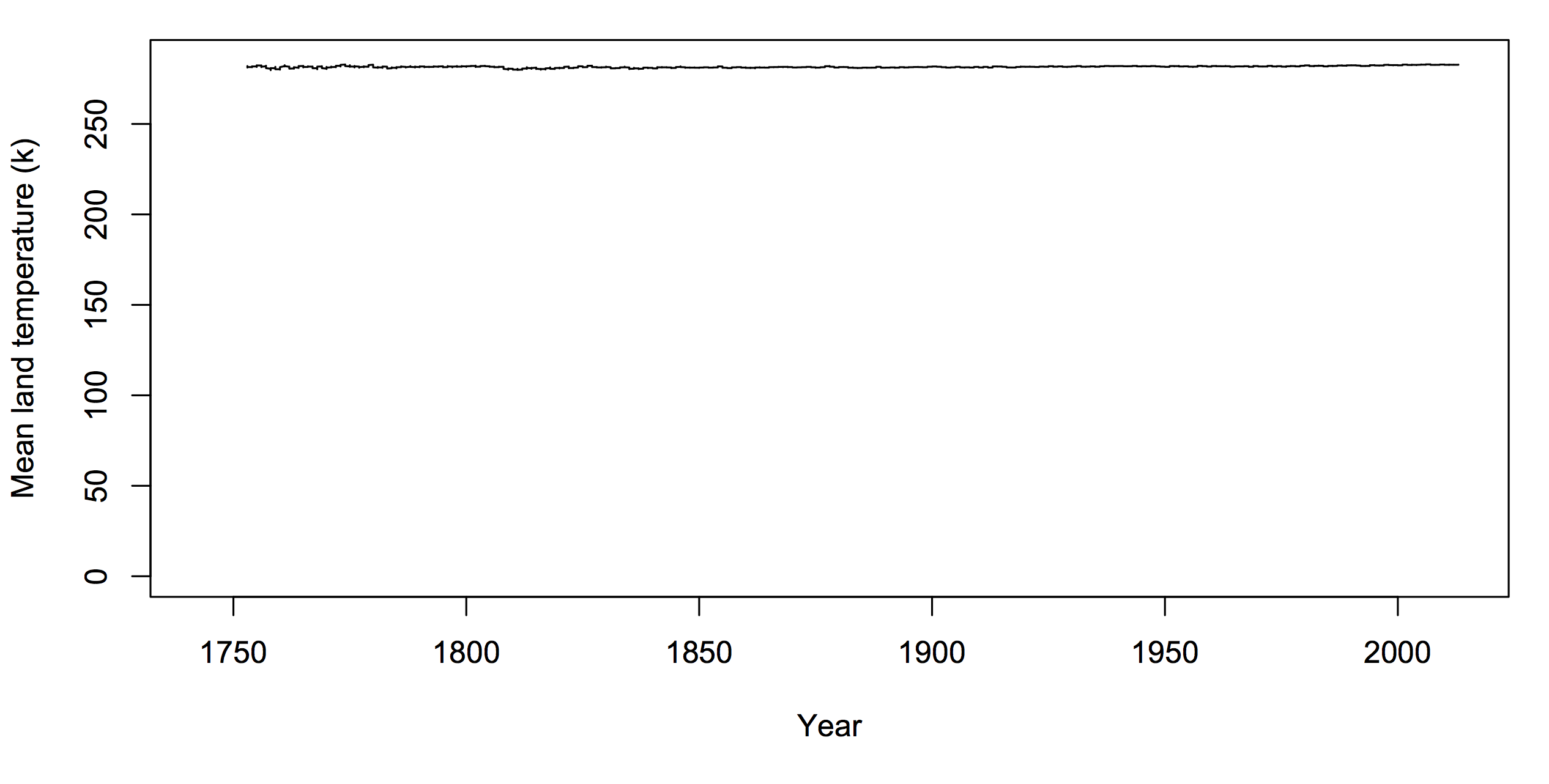
The only natural zero for temperature is zero kelvin. If you want to argue there has to be a zero on climate graphs, it should be that one. But you’d look silly.
If you want to use graphs of temperature history to make a point about policy, the graph needs to be one where differences that would matter for policy are clearly visible. As far as I know, no-one denies that a rapid 4C (7F) change in global temperature would be important. If your graph would make it look unimportant, your graph is wrong.
Thomas Lumley (@tslumley) is Professor of Biostatistics at the University of Auckland. His research interests include semiparametric models, survey sampling, statistical computing, foundations of statistics, and whatever methodological problems his medical collaborators come up with. He also blogs at Biased and Inefficient See all posts by Thomas Lumley »